Did you like this project?
Let's talk! You are welcome to join us for a short consultation. Click on the button below or write directly to: lotna@lotna.eu
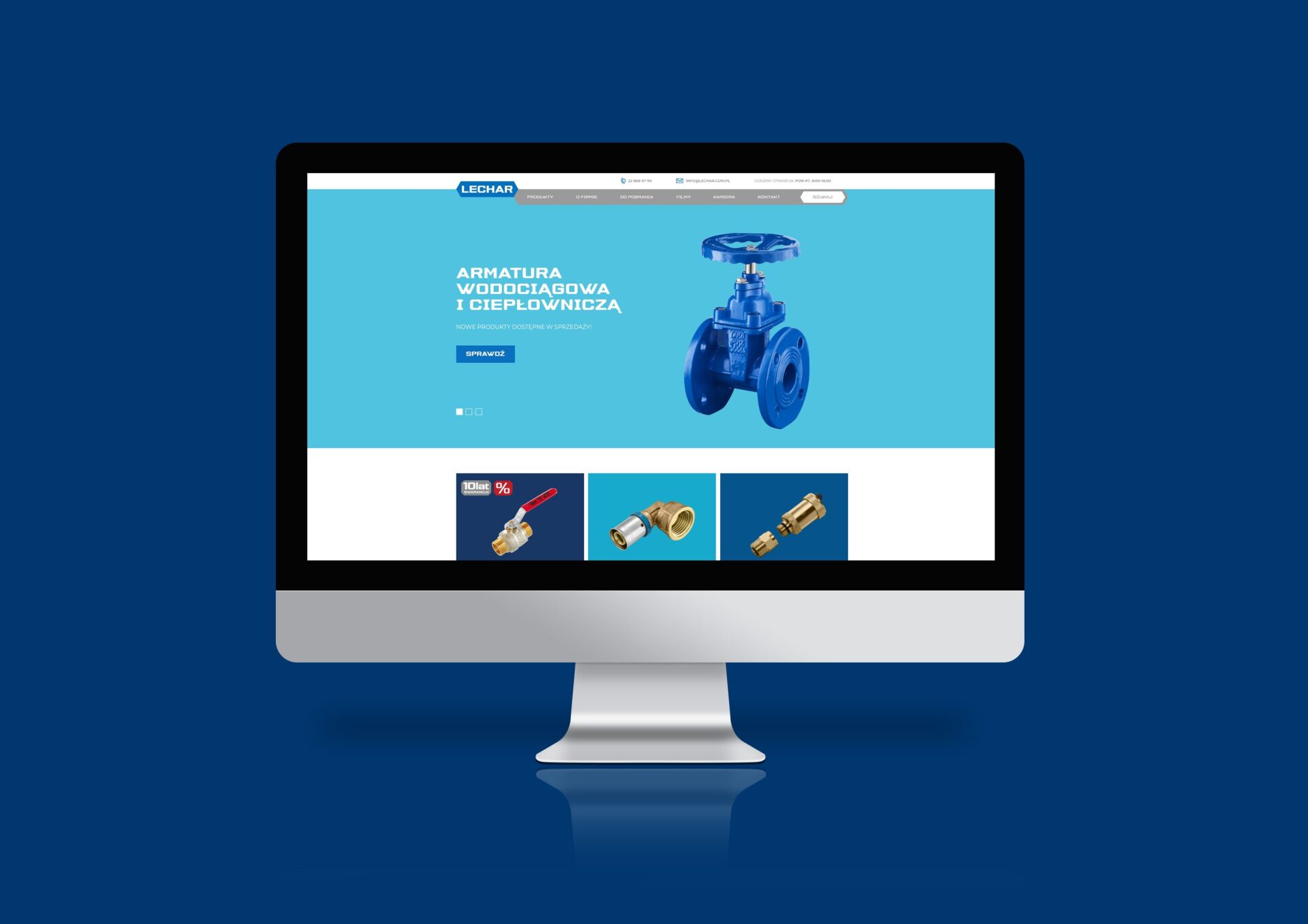
Lechar is a family-owned company that was founded in 1990. For more than 30 years of activity, the company has become a leader in the supply of assortments in the plumbing and sanitary industry.
In order to support further growth, strengthen its visibility and clean up its image, the company’s management decided to carry out a major rebranding.
Creative and branding agency Lotna was selected for the task. We took on the challenge with great pleasure.
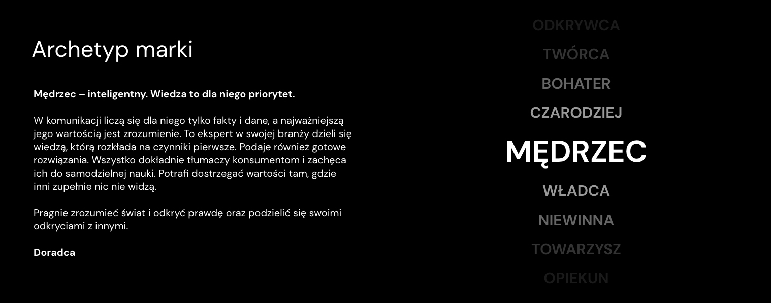
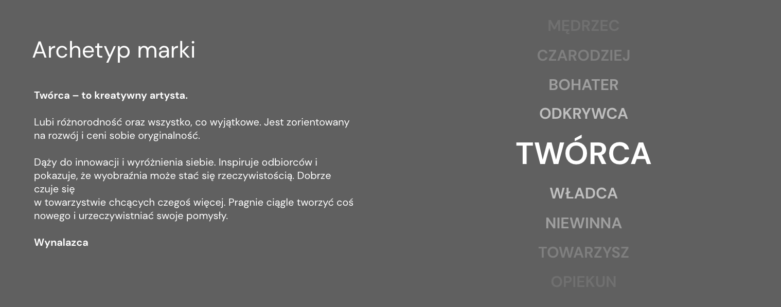
Lechar operates in the technical, professional industry. Although it is currently run by two energetic and passionate women, the nature of the business the company conducts and the market in which it operates required strong, masculine and streamlined elements. .
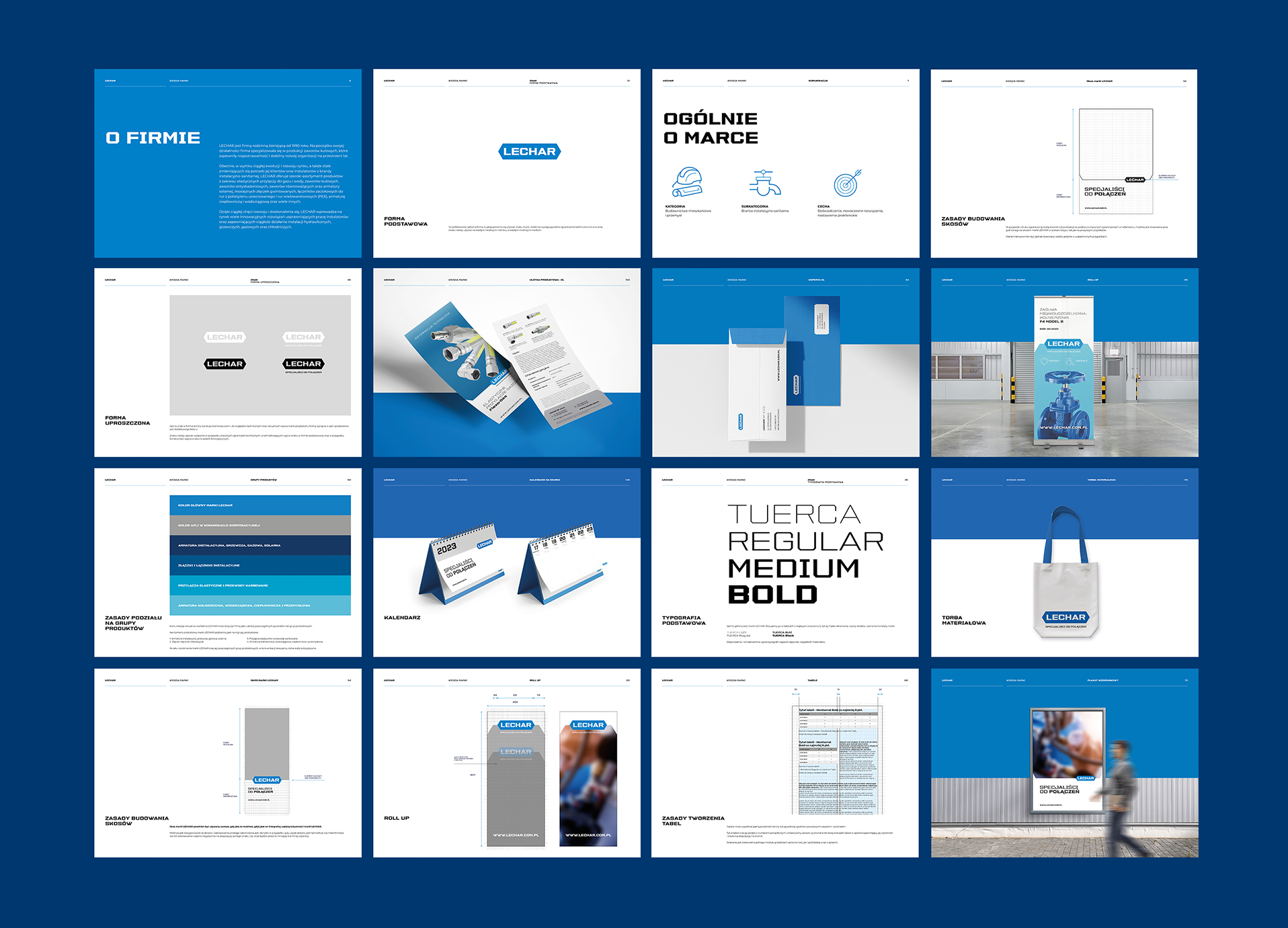
Based on these assumptions, we created a mark, developed principles for communicating with the brand environment, and created a comprehensive brand identity.
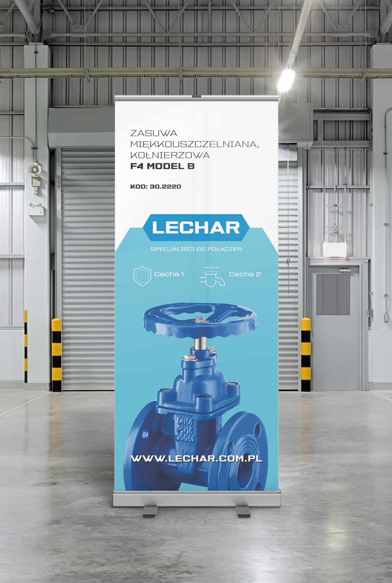
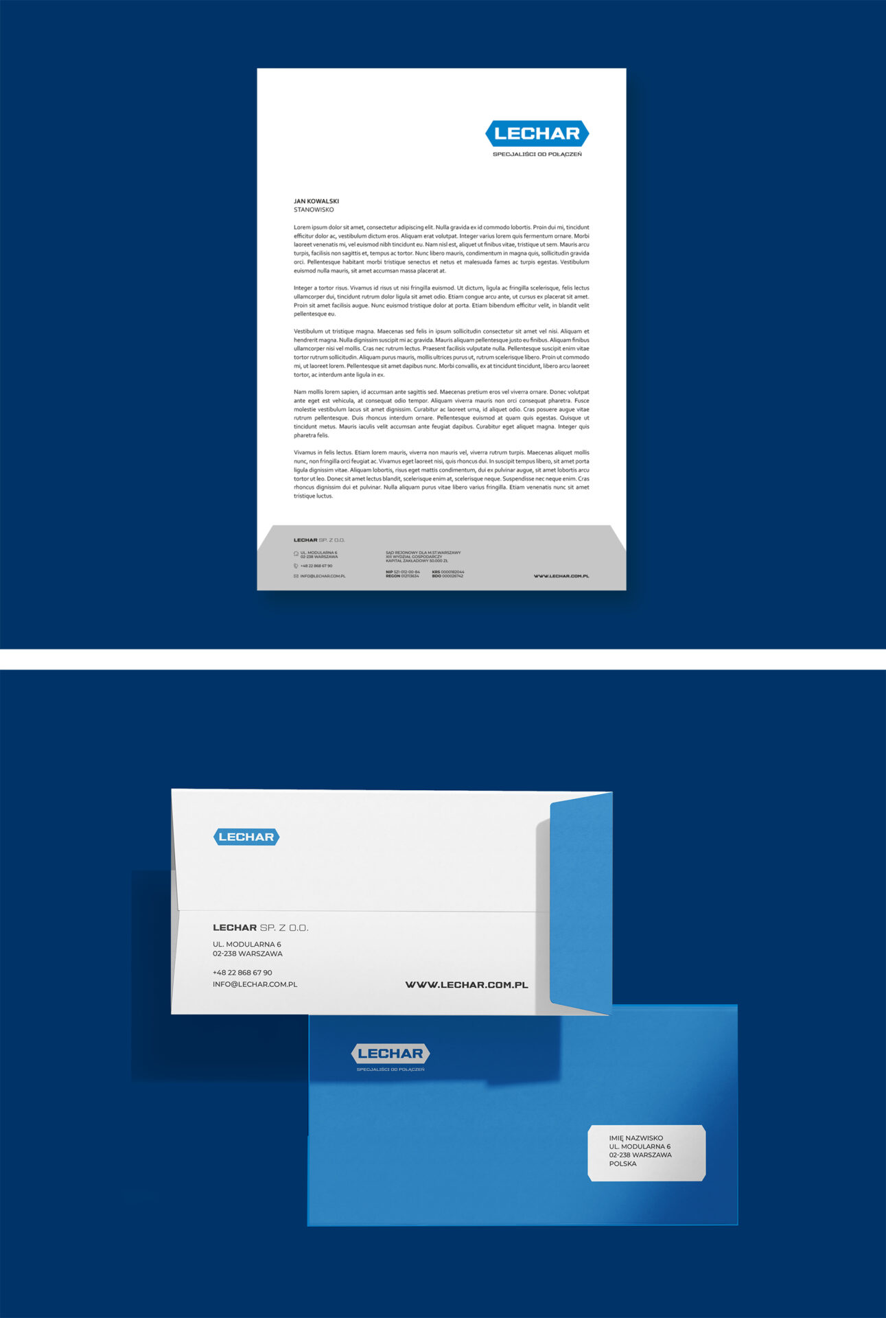
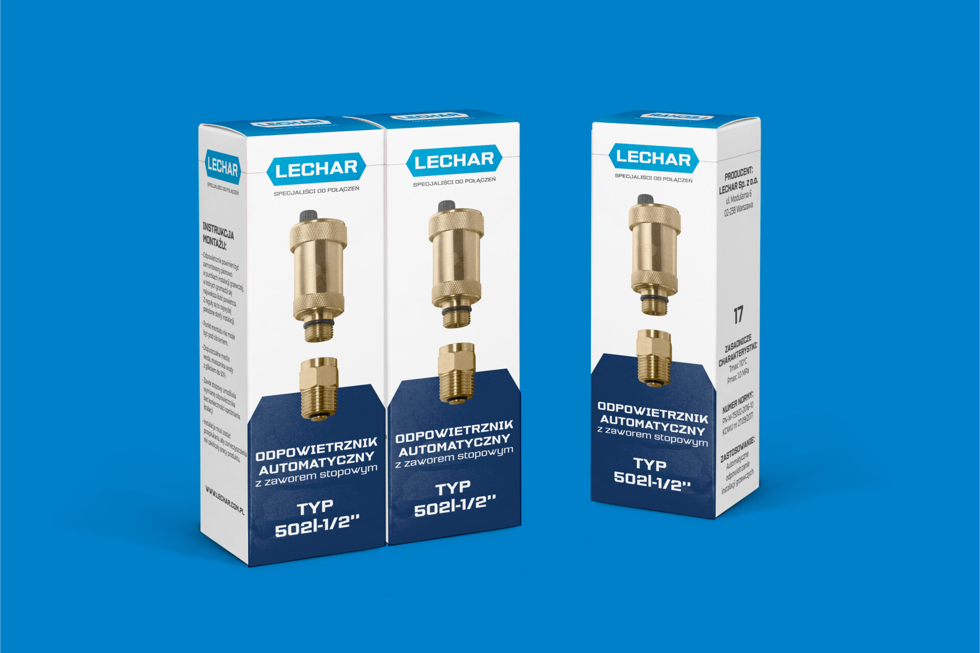
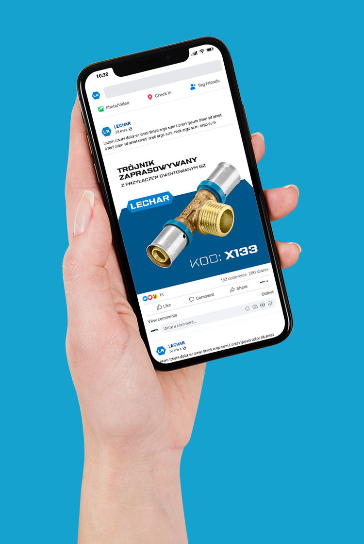
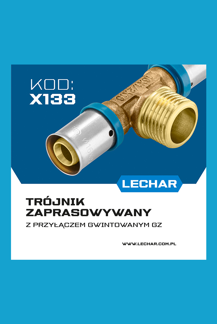
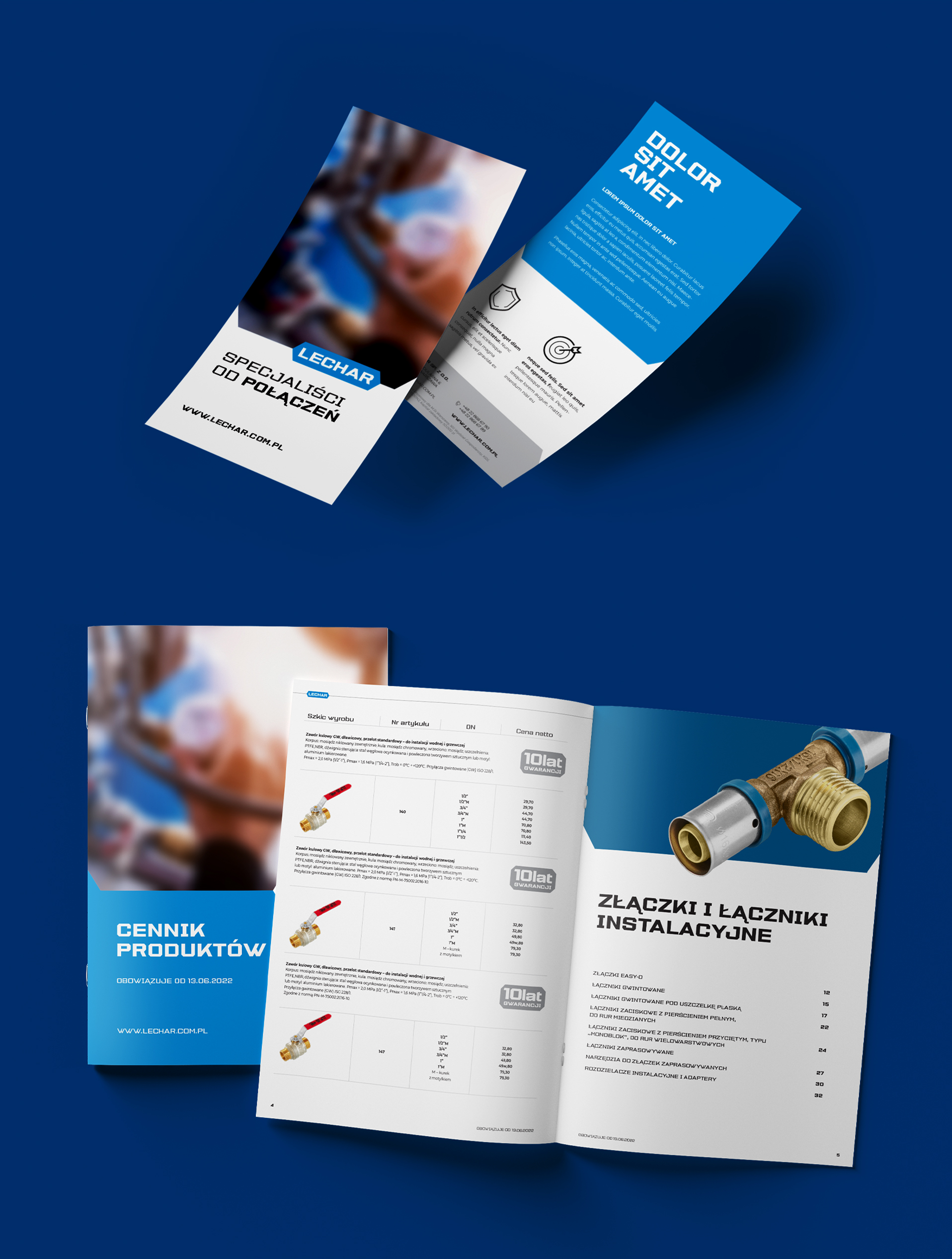
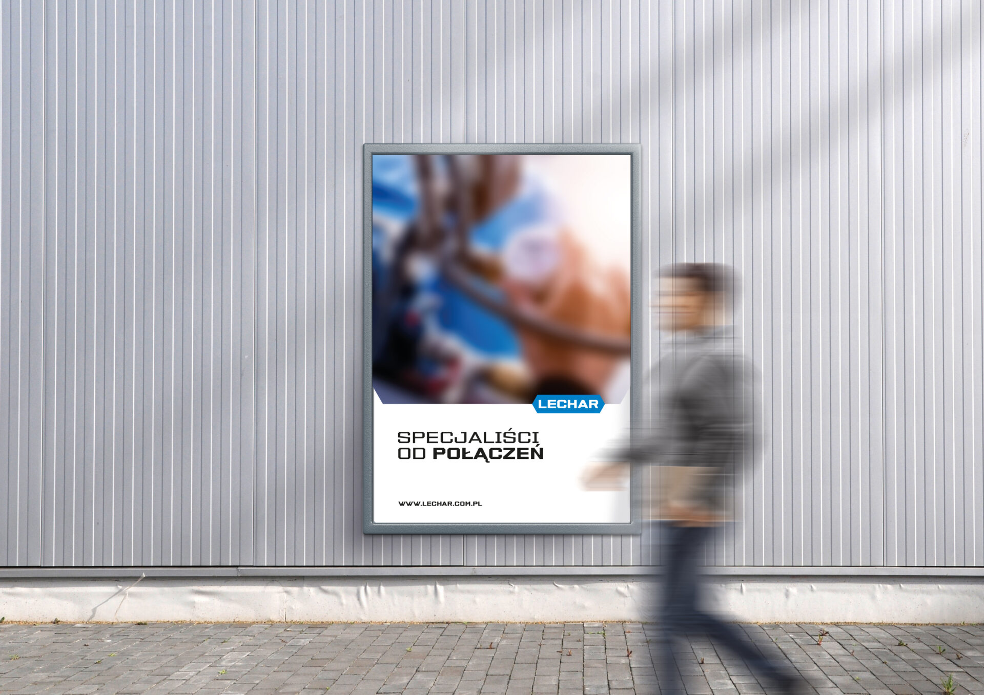
The client gained: a visually and verbally organized brand that stands out from the competition; templates for all informational and advertising materials that the brand may need to communicate with its market environment. We gathered all the rules and guidelines into an elaborate and clear Brand Book.

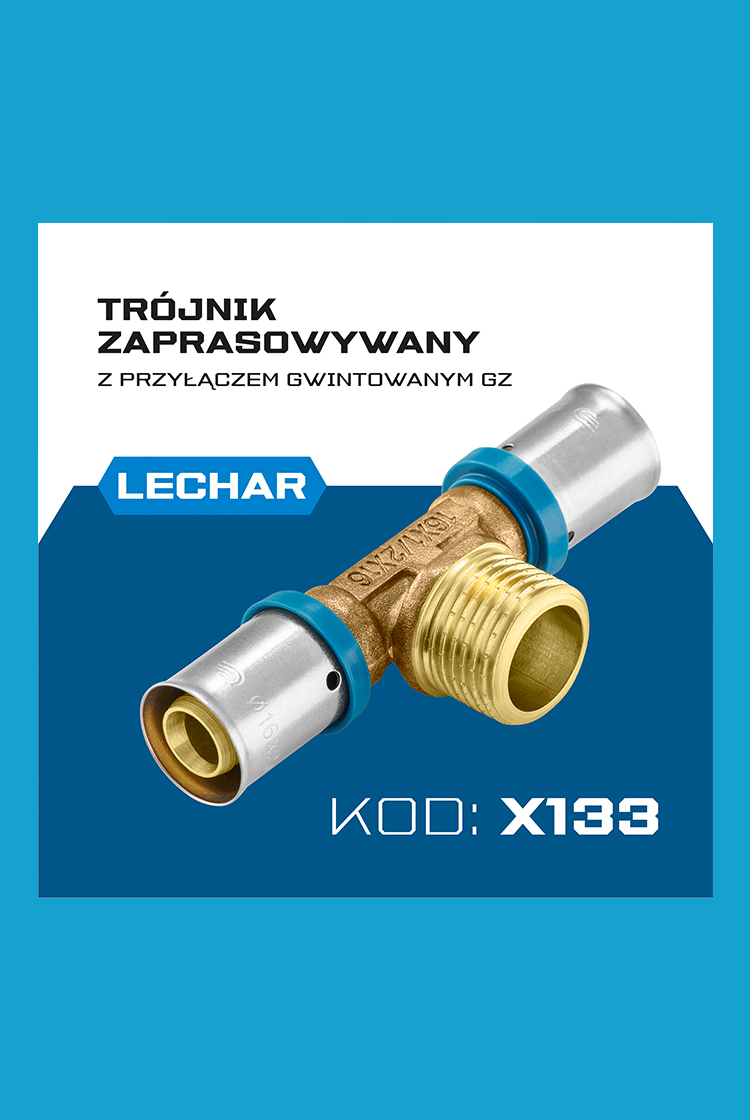
Lechar is a specialist. We provide expert advice and expertise. In the brand’s assortment, you will find all the components needed to connect installations in a durable and reliable way.
Lechar is not just a name, but first and foremost a team of people who have many years of experience in the installation industry.
The company reaches for excellent solutions, offering customers the best products.
Lechar is a creator, an innovator, an inventor, a compass of innovation. The brand doesn’t just want to be in the market. It wants to create it and point the direction for the whole industry to follow.
We encapsulated these key features of the brand, its Big Idea and the goals Lechar has set for itself in the slogan poppies.

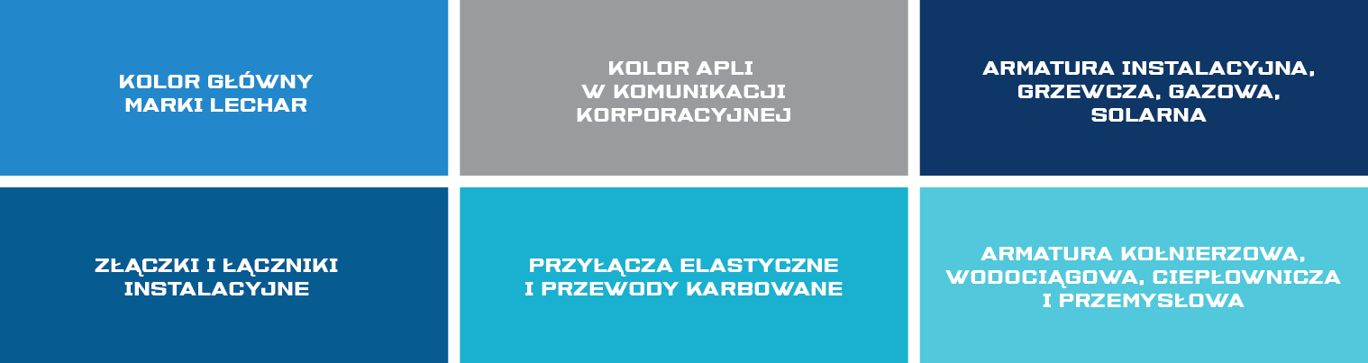
Like the brand’s mark, we based its identity on sharp clearly angles and graphic elements.
In all materials, we have introduced a clear division into a visual part and a content part, the connecting element of which is always the Lechar brand mark.
The graphic field can be filled with images, content, data, and can also be filled with a color aplomb or a photo. The whole thing can be flexibly adapted to the needs of communication and the type of material.

Team:
Visual Identity – Michał Wyszyński
Communication strategy – Piotr Flis
Nadzór kreatywny – Piotr Flis i Anita Kamila Sochacka
Scope of work:
Research
Brand audit
Rebranding
Communication strategy
Visual identity
Did you like this project?
Let's talk! You are welcome to join us for a short consultation. Click on the button below or write directly to: lotna@lotna.eu
Share:
