Did you like this project?
Let's talk! You are welcome to join us for a short consultation. Click on the button below or write directly to: lotna@lotna.eu
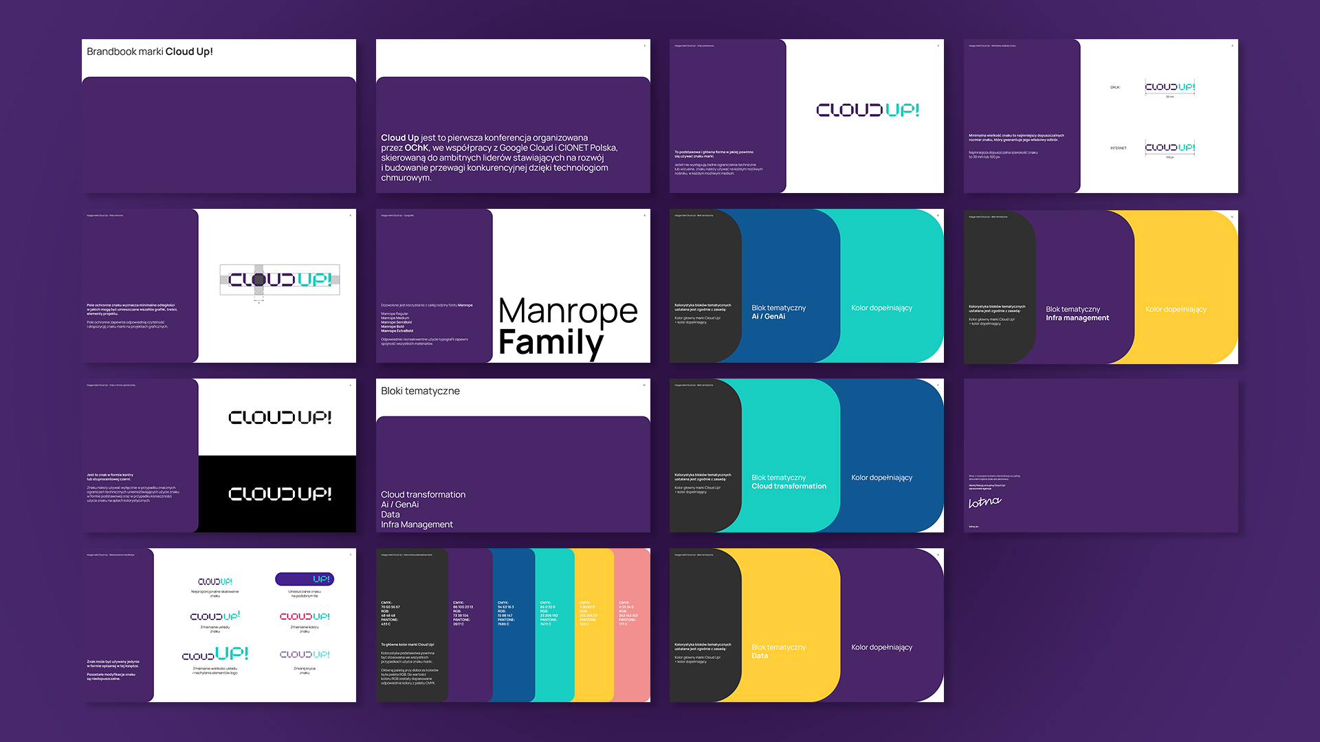
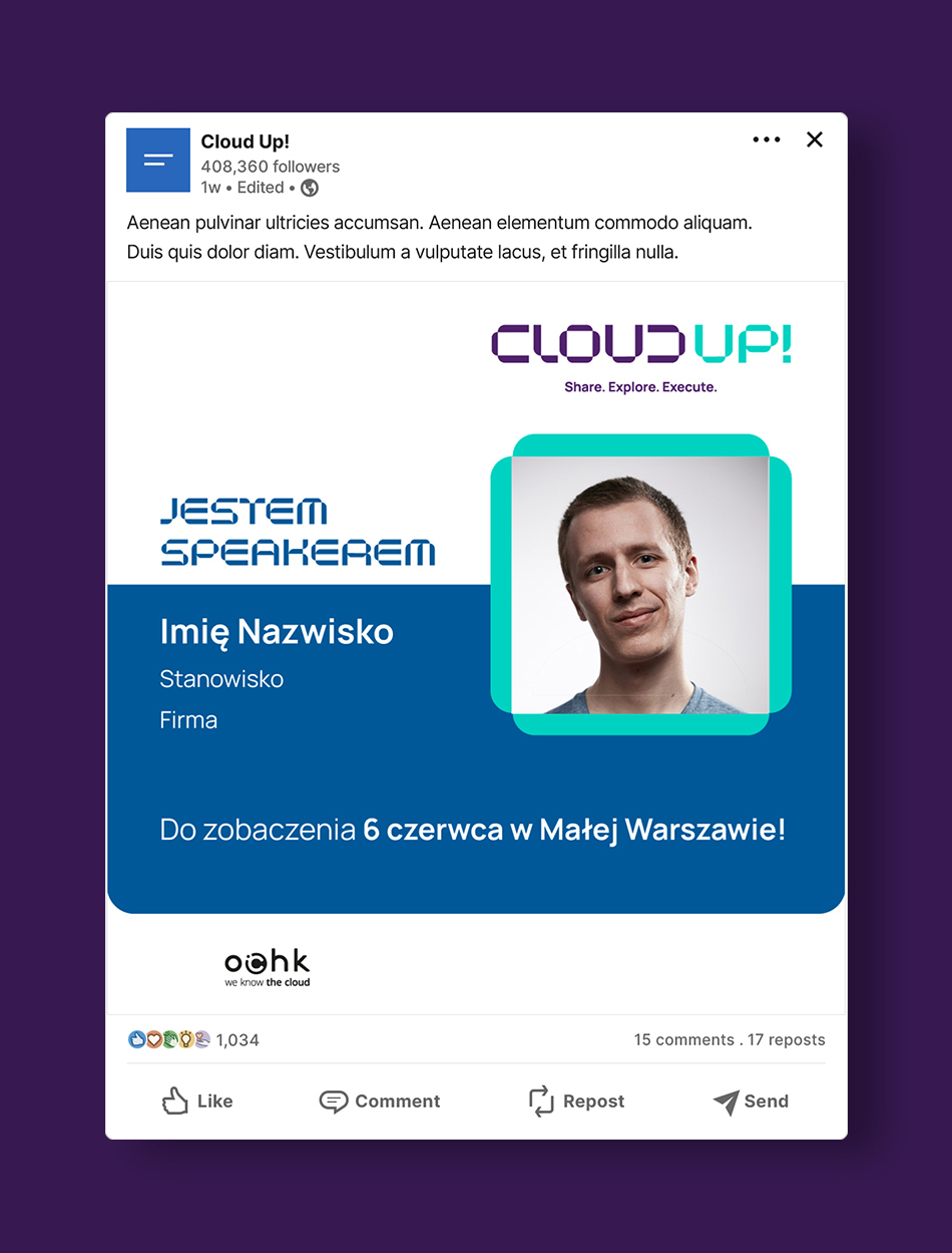
The visual identity for Cloud UP! – a conference organised by OChK for business and technology decision-makers who want to use cloud solutions in their organisations and thus build a competitive advantage. The first edition of the event took place in June 2024 in collaboration with Google Cloud and CIONET.
OChK, Poland’s most specialised cloud solutions provider, approached Lotna creative and branding agency to develop a visual identity for the venture.
Cloud UP! is an event whose agenda is made up of several thematic blocks that use a variety of formats – from expert sessions to speed panels to in-depth discussions in the form of roundtables.
In creating the logo and identity, we had to take this diversity into account while at the same time fitting in with the existing image of the OChK. In addition, our client expected the Cloud UP! identity to be modern and emphasise the link to technology, while at the same time standing out from other industry events on the market.
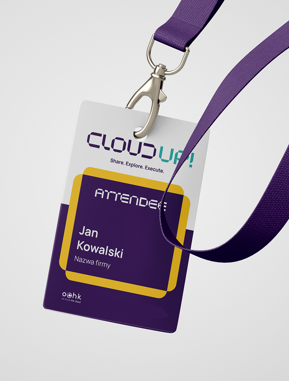
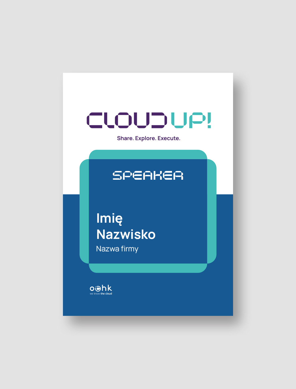
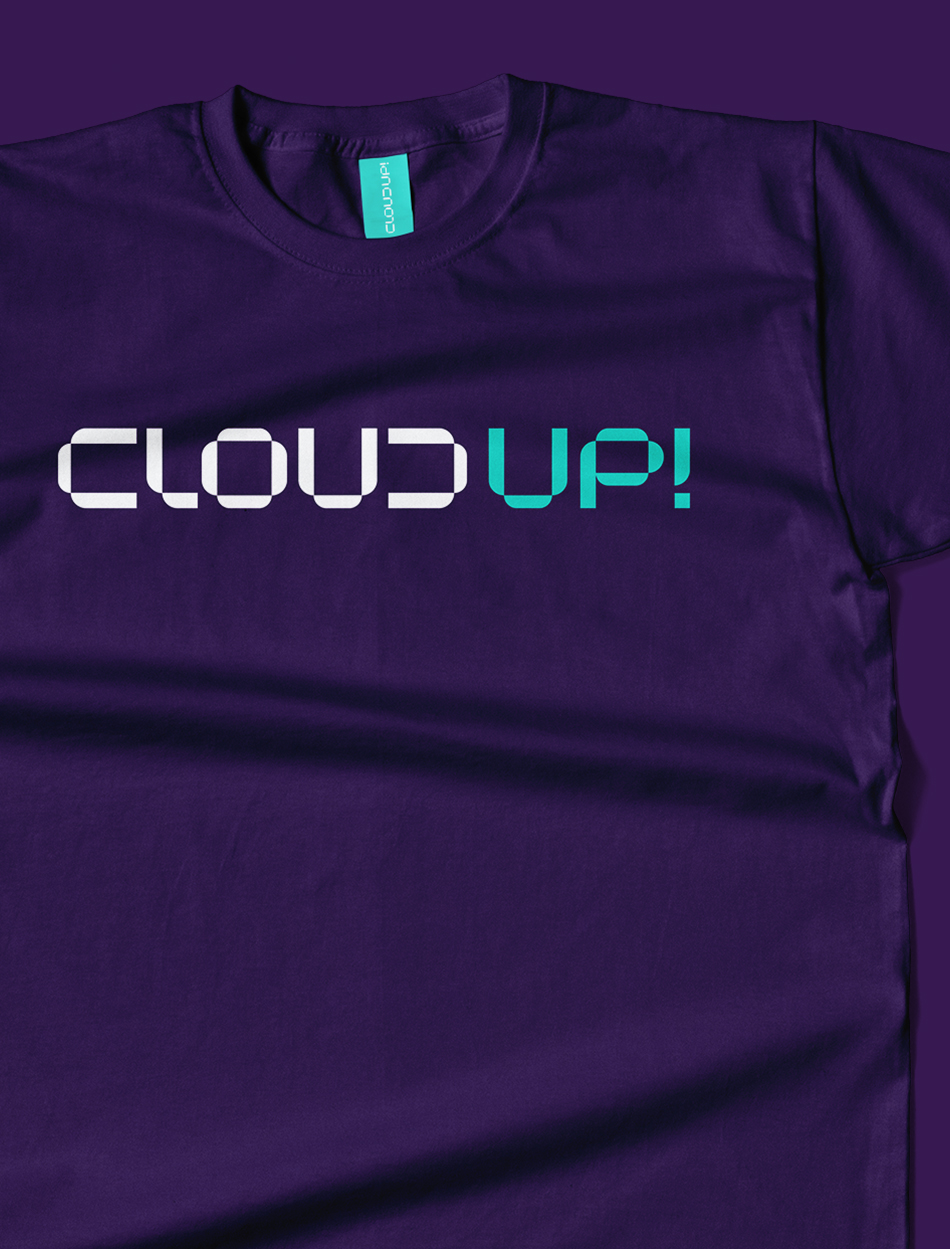
The main axis of the logo is a simple design with a digital character. Thanks to the treatment of the inverted letter ‘C’ and the construction of the letter ‘D’ from it, we have given the logo a technological yet original character.
The visual identity is based on the soft elements that make up the logo. The outline of the letter ‘O’ becomes the frame for the main visual message. It creates a screen in which the desired motifs can be placed – from static elements to audiovisual material. An additional advantage of the identity is its ‘plasticity’.
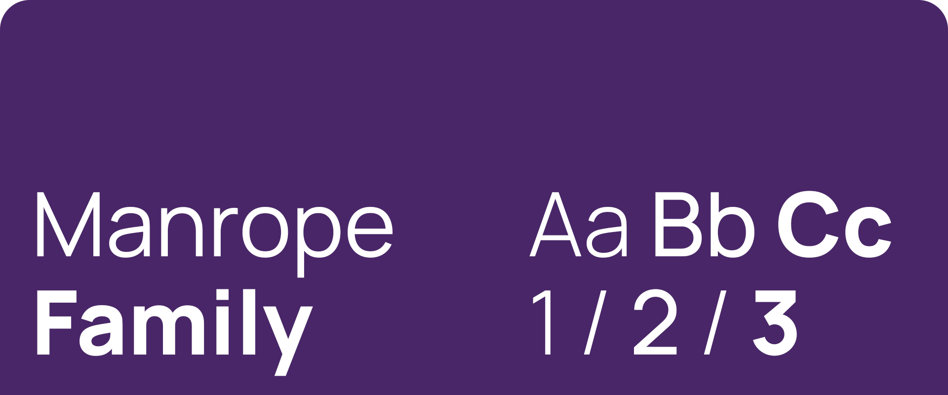
The colour scheme and typography used in the identity is consistent with the OChK’s visual brand identity.
Did you like this project?
Let's talk! You are welcome to join us for a short consultation. Click on the button below or write directly to: lotna@lotna.eu
Share:
