Did you like this project?
Let's talk! You are welcome to join us for a short consultation. Click on the button below or write directly to: lotna@lotna.eu
FEDERA is one of the largest and oldest non-governmental organizations in Poland. For more than 30 years, the Foundation has been working for human rights, with a special focus on women’s health and reproductive rights.
FEDERA includes the Ponton Group – which works on sex education among students, Great Coalition for Equality and Choice – an initiative that brings together more than 100 NGOs and pro-women’s movements, and includes helplines and hotlines, where anyone in need will get help with the law – primarily medical and patient rights – and get psychological support.
“Our work is evolving, the problems, the topics we deal with, the age of the people we help are changing. The world around us is changing. So we decided that we also need to change. To adapt more to the expectations of younger people and to focus more on building our image.” – says the Foundation’s CEO.
After several intensive workshop meetings, an in-depth analysis of competitors’ activities and the expectations of the target audience, we set the main goals of the brand, and then developed a new visual identity and communication strategy.
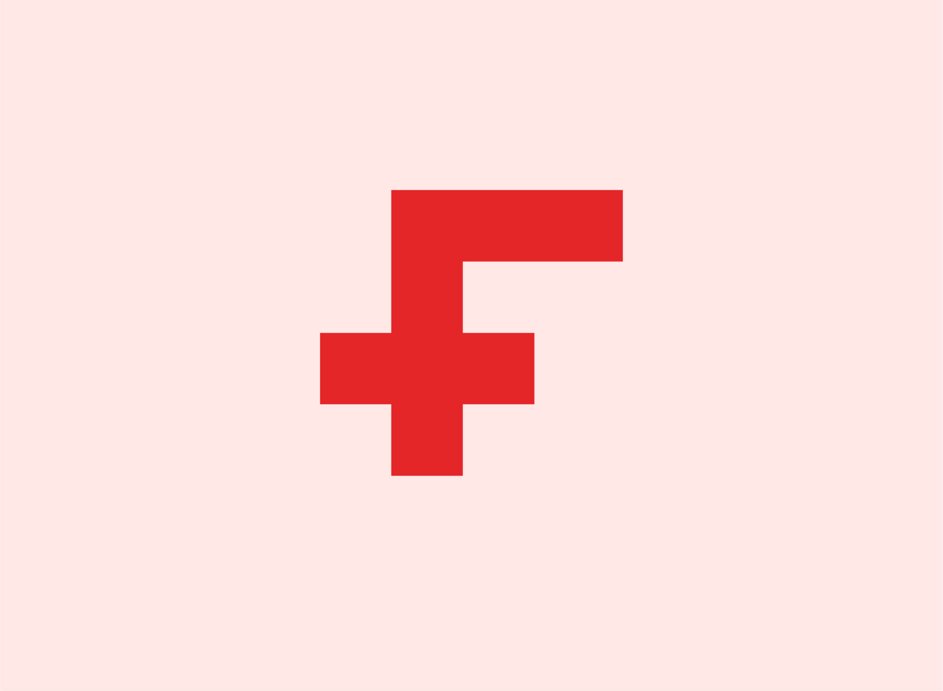
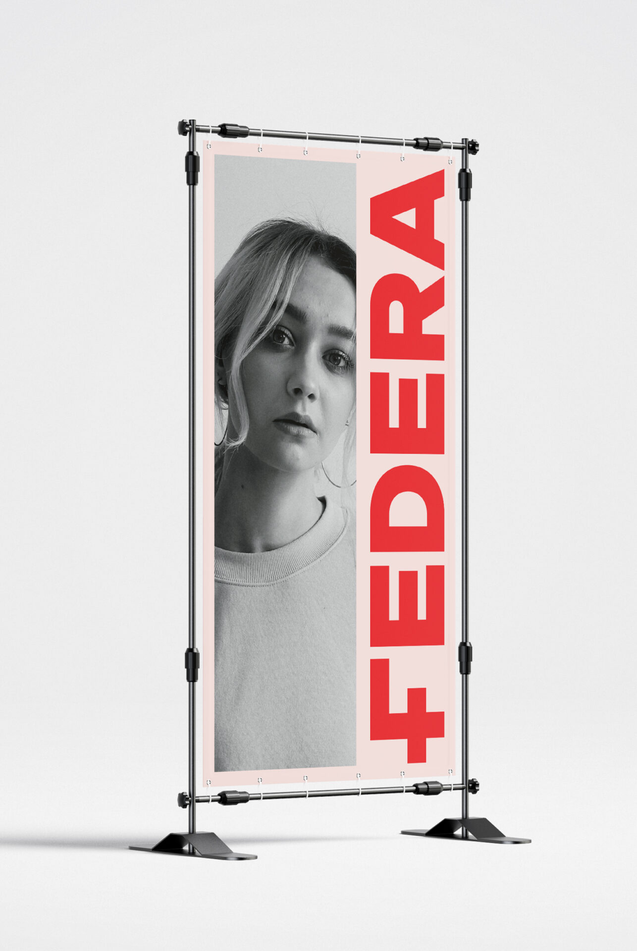
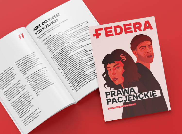
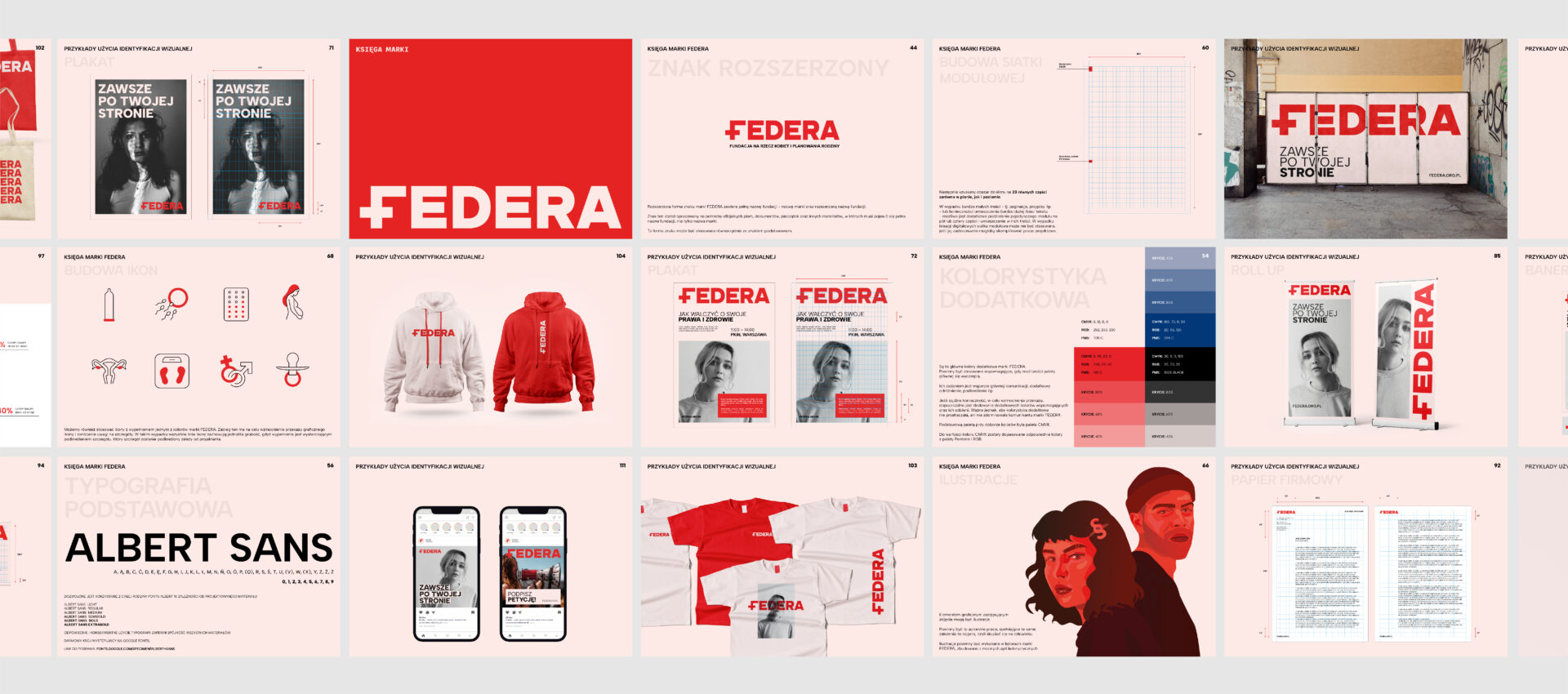
The idea and design of the new FEDERA logo were based on a combination of the brand’s characteristic motifs – the symbol of a woman and a symbol signifying help, including medical help.
The combination of these ideas resulted in the distinctive letter F – which will also be used as the abbreviated mark of the FEDERA Foundation.
The overall design was kept minimalist and replaced the previous logo – a feminine silhouette and the color purple.
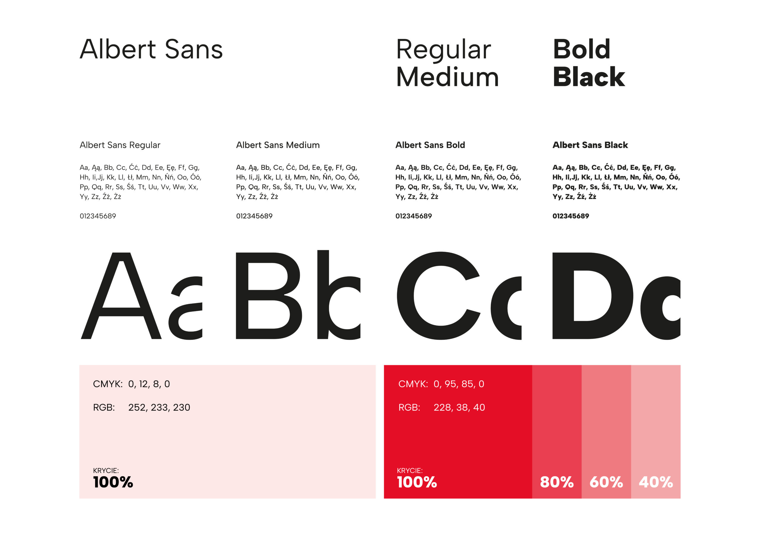
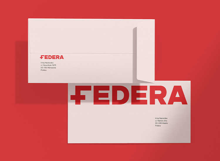
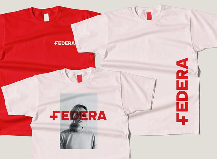
The design, based on 3 main colors, provides greater versatility and design flexibility. It will be perfect for both online and offline channels.
Sage:
Intelligent, with expert knowledge, thorough and sharing experience and pertinent advice.
Guardian:
Empathetic, offering care to those around, preventing threats and unfavorable situations.

We designed the visual identity to provide flexibility and freedom of action, and to allow more than just designers to work smoothly with the new image.
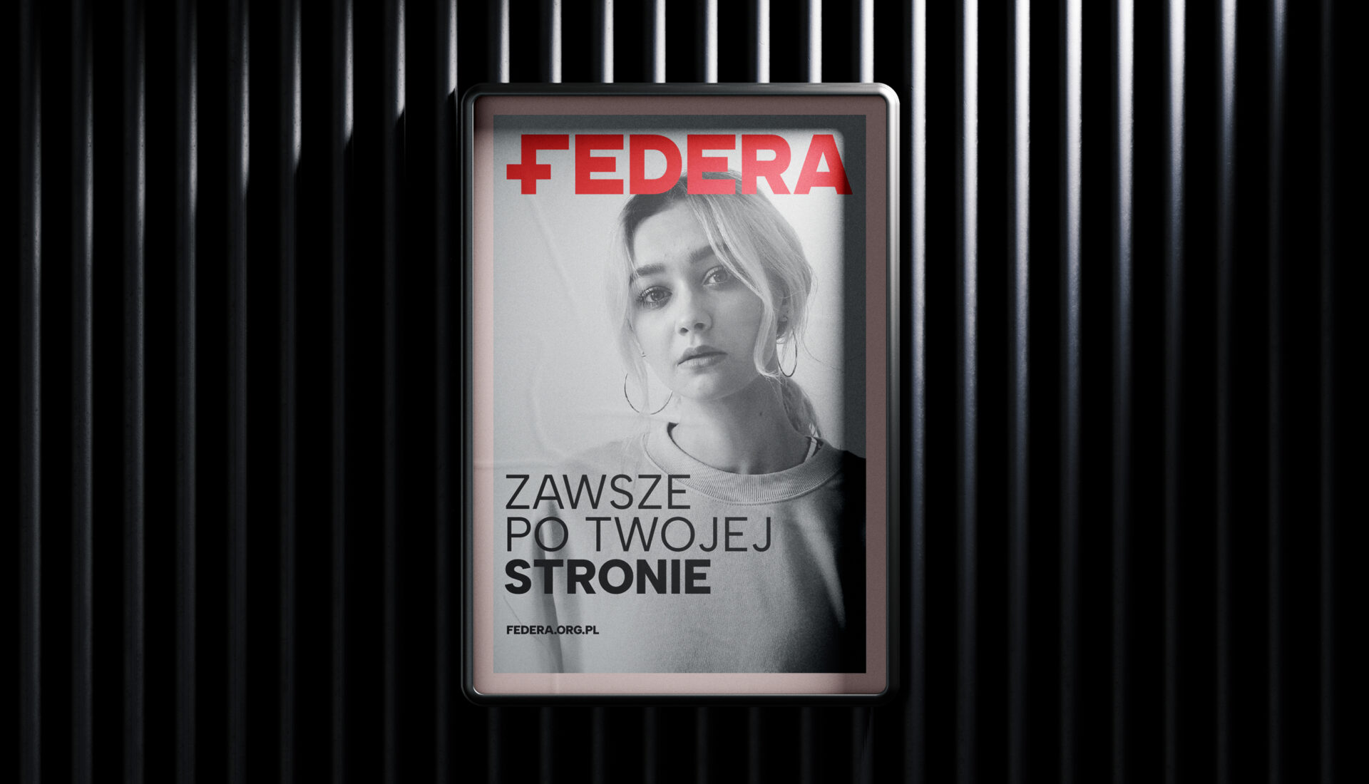
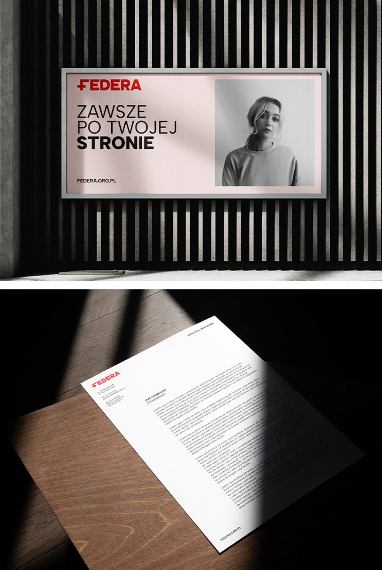
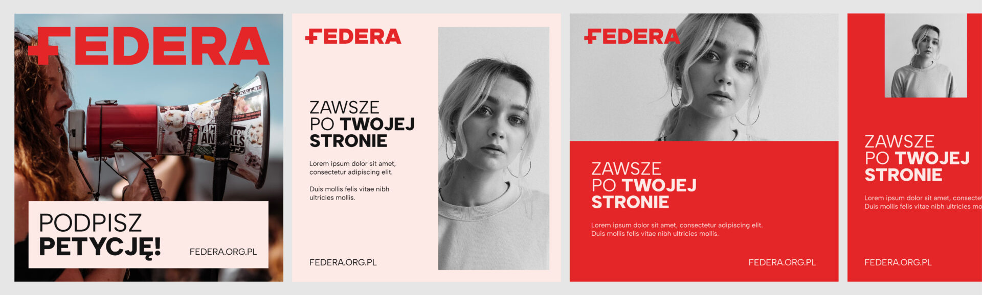
The main role in the visual and verbal identity of the Foundation is to be played by human beings. Human emotions, human problems, actions, dreams and everyday life. Successes and failures.
It is these, human issues that FEDERA is dealing with, and they will be the centerpiece of the brand’s message.
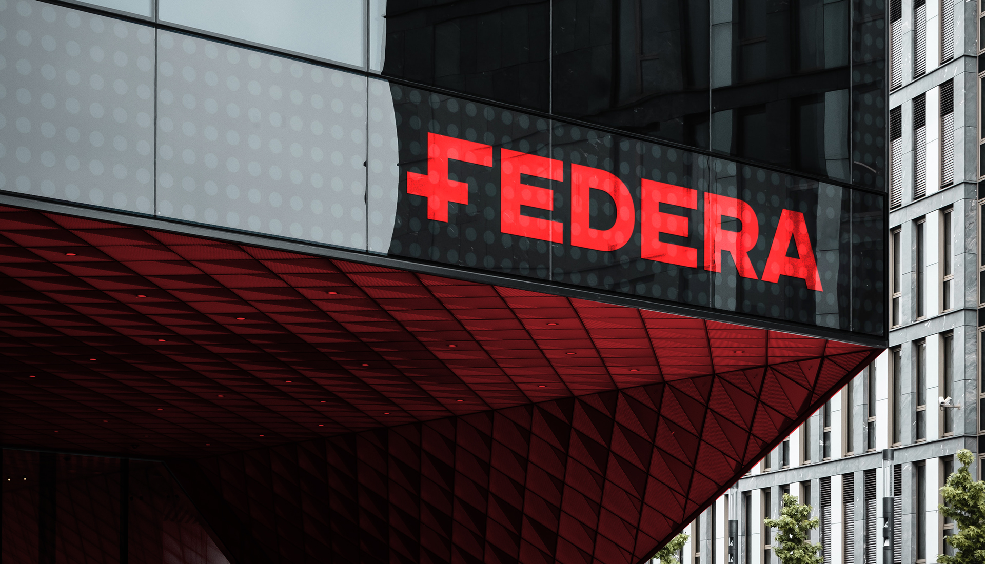
The main color of the brand is strong red – whose main task is to draw attention, stimulate action, inspire. Red, combined with strong typography and emotions expressed in key visuals, are the strength of the brand’s message
A counterbalance to this strong mix is the supporting color – soft pink – a cheerful hue, associated with femininity and care, whose function is to calm communication.
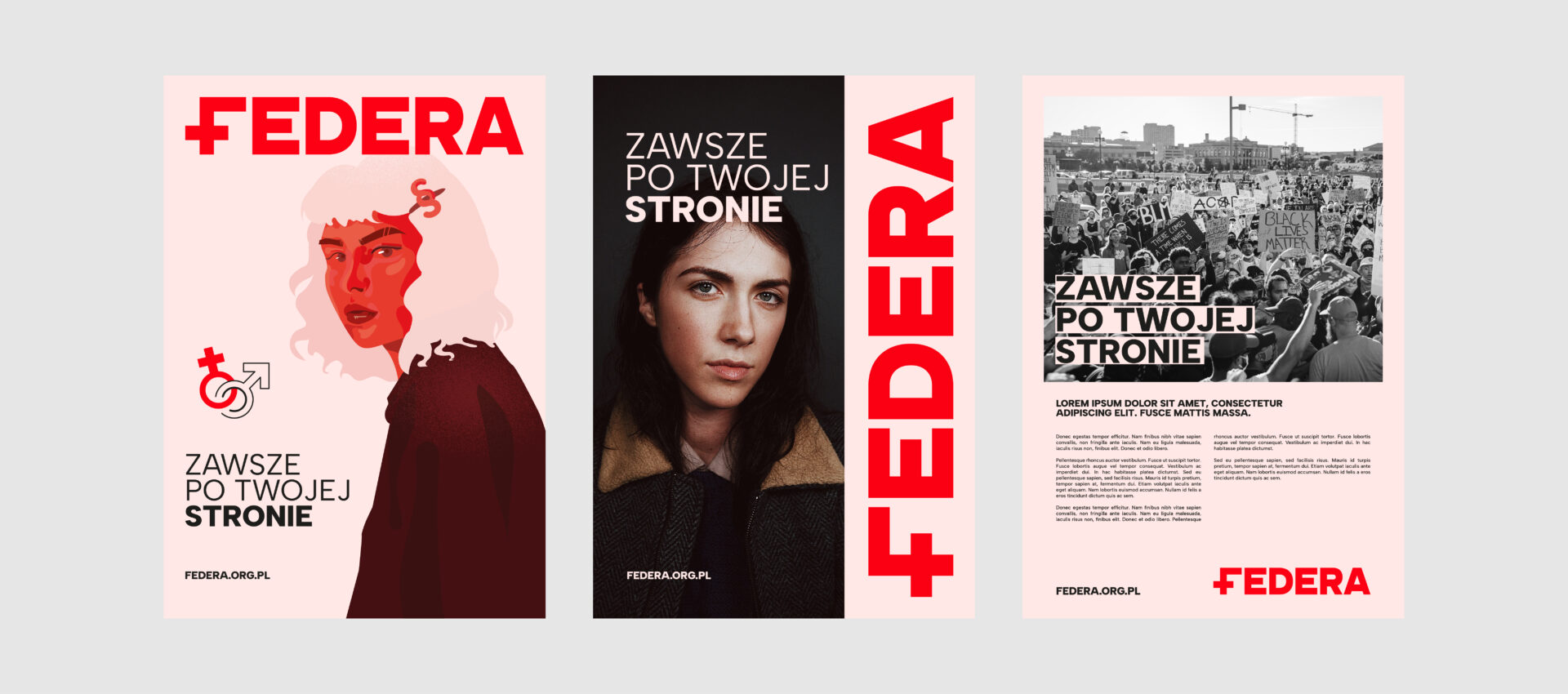
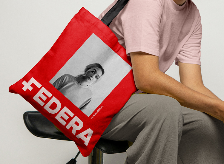
We also developed a customized system of icons and illustrations. They all have a simple, linear and minimalist form. They also have an infill with one of FEDERA’s brand colors – to reinforce the graphic message and draw attention to details.

The new visual identity system and communication strategy were designed to work well in both the offline and digital spaces. Especially in social media channels, which are one of the main points of contact between the Foundation and its target groups.
Team:
Visual identity – Michał Wyszyński
Communication strategy – Piotr Flis i Piotr Mateńko
Creative supervision – Piotr Flis i Anita Kamila Sochacka
Zakres prac:
Research
Brand audit
Rebranding
Communication strategy
Visual identity
Did you like this project?
Let's talk! You are welcome to join us for a short consultation. Click on the button below or write directly to: lotna@lotna.eu
Share:
