Time Trend corporate identity

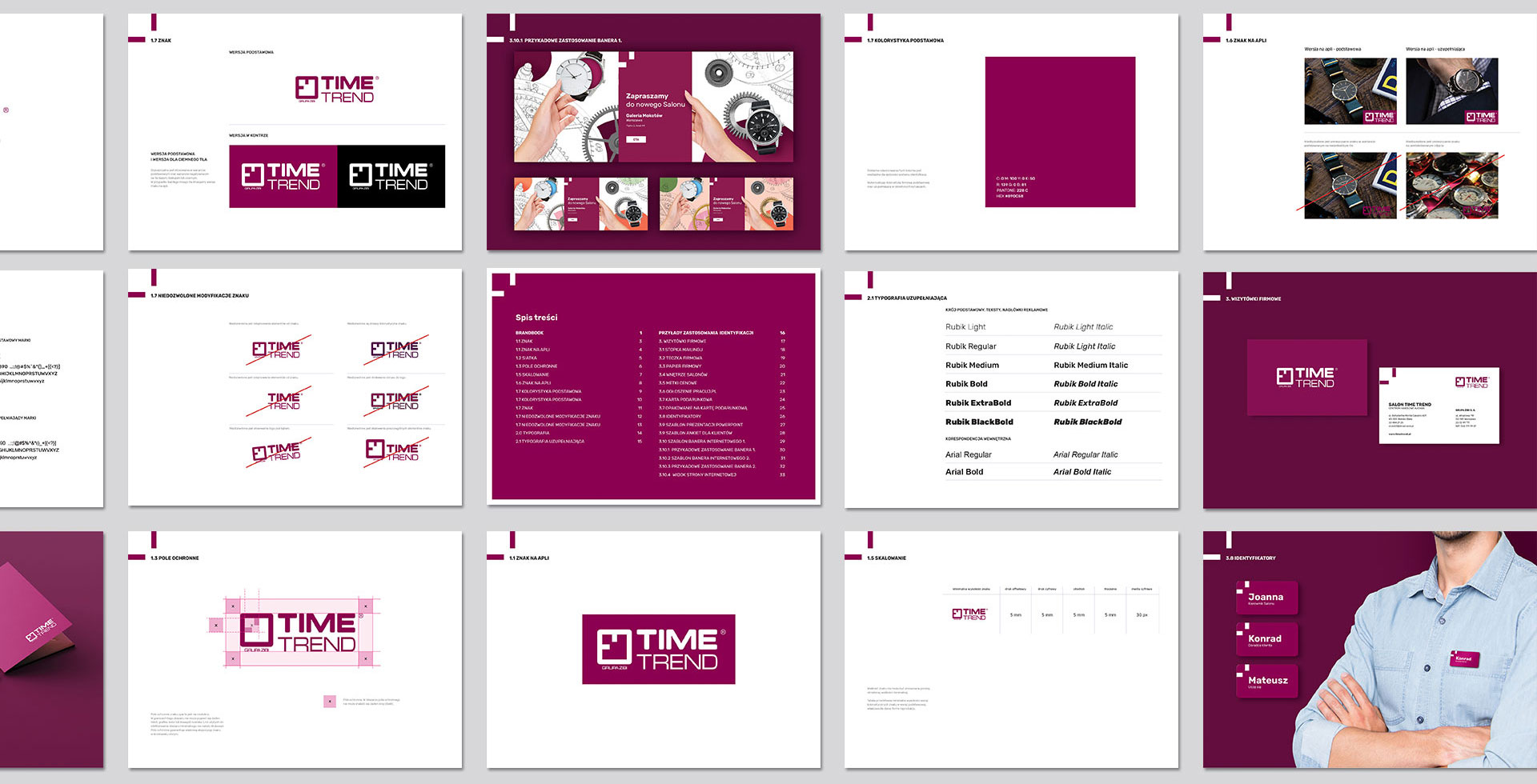
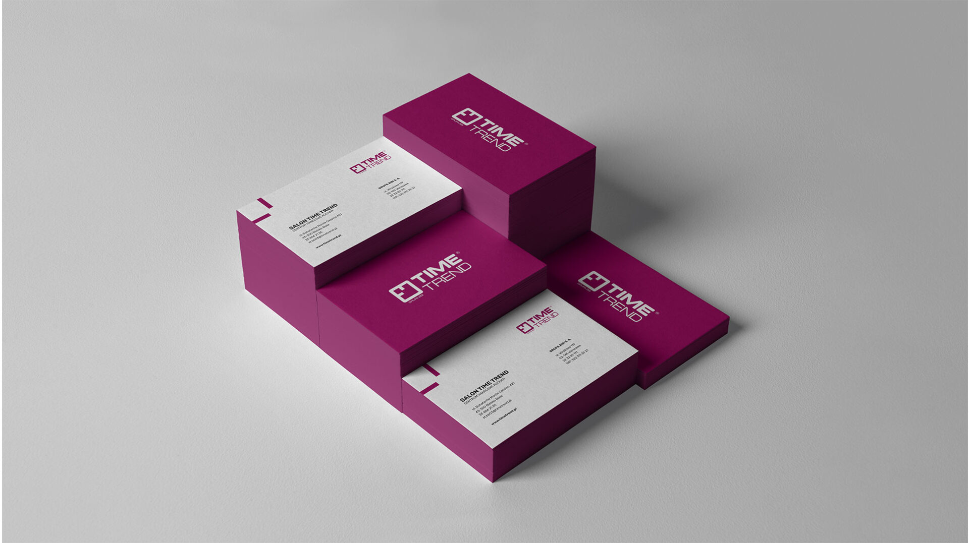
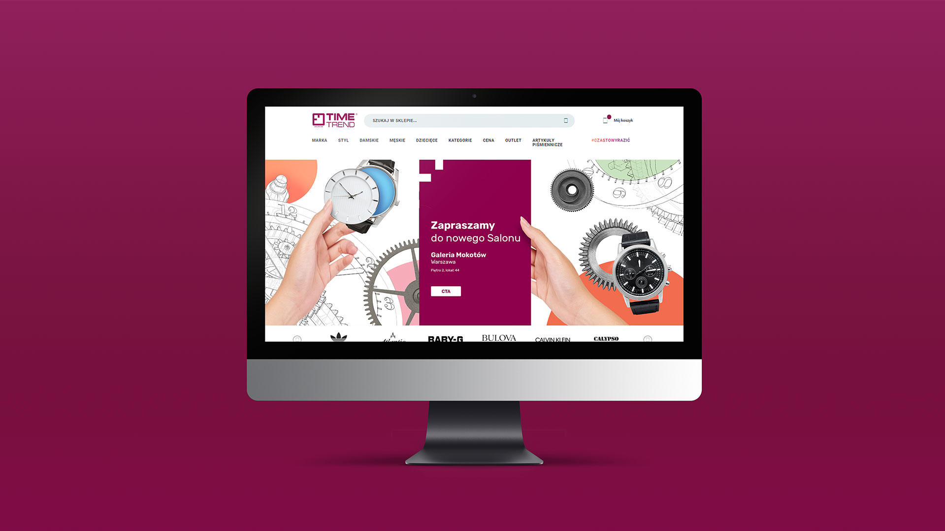
Time Trend is one of Poland’s largest chains of brand-name watch stores – the company’s customers can shop for luxury goods in as many as 100 outlets across the country.

As part of the buoyant growth, the brand got a new visual identity designed by our agency.


Before we began work on the actual identity, we gave the existing logo a gentle facelift. In it, the proportions of graphic and text elements, their thickness and distance from each other were changed. This created a closed composition, in which all the existing elements were placed in a specific space.


From the logo’s sigil we took the distinctive pointer layout, which became the core of the new visual identity. The dial designating 9 o’clock appears on all materials and is their indispensable point. The brand color used in the design – burgundy – emphasizes Time Trend’s essential features: premium products, their elegance and top-notch service to the chain’s customers.

The new visual code has been implemented in all advertising and office materials that the Time Trend brand uses.


Team:
Visual identity: Michał Wyszyński
Creative Supervision: Anita Kamila Sochacka


Did you like this project?

Let's talk! You are welcome to join us for a short consultation. Click on the button below or write directly to: lotna@lotna.eu

Get in touch

Share: