Did you like this project?
Let's talk! You are welcome to join us for a short consultation. Click on the button below or write directly to: lotna@lotna.eu
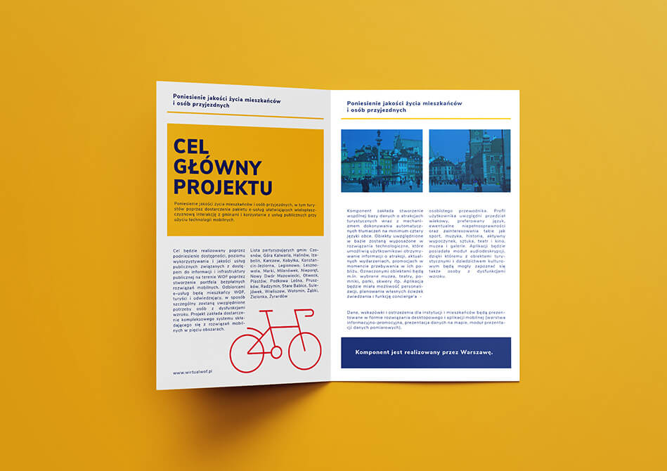
The Warsaw Functional Area (WOF) is a program carried out on a large and comprehensive scale, bringing together the City of Warsaw (leader) and as many as 25 partner municipalities. The aim of the project is to increase the accessibility of public space and services, make cultural and tourist offerings more attractive and broader, improve the quality of public transportation services, improve the parking system, and raise awareness of institutions and individuals about the environment. Within the framework of the conducted project, 5 basic thematic areas have been identified:
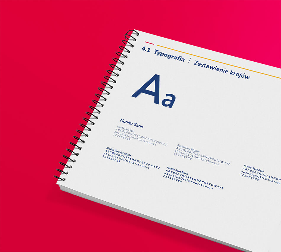
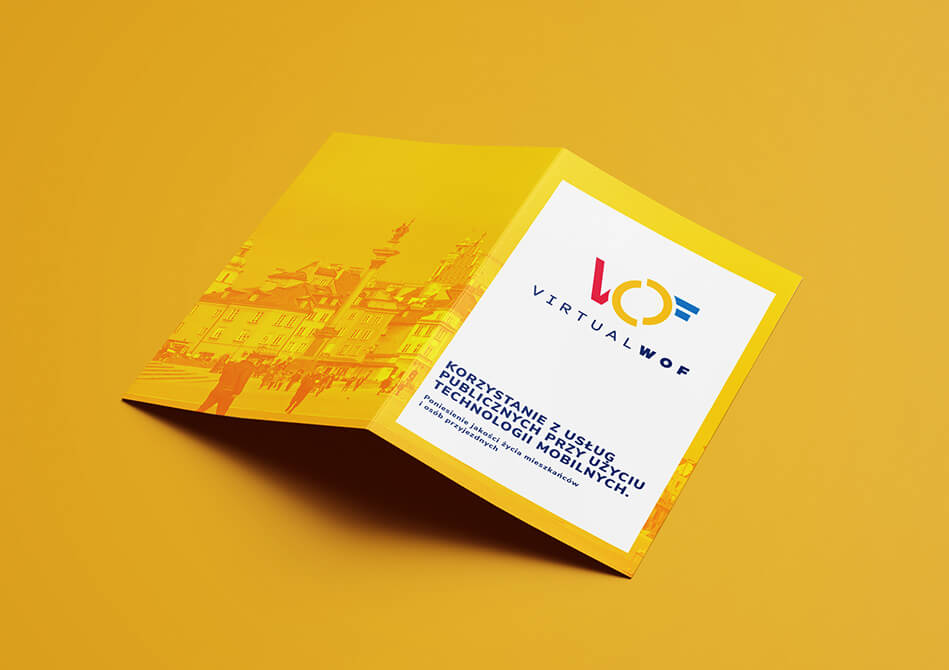
To keep the program consistent with its thematic areas, we created a comprehensive Visual Identity System.
The mark consists of a sigil, which consists of the first letters of the program’s own name and a logotype, which is the name of the program. Two semicircles symbolize the area – the center of the city and services. They give the impression of turning, which brings to mind functionality, action, positive energy and modernity. The unclosed form indicates openness and unlimited possibilities and opportunities facing program participants. The semicircle, itself a universal form of expression, is easy to adapt to virtually any media medium. Its resultants convey the symbolism of the area, the zone, and match each of the program’s identifiable features. The sign’s design also has its roots in the image of the Warsaw Mermaid – a symbol of the Capital and the main element of its coat of arms.
Thus, a graphic design was created that fully took into account the needs of local governments and accurately responded to the brief they created.
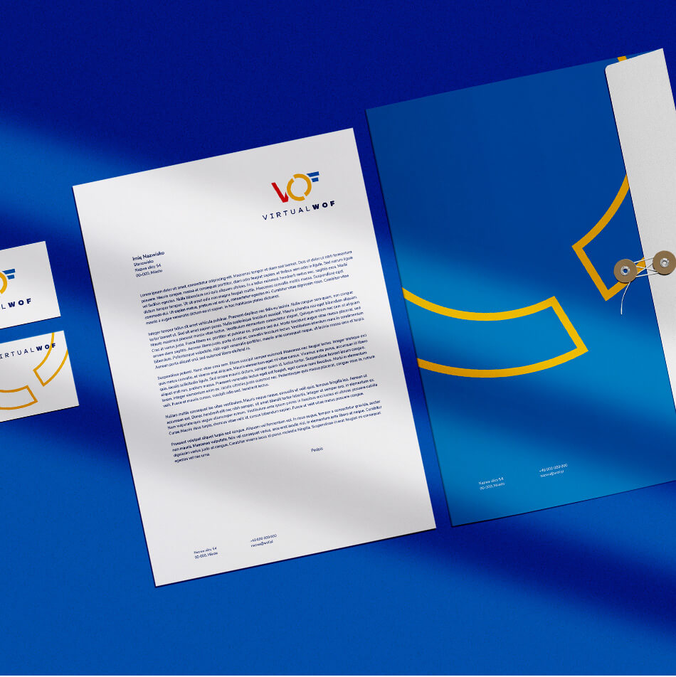
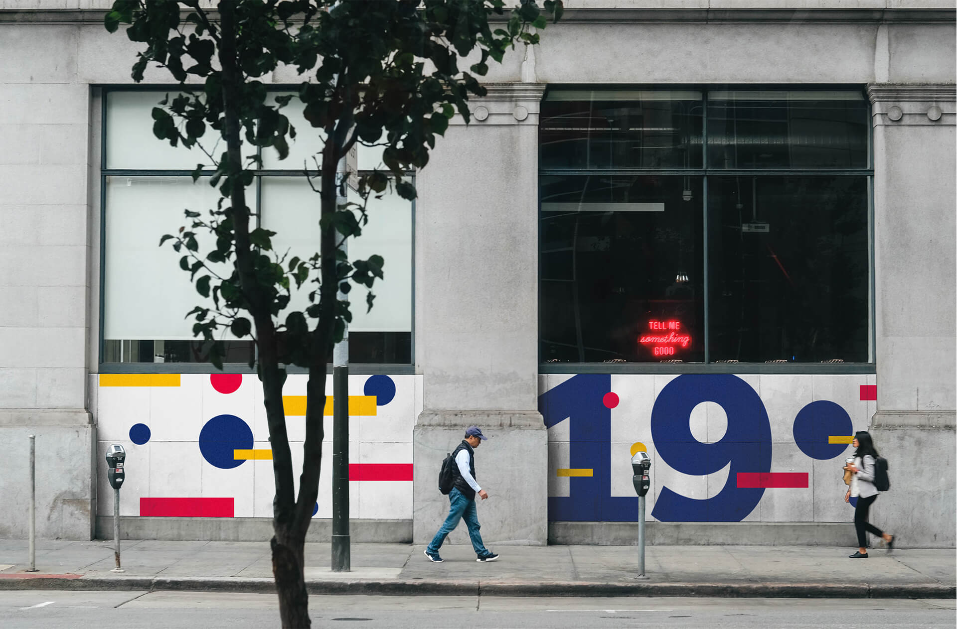
The color scheme used in the logo and identity elements refers to the city and traffic. The warm and contrasting colors are pleasant to look at. The palette was created based on the multitude of strong and saturated hues of a vibrant city. The vibrancy is balanced by the presence of a cool blue color. The juxtaposition of colors suggests cooperation, functionality and modernity. The whole design raises the dynamism of the designed sigil. An important role is also played by the appropriately selected contrast, which makes the use of the site easy also for the visually impaired.
Did you like this project?
Let's talk! You are welcome to join us for a short consultation. Click on the button below or write directly to: lotna@lotna.eu
Share:
