Cloud Up! visual identity
Cloud UP! visual identity
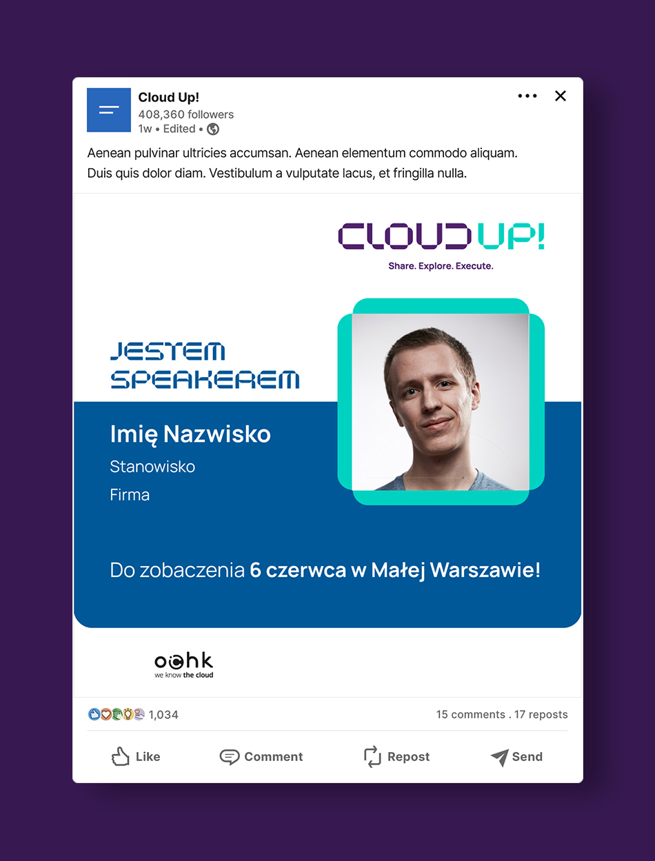
The visual identity for Cloud UP! – a conference organised by OChK for business and technology decision-makers who want to use cloud solutions in their organisations and thus build a competitive advantage. The first edition of the event took place in June 2024 in collaboration with Google Cloud and CIONET.
OChK, Poland’s most specialised cloud solutions provider, approached Lotna creative and branding agency to develop a visual identity for the venture.
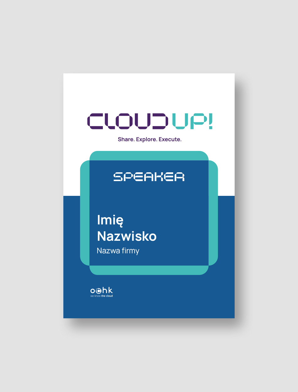
Cloud UP! is an event whose agenda is made up of several thematic blocks that use a variety of formats – from expert sessions to speed panels to in-depth discussions in the form of roundtables.
In creating the logo and identity, we had to take this diversity into account while at the same time fitting in with the existing image of the OChK. In addition, our client expected the Cloud UP! identity to be modern and emphasise the link to technology, while at the same time standing out from other industry events on the market.
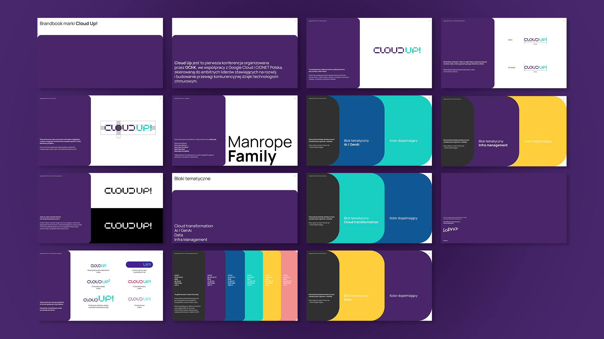
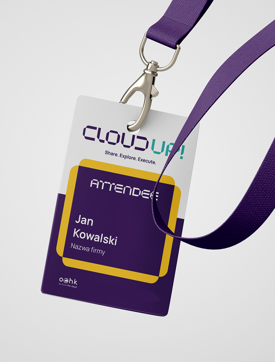
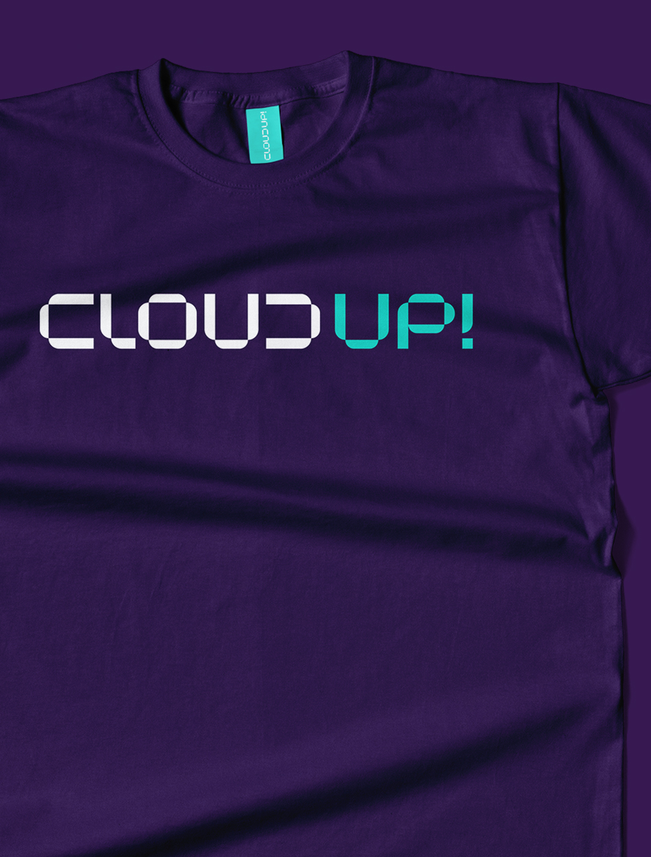
The logo and visual identity are dominated by soft forms, while maintaining a minimalist and modern character.
Logo and visual
identity
The main axis of the logo is a simple design with a digital character. Thanks to the treatment of the inverted letter ‘C’ and the construction of the letter ‘D’ from it, we have given the logo a technological yet original character.
The visual identity is based on the soft elements that make up the logo. The outline of the letter ‘O’ becomes the frame for the main visual message. It creates a screen in which the desired motifs can be placed – from static elements to audiovisual material. An additional advantage of the identity is its ‘plasticity’.
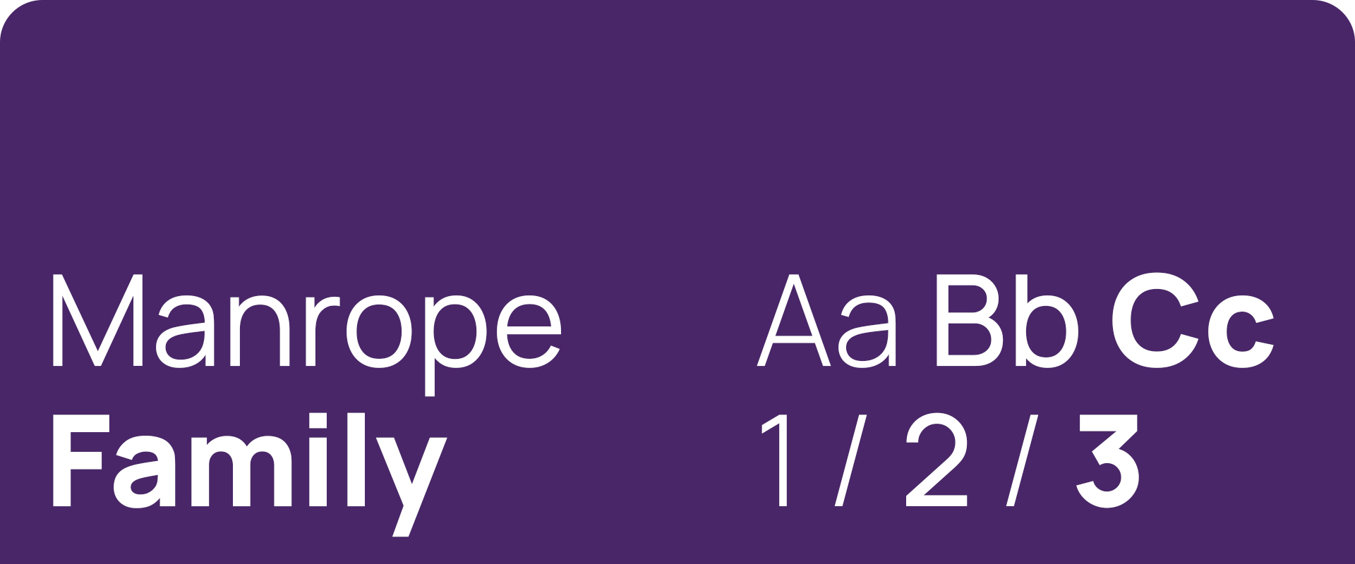
The colour scheme and typography used in the identity is consistent with the OChK’s visual brand identity.
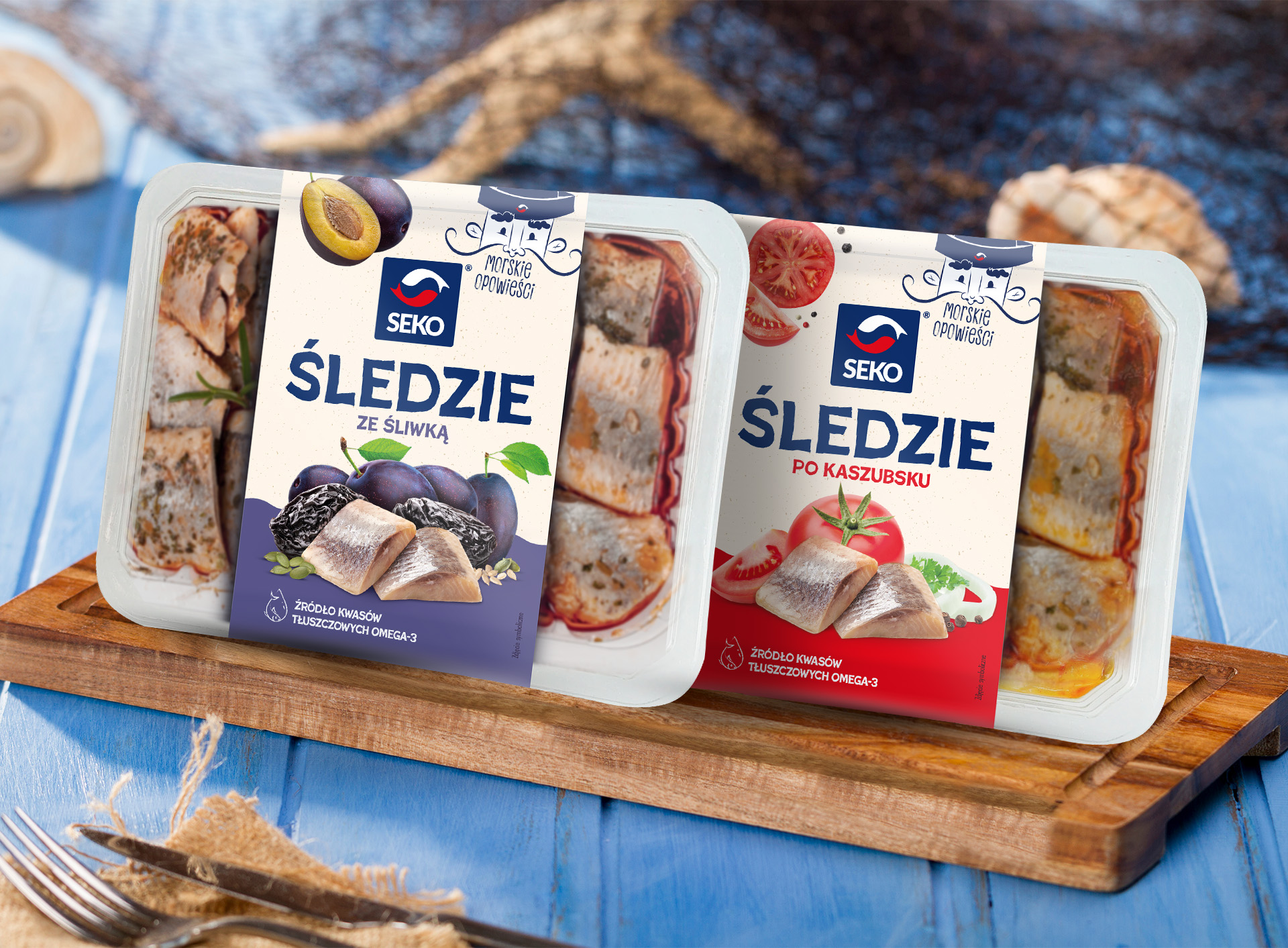
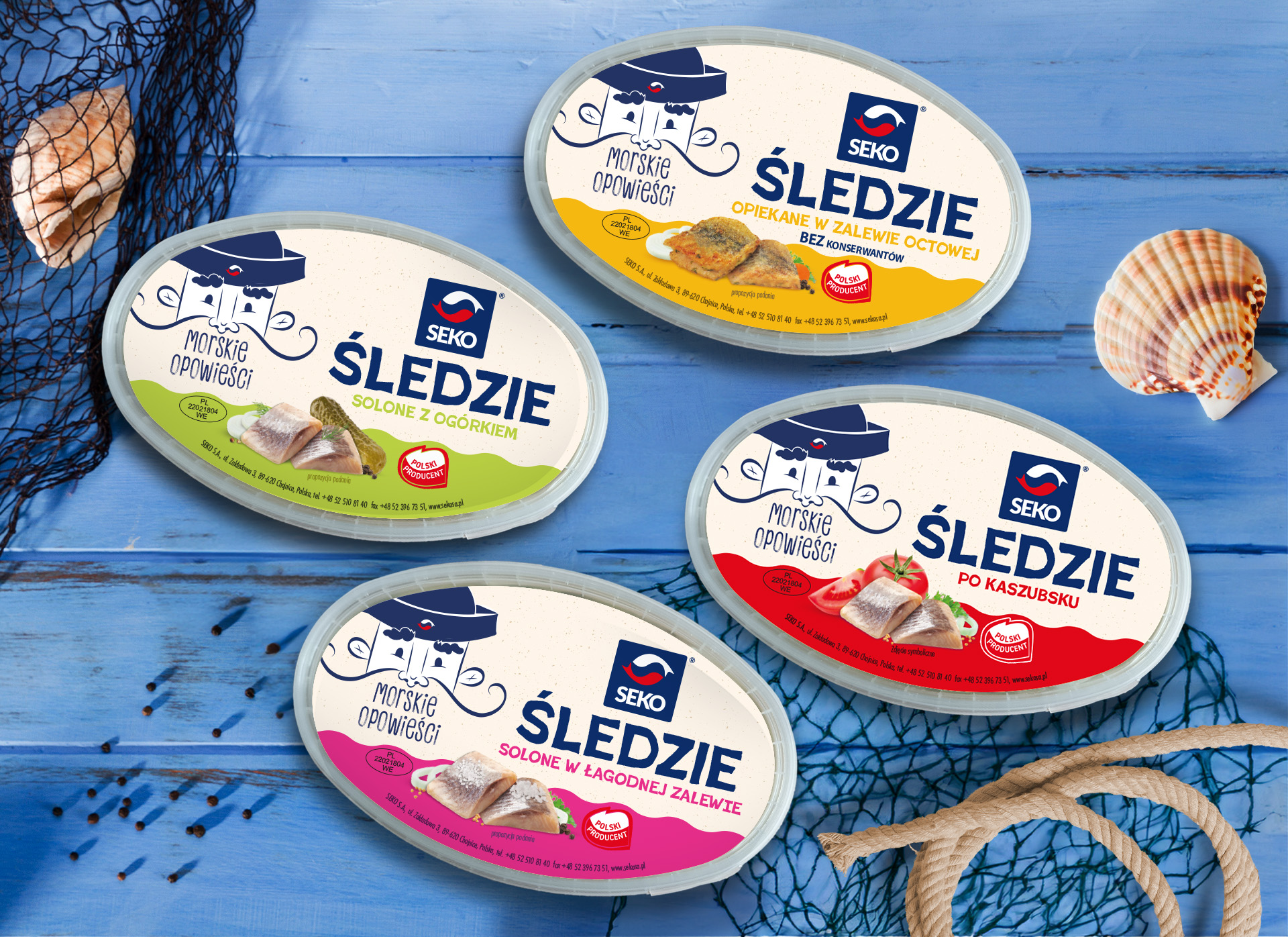
Sea Tales packaging
line designs
SEKO has been operating on the Polish market continuously since 1992. It is a brand attached to tradition and original recipes, which, however, is constantly looking for new directions of development, innovation and further market challenges. Today SEKO supplies the market with the widest range of pickled and salted products.
Creative and branding agency Lotna had the pleasure of developing a series of products from the Sea Tales line.
The project began with the development of Brand Hero, which, as a symbol referring to tradition, gave direction to further work.
“We opted for the distinctive character of a fisherman – a sea wolf. With this, we wanted to ‘take’ the consumer on a sea journey through the land of flavors, where together, with our hero, they could spin Sea Tales.”
The labels are reminiscent of old maps, which give a unique and deeper character to the packaging. An important element of it is the lower applique designed in the shape of a wave, and which, depending on the specific flavor, has different color reveals.
“We cared about the readability of the messages, so we used simple and reader-friendly fonts in the design. Everything is based on handwritten character, so the uniqueness of the recipes and flavor stands out.”
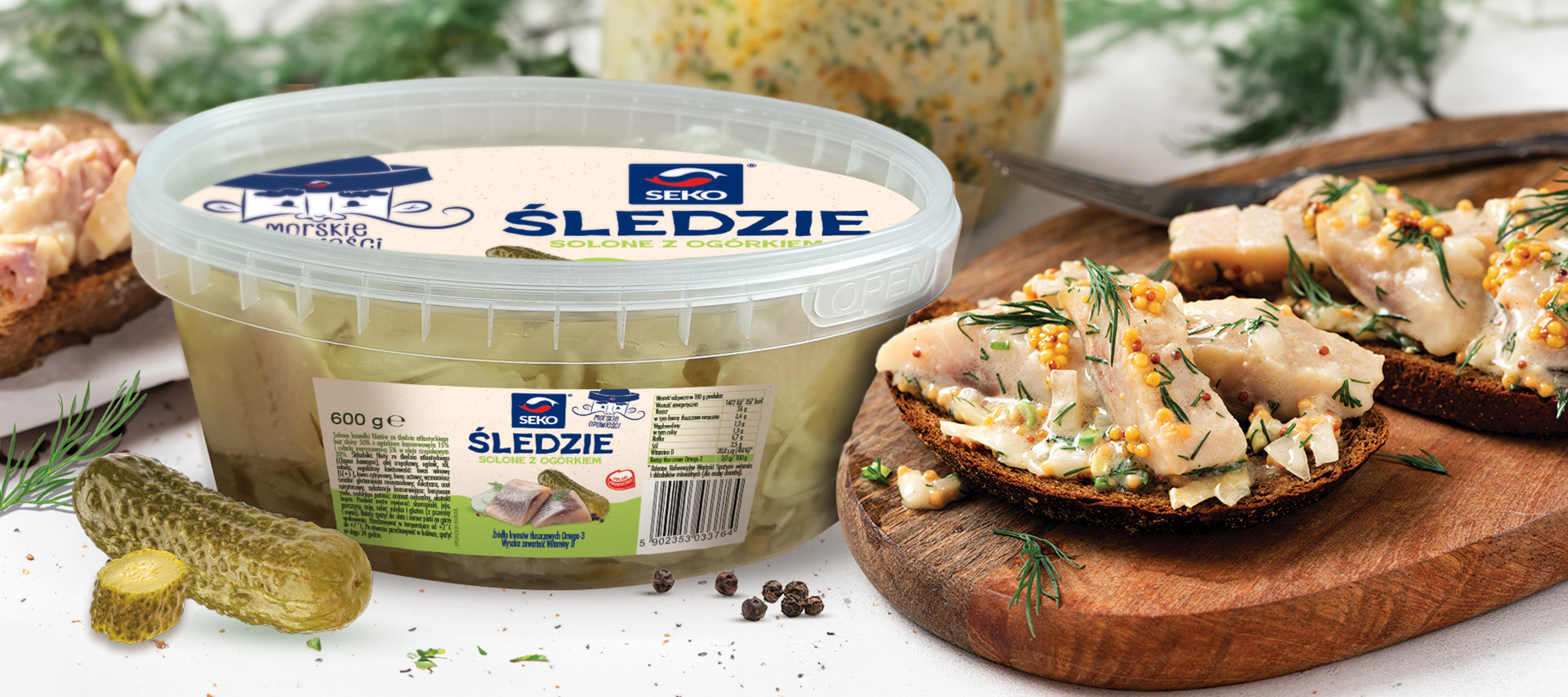
In addition to the labels, she also prepared materials to promote the new product line – for use in both offline and online communications.
Team:
Branding and design – Urszula Malyszko
Creative supervision – Sylwia Dudzińska
Scope of work:
Research
Branding
Packaging
Advertising materials
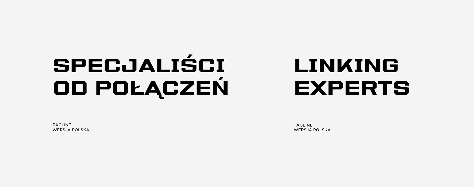
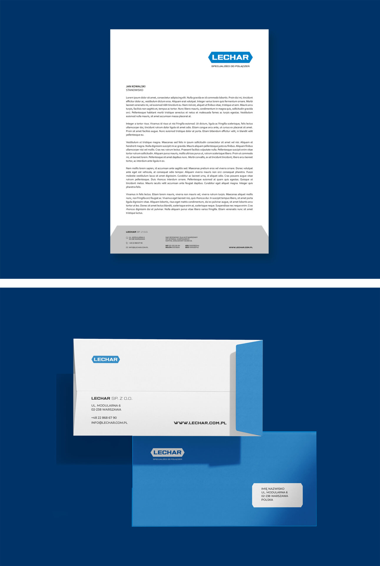
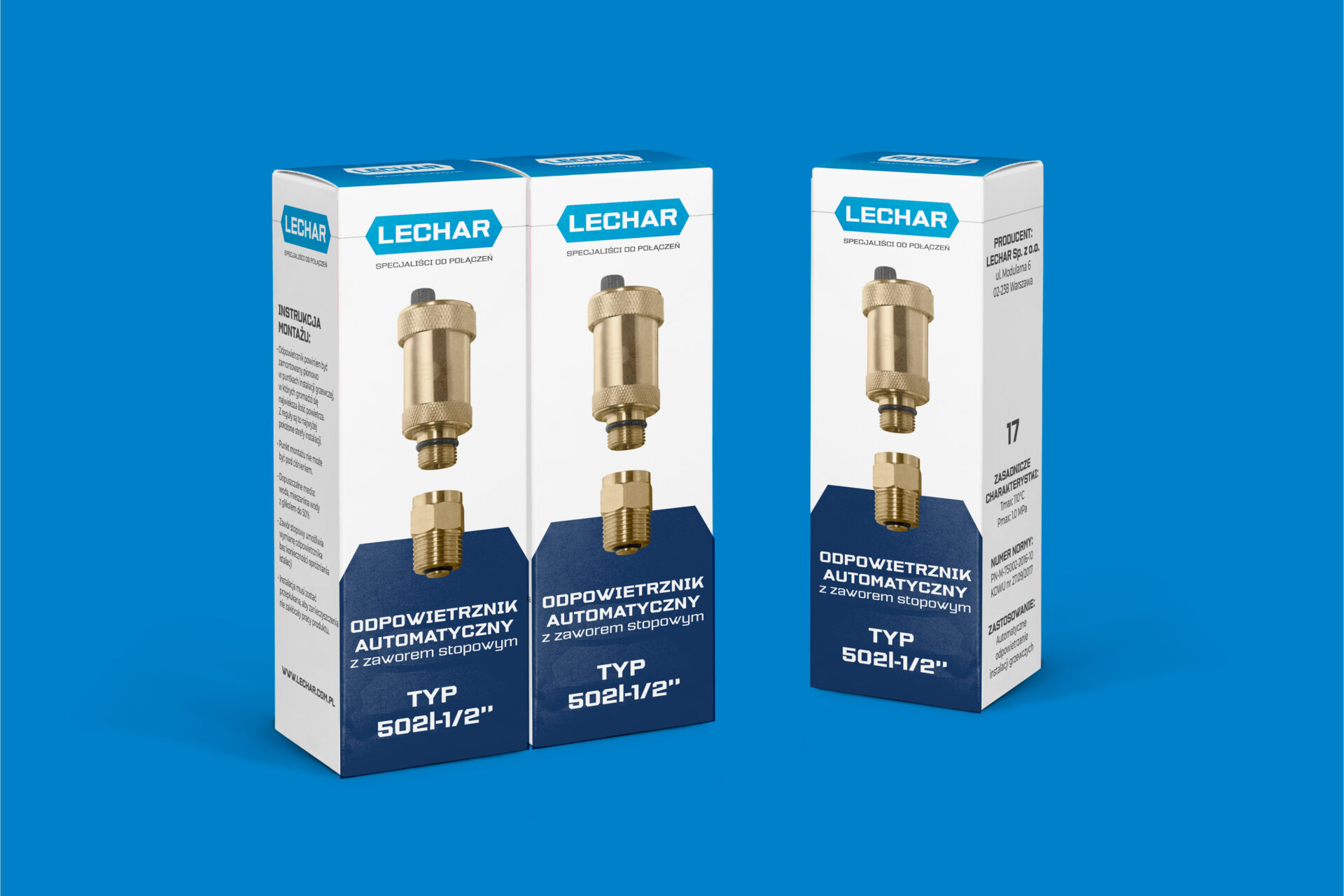
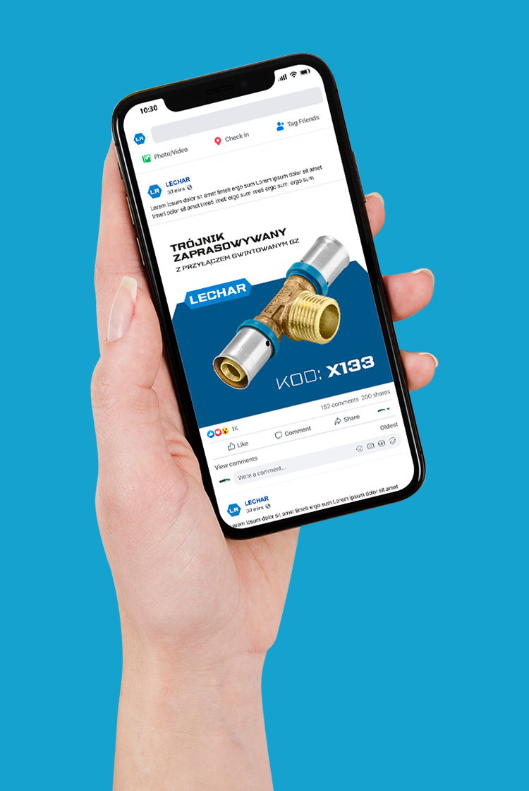
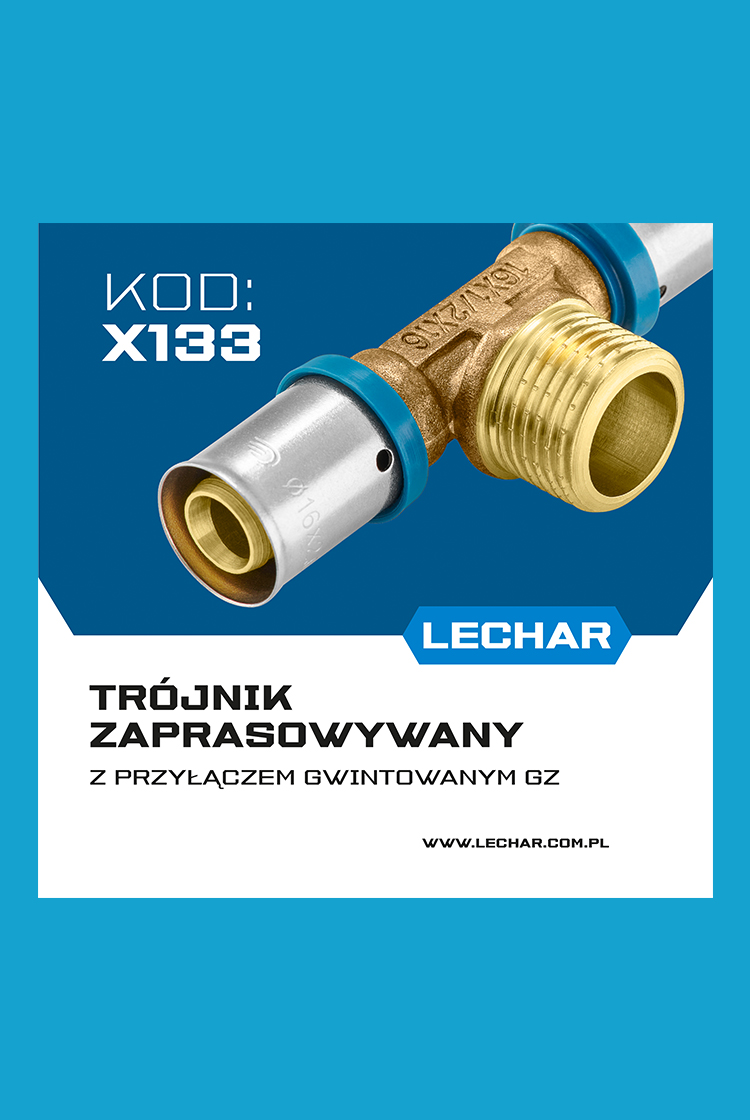
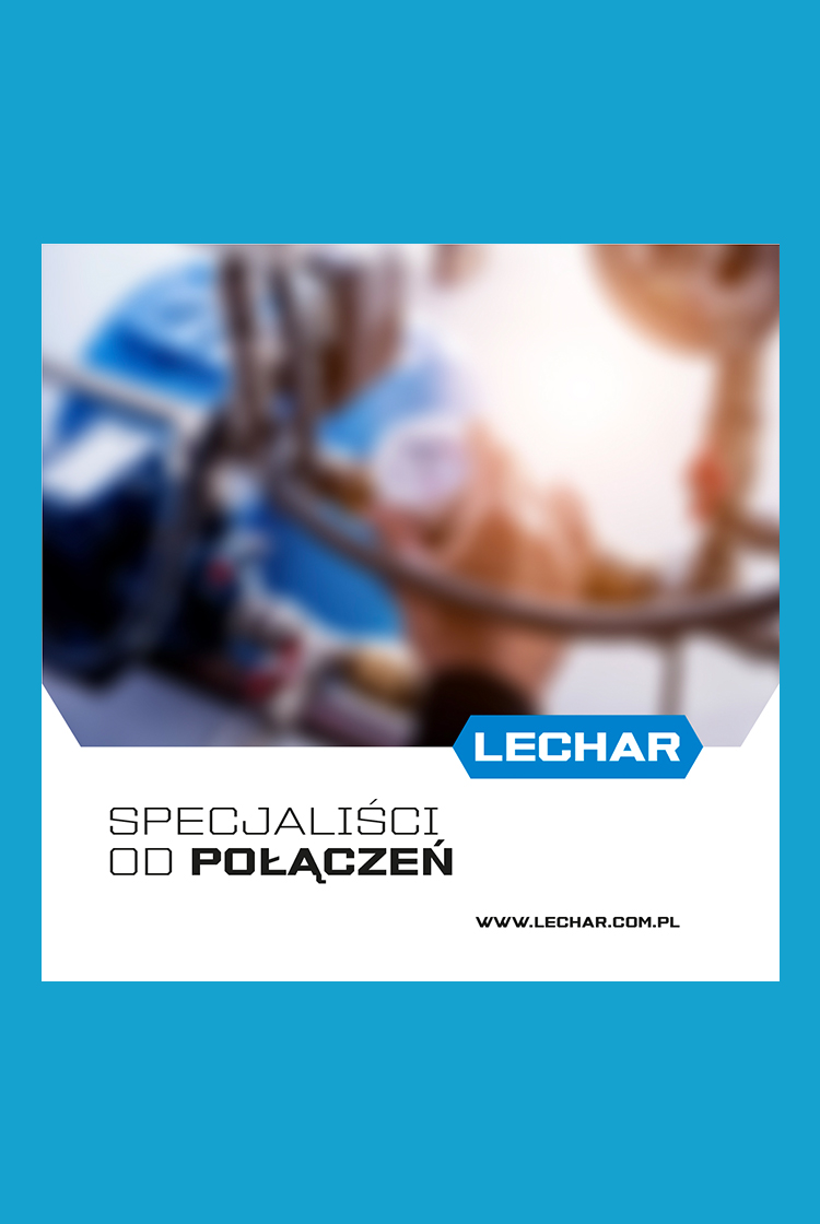
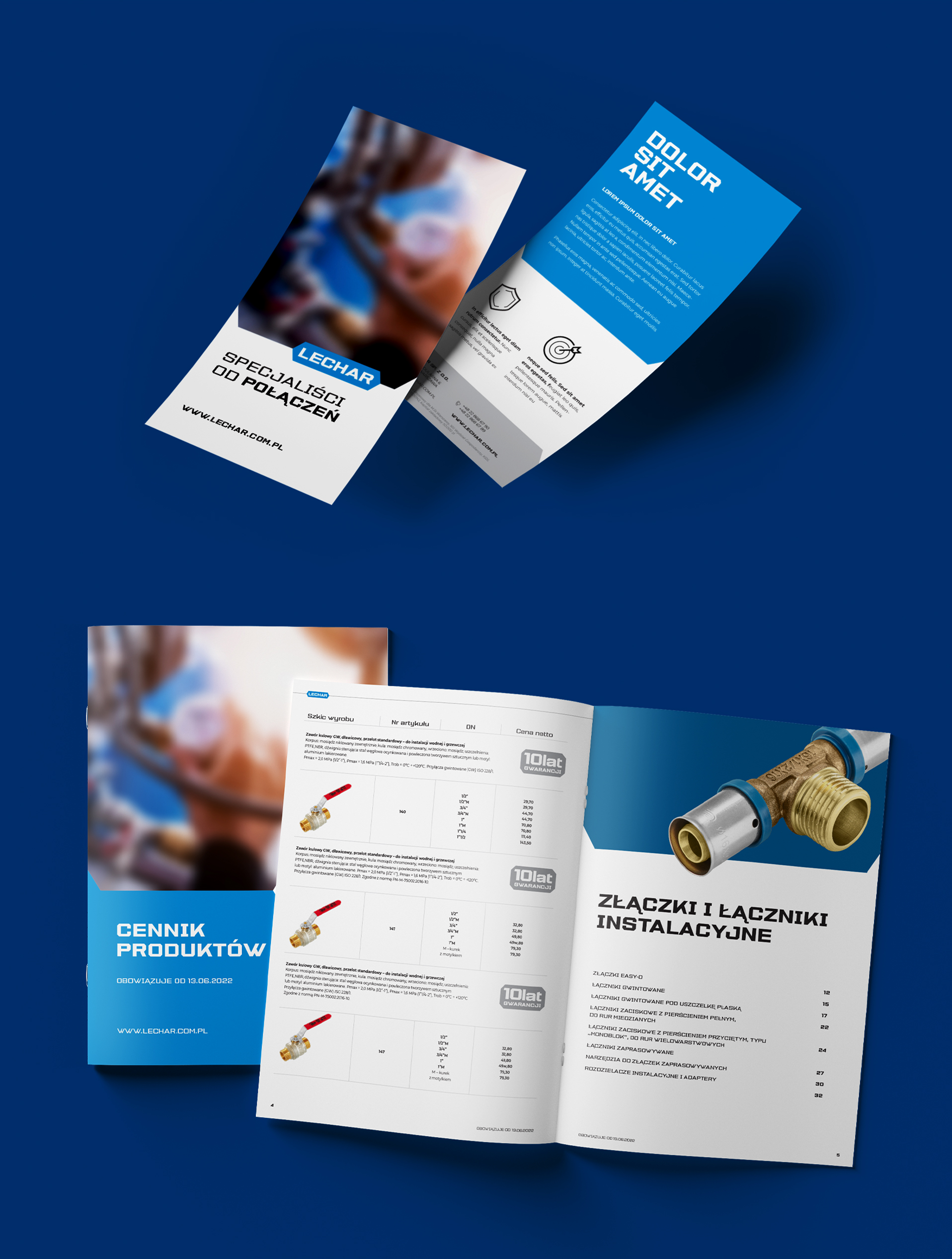
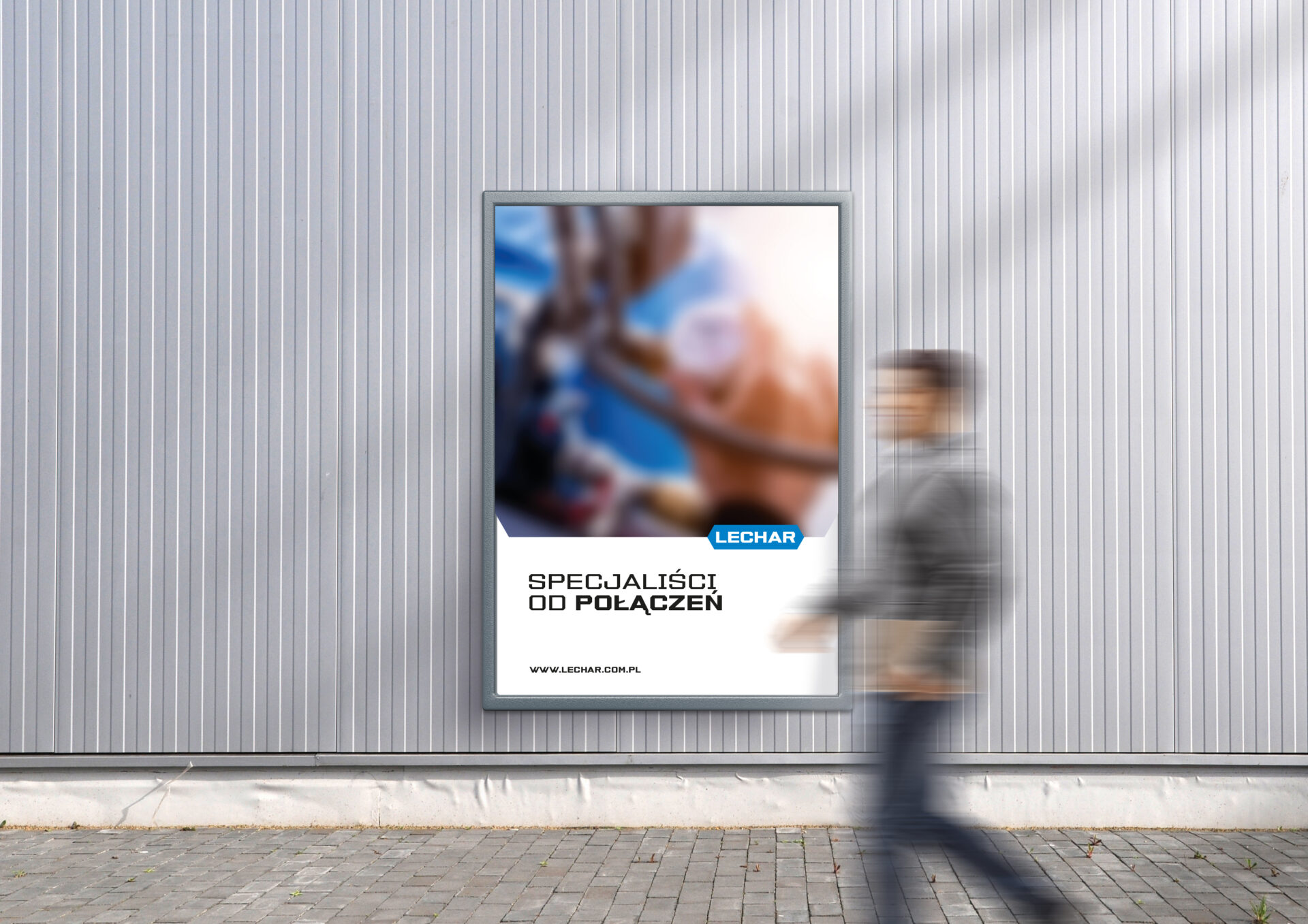
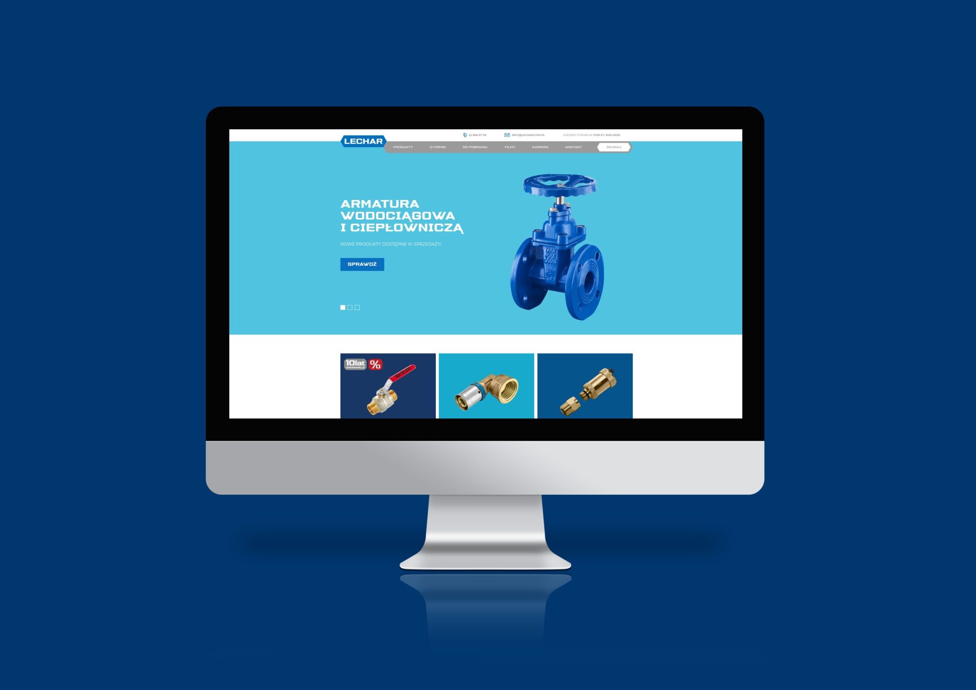
Lechar’s visual identity
and communication strategy
Lechar is a family-owned company that was founded in 1990. For more than 30 years of activity, the company has become a leader in the supply of assortments in the plumbing and sanitary industry.
In order to support further growth, strengthen its visibility and clean up its image, the company’s management decided to carry out a major rebranding.
Creative and branding agency Lotna was selected for the task. We took on the challenge with great pleasure.
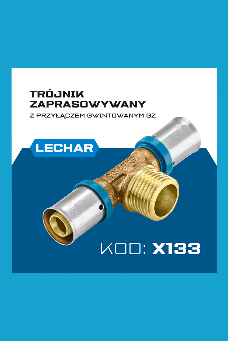
Lechar operates in the technical, professional industry. Although it is currently run by two energetic and passionate women, the nature of the business the company conducts and the market in which it operates required strong, masculine and streamlined elements. .
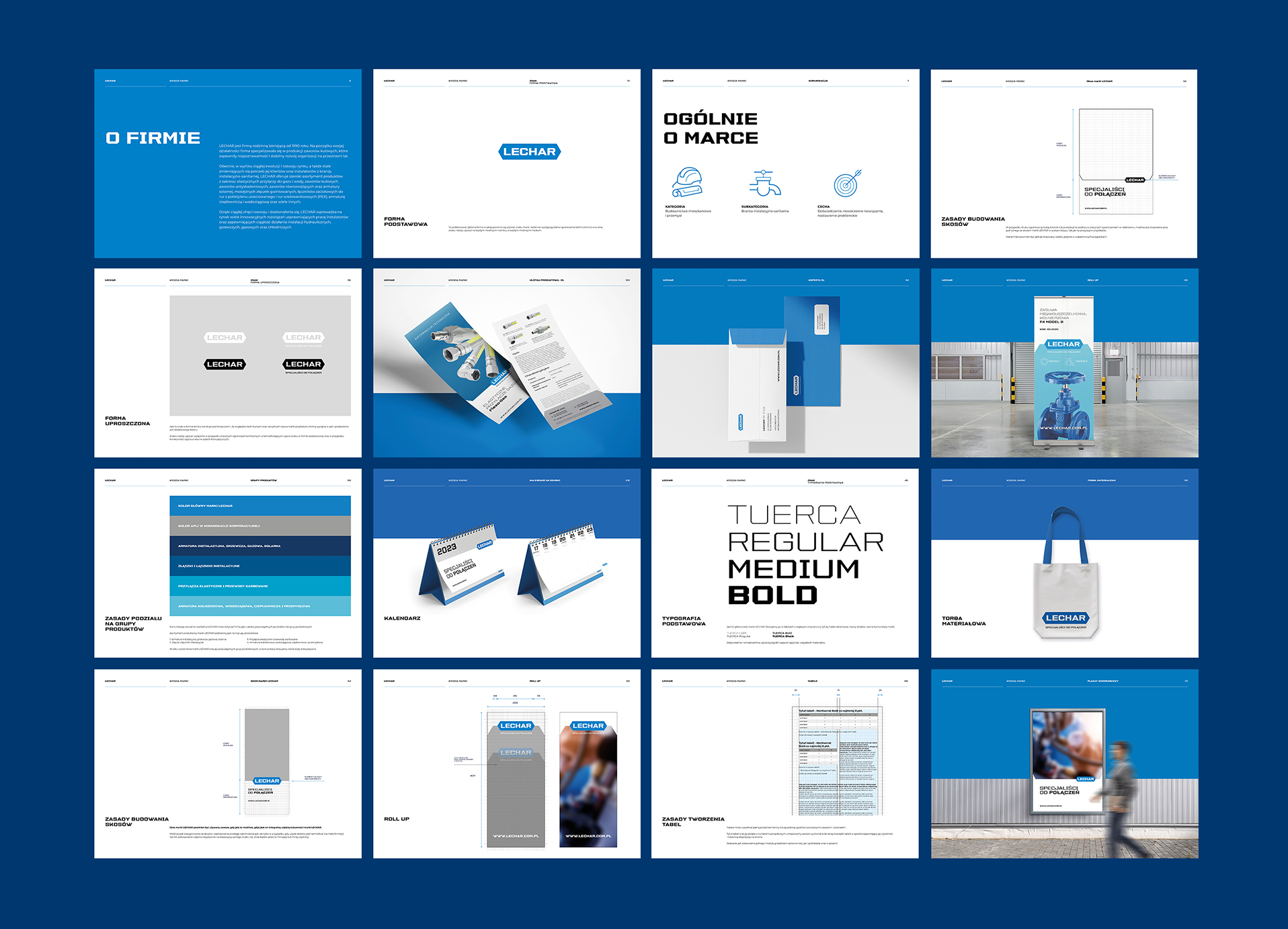
Based on these assumptions, we created a mark, developed principles for communicating with the brand environment, and created a comprehensive brand identity.
The client gained: a visually and verbally organized brand that stands out from the competition; templates for all informational and advertising materials that the brand may need to communicate with its market environment. We gathered all the rules and guidelines into an elaborate and clear Brand Book.
The main inspirations for the development of the logo were:
– the shape of the ball valve handle
– angles taken from the shape of the nut
The blue colour was modelled on the colour of the horizontal handle of the valve distributed by Lechar.
LECHAR is a stable and professional partner that any professional in the plumbing and gas industry can count on.
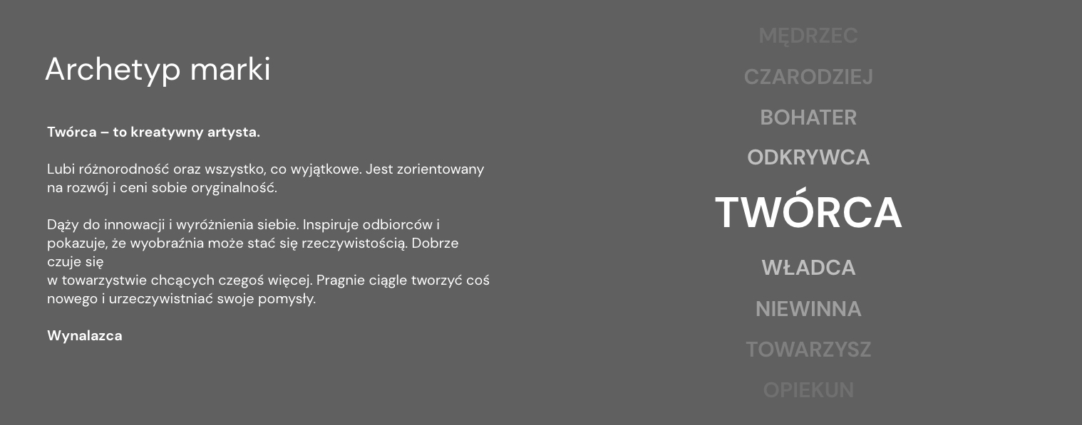
Big Idea
Lechar is a specialist. We provide expert advice and expertise. In the brand’s assortment, you will find all the components needed to connect installations in a durable and reliable way.
Lechar is not just a name, but first and foremost a team of people who have many years of experience in the installation industry.
The company reaches for excellent solutions, offering customers the best products.
Lechar is a creator, an innovator, an inventor, a compass of innovation. The brand doesn’t just want to be in the market. It wants to create it and point the direction for the whole industry to follow.
We encapsulated these key features of the brand, its Big Idea and the goals Lechar has set for itself in the slogan poppies.
Visual
identity
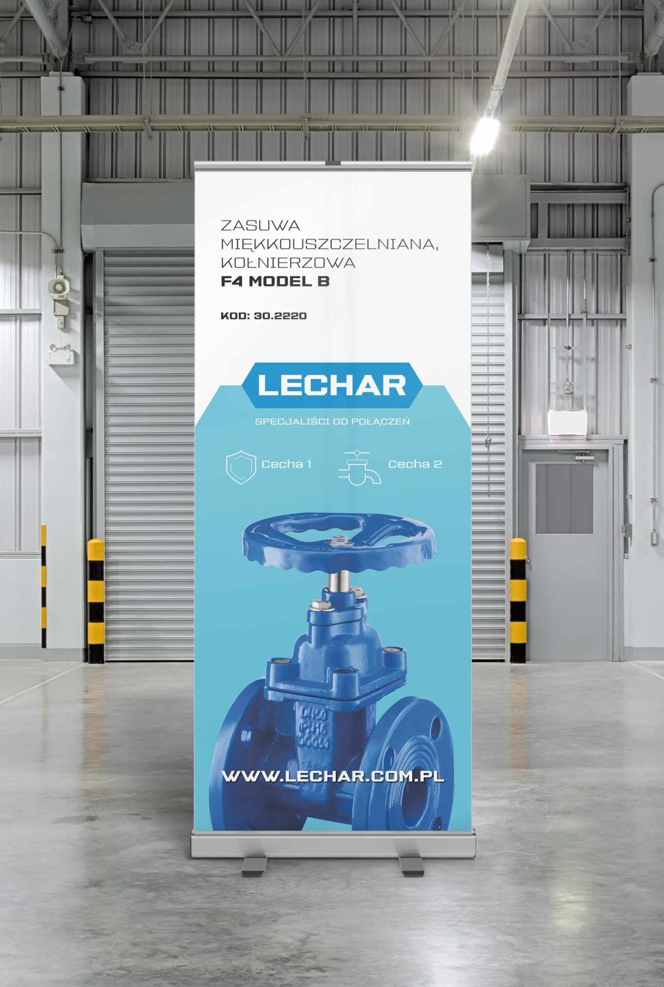
Like the brand’s mark, we based its identity on sharp clearly angles and graphic elements.
In all materials, we have introduced a clear division into a visual part and a content part, the connecting element of which is always the Lechar brand mark.
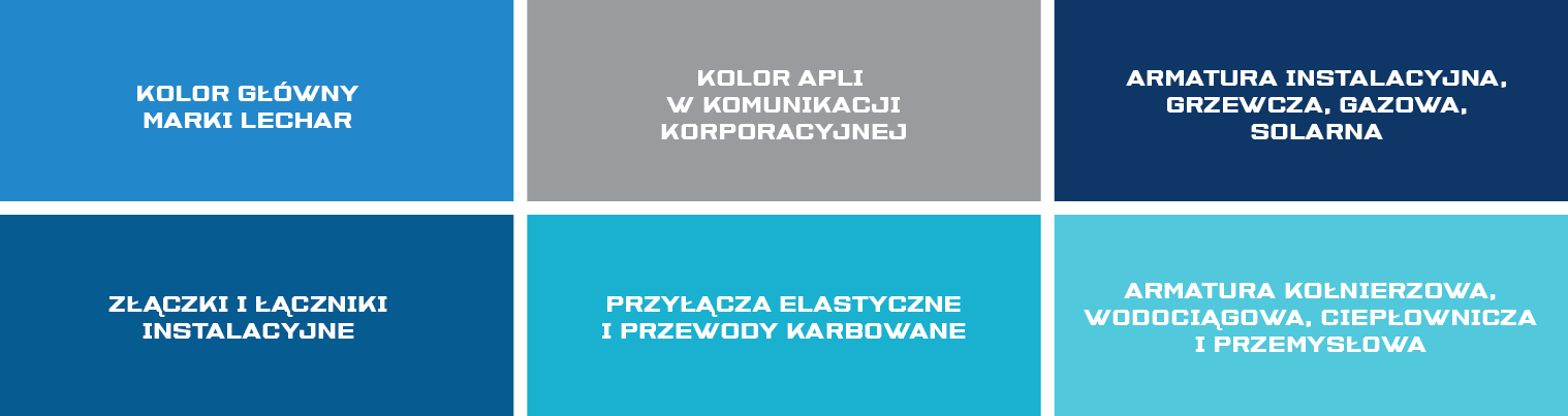
The graphic field can be filled with images, content, data, and can also be filled with a color aplomb or a photo. The whole thing can be flexibly adapted to the needs of communication and the type of material.
The method of brand communication has been divided into thematic sections, each of which has gained its color code. This treatment will make it easier to navigate the brand’s offerings and tailor them to a specific audience.
The system we developed is distinctive and very flexible. It allows the client to work freely and independently with all developed materials.
Team:
Visual Identity – Michał Wyszyński
Communication strategy – Piotr Flis
Nadzór kreatywny – Piotr Flis i Anita Kamila Sochacka
Scope of work:
Research
Brand audit
Rebranding
Communication strategy
Visual identity
Awareness campaign
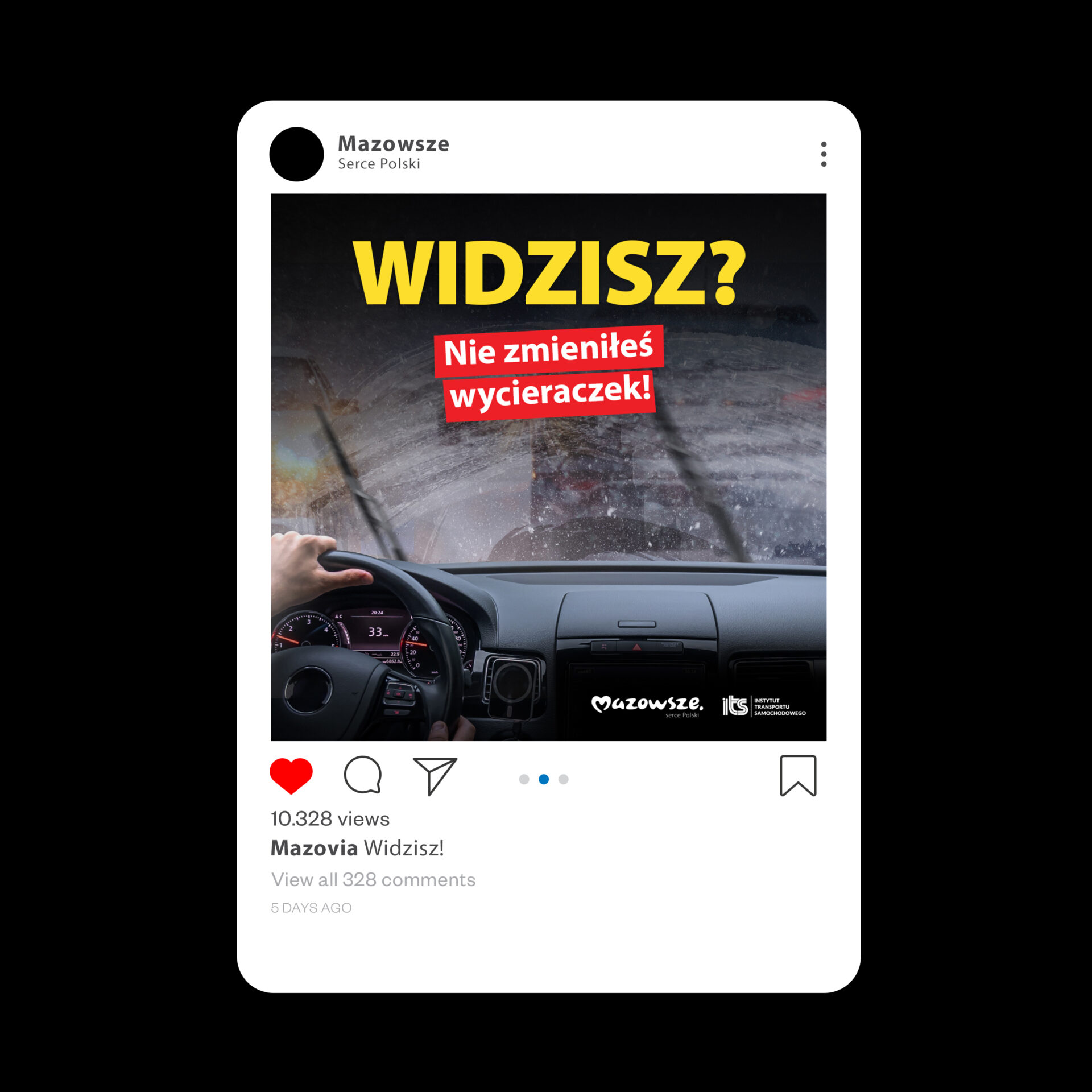
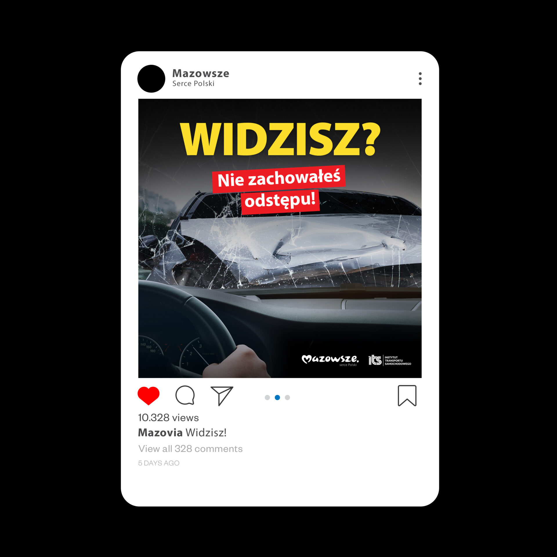
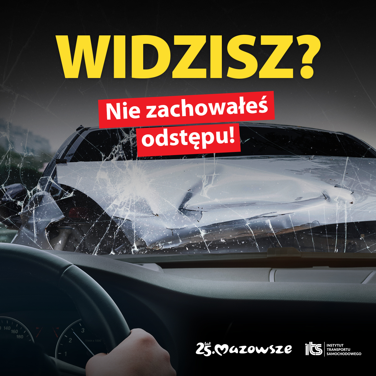
targeted to drivers.
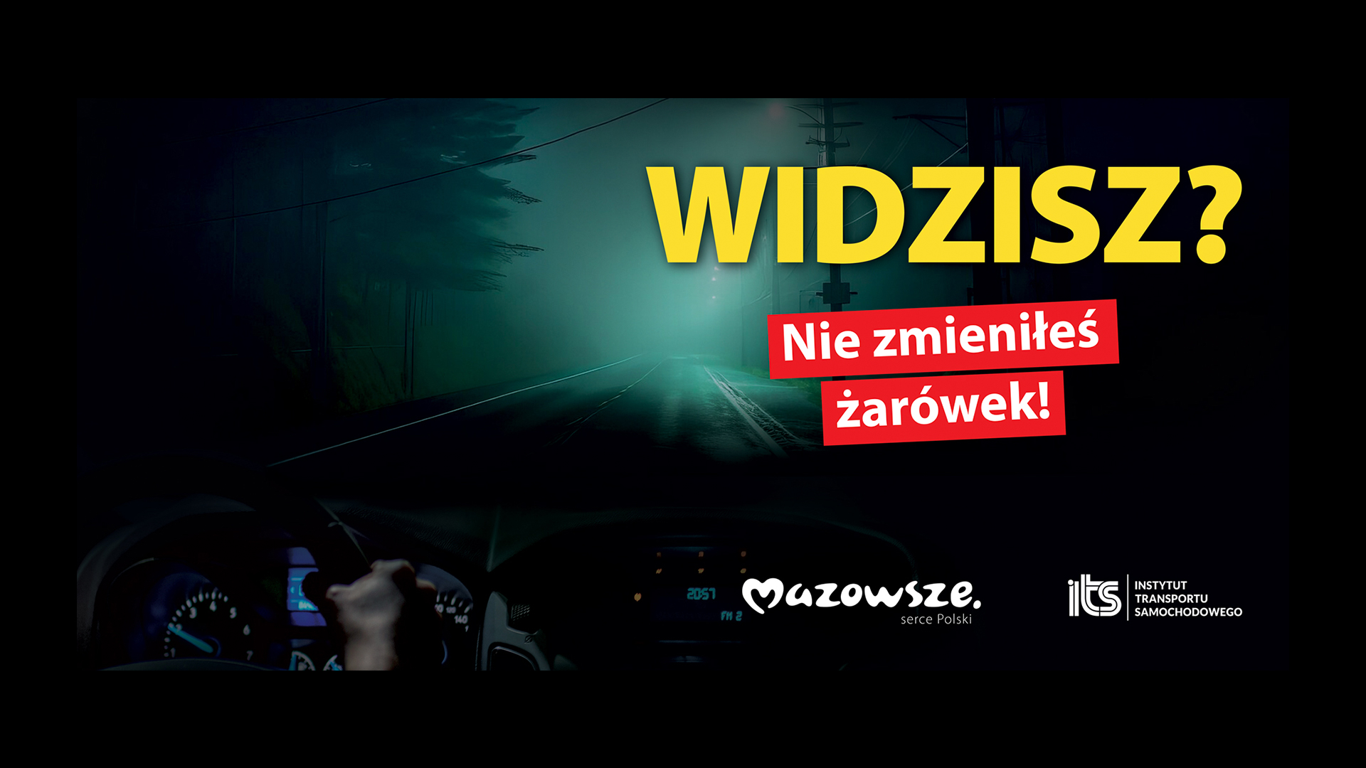
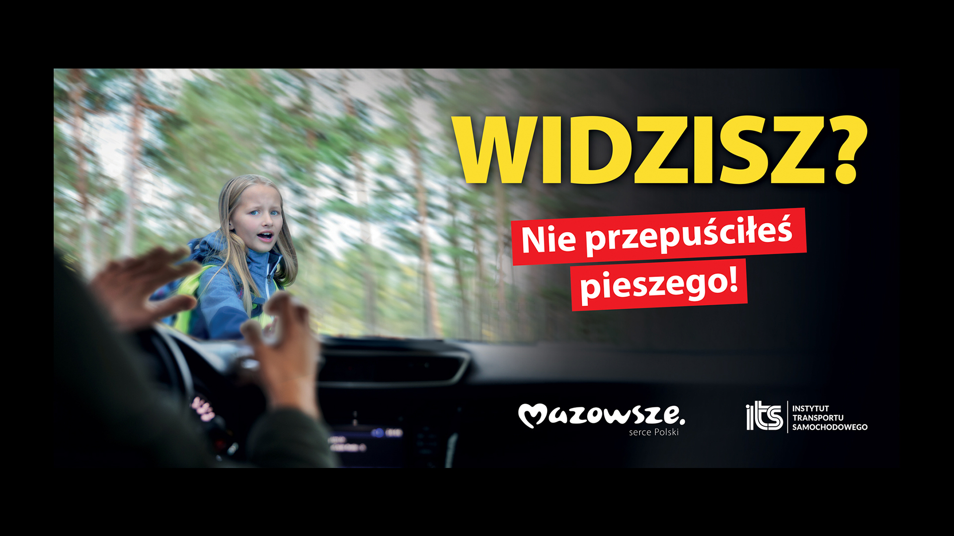
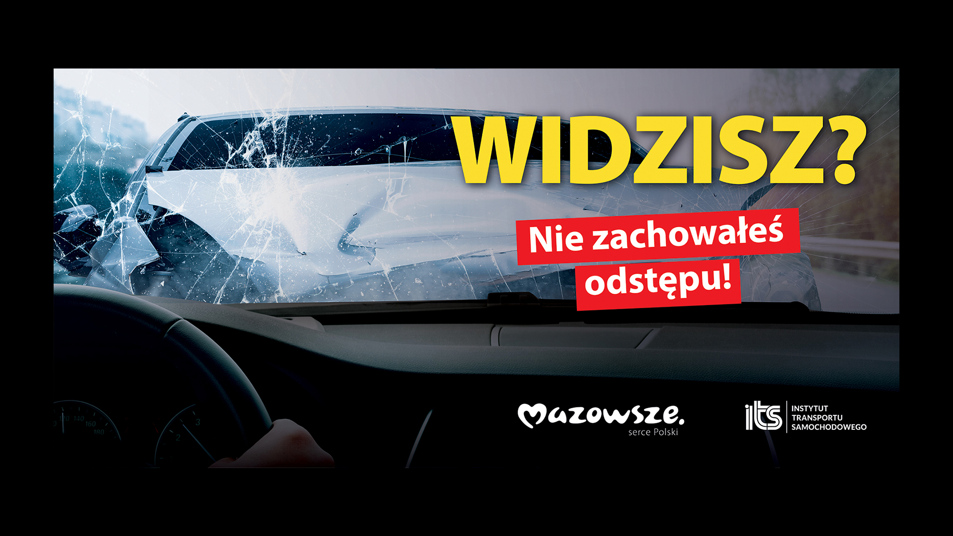
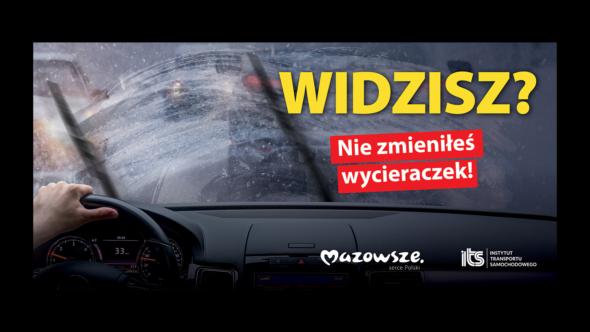
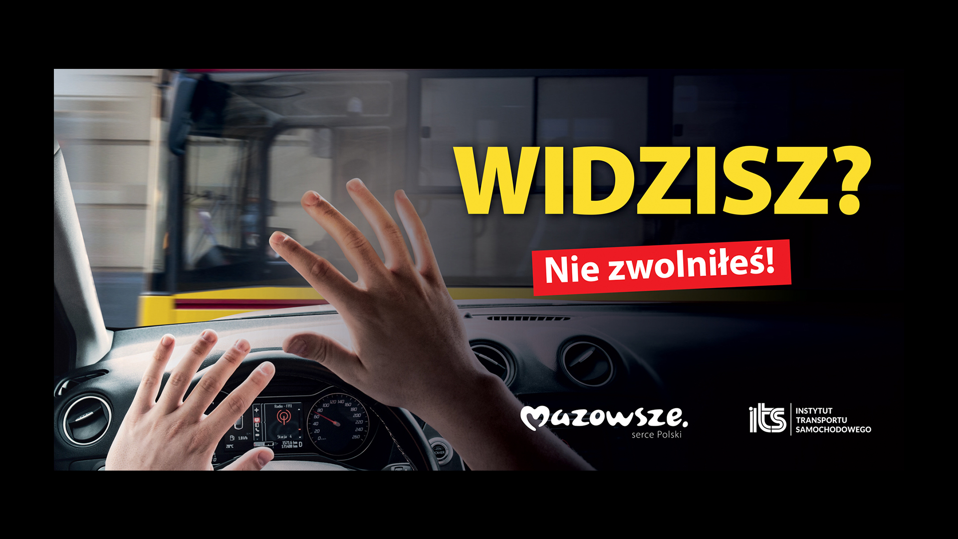
The Marshal’s Office of the Mazowieckie Voivodship in Warsaw is running a wide-ranging campaign to improve road safety. The creative and branding agency Lotna is responsible for the creation.
The aim of the campaign is first and foremost to raise drivers’ awareness of the road hazards that await them, to raise awareness and thus change habits, and ultimately to improve road safety.
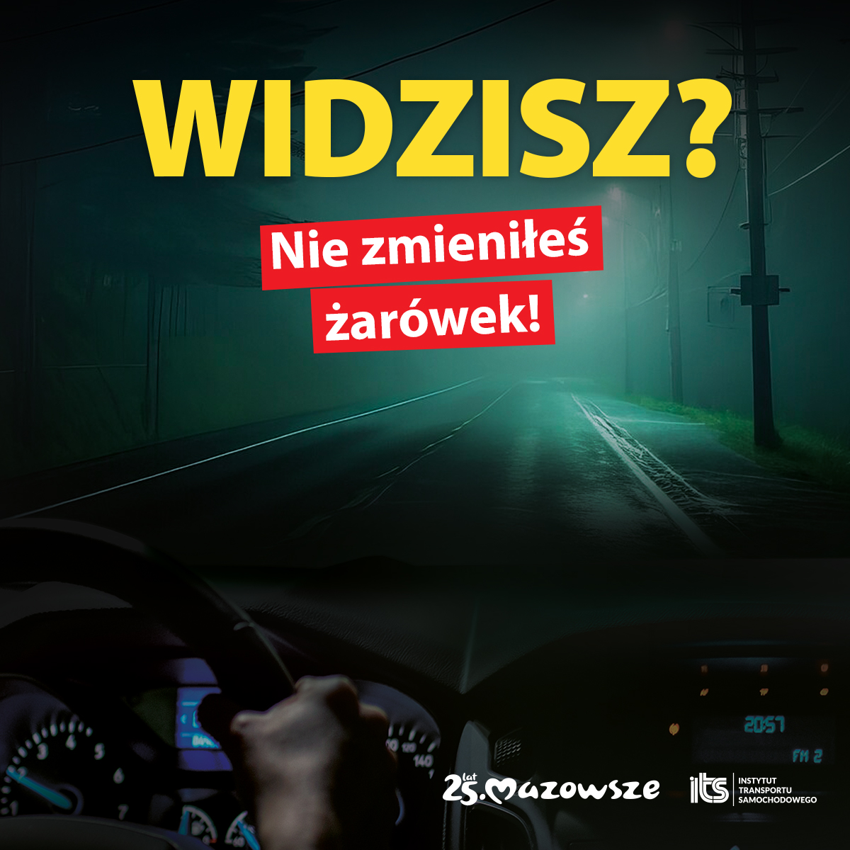
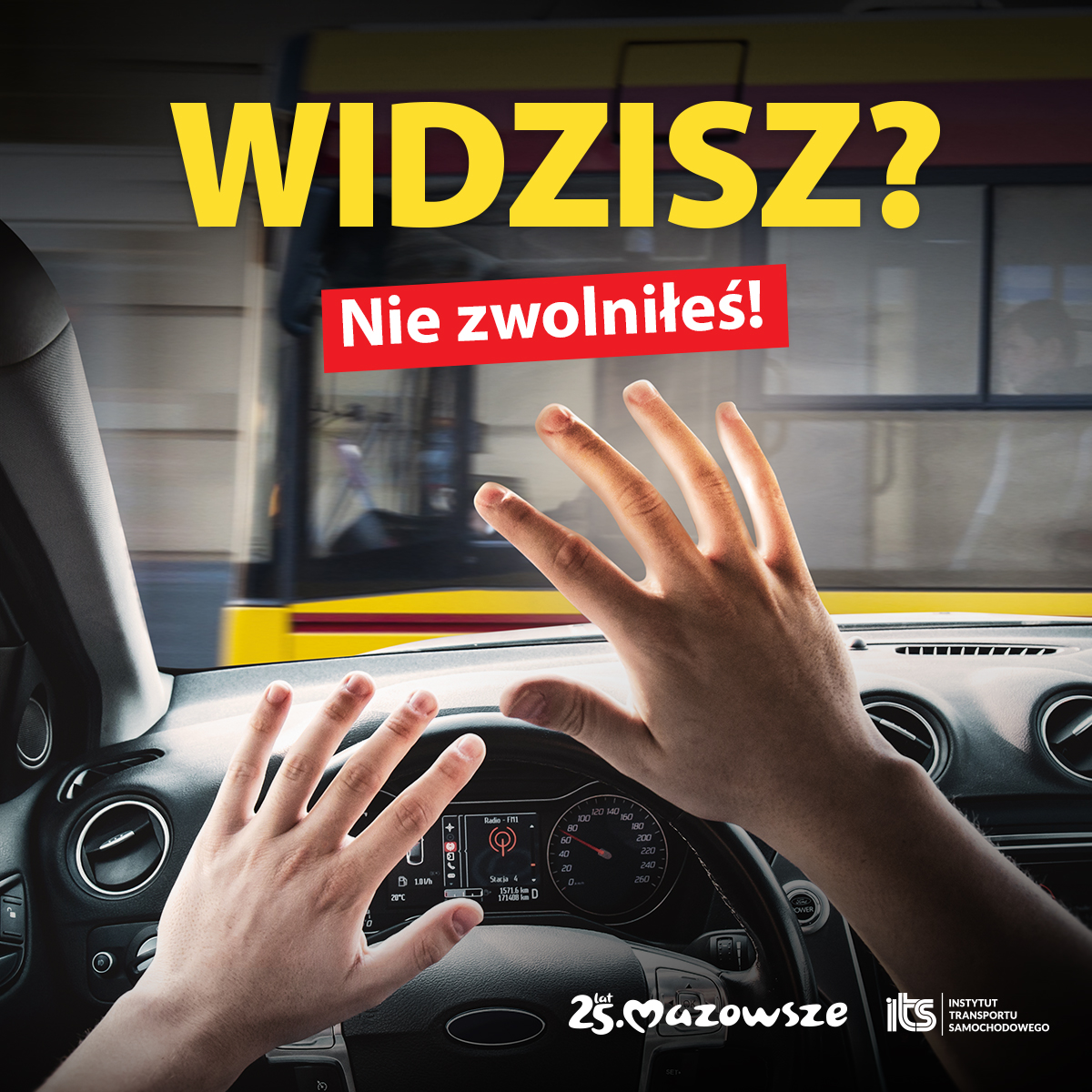
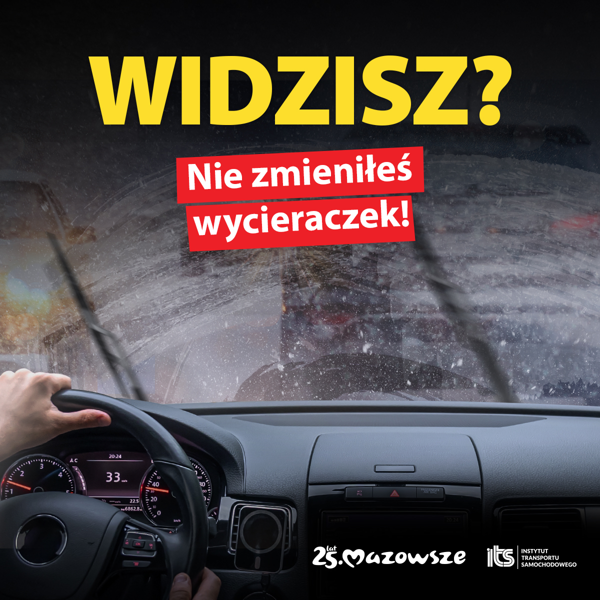
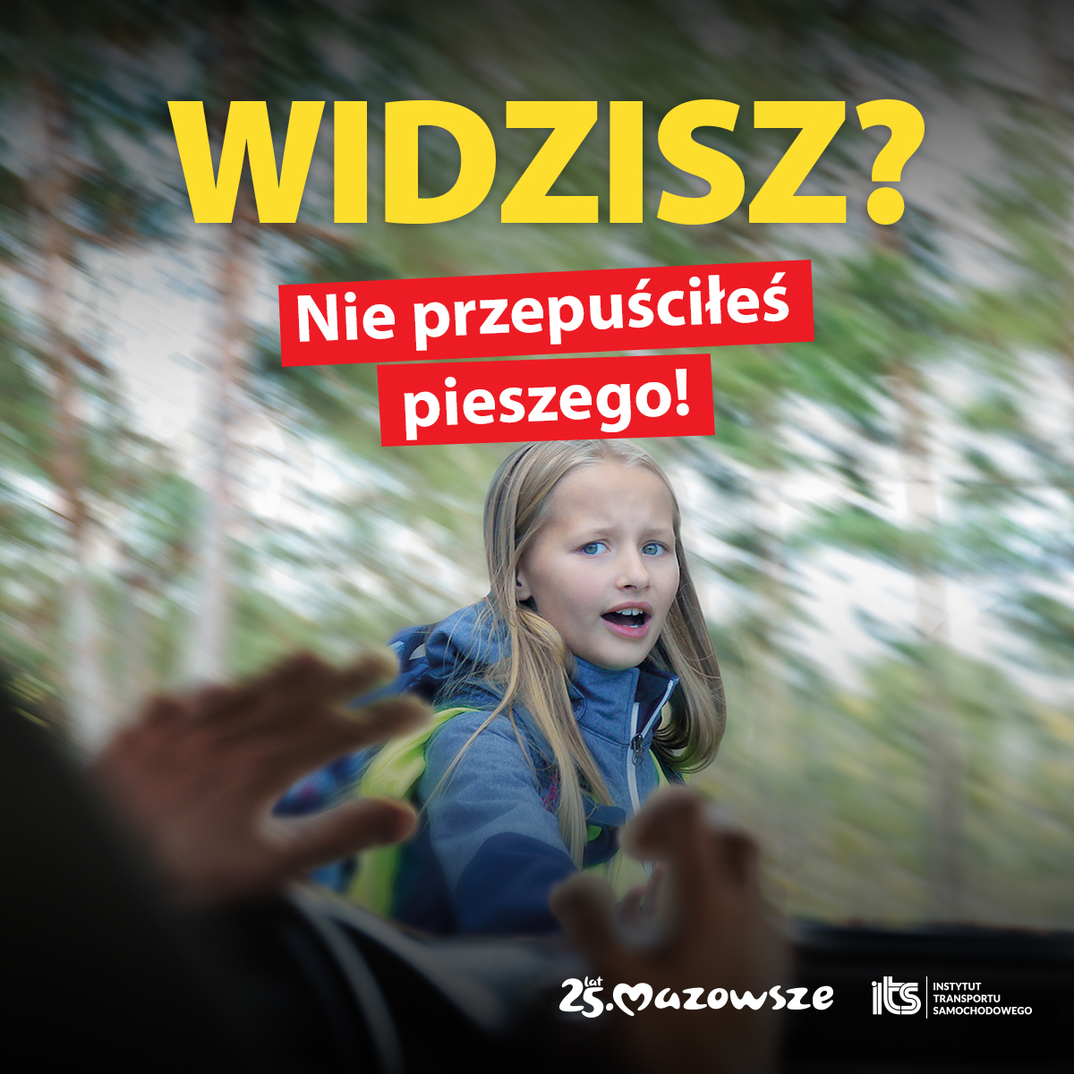
The campaign focuses on the 5 most common causes of accidents and collisions on our roads: speeding, pedestrian priority in lanes, inadequate visibility, inadequate lighting in the car and inadequate distance between vehicles.
Idea kampanii
The driver awareness campaign consists of 5 scenes. Each is a scene depicting an ordinary traffic incident that can happen to anyone who gets behind the wheel. However, each of these situations could have been avoided. All it took was the right reaction or preparing the vehicle for the road in advance.
The separate layouts are linked by simple and strong slogans that relate directly to us, the street users.
The driver – the protagonist of our story – faces a dangerous situation because he or she failed to take care of safety, made a bad decision or ignored a risk.
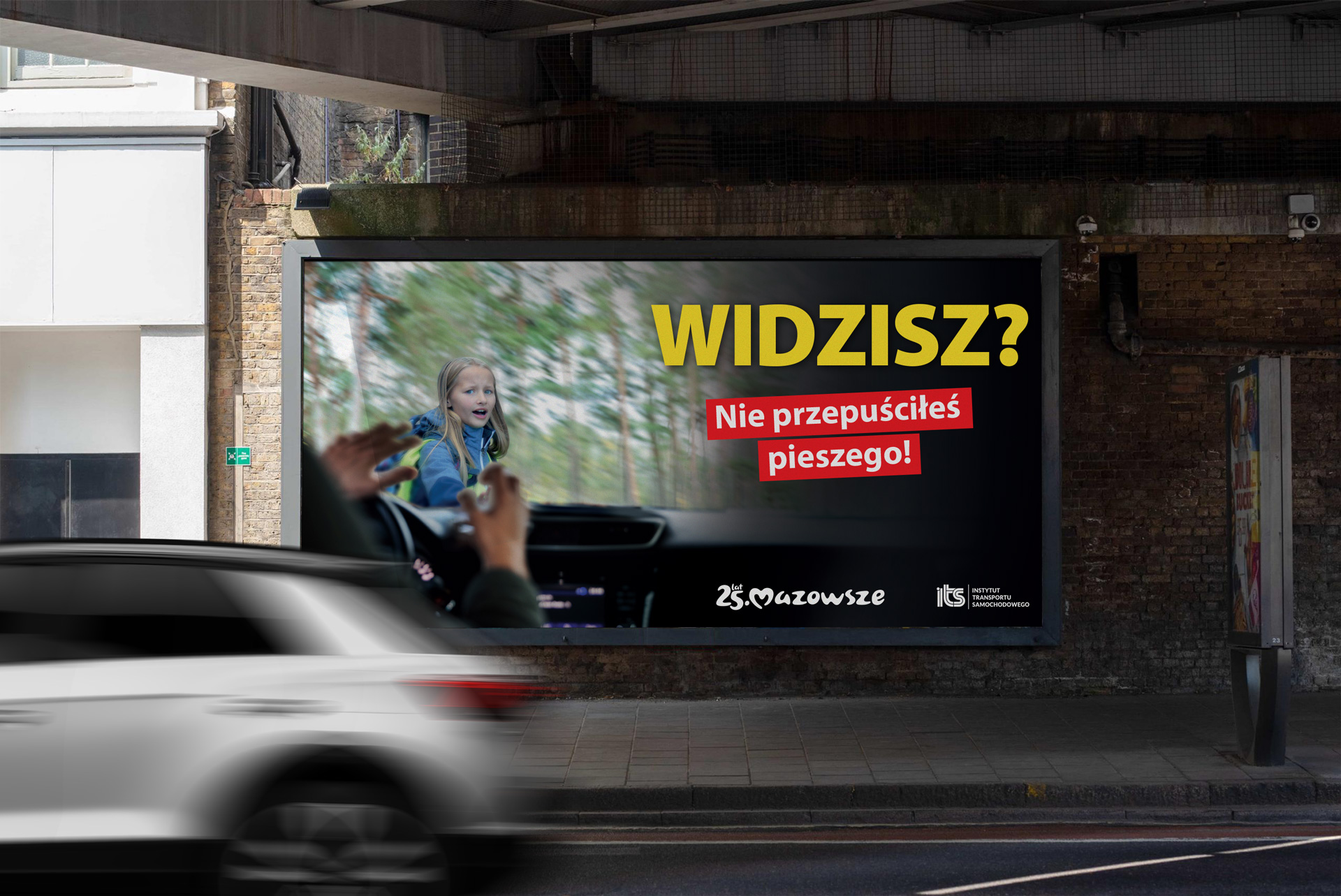
With a picture we show the effect. In a word, a solution that would help the driver avoid an unpleasant and potentially very dangerous incident.
The whole message is intended to attract drivers’ attention, make them reflect and analyse their habits. Many situations on the road cannot be avoided or predicted, but many are influenced by the driver. The driver’s preparation, the condition of his or her car or “taking your foot off the accelerator” at the right moment can significantly improve the safety of our roads.
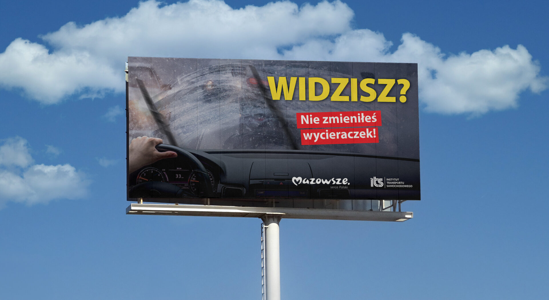
The driver awareness campaign will run online and on OOH media in February and April 2024.
Team:
Creative Idea
– Ulka Malyszko, Piotr Flis, Michał Wyszyński
Graphic design – Michał Wyszyński, Ulka Małyszko
Client service – Sylwia DudzińskaTeam:
Scope of work:
Koncepcja kreatywna
Key Visual
Advertising materials
Campaign for nonprofit organization Great Coalition For Equality and Choice.
In view of the upcoming elections in Poland, the Great Coalition for Equality and Choice, with the support of the Batory Foundation, asked the Lotna Agency to develop a concept for a public campaign drawing public attention to Women’s Rights and encouraging everyone for whom these issues are important to participate in the elections.
Women’s rights, especially reproductive rights and a woman’s freedom to decide about her own body, have been the subject of political and social dispute in Poland for years. Freedom of access to sexual education, contraception, in vitro, etc. is, compared to other European countries, very limited.
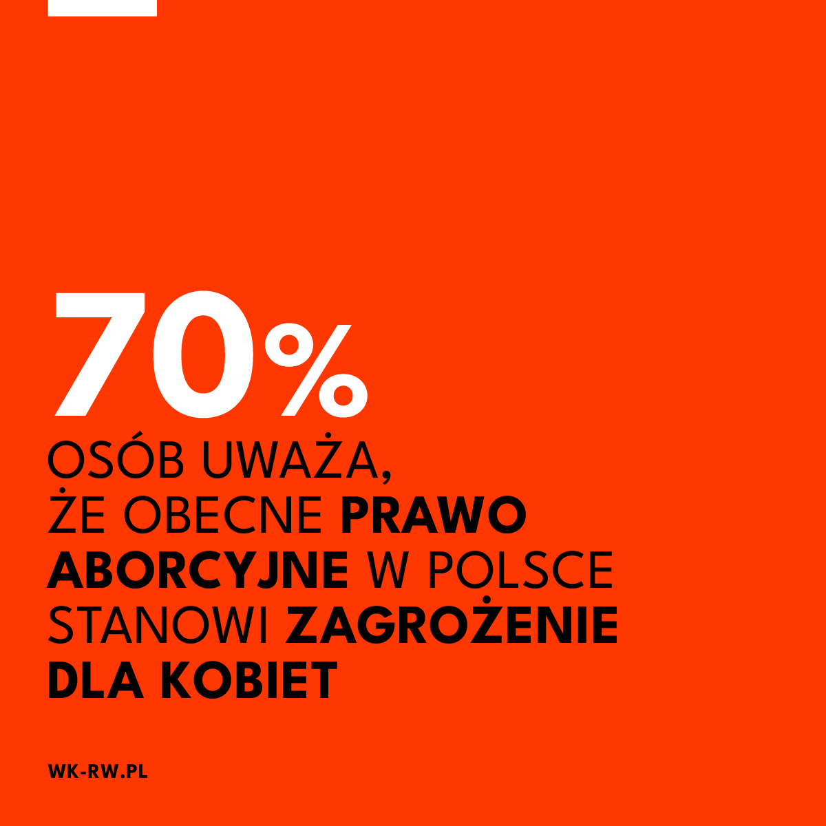
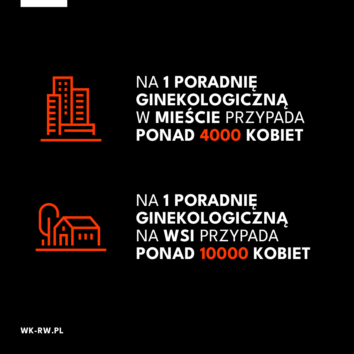
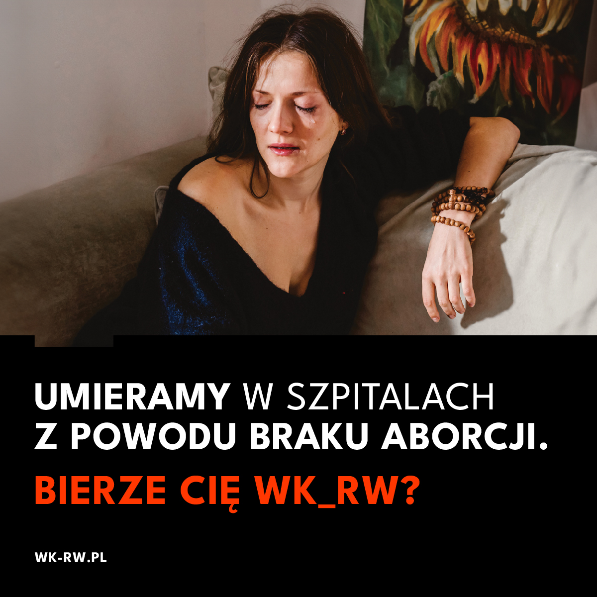
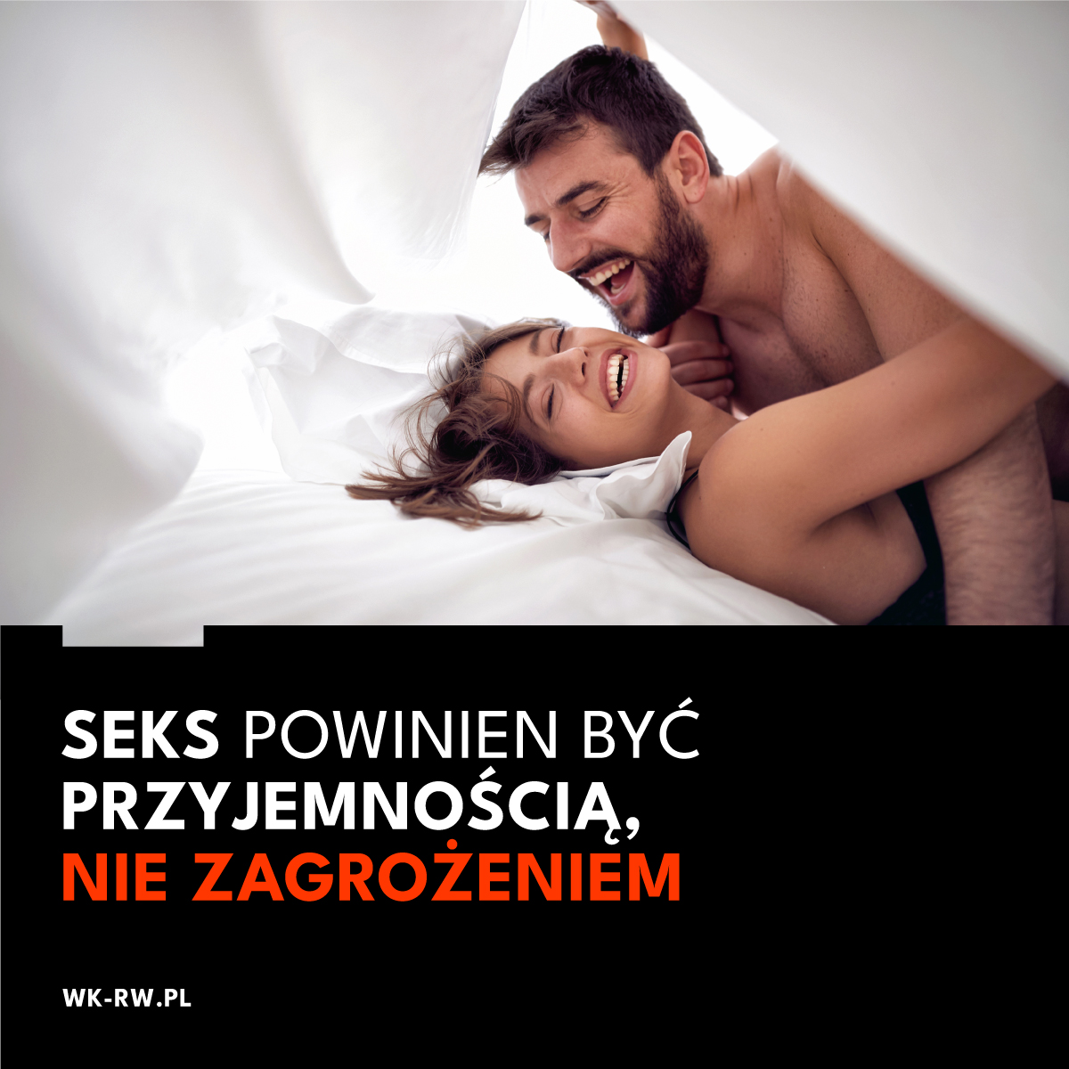
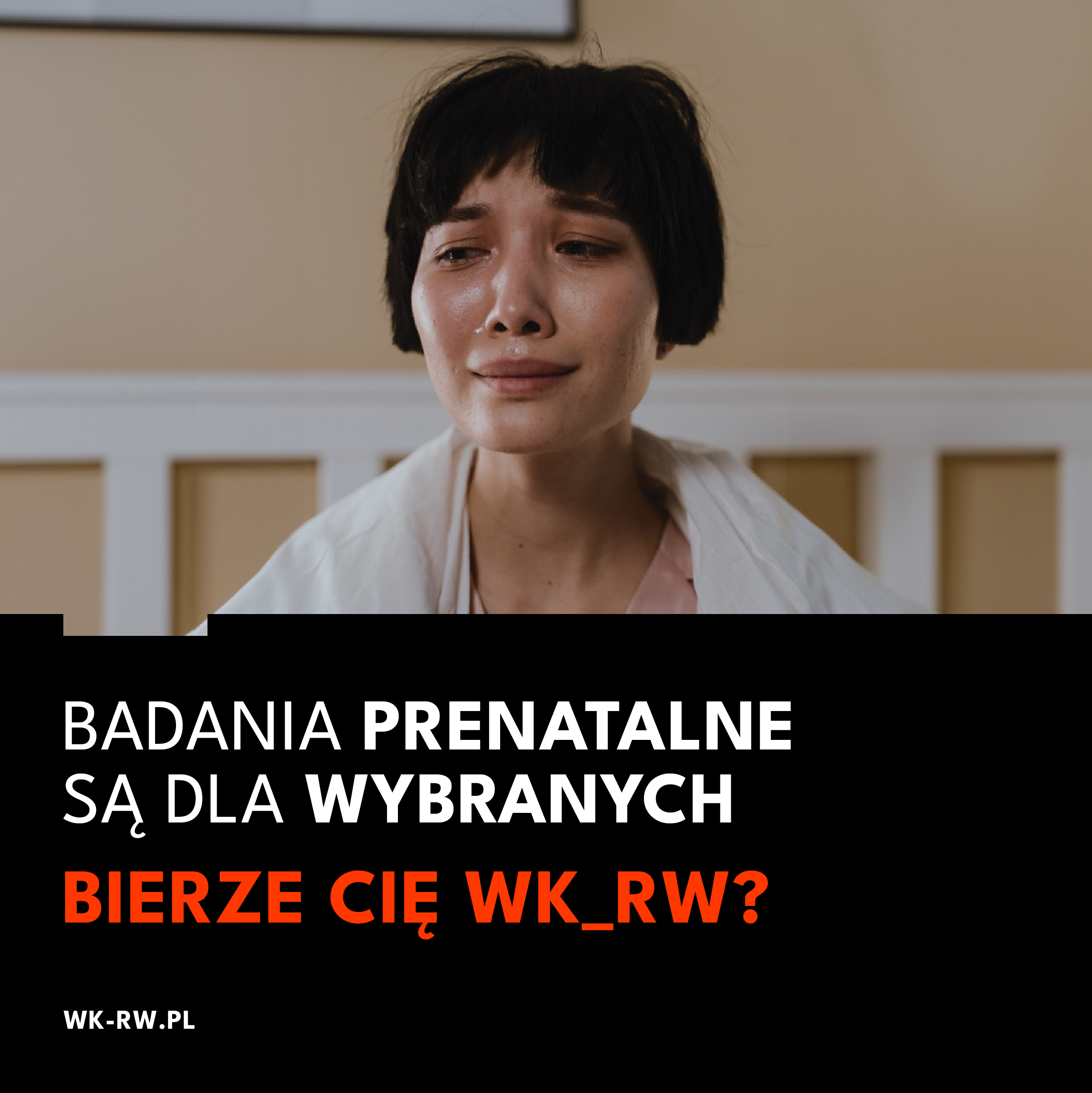
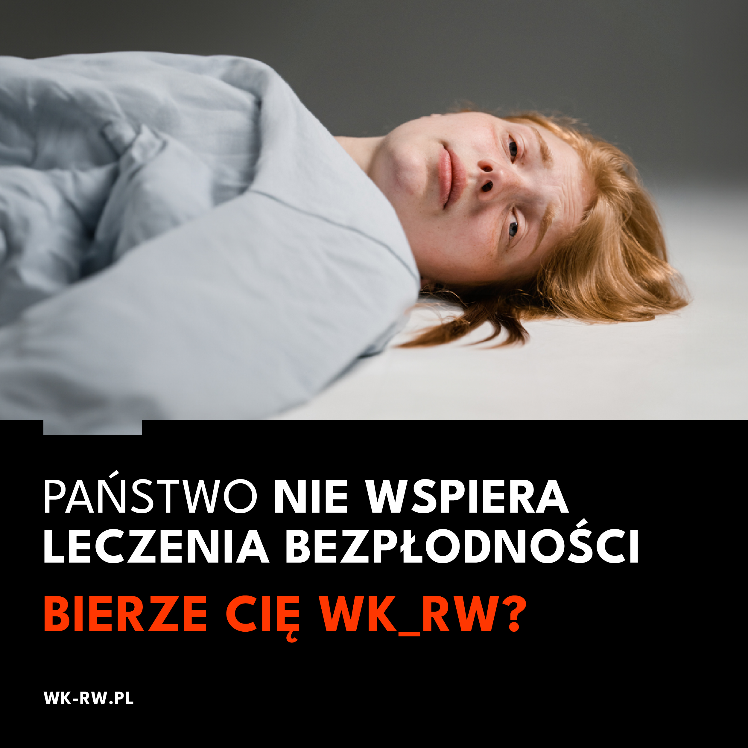
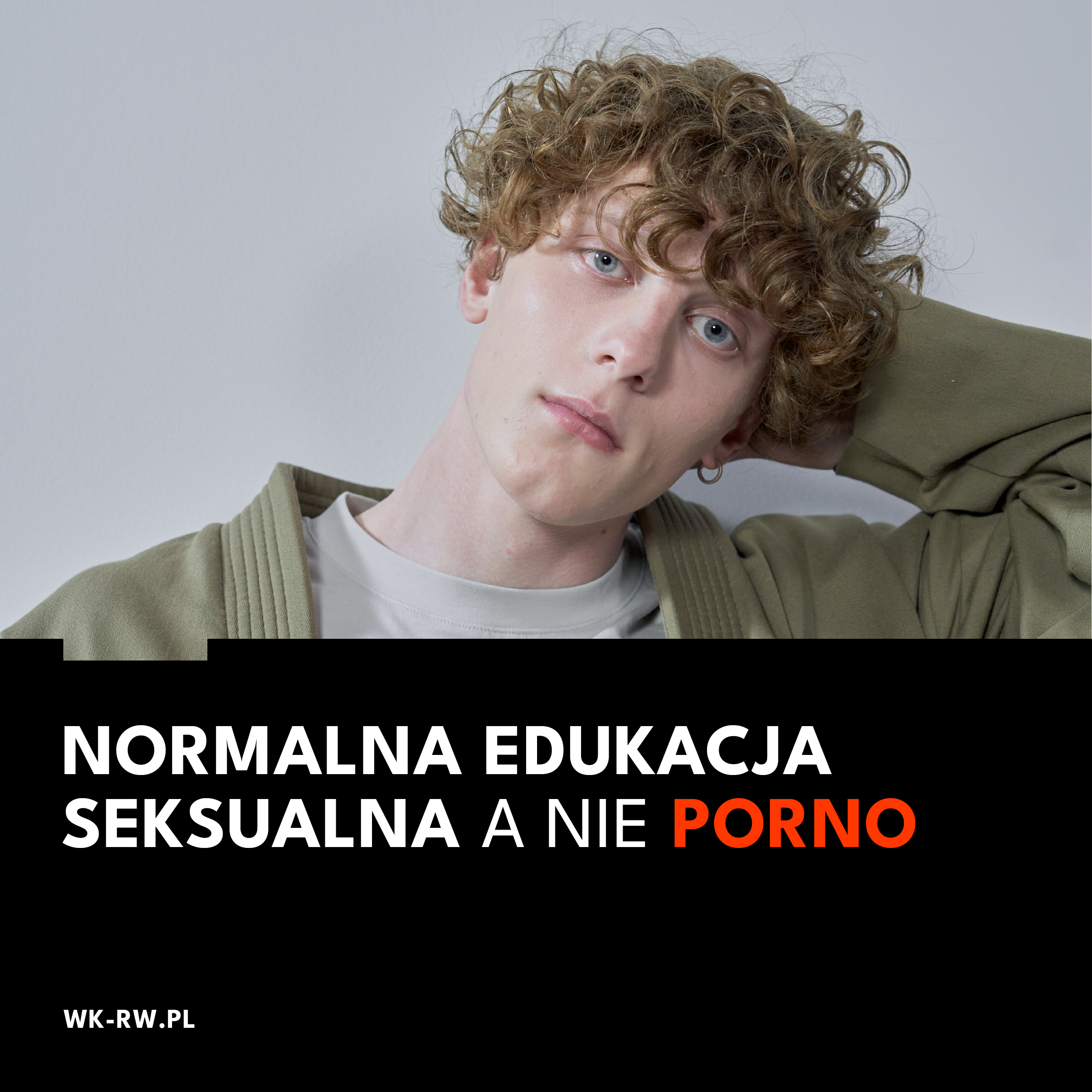
In the campaign, we highlighted 5 key issues:
The main message had to be simple, strong and eye-catching. We based the main slogan and the whole idea of the campaign on a censored curse word that was formed from the first letters of the Coalition’s name – WK_RW. We have hidden the middle letter from the word – the letter U. The full word in Polish means the same as the term pissed. it’s a similar wordplay to FCK.
For the Campaign, we developed a new visual identity for the Coalition. We based the whole thing on strong expressive colors, lettering and graphic elements.

We divided the campaign into two phases, the cohesive element of which is the question “Are you taken by WK_RW?”
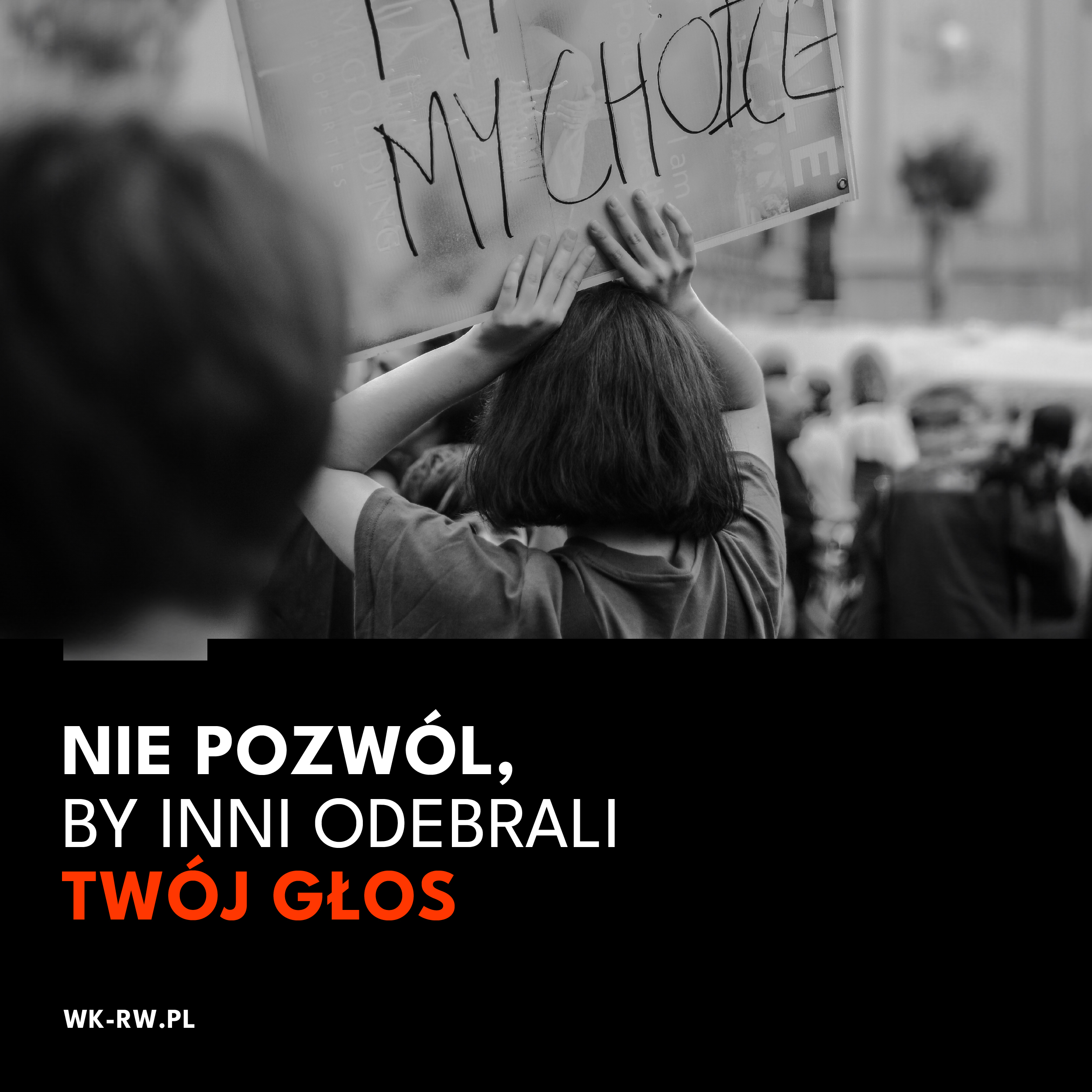
In the first stage, we focused on emotions resulting from everyday problems and legal situations related to women’s rights and lack of access to contraception, sexual education, etc. The main action is based on 8 key visuals.


The second stage is activating the public, who can turn their discontent or general desire for change into action. In it, we call to action all those who are close to the slogans presented in the first stage of the campaign. We encourage everyone to turn their views into action and participate in the October elections.
The campaign is being implemented in offline and online channels. The main emphasis in the digital channel was placed on social media. The campaign was carried out on Instagram and Tik Tok of the WKRW organization. It was in these places that we had the best and natural access to the target group consisting of representatives of generations Y and Z.
The main part of the content created was animations as well as creations referring to the world of memes and using current trends on IG and Tik Tok.


Team:
Creative idea and strategy – Piotr Flis
Content strategy – Piotr Mateńko
Graphic implementation – Michal Wyszynski, Ulka Malyszko, Anna Woroniecka
Zakres prac:
Idea kreatywna
Strategia komunikacji
Digital
Print
Visual identity
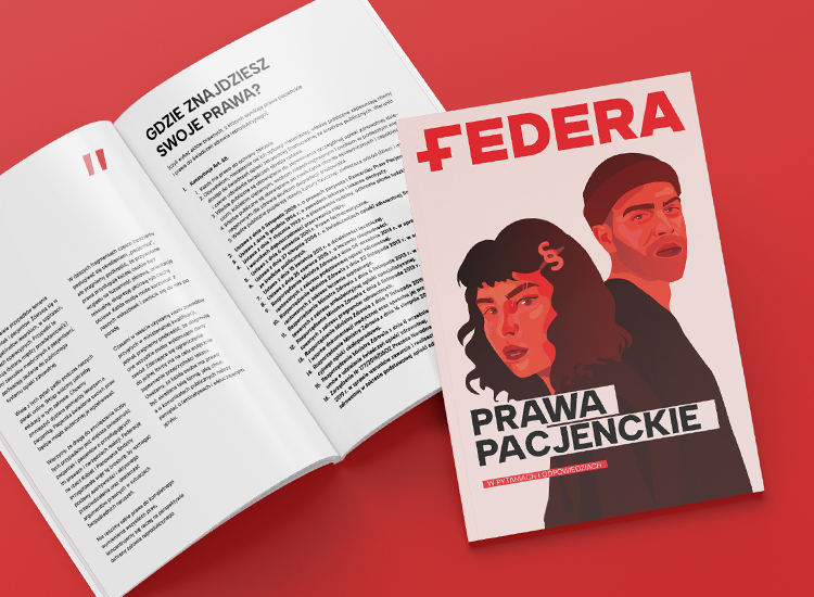
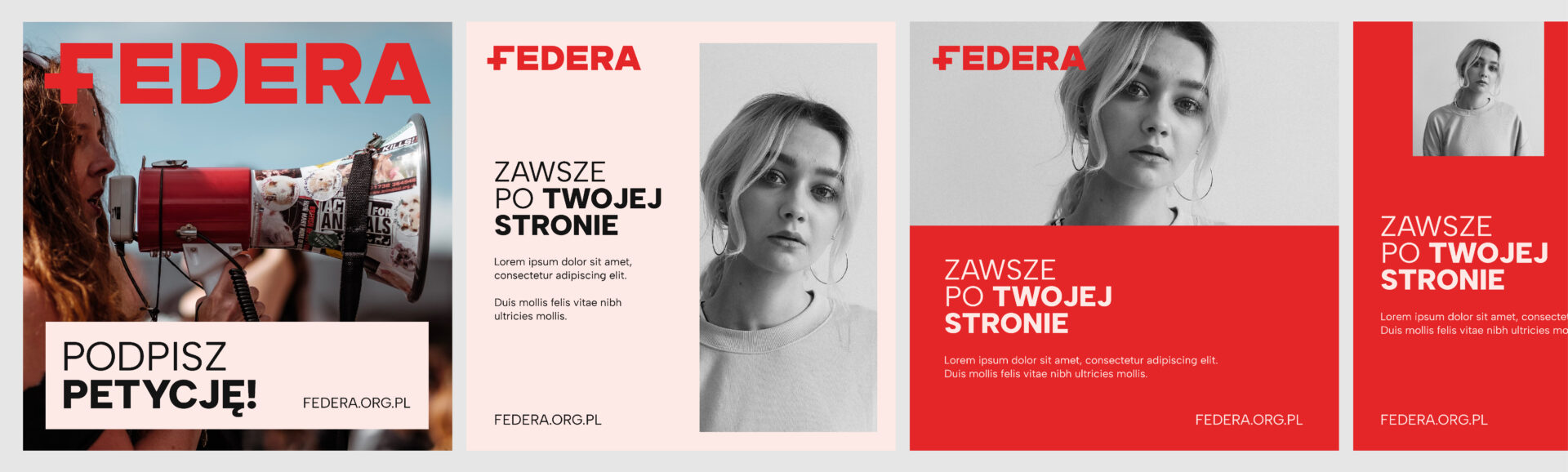
Visual identity and communication strategy of FEDERA
FEDERA is one of the largest and oldest non-governmental organizations in Poland. For more than 30 years, the Foundation has been working for human rights, with a special focus on women’s health and reproductive rights.
FEDERA includes the Ponton Group – which works on sex education among students, Great Coalition for Equality and Choice – an initiative that brings together more than 100 NGOs and pro-women’s movements, and includes helplines and hotlines, where anyone in need will get help with the law – primarily medical and patient rights – and get psychological support.
“Our work is evolving, the problems, the topics we deal with, the age of the people we help are changing. The world around us is changing. So we decided that we also need to change. To adapt more to the expectations of younger people and to focus more on building our image.” – says the Foundation’s CEO.
After several intensive workshop meetings, an in-depth analysis of competitors’ activities and the expectations of the target audience, we set the main goals of the brand, and then developed a new visual identity and communication strategy.
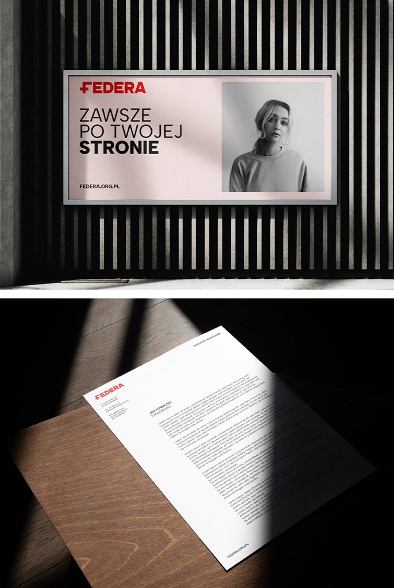
FEDERA is about ideas, values and real help. It works wherever it is needed. In hospitals, doctors’ offices, courtrooms, TV studios and conference rooms around the world. We had to show the brand’s communication in such a way that the message would reach a wide and diverse target audience and be properly understood.
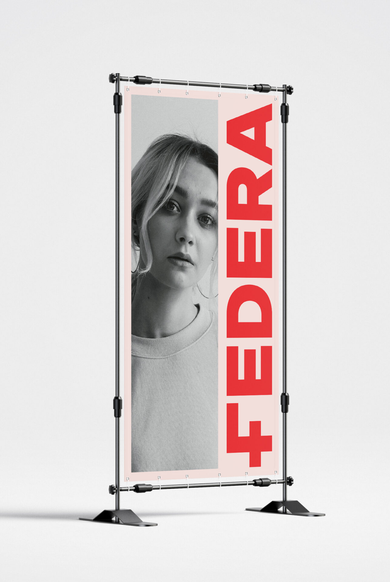
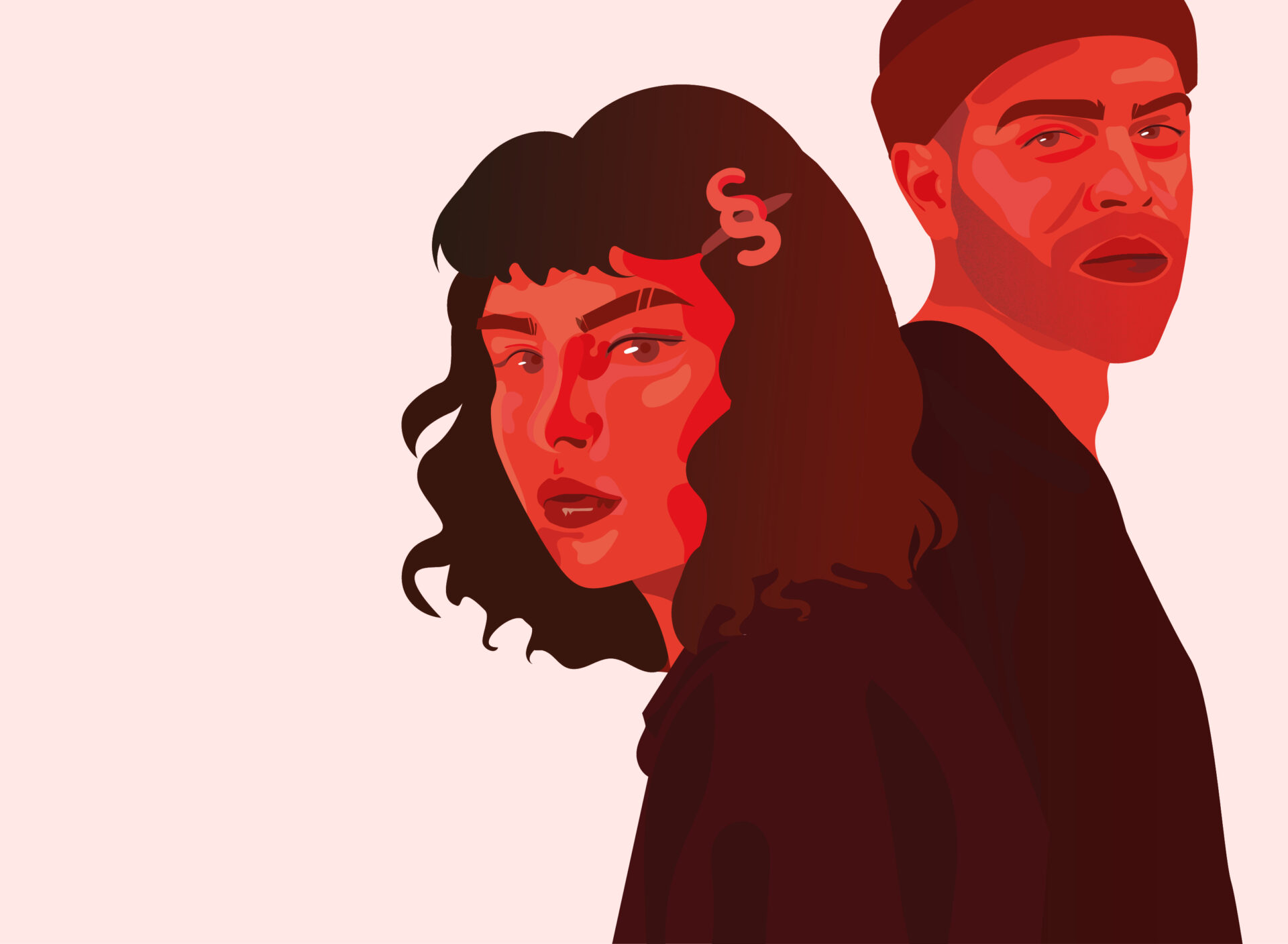
New FEDERA brand mark
The idea and design of the new FEDERA logo were based on a combination of the brand’s characteristic motifs – the symbol of a woman and a symbol signifying help, including medical help.
The combination of these ideas resulted in the distinctive letter F – which will also be used as the abbreviated mark of the FEDERA Foundation.
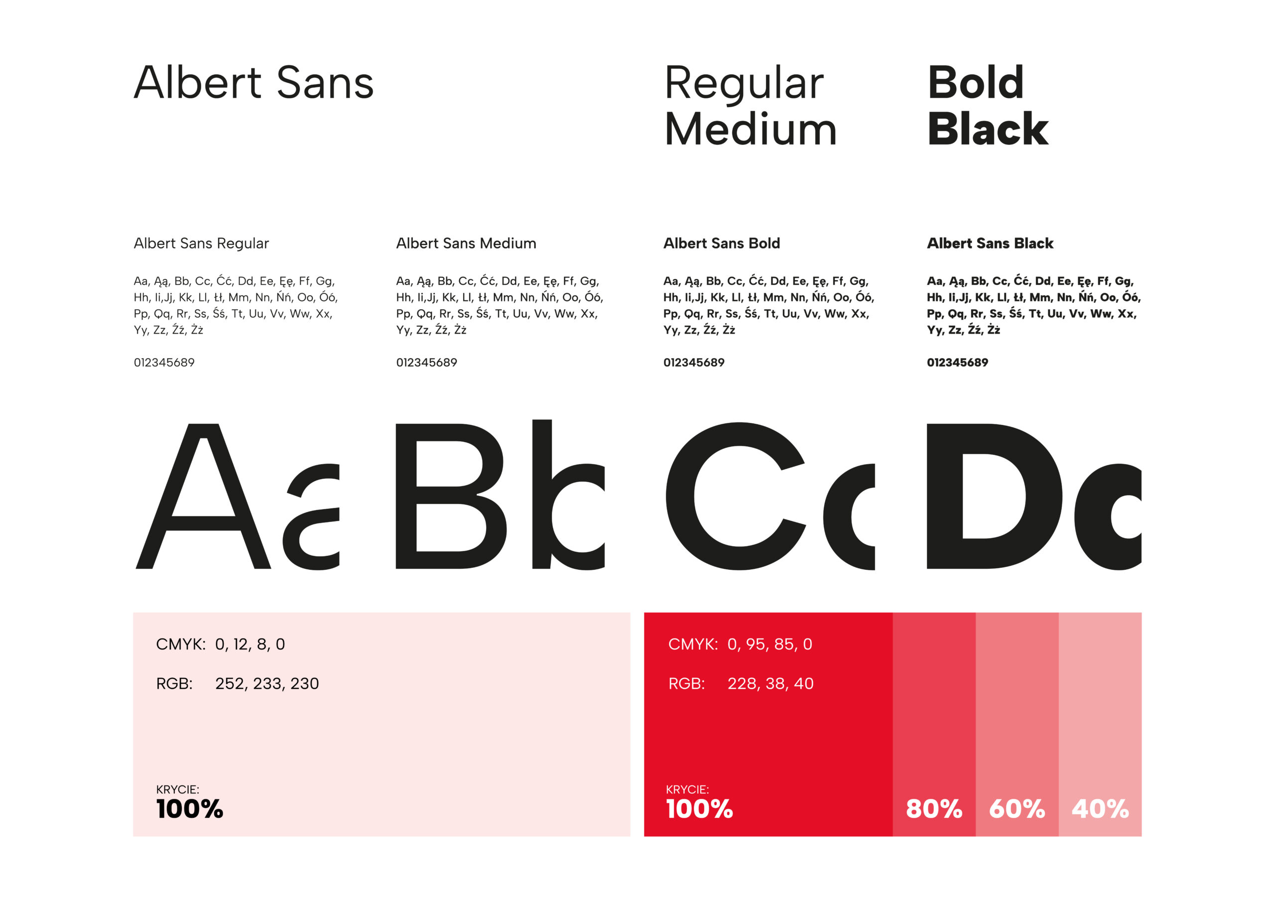
The overall design was kept minimalist and replaced the previous logo – a feminine silhouette and the color purple.
The design, based on 3 main colors, provides greater versatility and design flexibility. It will be perfect for both online and offline channels.
Brand essence:
FEDERA is a foundation that fights for equal and just rights to decide about one’s body and sexual health, and access to information and services related to contraception, abortion, pregnancy and childbirth.
FEDERA is:
Sage:
Intelligent, with expert knowledge, thorough and sharing experience and pertinent advice.
Guardian:
Empathetic, offering care to those around, preventing threats and unfavorable situations.

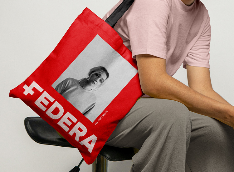
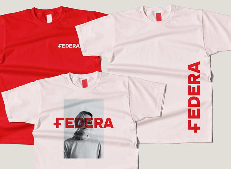
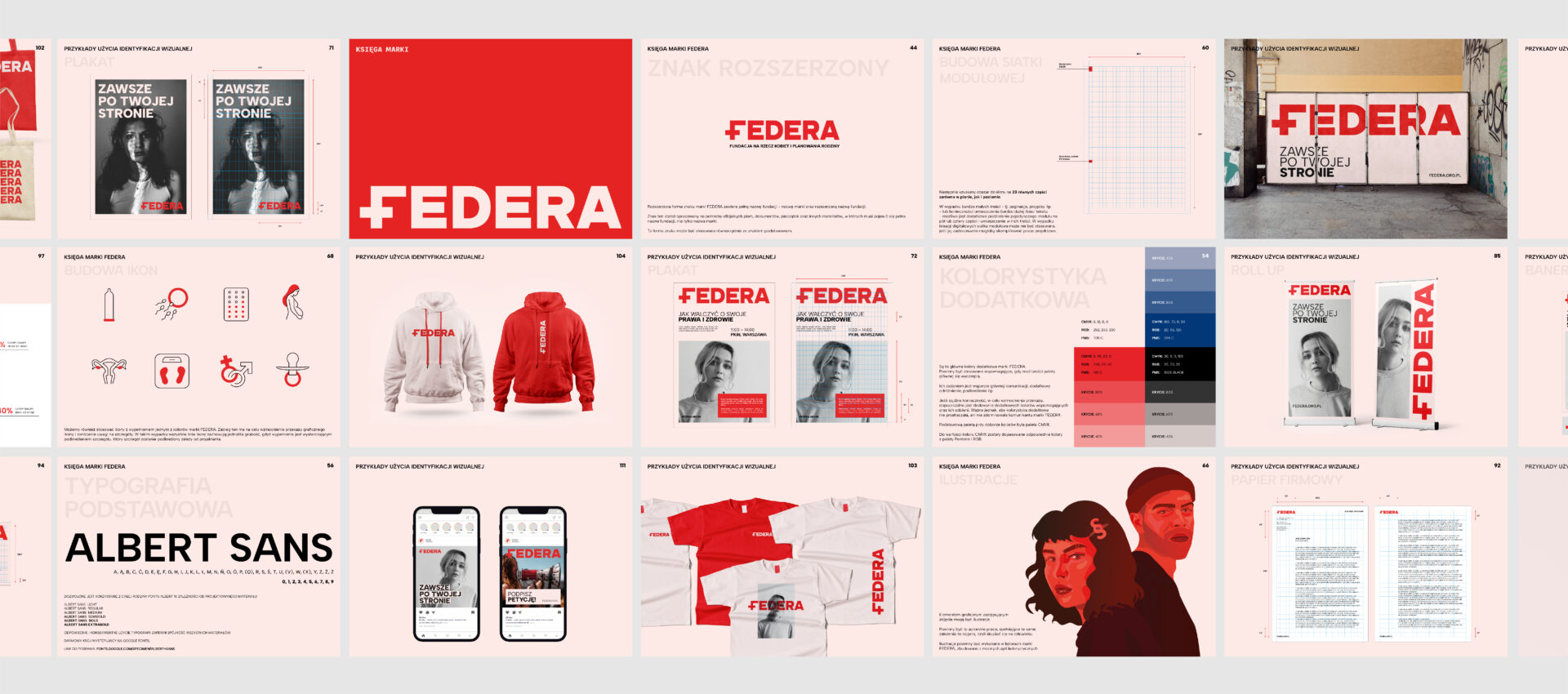
Visual identity
We designed the visual identity to provide flexibility and freedom of action, and to allow more than just designers to work smoothly with the new image.
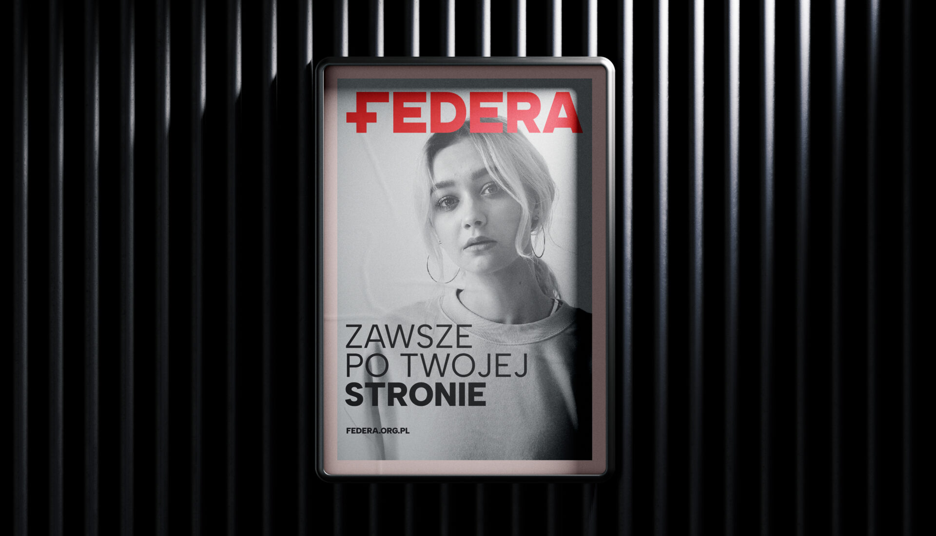
The main role in the visual and verbal identity of the Foundation is to be played by human beings. Human emotions, human problems, actions, dreams and everyday life. Successes and failures.
It is these, human issues that FEDERA is dealing with, and they will be the centerpiece of the brand’s message.
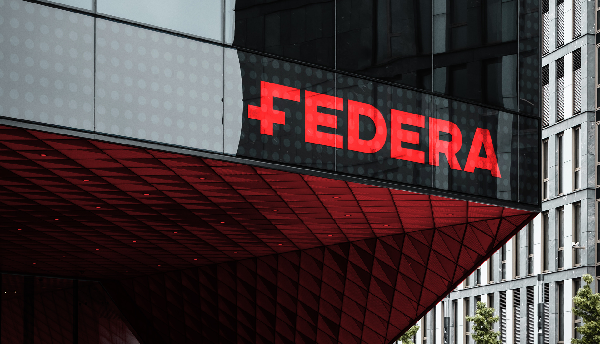
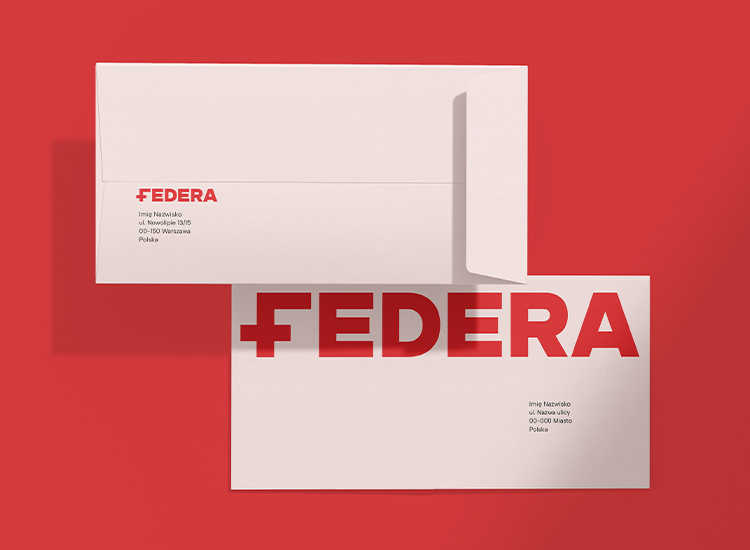
The main color of the brand is strong red – whose main task is to draw attention, stimulate action, inspire. Red, combined with strong typography and emotions expressed in key visuals, are the strength of the brand’s message
A counterbalance to this strong mix is the supporting color – soft pink – a cheerful hue, associated with femininity and care, whose function is to calm communication.
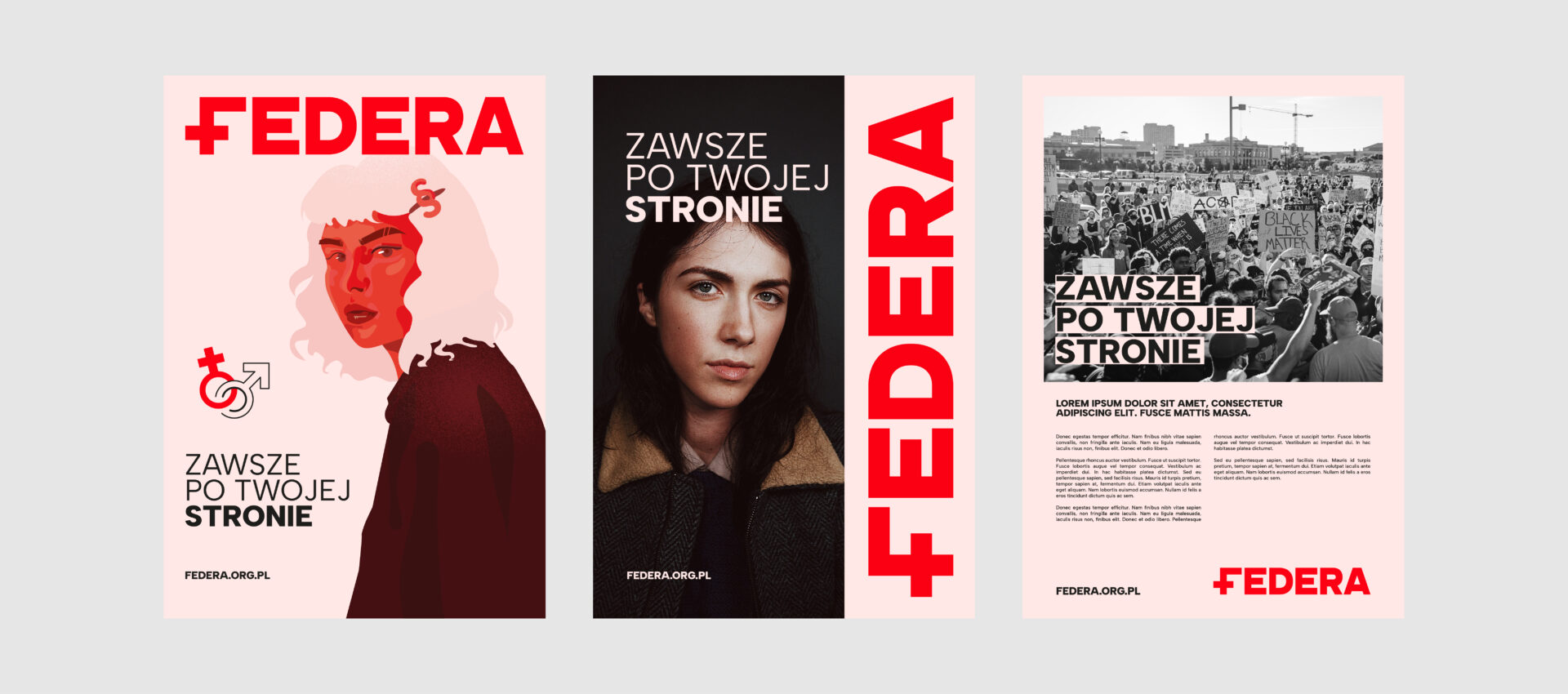
Icons and illustrations
We also developed a customized system of icons and illustrations. They all have a simple, linear and minimalist form. They also have an infill with one of FEDERA’s brand colors – to reinforce the graphic message and draw attention to details.
Offline i Online
The new visual identity system and communication strategy were designed to work well in both the offline and digital spaces. Especially in social media channels, which are one of the main points of contact between the Foundation and its target groups.
Team:
Visual identity – Michał Wyszyński
Communication strategy – Piotr Flis i Piotr Mateńko
Creative supervision – Piotr Flis i Anita Kamila Sochacka
Zakres prac:
Research
Brand audit
Rebranding
Communication strategy
Visual identity
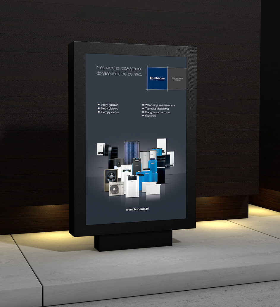
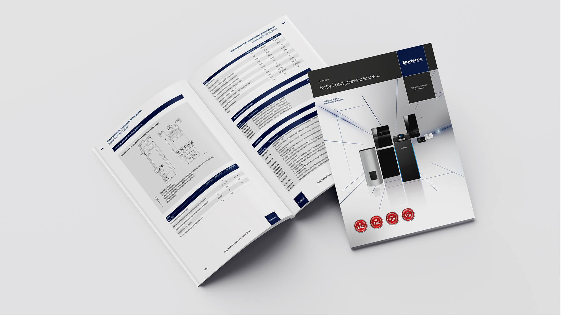
Buderus brand service
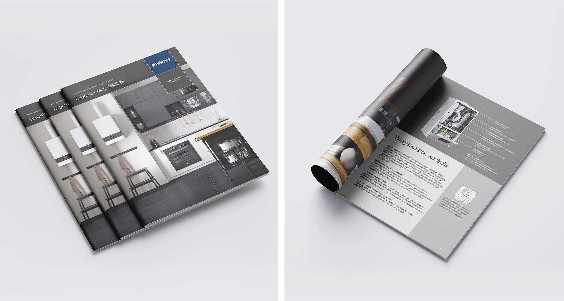
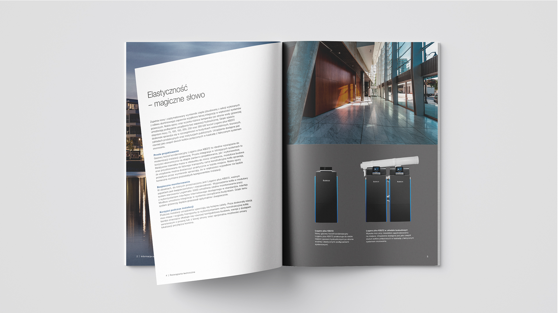
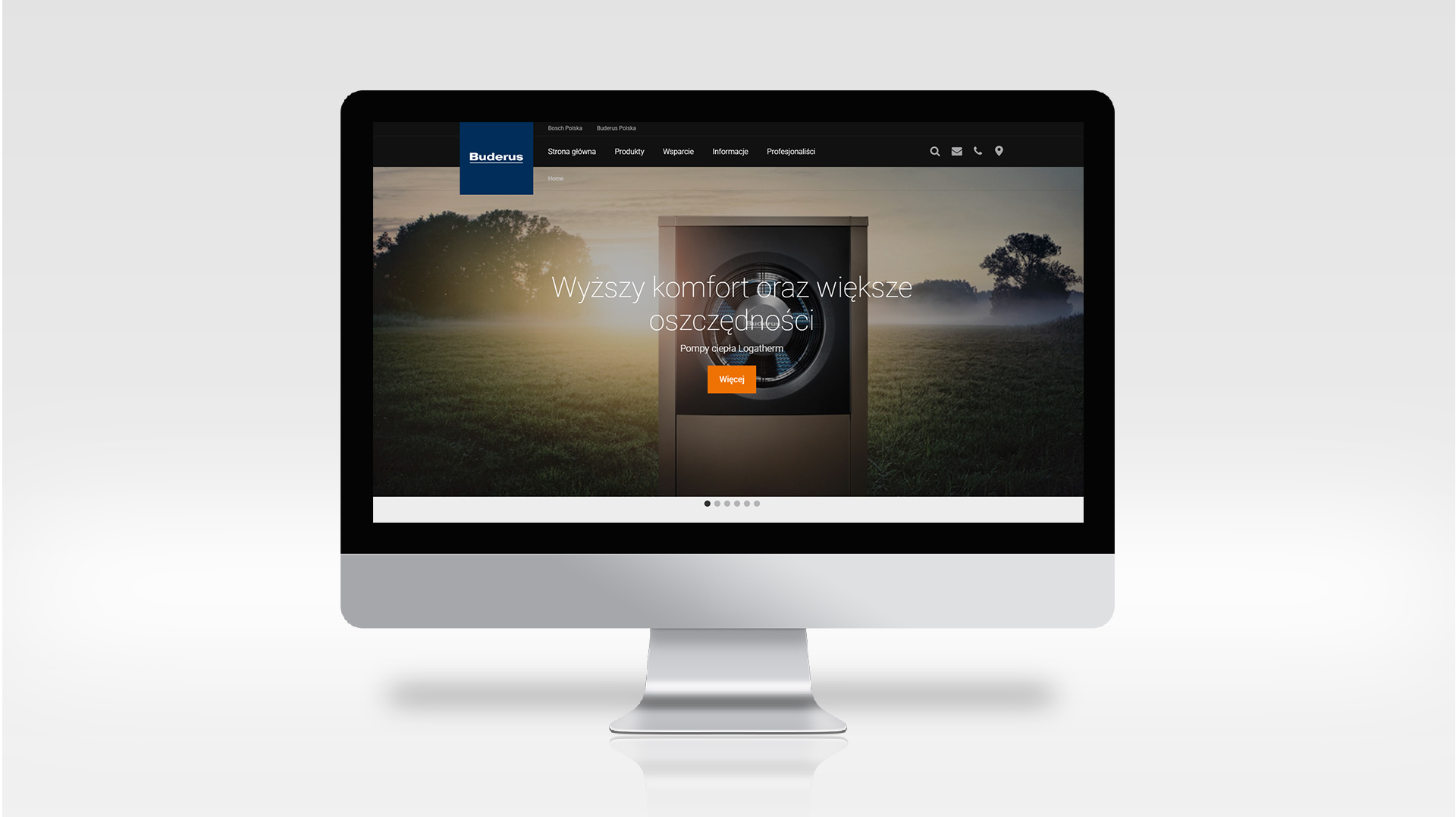
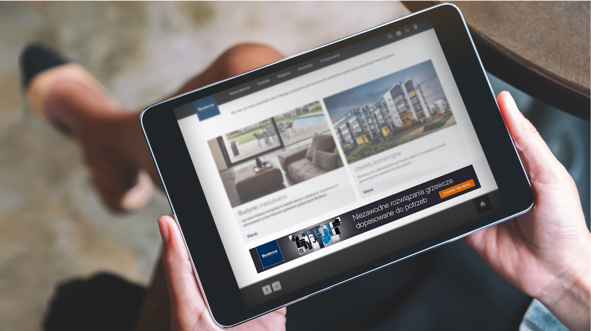
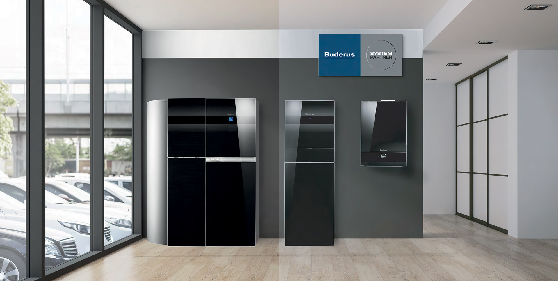
Buderus is one of the world’s largest manufacturers of heating equipment and technology. Since 2002, the company has been part of the structure of Bosch Termotechnik GmbH, Europe’s largest manufacturer of heating systems.
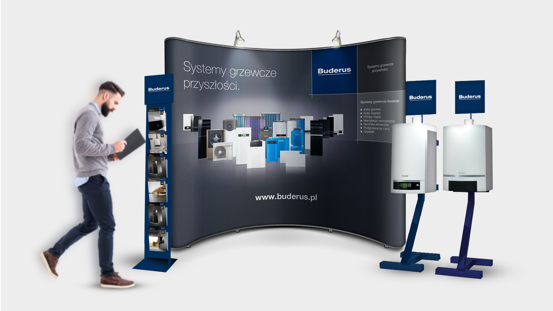
Creative and branding agency Lotna has had the pleasure of providing services to the Buderus brand since 2013. As part of our cooperation with the brand, we are responsible for designing informational, advertising and branding materials.
At Lotna, we supervise the compliance of developed materials with the international Brand Book. We take care of the quality, detail and uniformity of the developed materials.

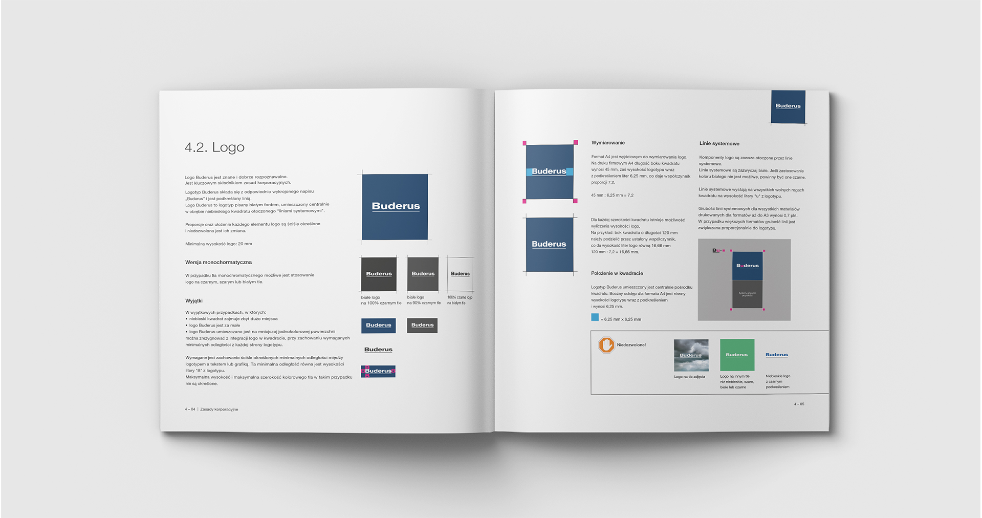
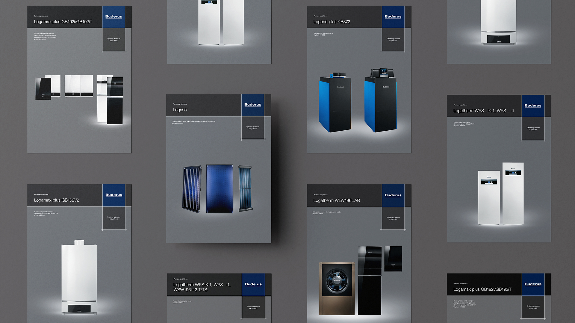
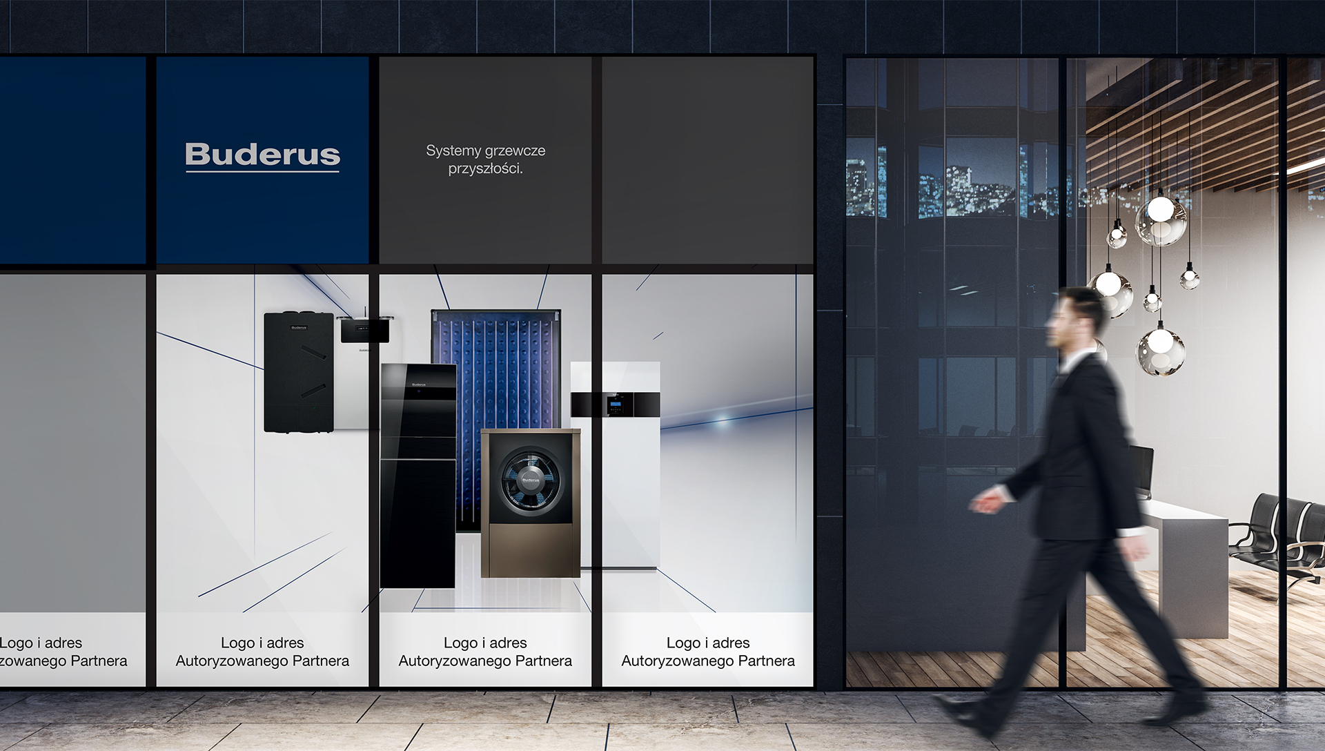
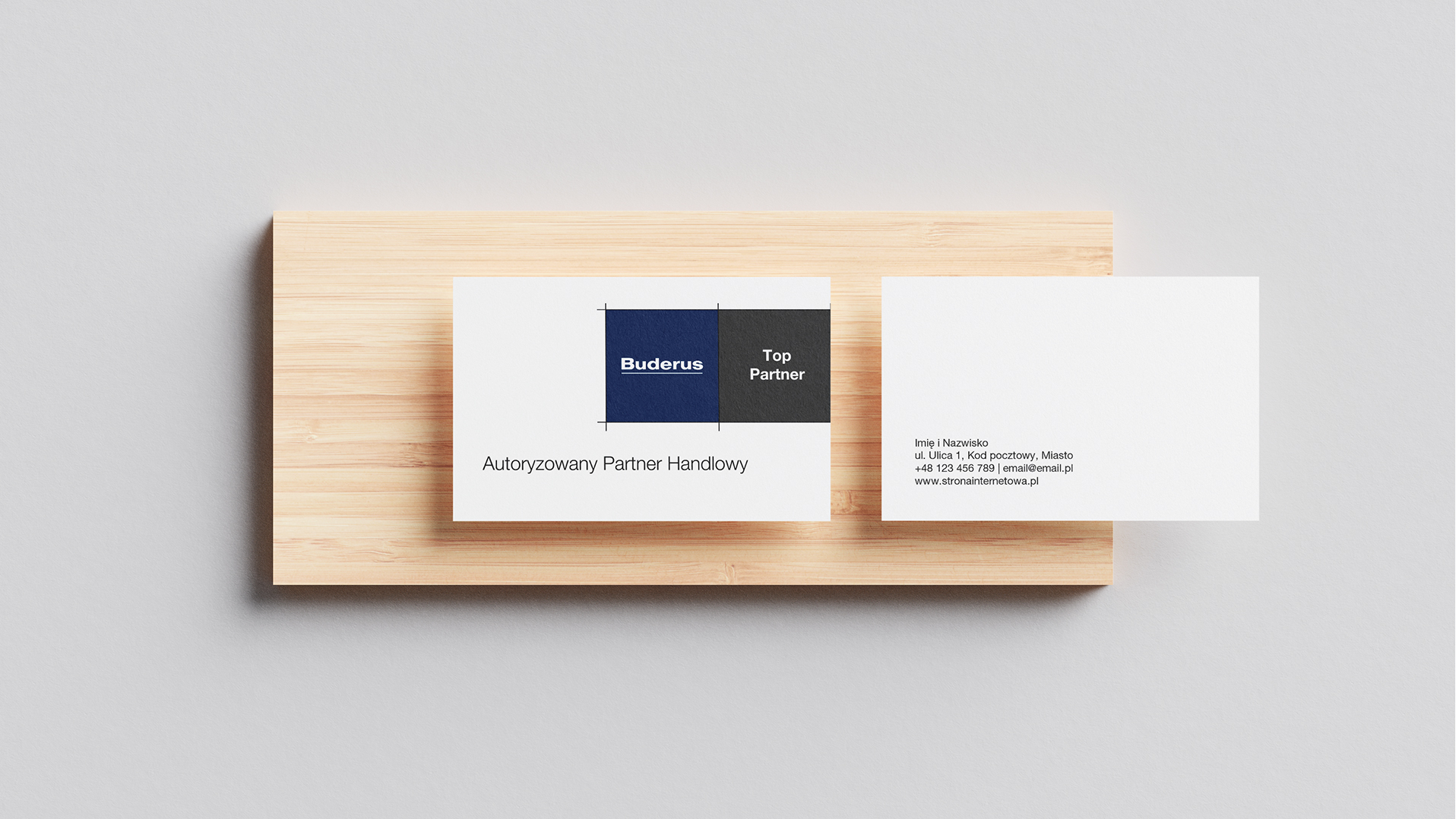
A large part of sales of the brand’s products, is carried out through Authorized Representatives.
In order to make their work easier and ensure brand uniformity at all points of contact with the consumer, we have developed a Brandbook for Authorized Representatives of the brand, which brings together all the key principles and rules of visual and verbal communication.
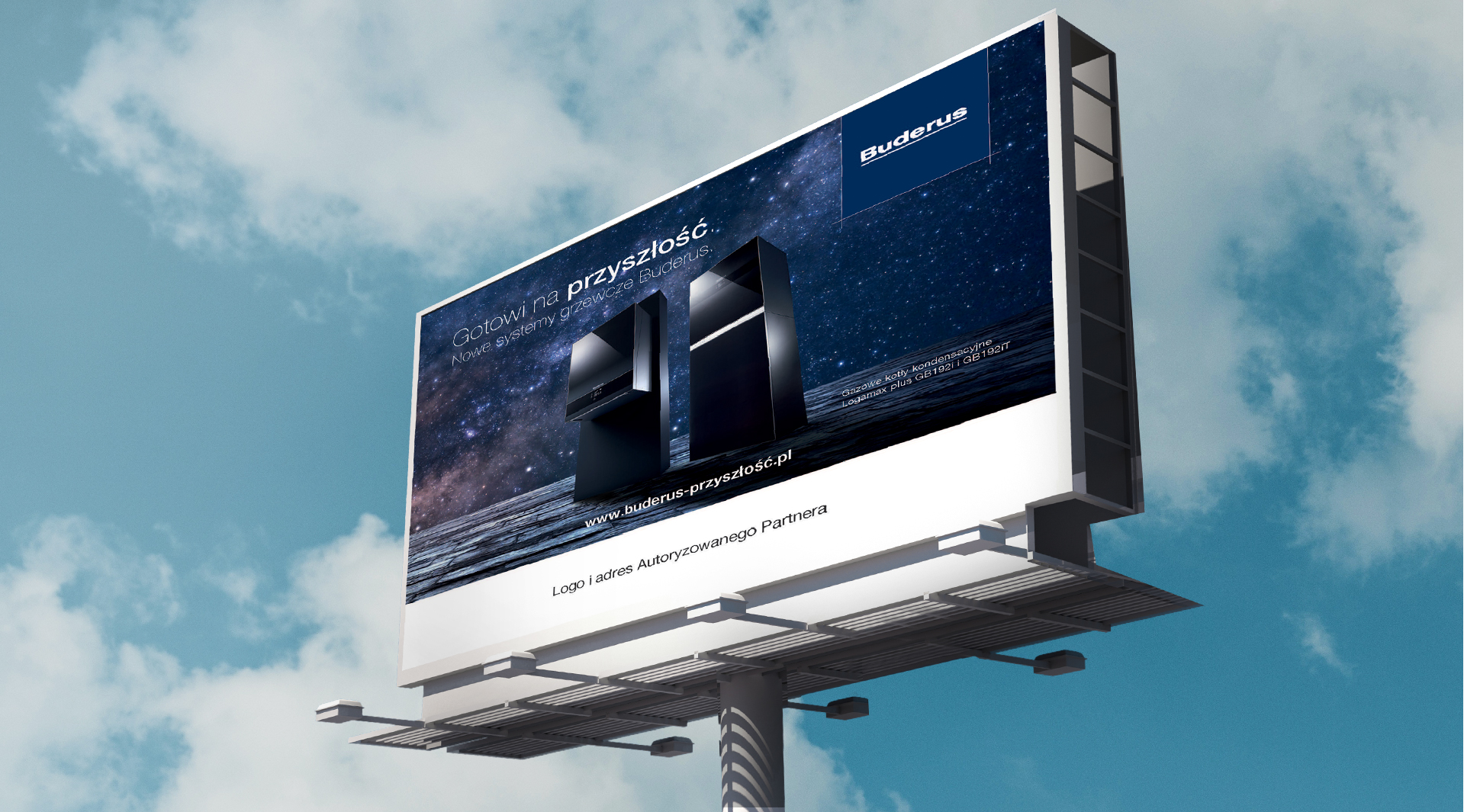
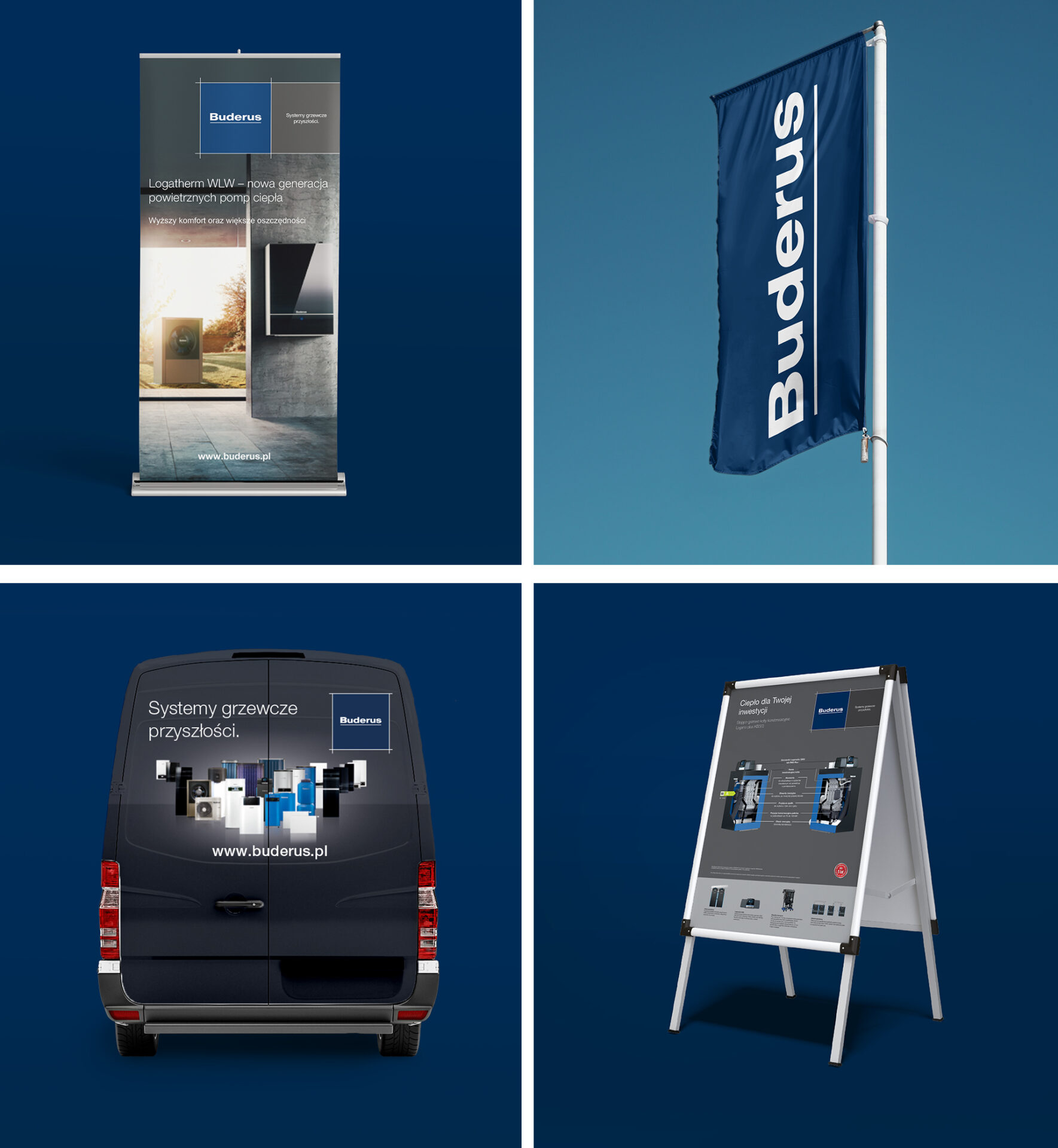
Over the years of work, we have managed to produce a number of advertising, informational and technical materials, i.e:
– 20 catalogues
– 60 leaflets
– 6 price list updated annually
– folders
– rollups
– posters
– exhibition walls
– banners
– billboards
– vehicle wraps
– stands
– gadgets
– 4 brandbooks
– icons
– products and lifestyle pictures
– packaging
– Google Ads i Medta Ads artwork
– press campaigns

Team:
Service – Anita Kamila Sochaka i Piotr Flis
Implementation – Creative Team i DTP
Scope of work:
Campaigns
Folders
Catalogues
Price lists
Iconography
Brand Books
OOH
Digital
Creative services
for the Cemex brand
CEMEX is a leading producer of construction materials, focused on four core manufacturing activities – cement, ready-mix concrete, aggregates and urbanization solutions.
We are pleased to work with the company providing a wide range of services – from designing offline and online materials, to creative ideas for POS materials. Below are some sample projects.
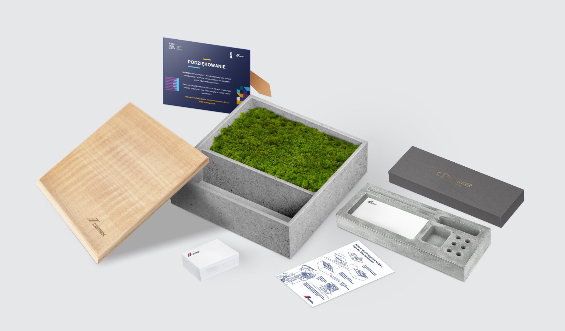
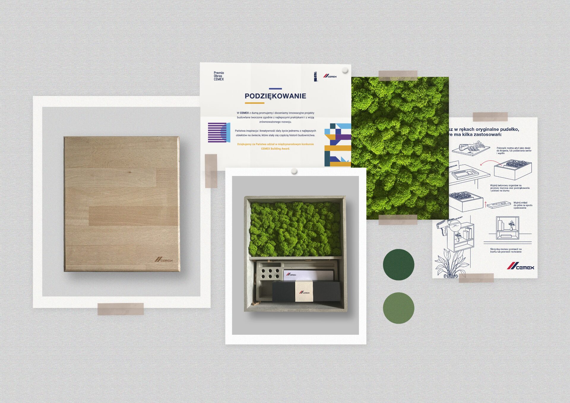
A creative thank you box for Cemex brand customers for their long-term cooperation. The box is made of concrete, inside on a moss lining is an elegant pen and goodies with the brand logo. In addition, a concrete stand for office supplies is placed.
The whole project was custom-made for the Cemex brand.
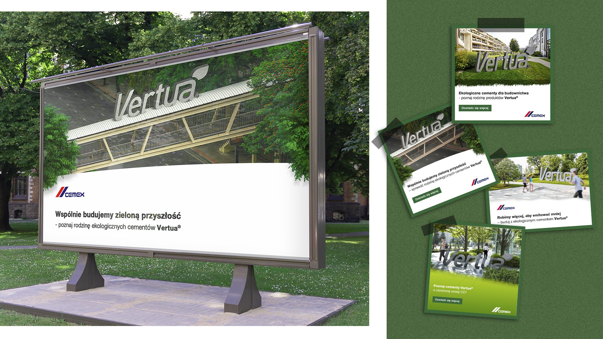
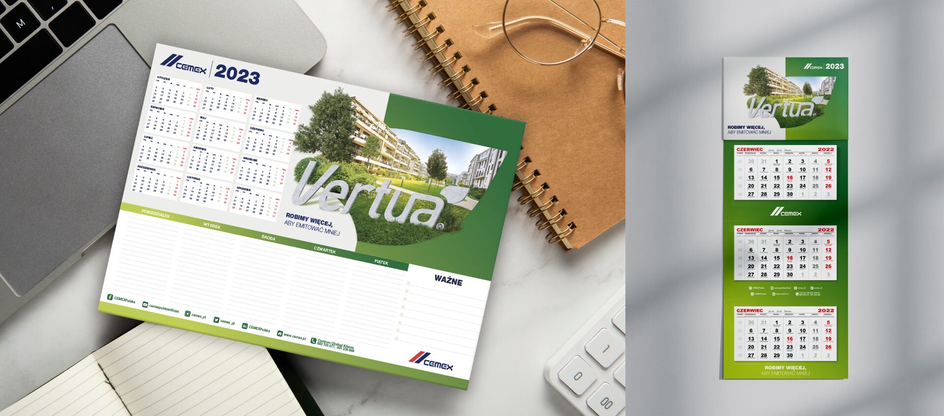
Vertua ecological cements, is one of the brand’s top products.
We implemented campaigns for this product, made an animation showing its pro-environmental performance, and designed visual materials to promote the brand.
Team:
Client service – Anita Kamila Sochacka i Piotr Flis
Design – Creative and DTP team
Scope of work:
Advertising campaigns
Animations
Social media
Gifting
Digital
Packaging designs for cosmetics
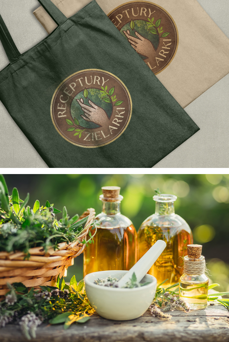
Receptury Zielarki
Receptury Zielarki is a novelty on the Polish cosmetics market introduced by Eurus, a leading distributor. We have created projects for the brand including a logotype, packaging for as many as 20 products and an accompanying brand hero.

Bottles and labels
We created packaging designs for 20 products in 2 series: Field Treasures and Home Traditions. The background, and the element that first catches the eye, are engravings depicting fields, herbs and plants characteristic of rural and forest surroundings.
Rich in color, symbolizing nature and the natural character of the products. Each background has dedicated illustrations of plants.
The backgrounds are inscribed with centrally located beige appliques, which contain the most important information: about the cosmetic line, the product, its use, composition and the drawing that symbolizes the latter element.
Also included in the design are gilded icons, which, with their brilliance, further draw the attention of consumers, and also highlight the most important features of the cosmetic.
In addition, the gilding on the sides of the labels emphasizes the high percentage of ingredients of natural origin, further reinforcing the message of naturalness.
The next design step was the design of the logotype. It is a combination of three elements – a hand, a mortar and nature.
The first element, placed in a central position, shows the tradition and even artisanal nature of the products. It’s an emphasis on the fact that the cosmetics are based on proven recipes that come from nature and the secret knowledge of herbs, not from the impersonal, cold and sterile atmosphere of cosmetic laboratories. The hand is inscribed in a circle taken from the rim of a mortar – another symbol of tradition and herbal and cosmetic craftsmanship.
The whole is complemented by the symbol of herbs and leaves symbolizing nature and its closeness to man. The logotype was designed in a style reminiscent of historical signs – one has the impression that the design is “painted” on wood. The sign, with its style, is reminiscent of pre-war cosmetics and pomade stores, where quality, tradition and naturalness were inextricably linked.
During the work, we analyzed the brand and defined its vision. Herbalist’s Recipes is a symbol of tradition, a return to the roots and, at the same time, a philosophy of life behind the products. Intergenerational transmission of knowledge about herbs and their properties, symbiotic coexistence with nature and taking the best from it, slow-life philosophy, thanks to which one can seek respite from the daily rush of life – all this contributes to the properties of cosmetics under the banner of Receptury Zielarki.
Anita Kamila Sochacka – Managing Director
Brand Hero
Herbalist Agatha
Knowing the values behind the brand and already having the bottle and logo designs, we were able to create a brand hero design – a character that would not only embody the individual products, but also represent the lifestyle and promises the brand makes.
Thus, the Agatha Herbalist was created. A doyenne characterized by life wisdom and experience. Over the years, accumulating knowledge of the secrets of nature and combining its elements so as to discover the recipe for the beauty of the body and hair.
Patient, with a nurturing nature, drawing from her experiences and eager to share the knowledge she has. Years of traveling and learning about other cultures, traditions and rituals allow her to be described as an expert without a shadow of a doubt.
Despite her age, she still retains verve and spark in her outlook. Constantly curious about the world and discovering new connections rooted in tradition and nature.


Team:
Visual identity – Aleksandra Luboch
Creative supervision – Anita Kamila Sochacka i Sylwia Dudzińska
Scope of work:
Packaging designs
Packaging
Visual identity
Brand Hero
Golden Rose – campaign “Play with colors”
Golden Rose is one of the leading manufacturers in the cosmetics and makeup products market. It has been active in the beauty industry for years. The brand has recently created a promotional campaign “Play with colors” for a new series of color cosmetics. We prepared the graphic design of the influencer and sales campaign – offline as well as online.
As part of the work, we created gift boxes that were sent out to dozens of leading influencers in the beauty industry. In parallel with the influencer campaign, a digital campaign was launched, focused on the brand’s social media. For its purposes, we created a number of graphic creations that promoted the image and sales action of the cosmetics.
Complementing everything was an offline campaign – in hundreds of drugstores in Poland. Installed in them were graphic materials created by Lotna, which had one task: to stand out from the competition and attract the attention of female customers of the stores. We came out sensationally!

Zespół:
Graphic creation: Urszula Małyszko, Aleksandra Luboch
Creative Supervision: Sylwia Dudzińska
