Branding for new cosmetics series by Vis Plantis&Loton Cosmetics
Branding for new
cosmetics series
by Vis Plantis&Loton Cosmetics
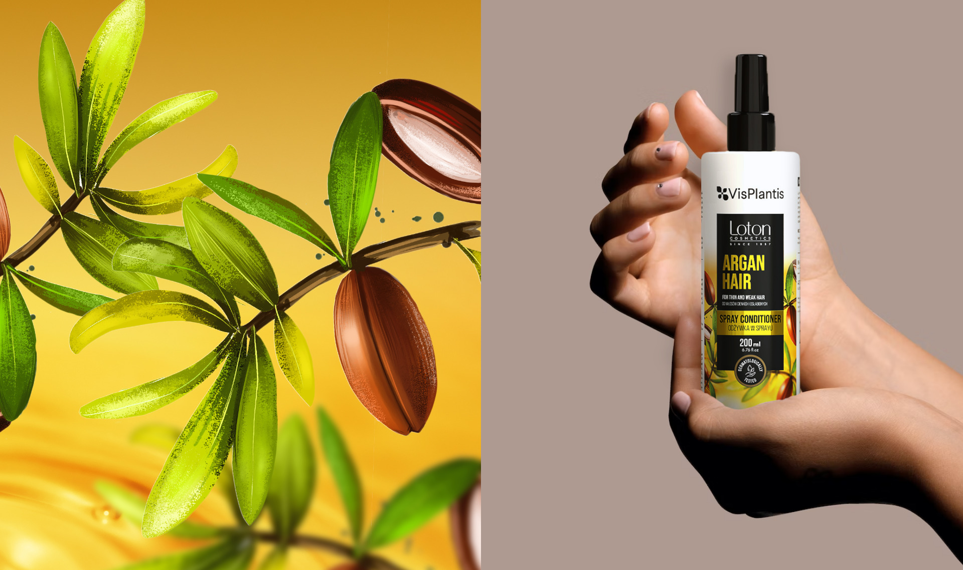
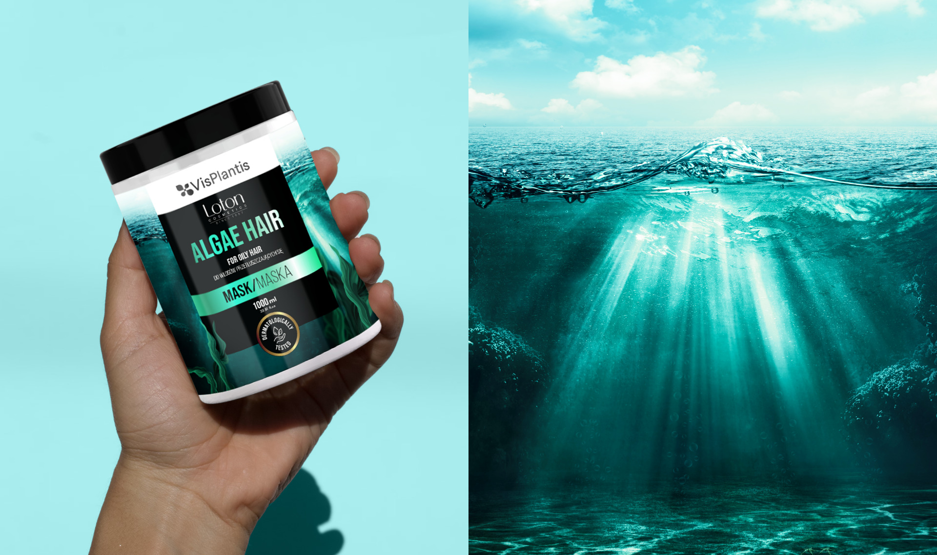
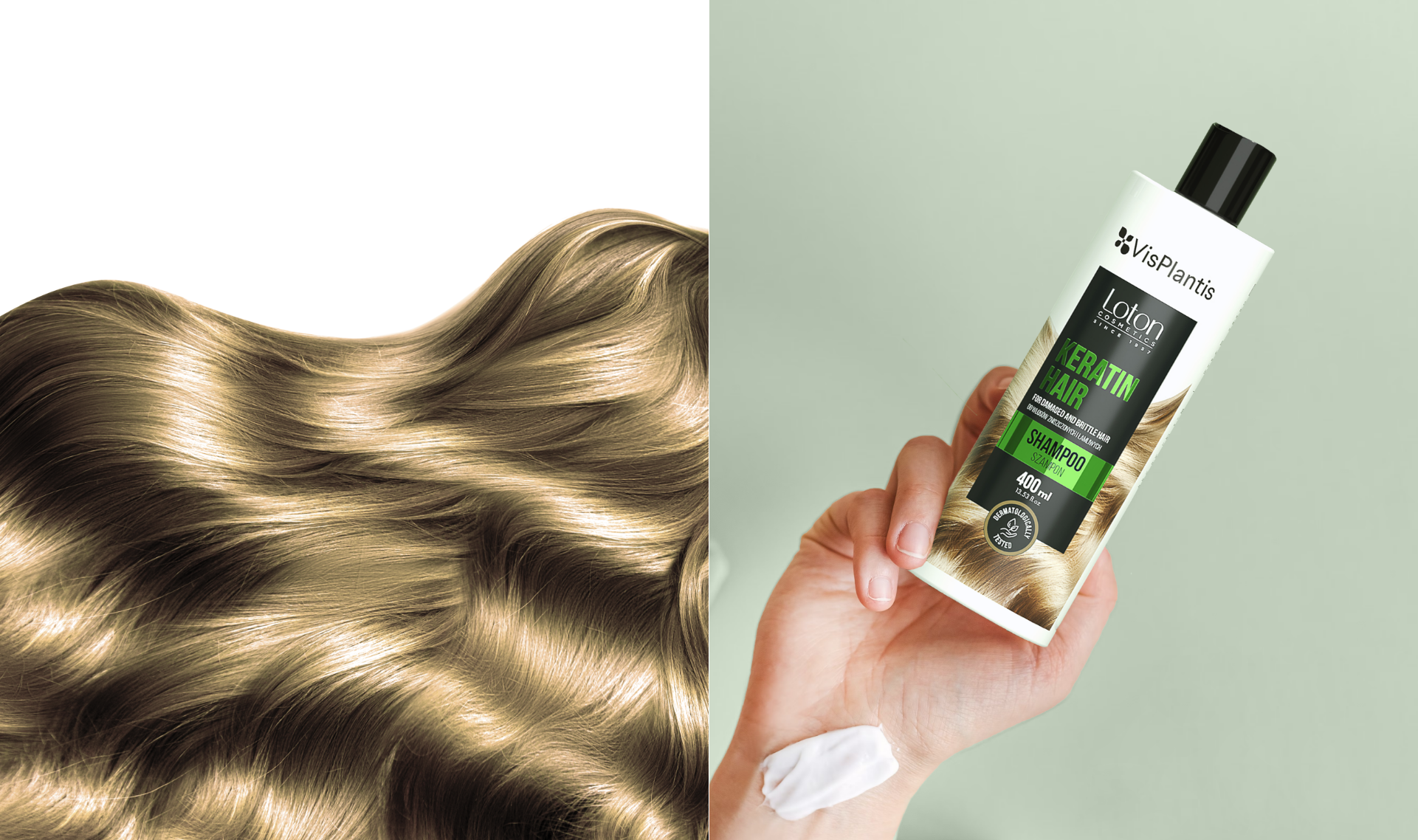
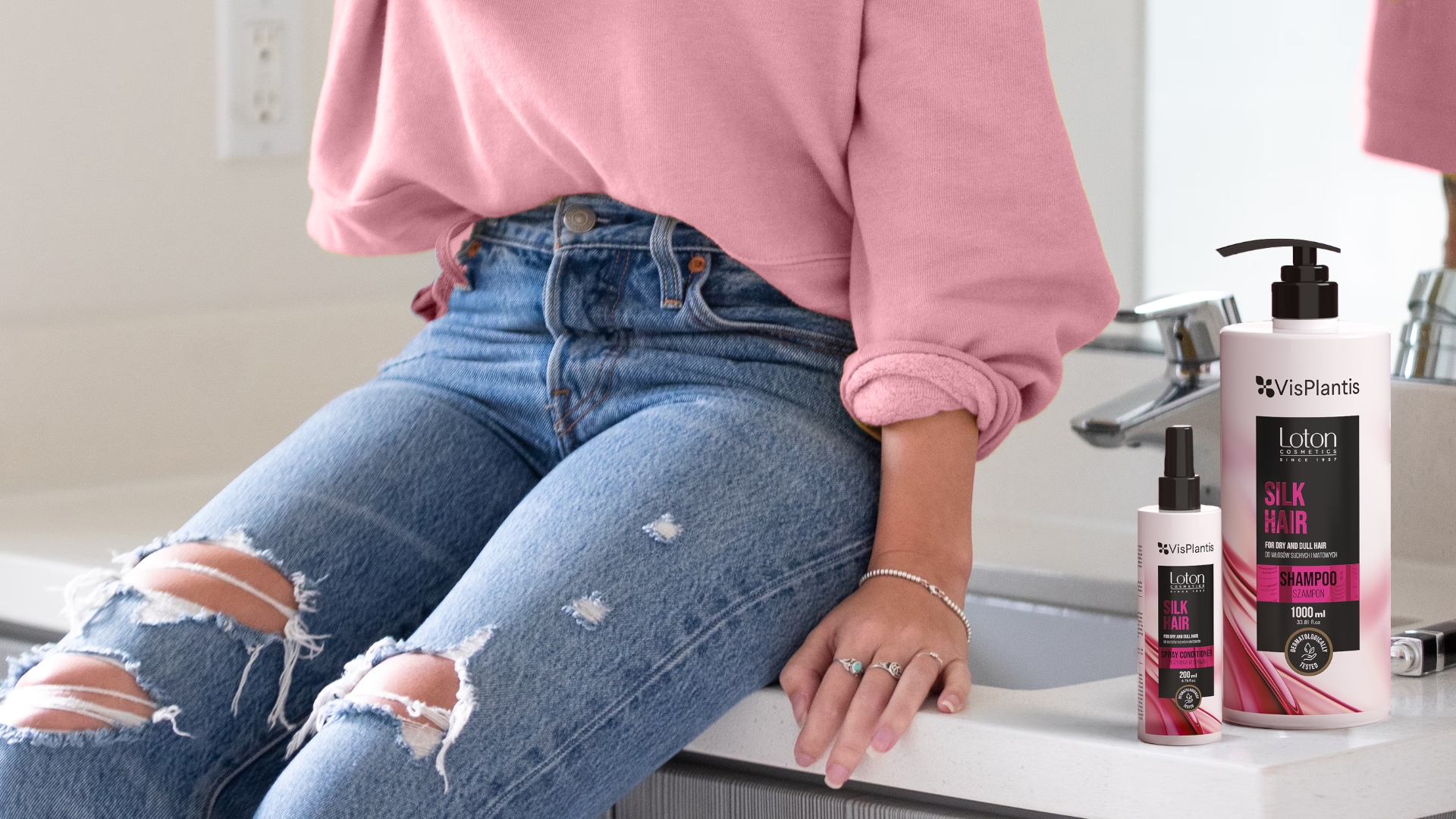
Vis Plantis is a Polish cosmetics brand founded by Elfa Pharm. It has been supplying the market with high-quality products for hair, face and body care for many years. In cooperation with Loton Cosmetics, the brand has created 4 new lines of cosmetics for hair care. As part of the order, we developed creative concepts for branding for all packaging, creating a total of as many as 20 labels.
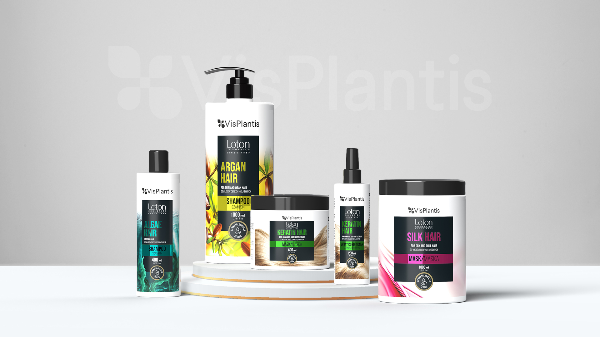
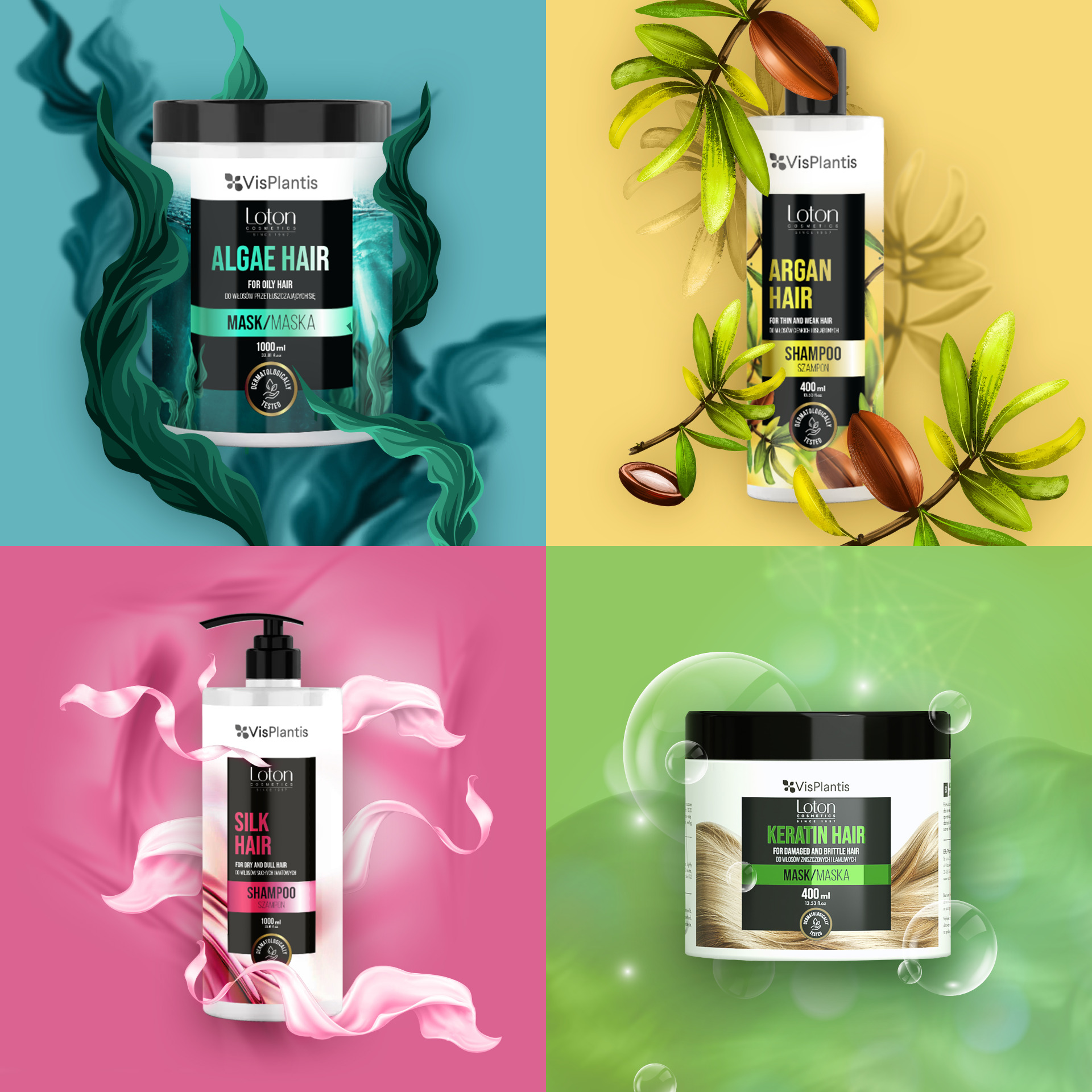
Our goal was to make the characteristics of the products as prominent as possible. Thus, we relied on clear and eye-catching photos of the ingredients that were used in the 4 hair product series:.
- oily with algae
- dry and dull with silk
- thin and weakened with argan oil
- damaged and brittle with creatine
In order to best represent the use of the products, we also used colorful appliques on which we placed key information, using clear typography. Increased readability and clear layout allow the consumer to quickly identify the products and choose the right ones for their needs. The whole was complemented with enhancement elements – including light-reflecting metallics, giving an interesting and eye-catching effect on store shelves.
Team:
Graphic design: Aleksandra Luboch
Creative Supervision: Sylwia Dudzińska
Branding of the new line
of Hellena brand
carbonated beverages
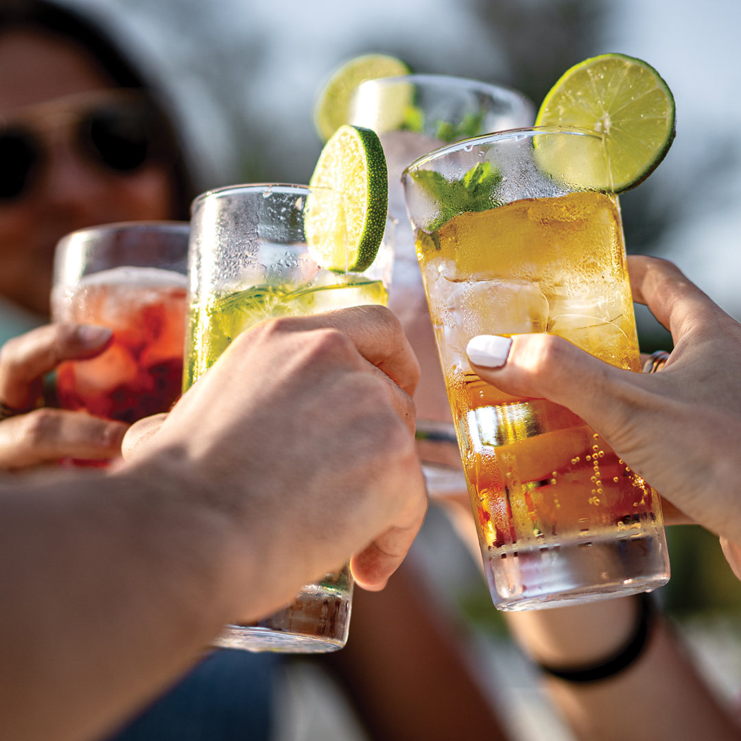
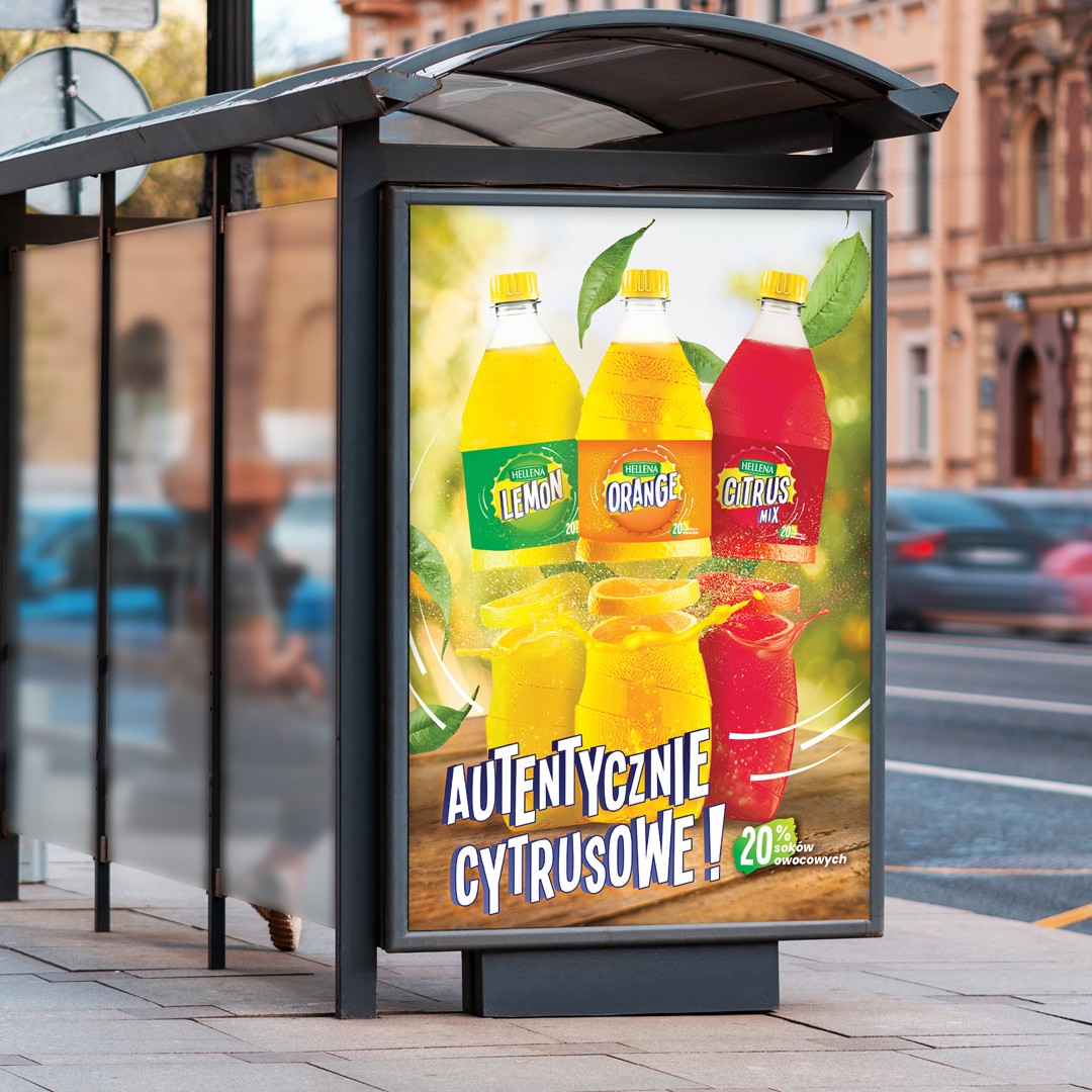
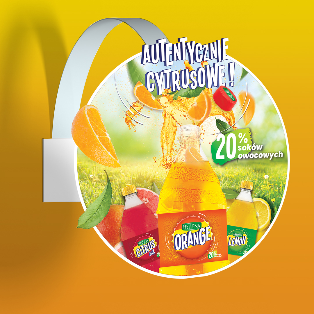
For the Hellena brand – one of the largest in the Polish beverage market – we created branding for a new line of carbonated beverages, consisting of three flavor variants – Orange, Lemon and Citrus Mix. All versions have been given a unique, fruity label using the brand’s characteristic orangish cap. The new products are promoted with the slogan “Authentically Citrus”, as they surprise with their authentic citrus flavor. With 20% fruit juice content and very good carbonation, they intensify the impression of crisp refreshment and effectively quench thirst on warm days.

It is these qualities that we have highlighted in our designs – so as to visually emphasize and reflect the authenticity of flavor translated into the unique citrus composition of the products. Just as the drinks are infused with the flavor of the fruit juices, we designed the labels using vibrant colors, embedded in a modern design.
The graphics of the labels refer to the brand’s flagship product – Oranżada Hellena. In the central part was placed the characteristic cap in the version with a color distinction of the flavor. Appropriately chosen typeface, describing citrus variants, gives the project dynamism and modernity. An integral part of the cap – the logo of the Hellena brand – emphasizes the product’s belonging to the Polish brand and allows it to be permanently rooted in the consumer’s consciousness. Also present in the graphic communication of the line of carbonated beverages are juicy fruits – elements shaped to be associated with juiciness and what is essential of new products – fruitiness.
The exotic character is reflected in the modern design of the bottle, which is entwined with orange peel. The decoration refers to the citrus flavor of the drinks and accentuates the uniqueness of the new products. The specially designed design makes the bottle unique on the market. The capacity is 1.5 l.
The author of the creative idea and design is Katarzyna Loboda-Karki.
.Creative supervision on the project was provided by Anita Kamila Sochacka.
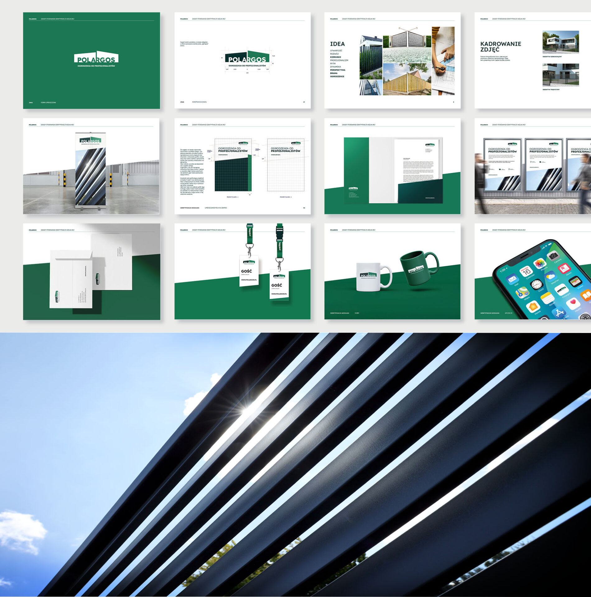
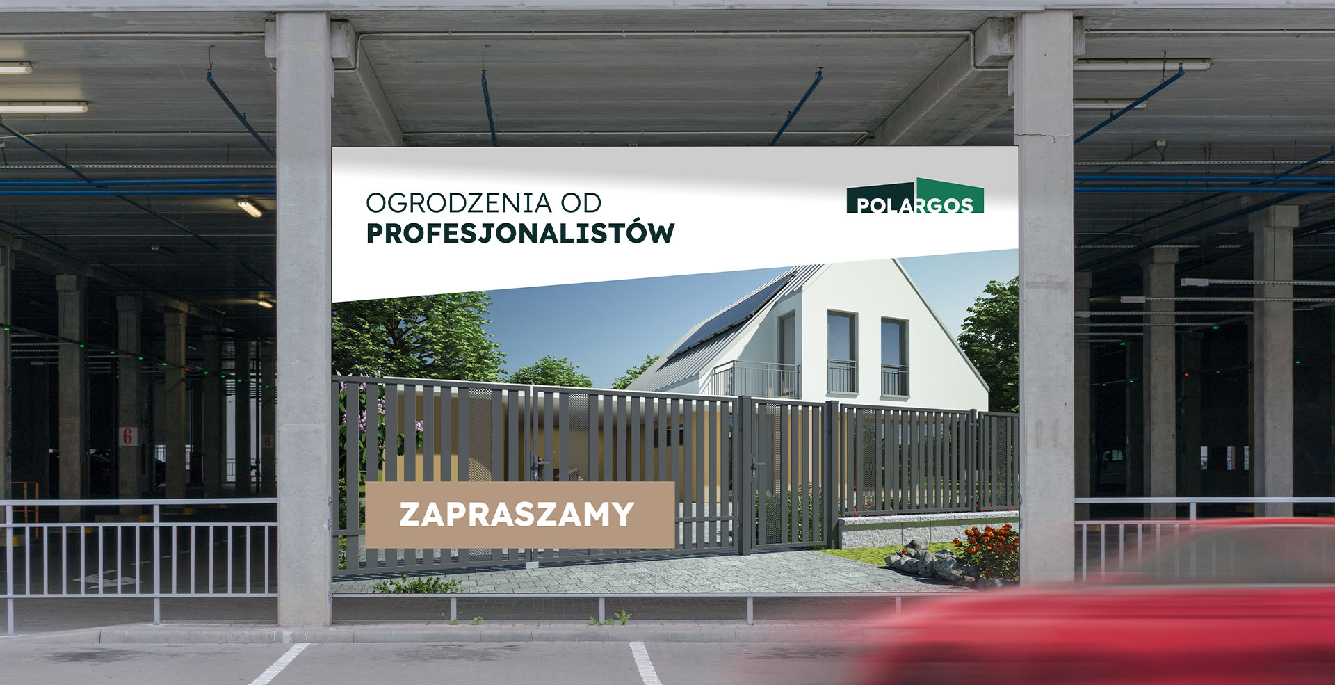
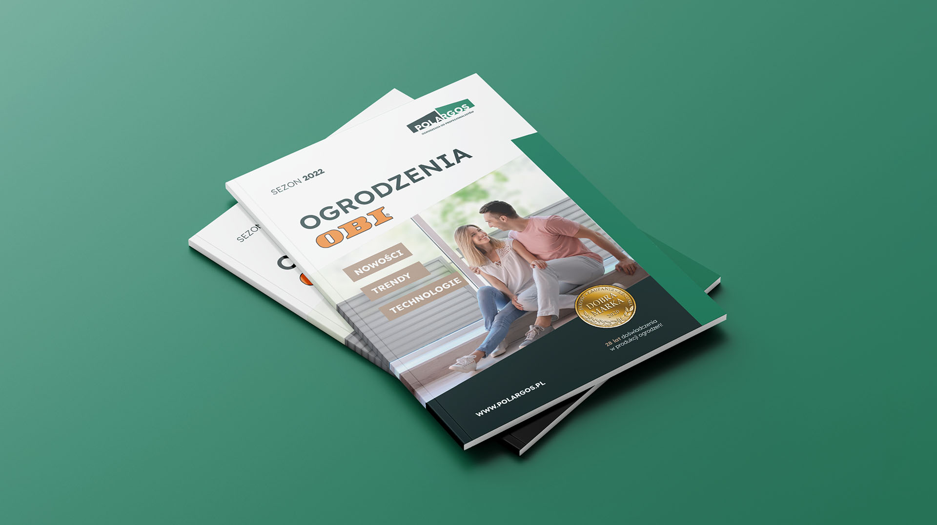
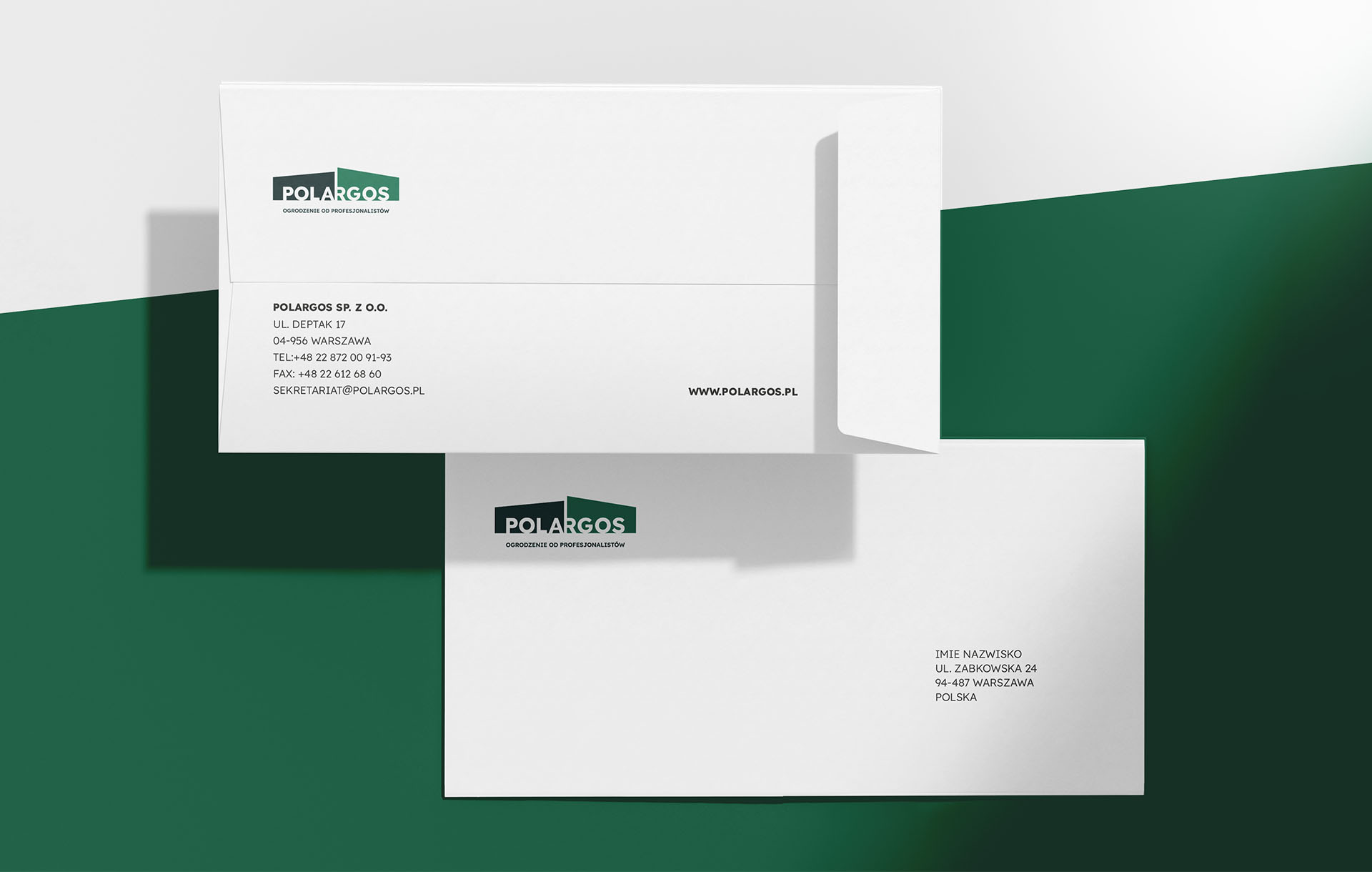
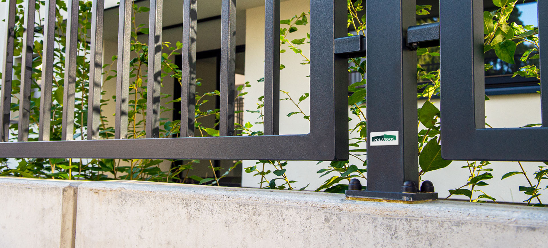
Communication strategy and rebranding of the Polargos brand
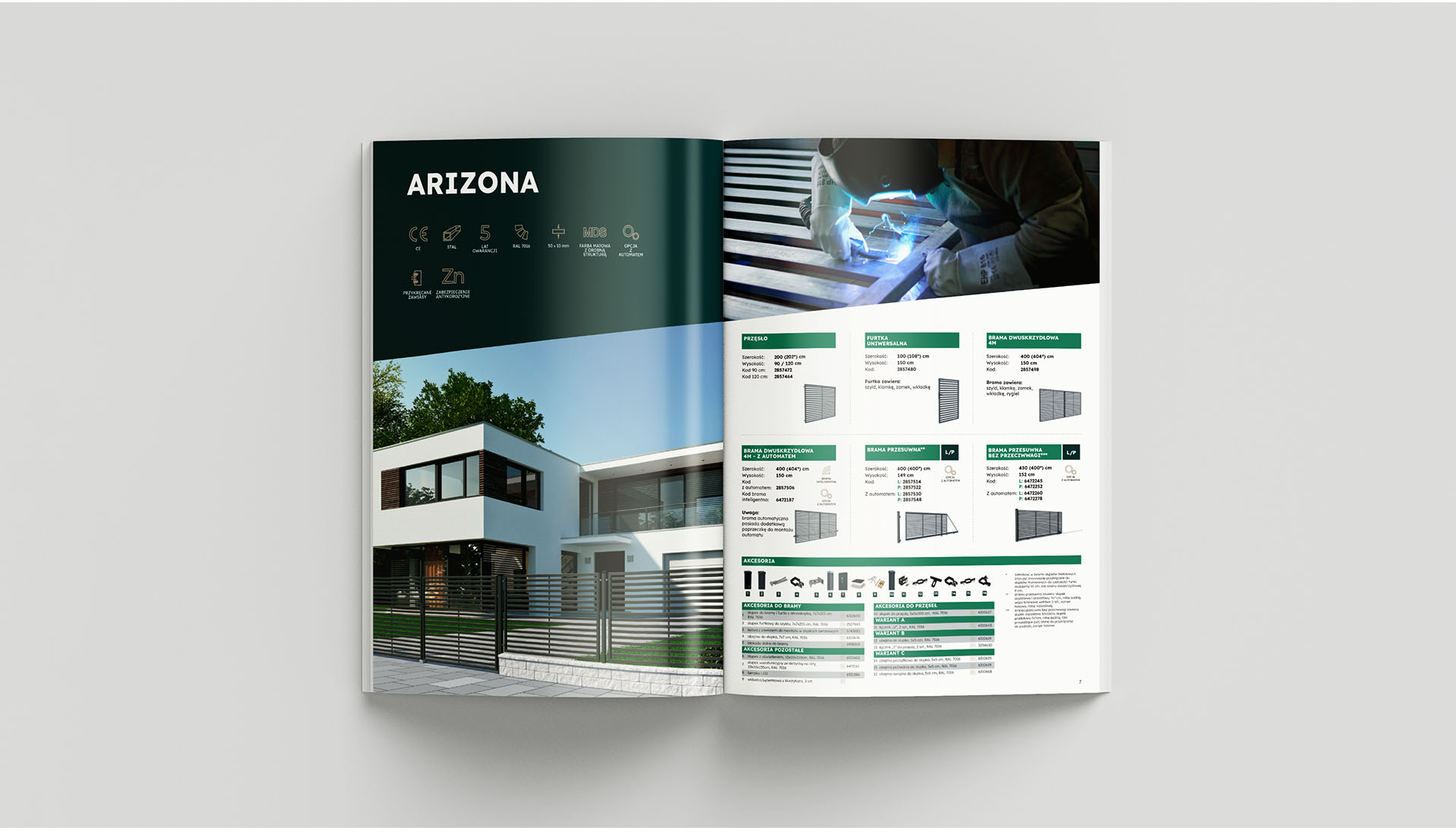
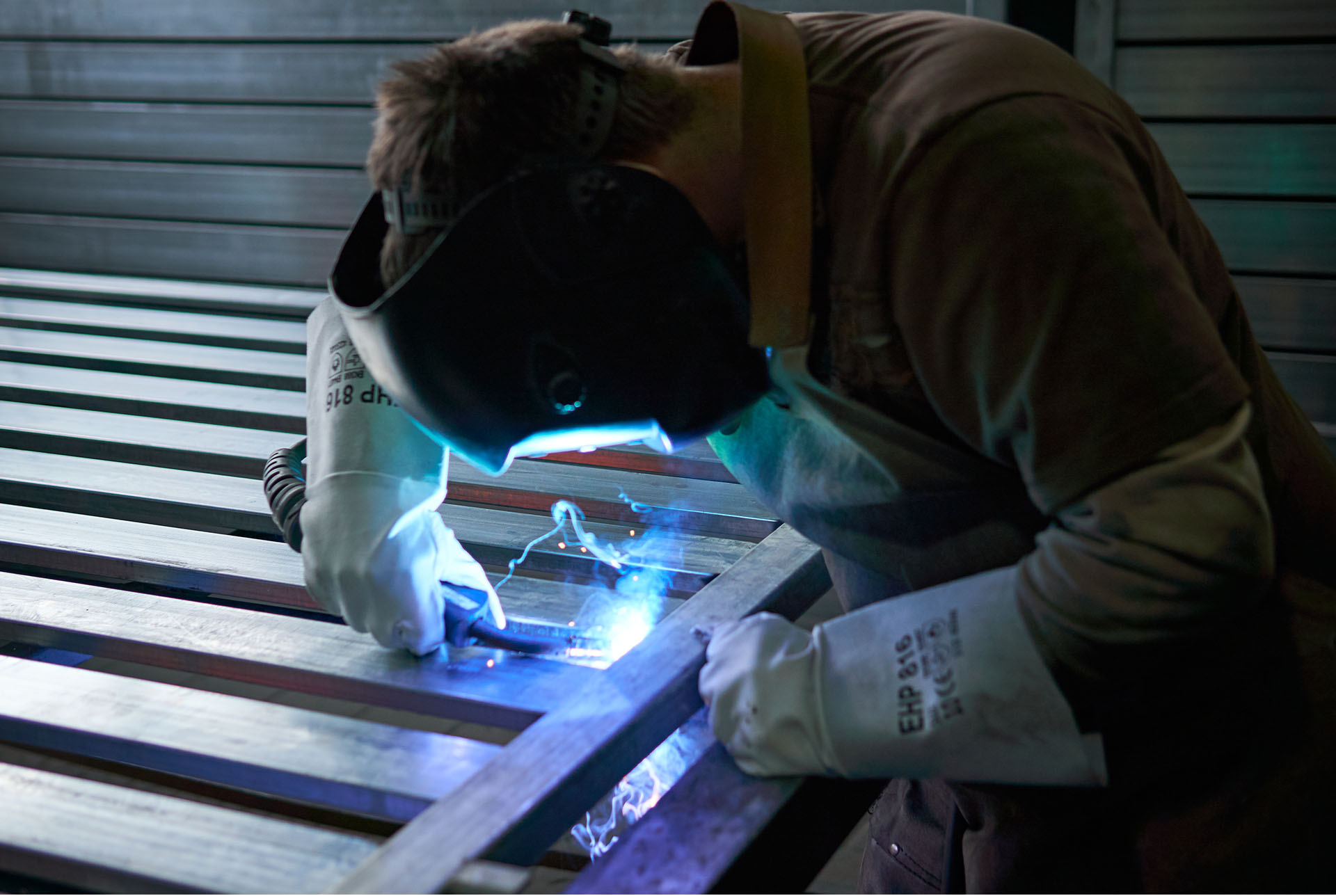
Polargos is one of Poland’s largest manufacturers of gates and fences. The products created in the company’s factories are sold not only to the domestic market, but also successfully conquer foreign markets. As part of its continuous development – both on the product and marketing levels – the company underwent a thorough rebranding, gaining a new logo, visual identity and communication strategy.
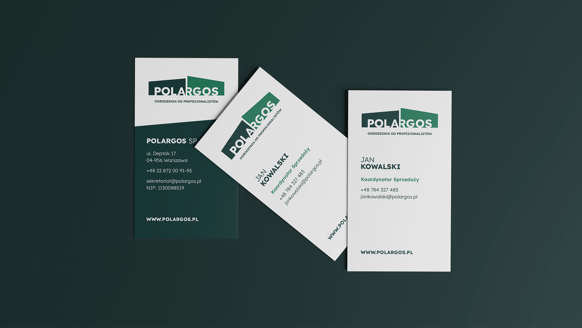
The first stage of cooperation was the supervision of the company’s rebranding. We created a new visual identity, which from the beginning of 2022 is consistently implemented on all communication channels. All this is based on the developed communication strategy, which we also created for the brand.
The sign we designed closely corresponds to the nature of the company’s business. It consists of a two-element signet, which is a metaphorical representation of an open gate, and the brand name inscribed in the very center. The whole is accompanied by a claim: Fences from professionals.
The claim is a creative development of the strategy developed at the agency – Polargos products are placed in the DIY segment, making them easy to install even by laymen. The individual components have been created so professionally and functionally that you don’t need a bunch of experts and professionals to be able to install the fencing systems – a little neighborly help is enough for that.
The new Polargos logo, as a whole, is a symbol of openness to new solutions, technologies, people, trends, and an attempt to show directly the company’s area of activity. The slant used in the new visual identity is an emphasis on dynamism in action, achieving goals and setting the direction of development for the entire fencing market.
The color scheme used is a kind of identity bridge between the old and new identities. Green has been with Polargos from the very beginning, it is the company’s signature color that distinguishes it from the competition, which is why it has remained unchanged.
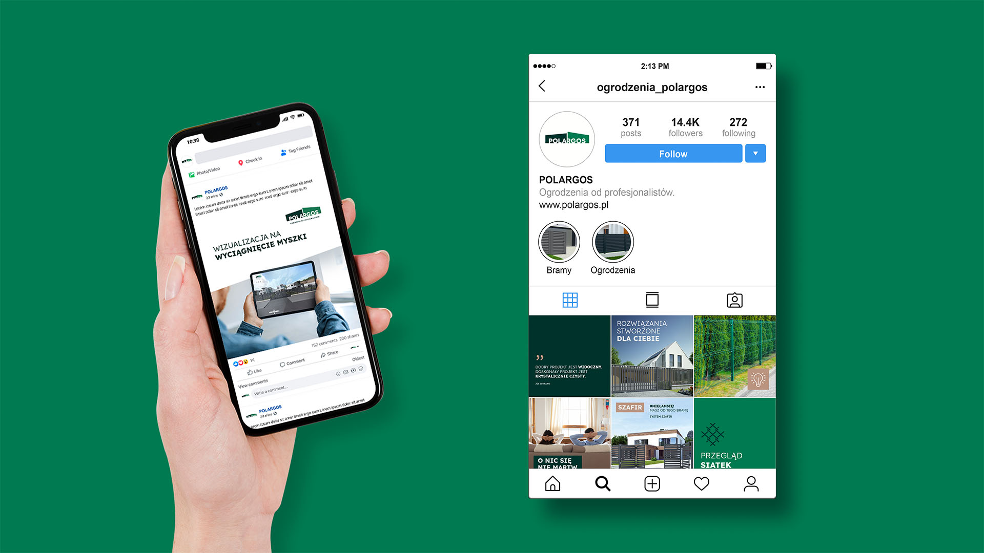
Lotna also took over the brand’s social media communications support. The developed strategy of activities in SoMe mesh the brand’s image and sales goals. Communication activities are currently being conducted on Facebook, Instagram and LinkedIn.
As part of marketing support for the Polargos brand, the agency also creates BTL materials and all custom actions in diversified communication channels.
The agency’s task is also to provide advice and substantive support to the client in the field of ongoing communication and strategic activities.
Team:
Graphic creation: Michał Wyszyński
Creative Supervision: Anita Kamila Sochacka
Communication strategy and project management: Piotr Flis
Social media supervision: Piotr Mateńko
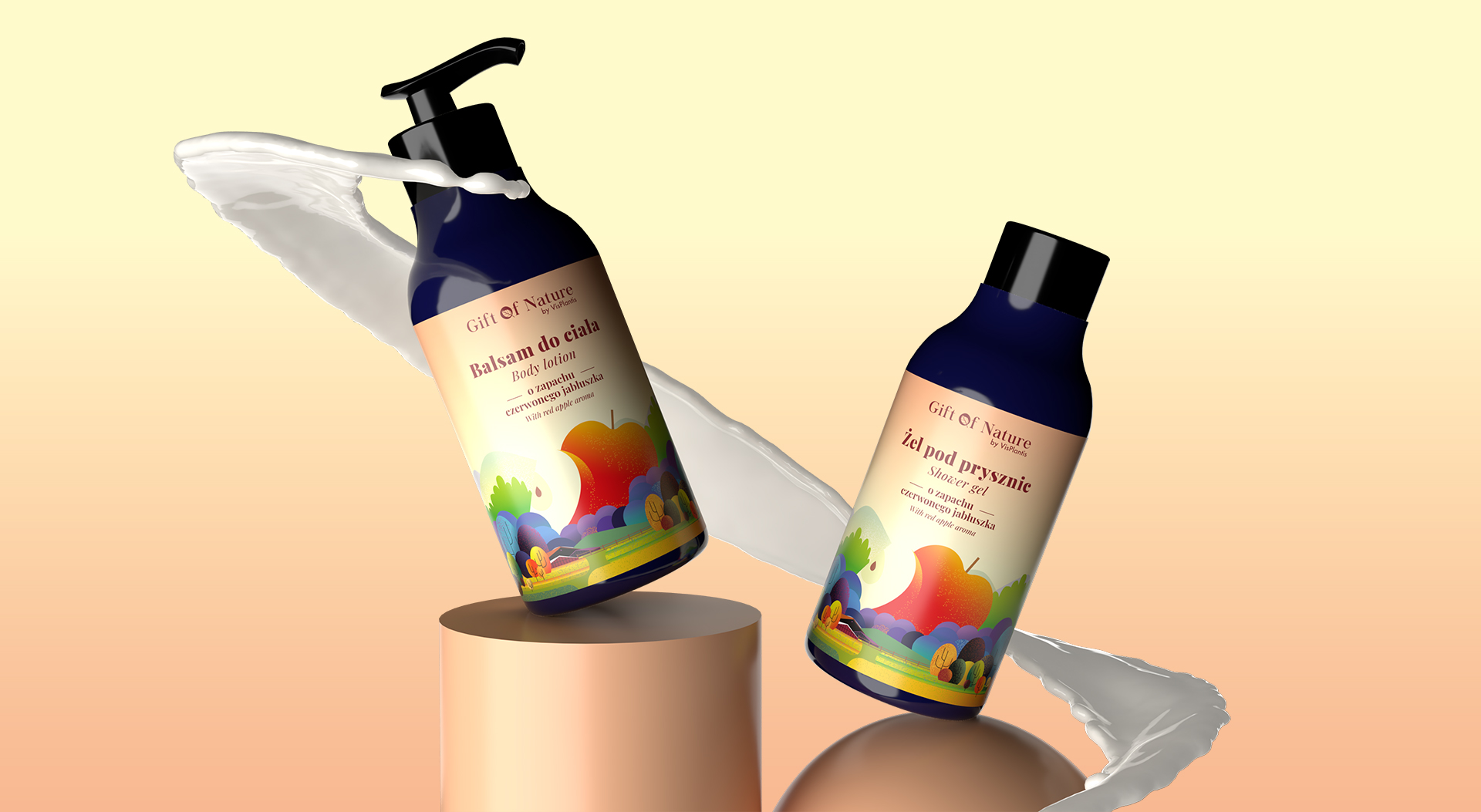
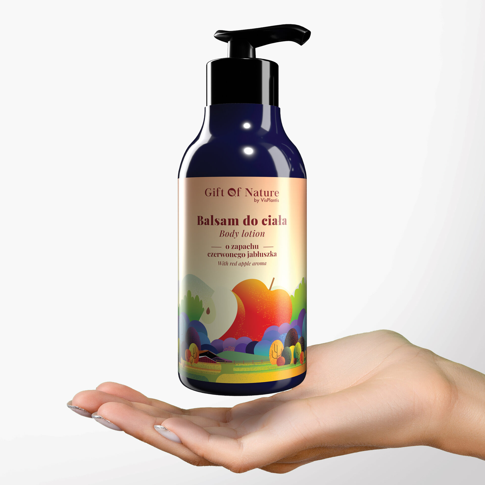
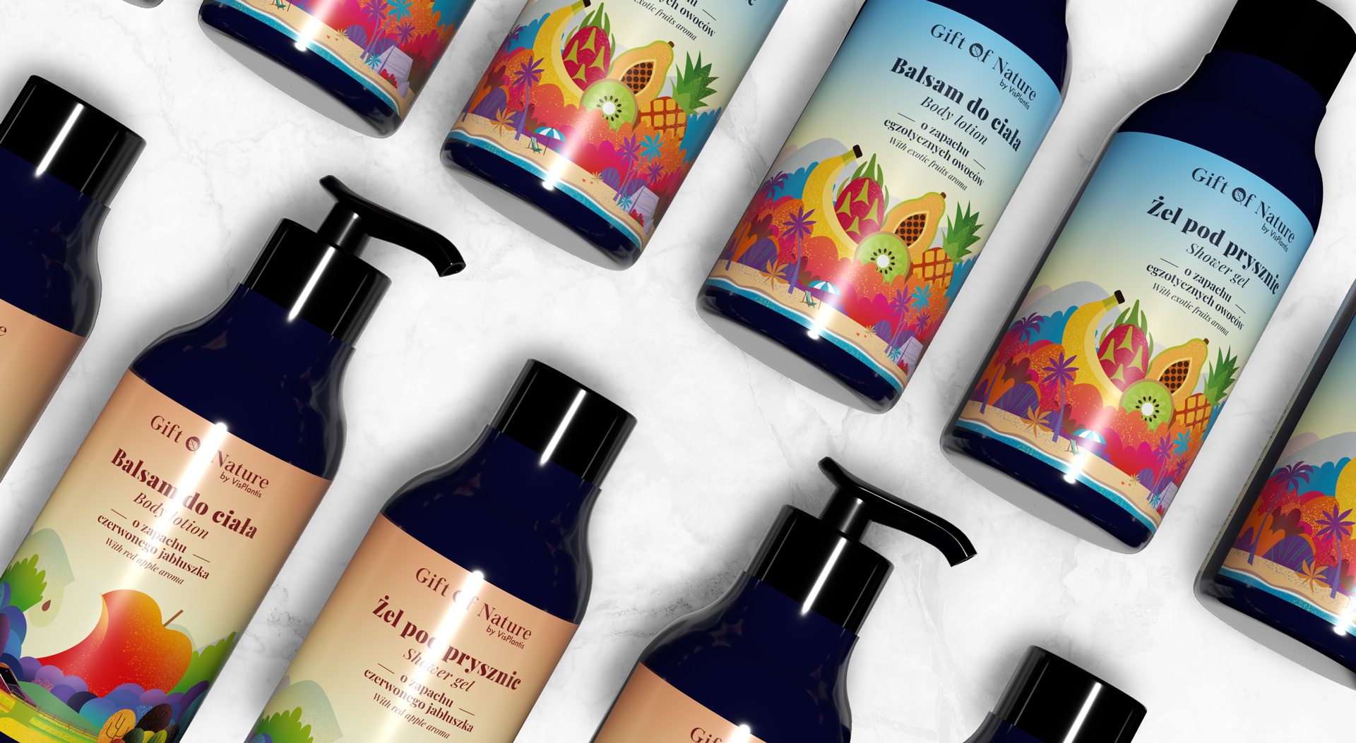
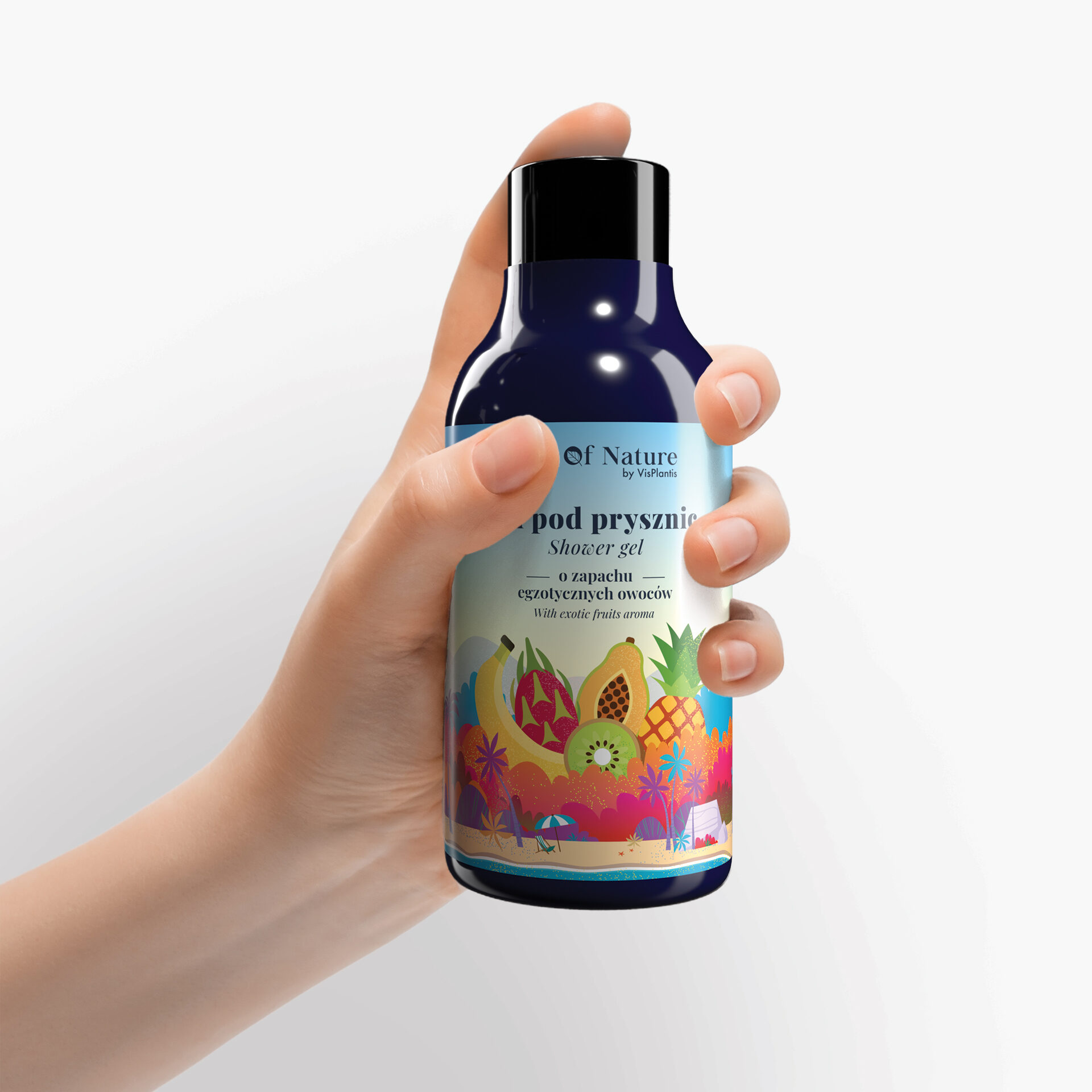
Spring-summer line Gift of Nature by Vis Plantis cosmetics
Gift of Nature by Vis Plantis is a series of natural, 100% vegan cosmetics that respond to the needs of modern women who want effective and proven products. Cosmetics in the GoN series are known for their focus on original fragrances, natural ingredients and interesting label and packaging design.
It was for Gift of Nature cosmetics that we designed spring-summer labels for a special occasional series of packaging. The project included labels for 4 products – two fragrance versions of shower gel and 2 fragrances of body lotions.
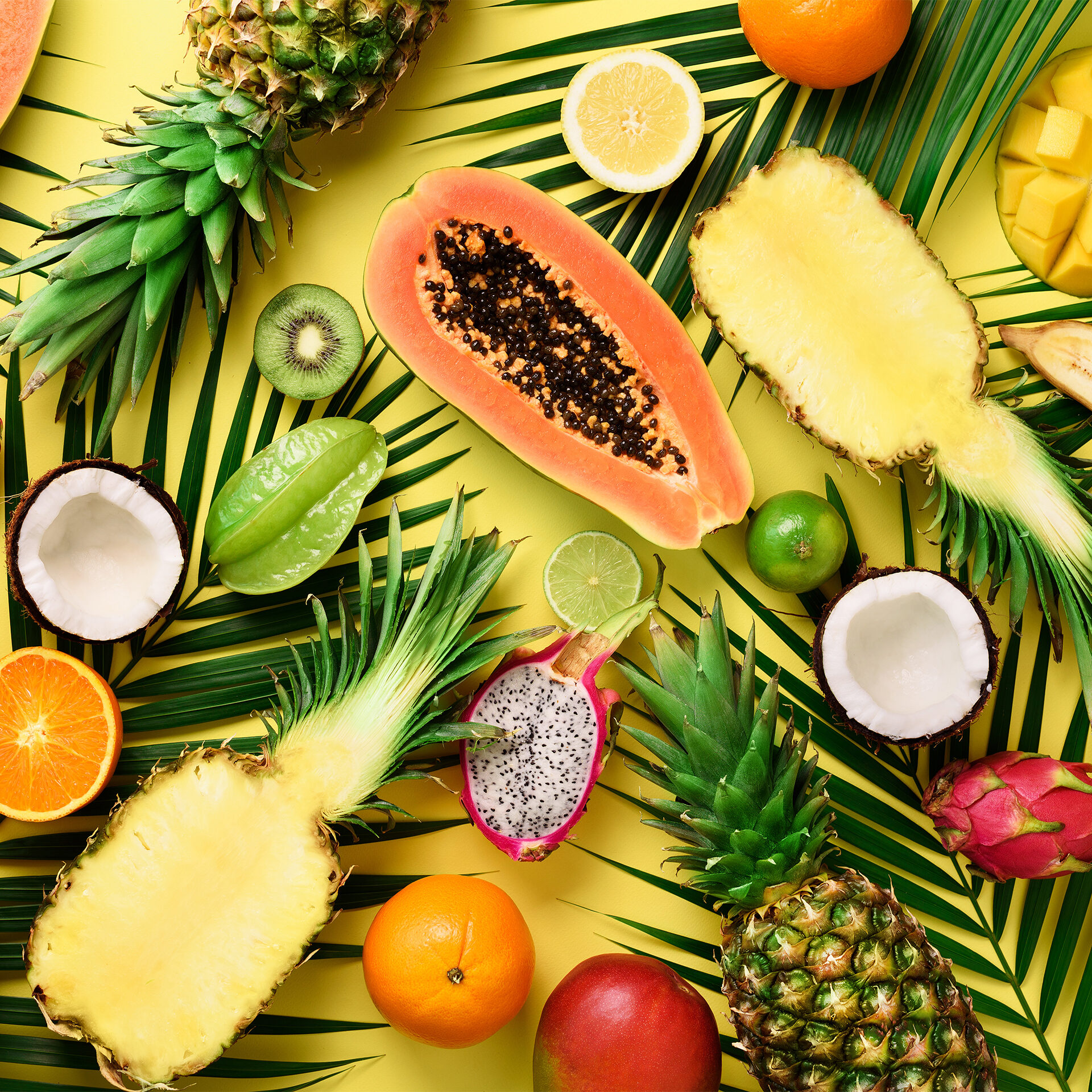
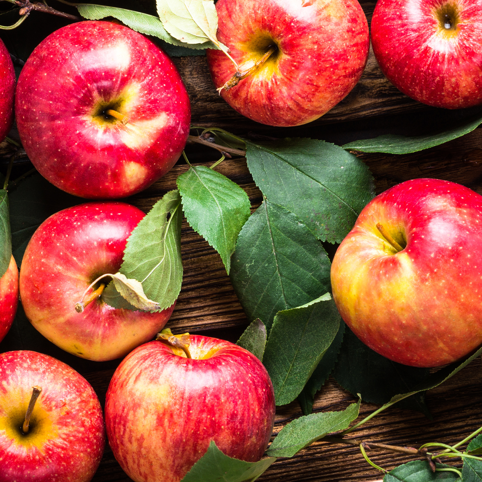
One of the most important objectives was to create a design that at first glance “transports” the consumer to a world full of sunshine and warmth. The red apple fragrance version is associated with calm and soothing moments on summer days in the countryside, while the tropical fragrance variant is a pure world of exotica, swaying palm trees and a roaring, warm and crystal clear ocean.
The color scheme we chose fully corresponds to the nature of the products, and also distinguishes them on the shelf from the rest of the assortment. Large names and illustrations of fruits visually indicate a specific fragrance line. The illustrative style, which has just been implemented into the design, fits into the broader design concept of the brand’s other lines and cosmetic products – thus representing the brand’s stylistic consistency and following current trends in the design world.
The distinct yet still perfectly fitting logo and other information in the design make it easy for consumers to associate the attractive-looking product with the Gift of Nature brand.

Team:
Kreacja graficzna: Katarzyna Łoboda-Karki
Nadzór kreatywny: Anita Kamila Sochacka
Fitos advertising campaign
Fitos is a new subbrand of the Kupiec brand, representing a subgroup of flavored wafers in the brand’s portfolio. For Fitos, we developed a creative concept for an image campaign in online and offline channels.
The main idea behind the designs was to highlight the unique flavor of the snack that will make every moment more pleasant – toffee, chili and cream and onion. The uniqueness of the product was shown through surreal and eye-catching reveals. The protagonists of the creations, who spend their time during various activities, are accompanied by exaggerated objects coming out of the ground or ceiling, symbolizing the individual flavors of the products.
The focus on taste and on spending time together with loved ones – whether family or friends – were the two cornerstones of the advertising creations, which were designed to reach a variety of target groups – both younger and older audiences.
Team:
Creative concept and design: Katarzyna Łoboda-Karki oraz Piotr Mateńko
Creative Supervision: Anita Kamila Sochacka
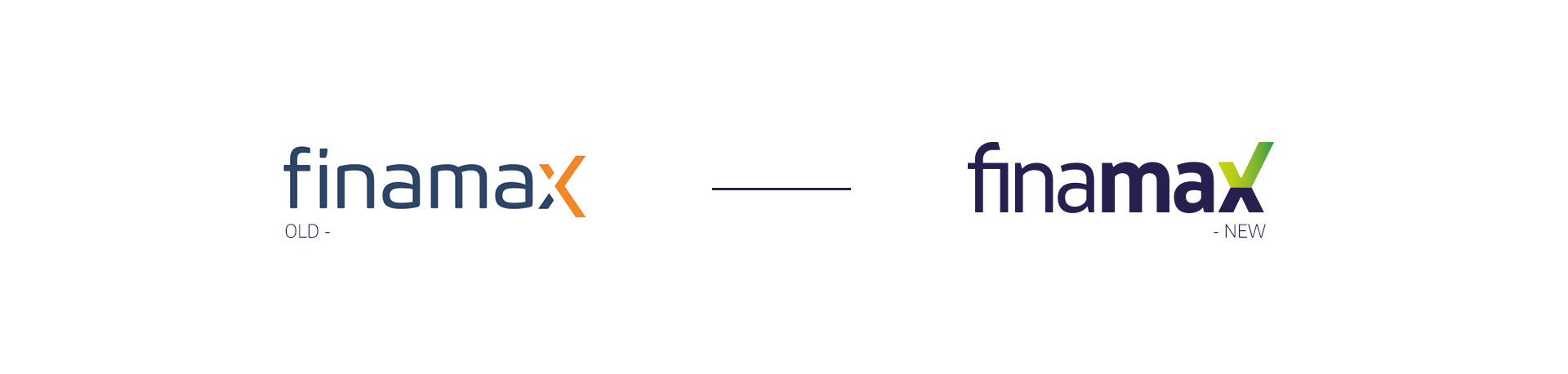
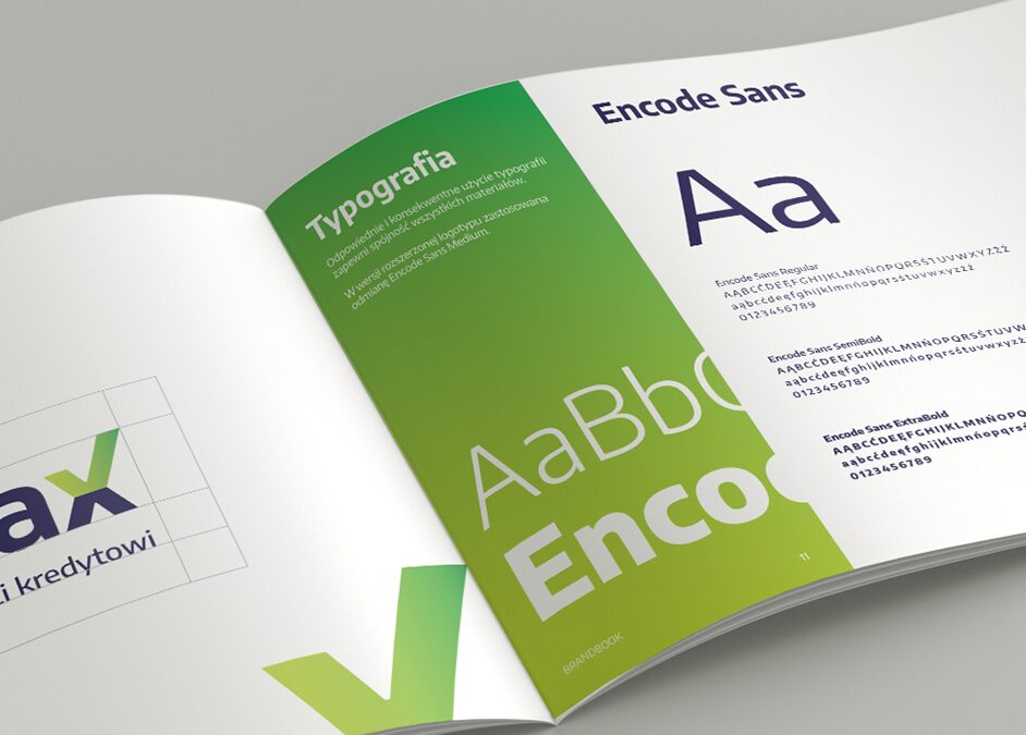
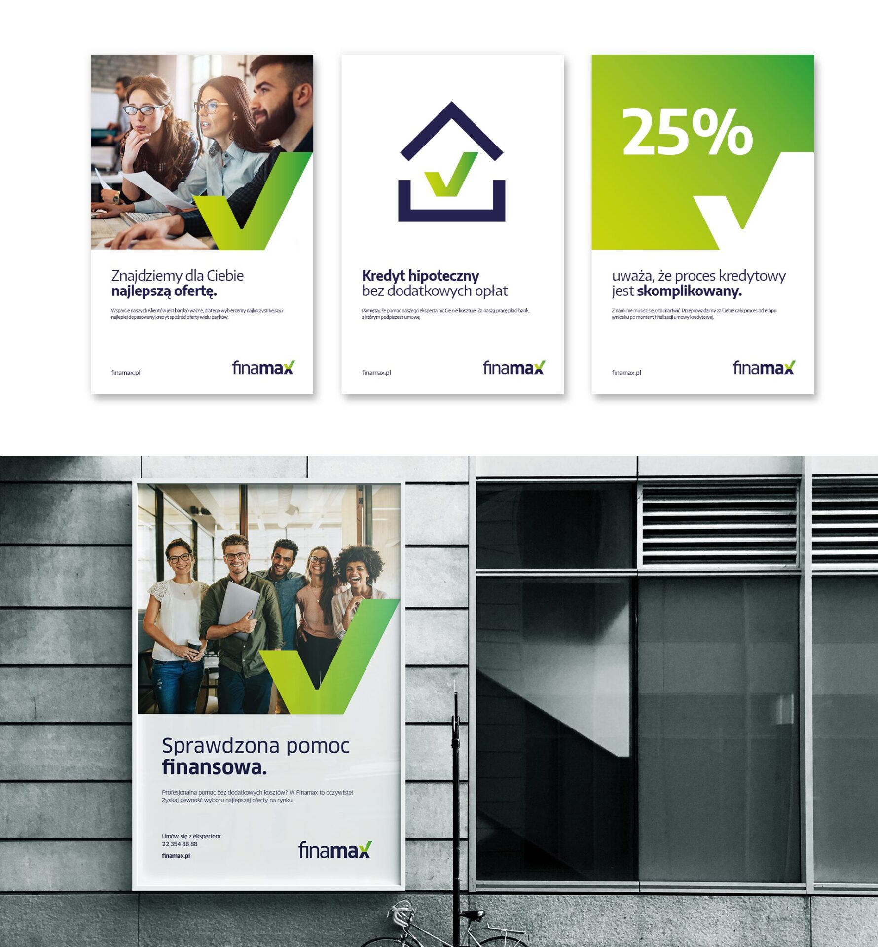
Finamax brand visual identity
Finamax is a company engaged in credit intermediation for the purchase of real estate. Due to strong growth and market demand for such services, the brand owners decided to refresh the company’s image. The created proposal added freshness, energy, vitality and strength to the brand. The “x” associated with Finamax was retained by us, but we modified its appearance, giving it additional symbolism.

Team:
Vissual identity: Michał Wyszyński
Creative supervision: Anita Kamila Sochacka
The project will not be implemented.
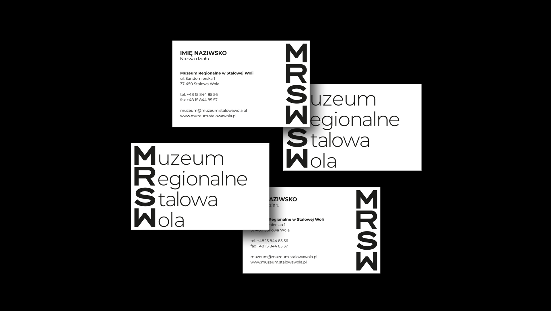
Visual idenity of the Regional Museum in Stalowa Wola
The Regional Museum in Stalowa Wola is an institution that for many years has been providing local audiences with collections of regional character in the field of archaeology, history, ethnography and art. For the institution, we prepared a comprehensive visual identification system as part of the tender.
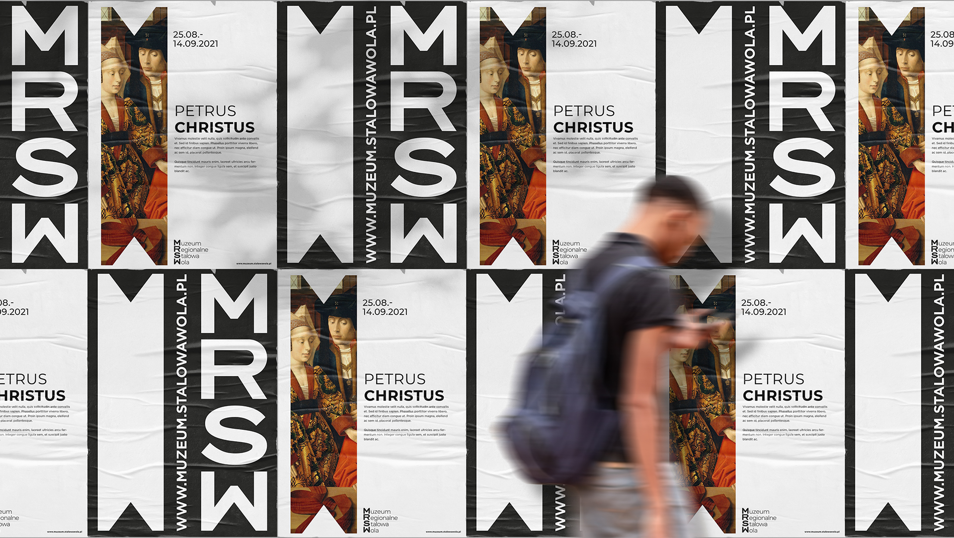

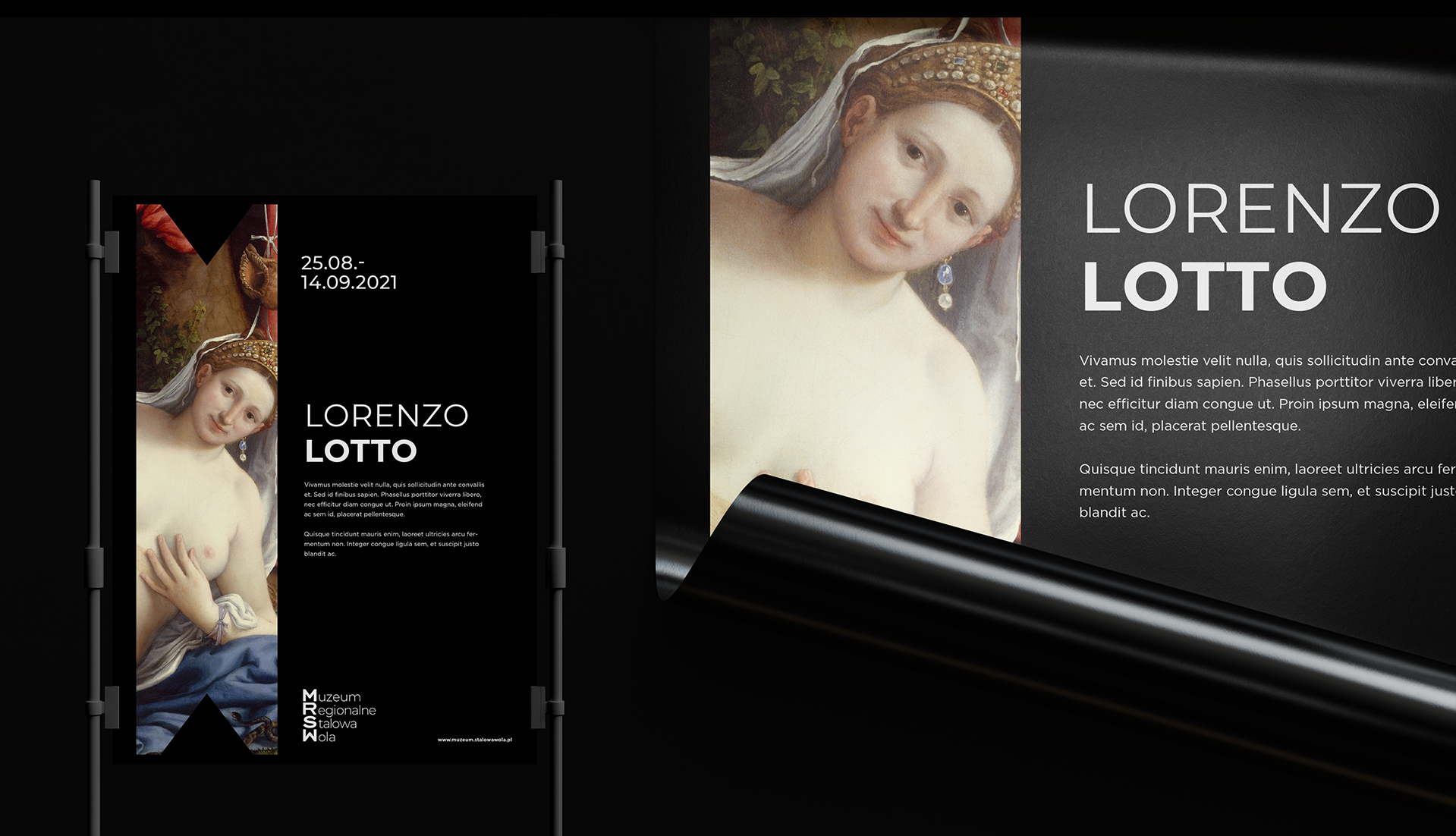

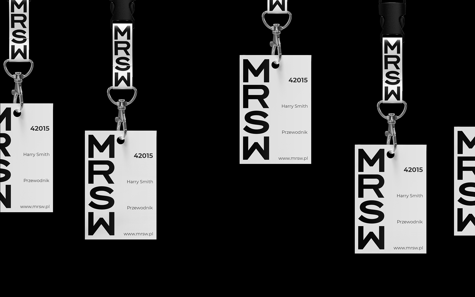
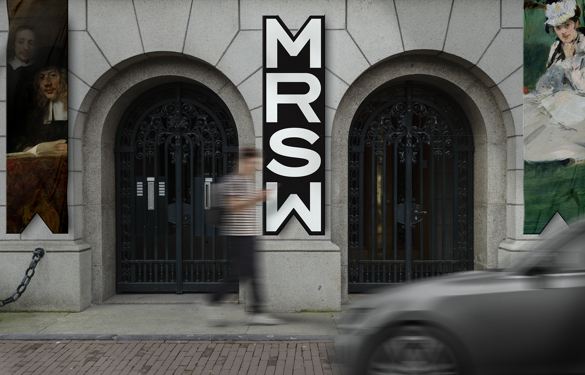
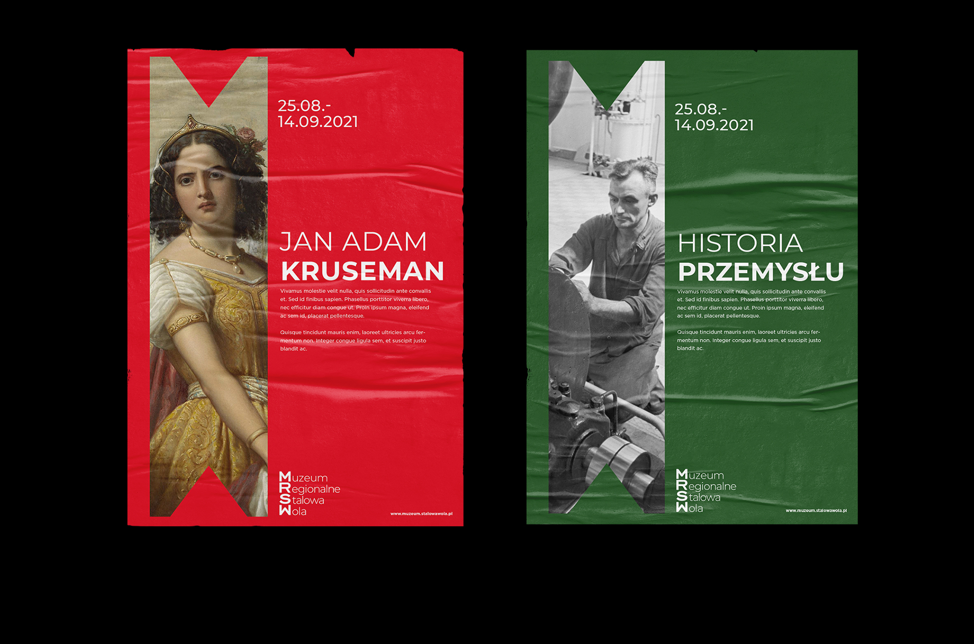
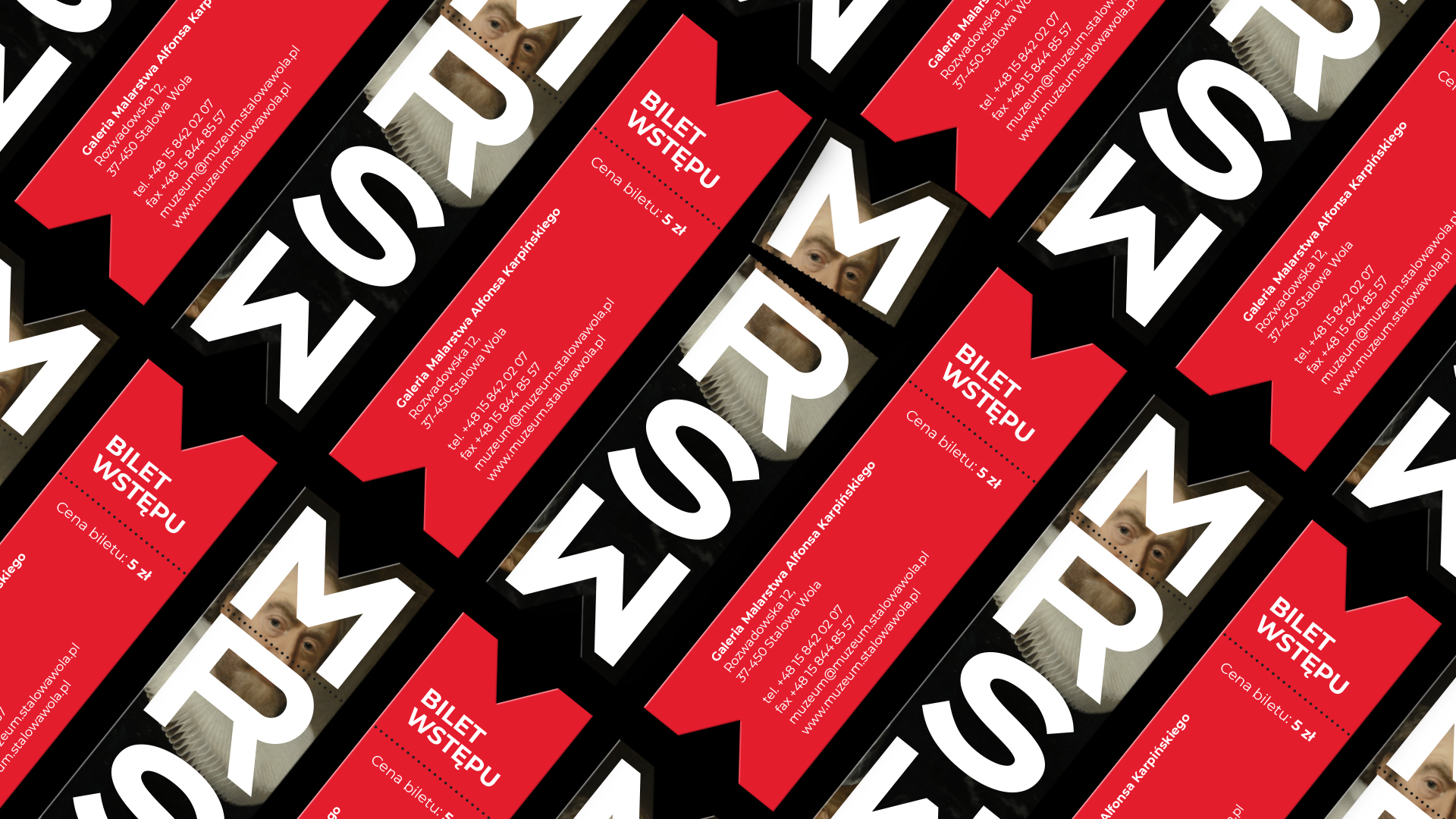
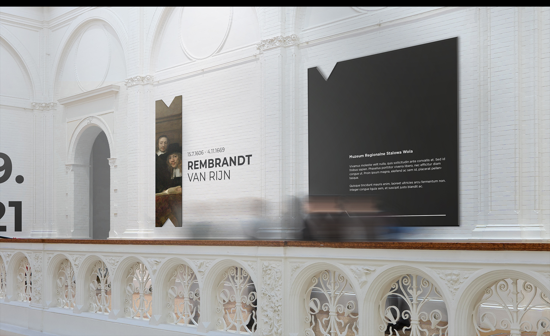
Our proposal draws from the world’s common trends of identification systems, which are successfully implemented in the world’s largest museums. Courageous characteristic and arousing intrigue are the main distinguishing features of the creation, which cannot be passed by indifferently.
Despite its expressiveness and array of modules, the whole is set in a simple and understandable design. The SIW, in its conception, is not meant to overwhelm the museum’s offer, but to create space for its presentation. Designed elements and layouts of a universal nature provide a backdrop for museum works and collections, putting them in the foreground as the main element of the institution’s communication.
The concept uses distinctive shapes, modernity, a sans-serif font and a logo that is readable by all audiences – the lack of embellishments and the large, typographic nature allows good reception also for the visually impaired.
The graphic element on the posters and other materials was taken from the main shape of the IRSW logo. This would allow for easy adaptation to advertising materials, in keeping with the museum’s most recognizable element and symbol. Depending on which museum needs the materials would be prepared for (whether for the main headquarters of the IRS or its branches), the designed media, in addition to the text layer, are also differentiated on the color and graphic level.
The visual identity system was designed to support the museum’s offerings and provide a kind of storytelling space for the museum.
Team:
Visual identity: Michał Wyszyński
Creative Supervision: Anita Kamila Sochacka
The project will not be implemented.
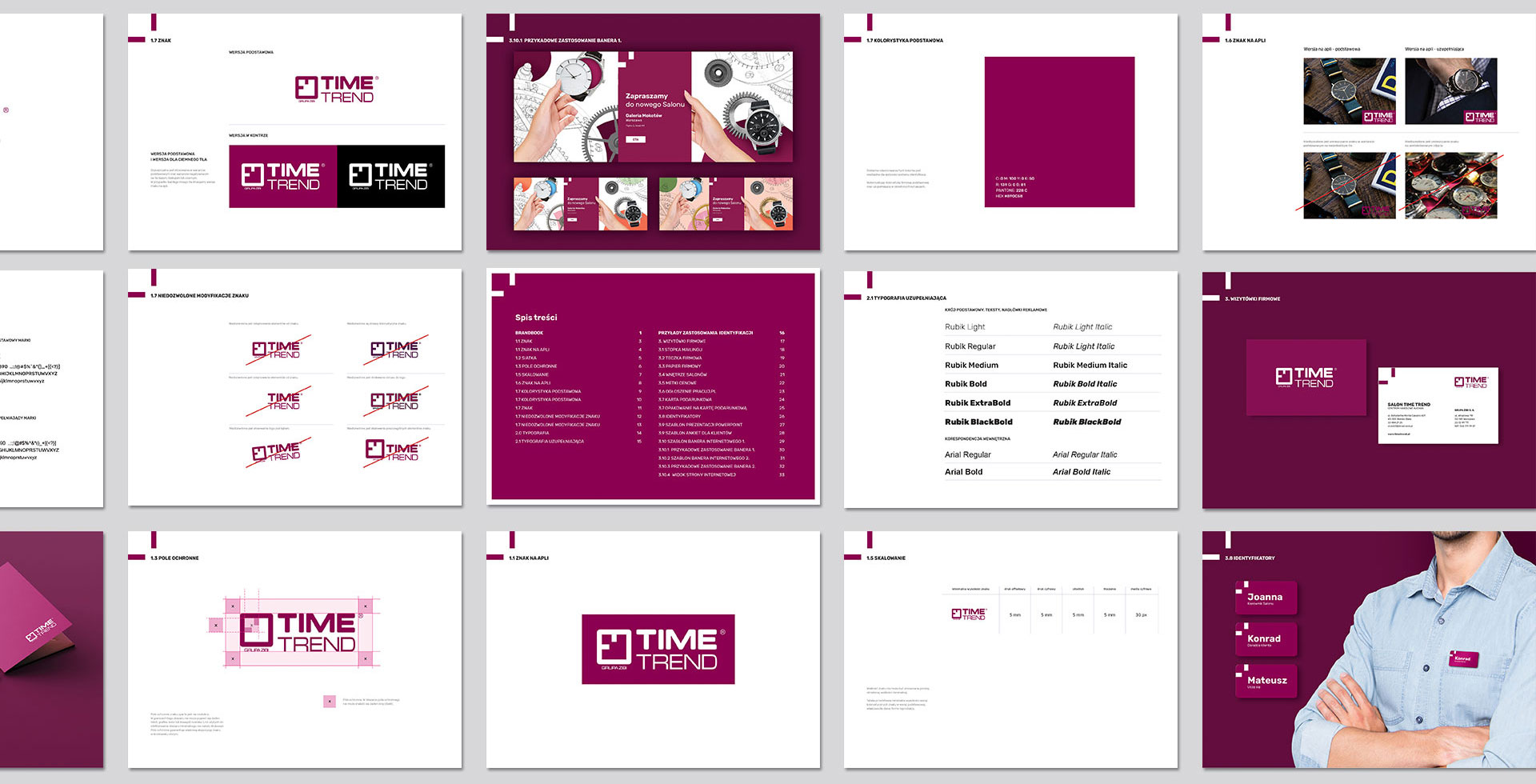
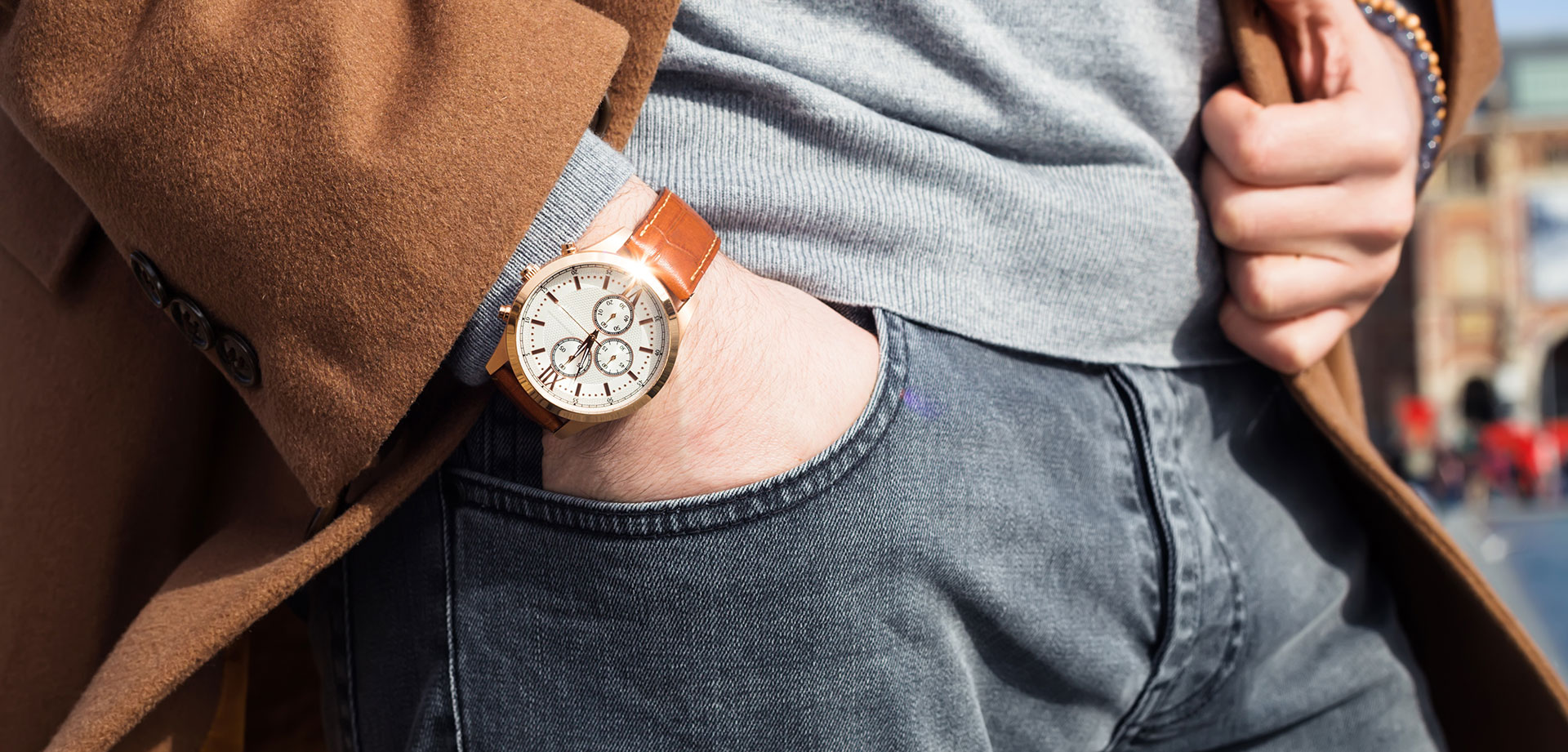
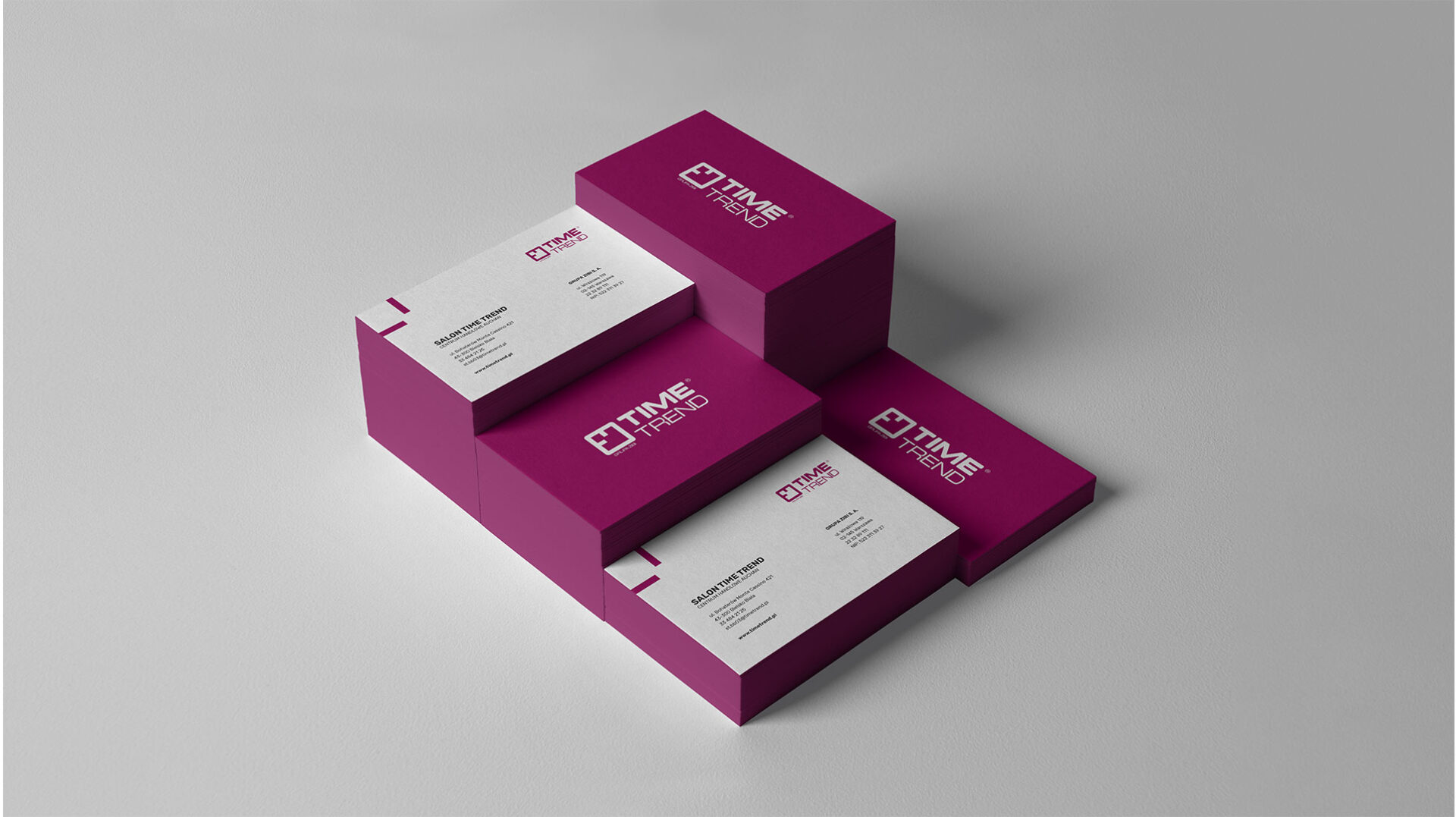
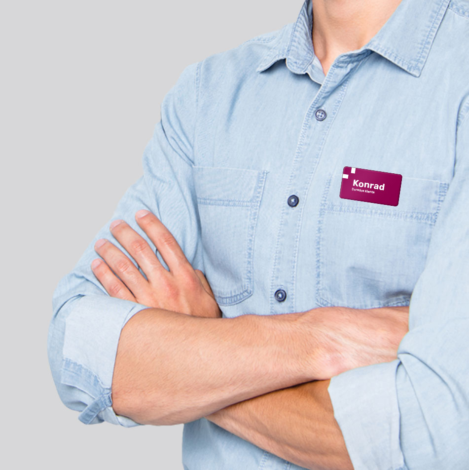
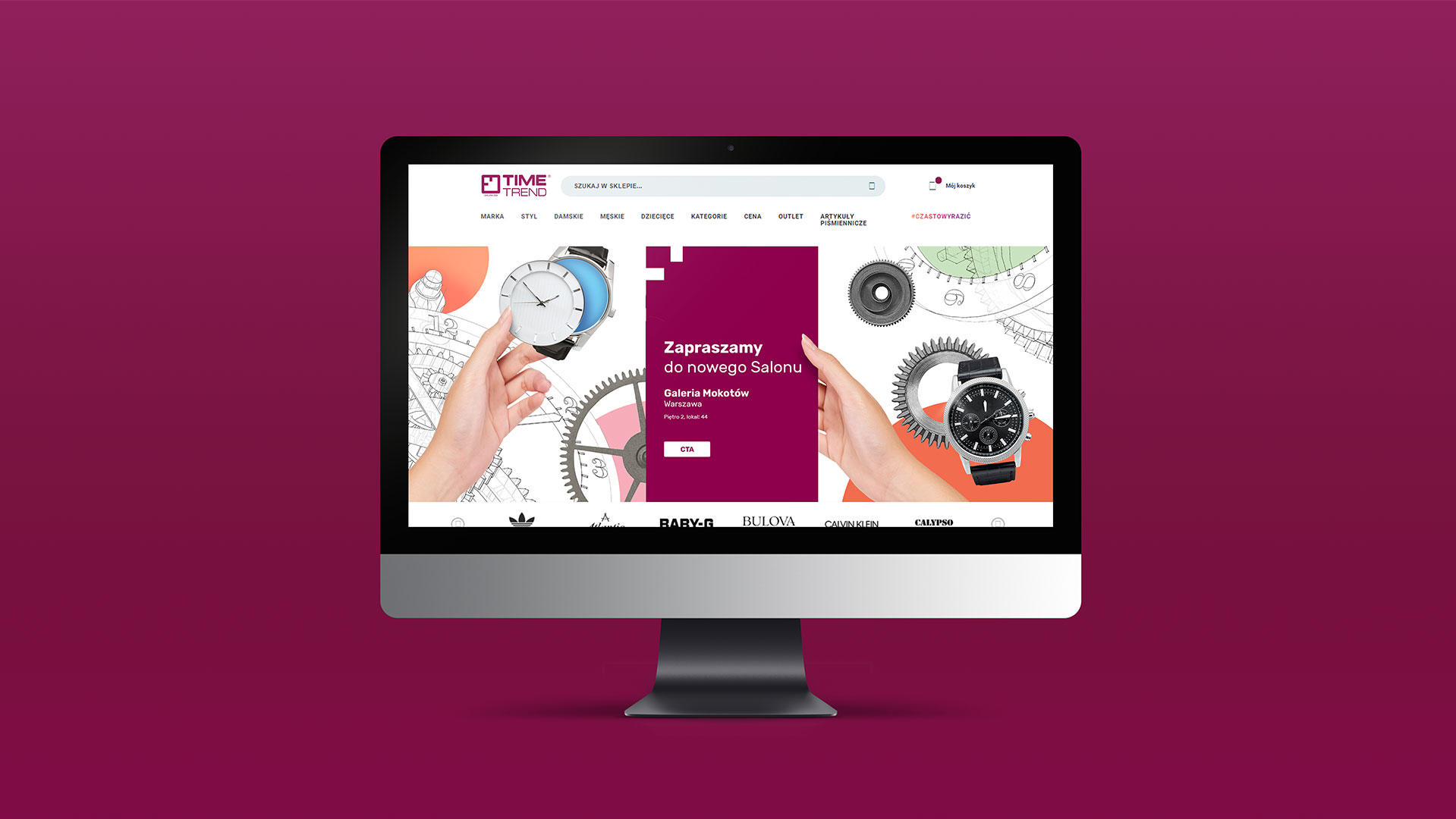
Time Trend corporate identity
Time Trend is one of Poland’s largest chains of brand-name watch stores – the company’s customers can shop for luxury goods in as many as 100 outlets across the country.
As part of the buoyant growth, the brand got a new visual identity designed by our agency.
Before we began work on the actual identity, we gave the existing logo a gentle facelift. In it, the proportions of graphic and text elements, their thickness and distance from each other were changed. This created a closed composition, in which all the existing elements were placed in a specific space.
From the logo’s sigil we took the distinctive pointer layout, which became the core of the new visual identity. The dial designating 9 o’clock appears on all materials and is their indispensable point. The brand color used in the design – burgundy – emphasizes Time Trend’s essential features: premium products, their elegance and top-notch service to the chain’s customers.
The new visual code has been implemented in all advertising and office materials that the Time Trend brand uses.

Team:
Visual identity: Michał Wyszyński
Creative Supervision: Anita Kamila Sochacka
Social Media support
for SPAR Poland
Can food dressing make you laugh? Can the history of pineapple be interesting? Is it even possible to combine veggies with RTM and thus “make the internets smile”?
For all questions for the third year we answer YES without hesitation. And confidence + proper strategic work = social communication for SPAR brand – one of the largest grocery chains in Poland, conducted with humor and creativity.
In practice, it looks like this:

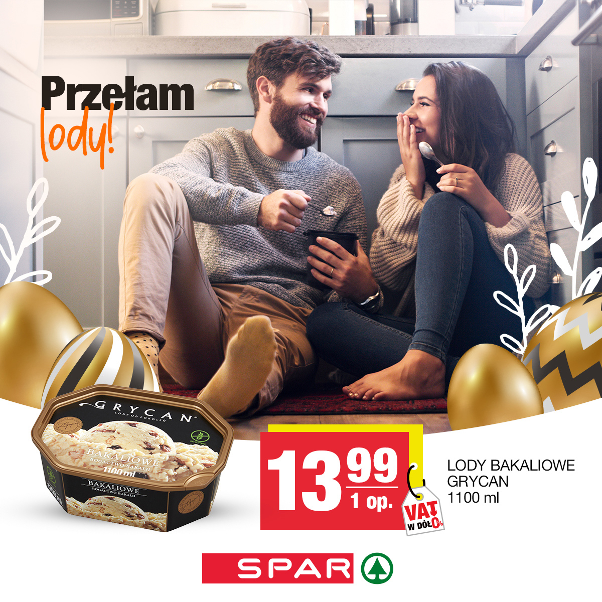
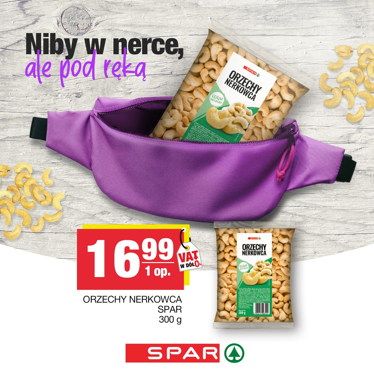
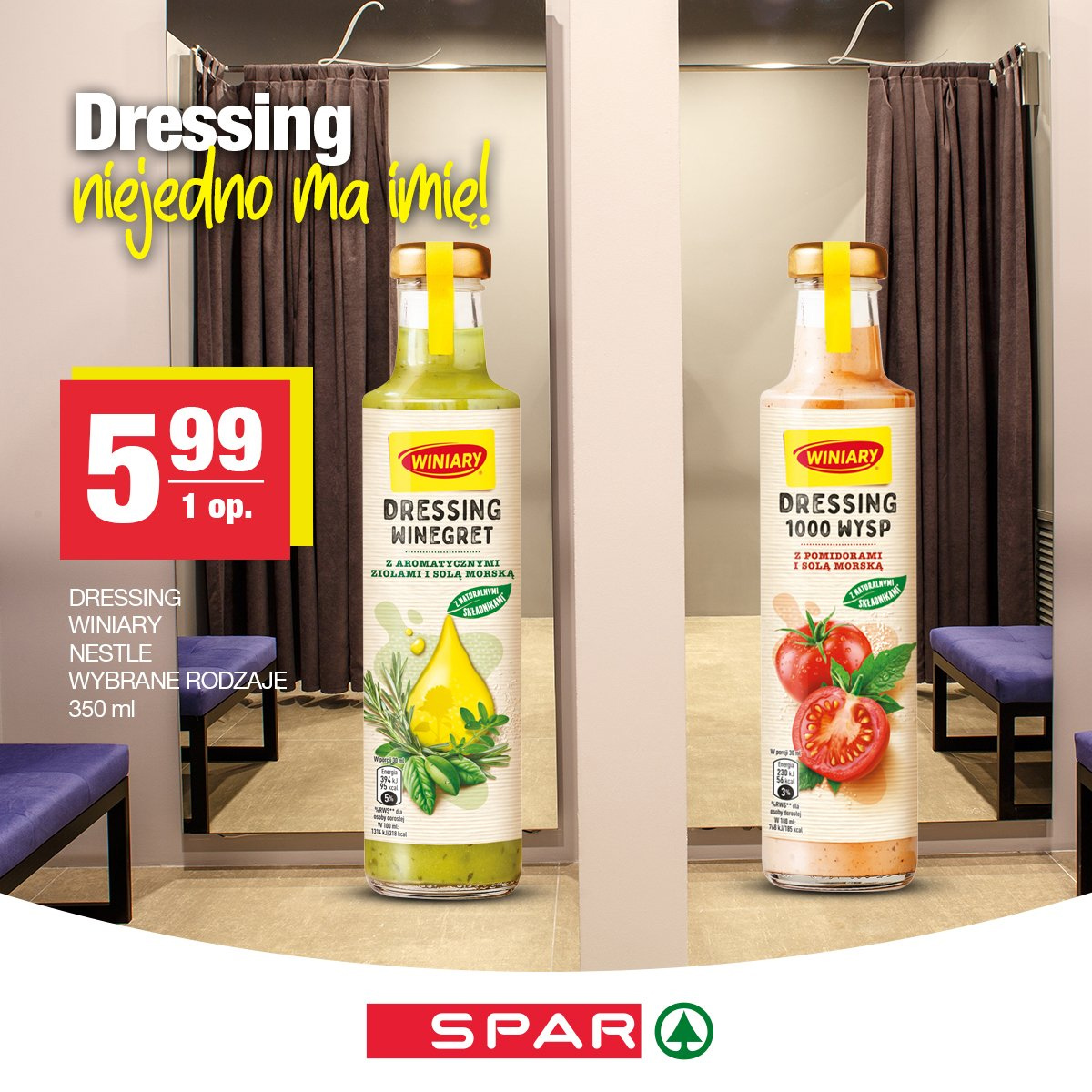
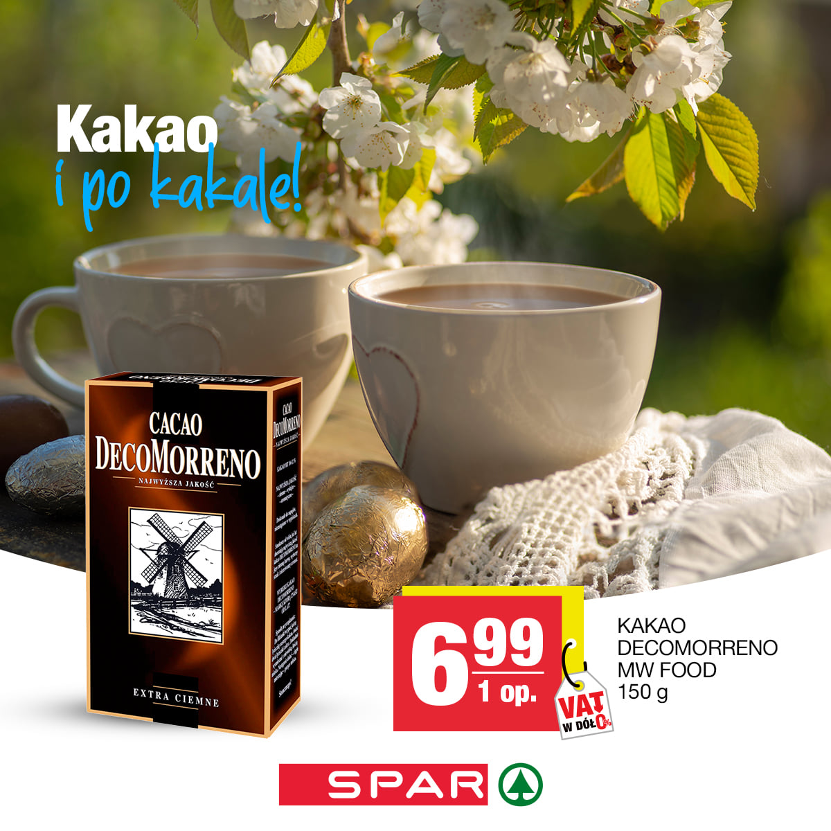
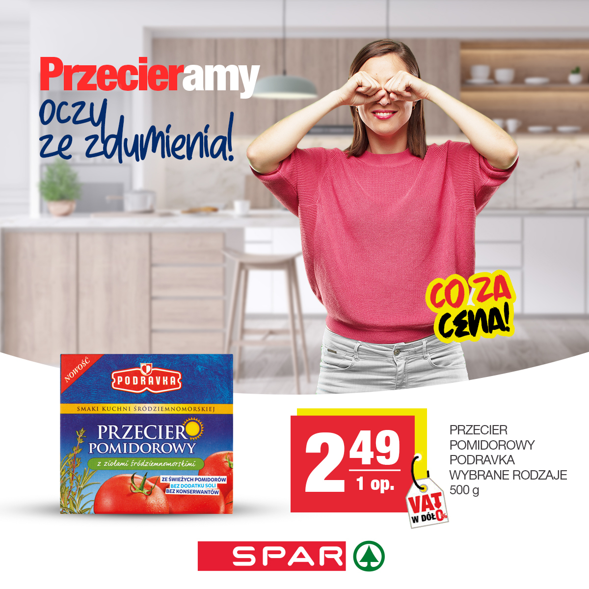

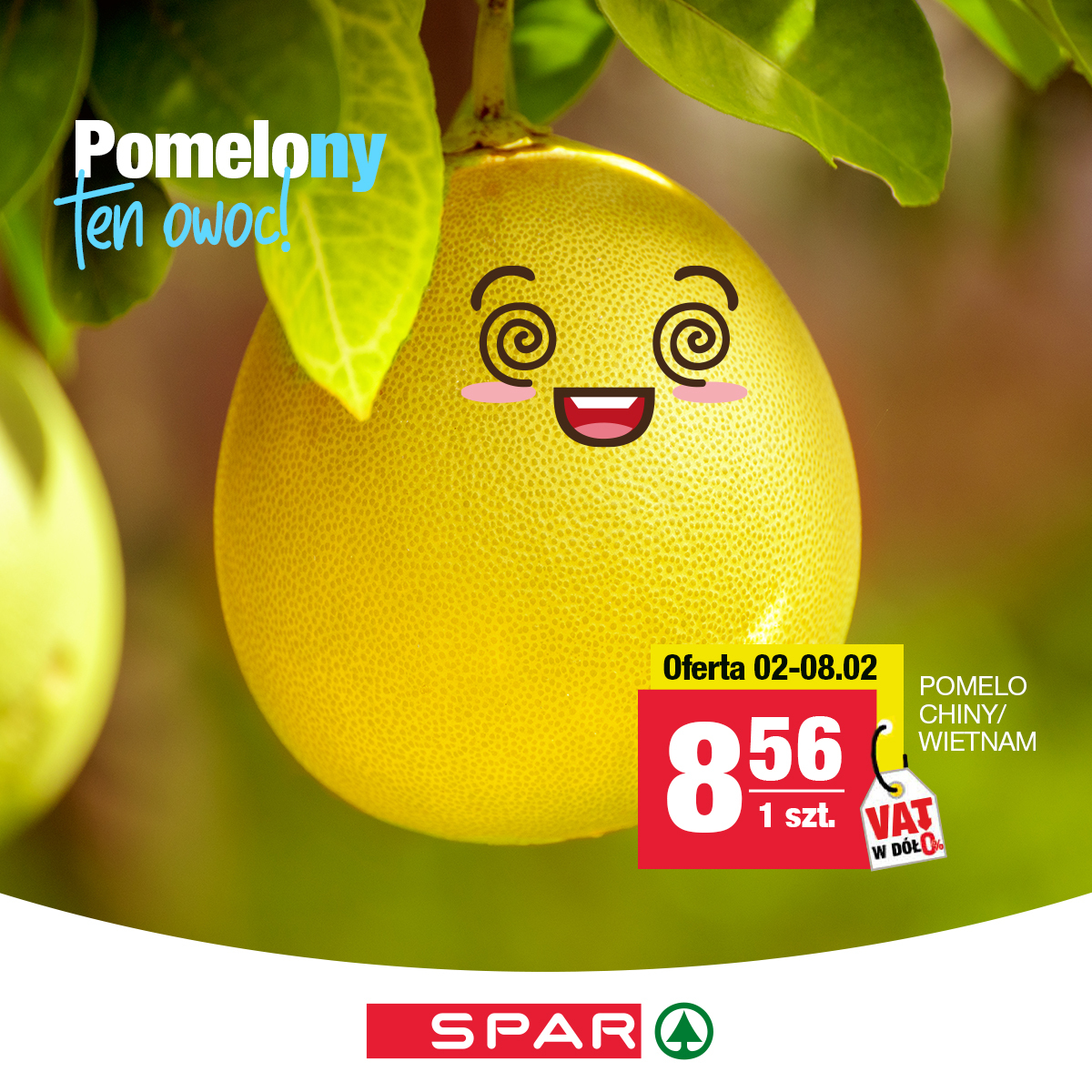
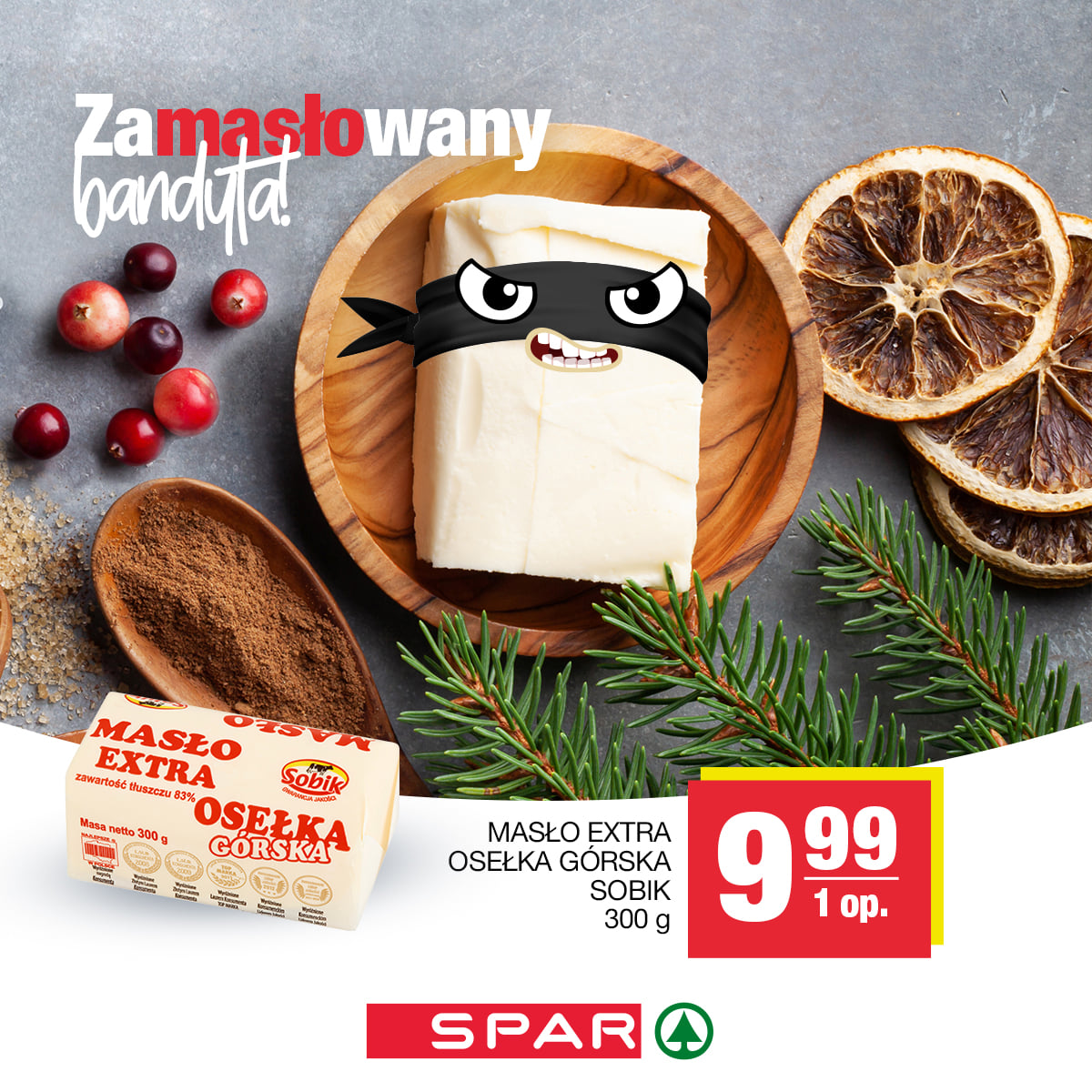
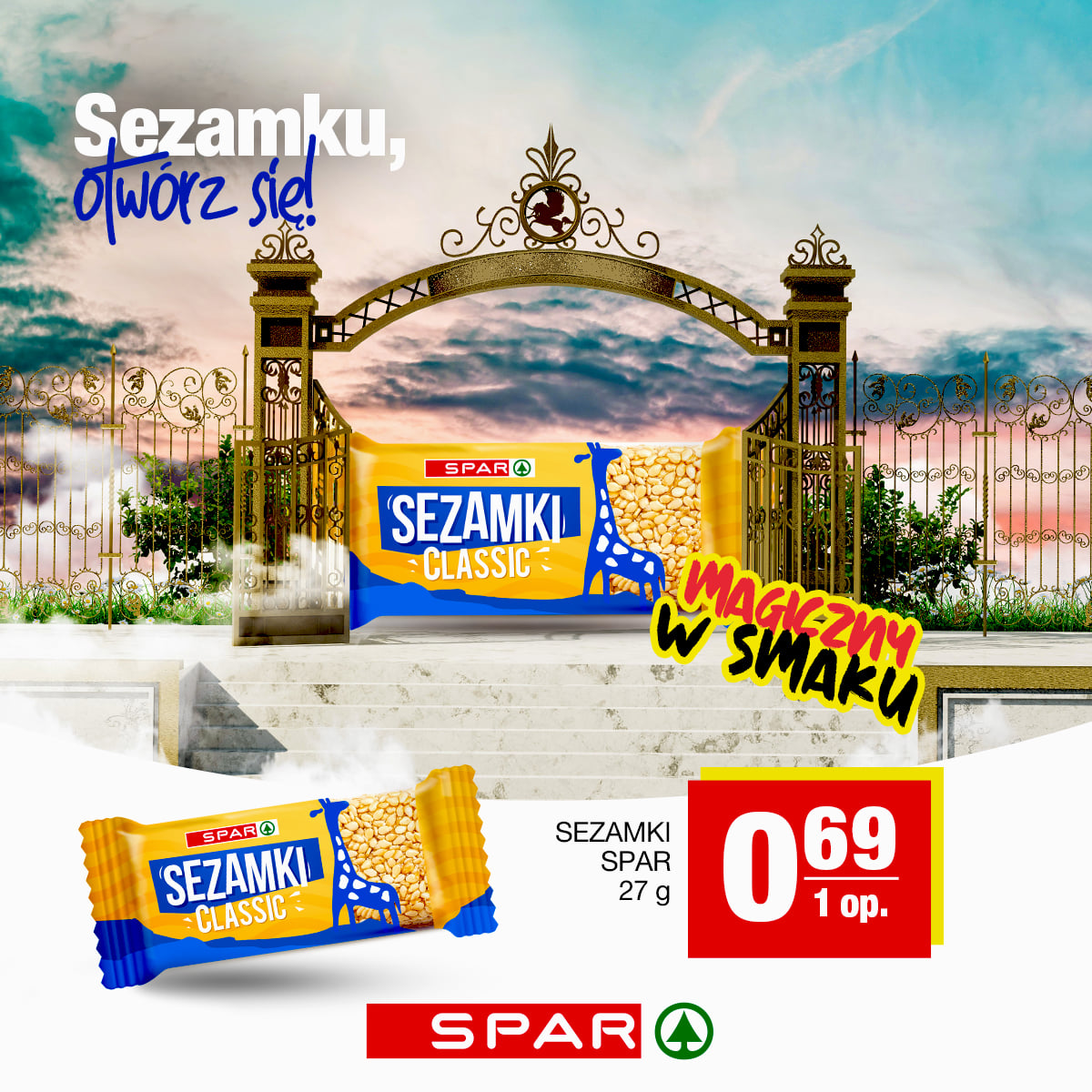

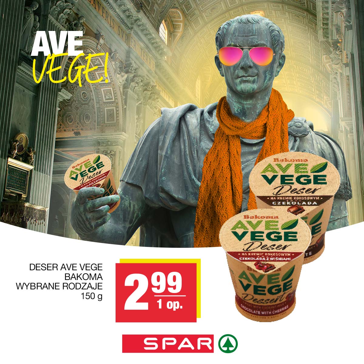

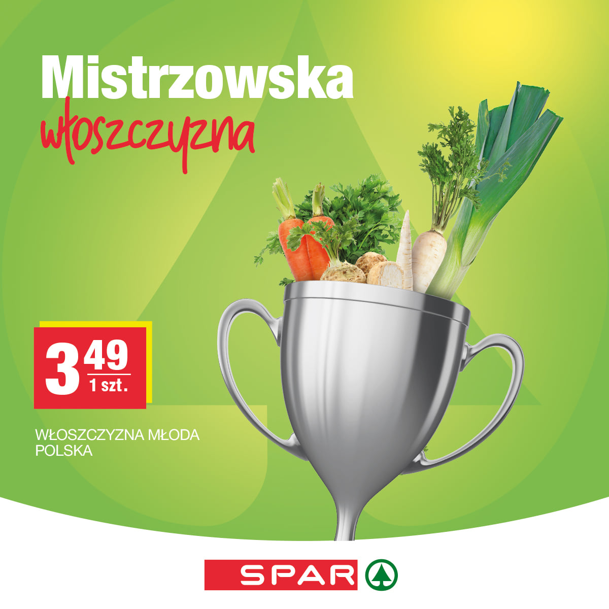
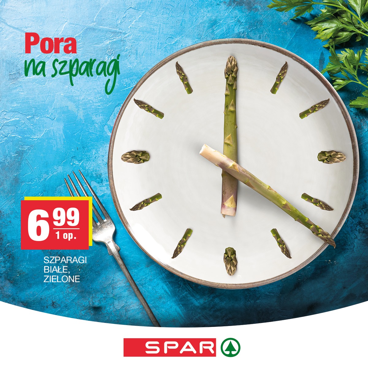
We also put the products available in the brand’s stores into motion. Individually and collectively, presenting SPAR promotional offers on a regular basis.
We bravely moderate every day so that no message or comment goes unanswered.
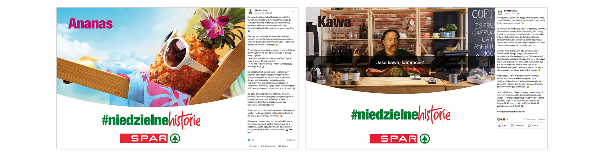
But our communication is not only products! It’s also several series in which we shared home and cooking tips, food stories and recipes with users!
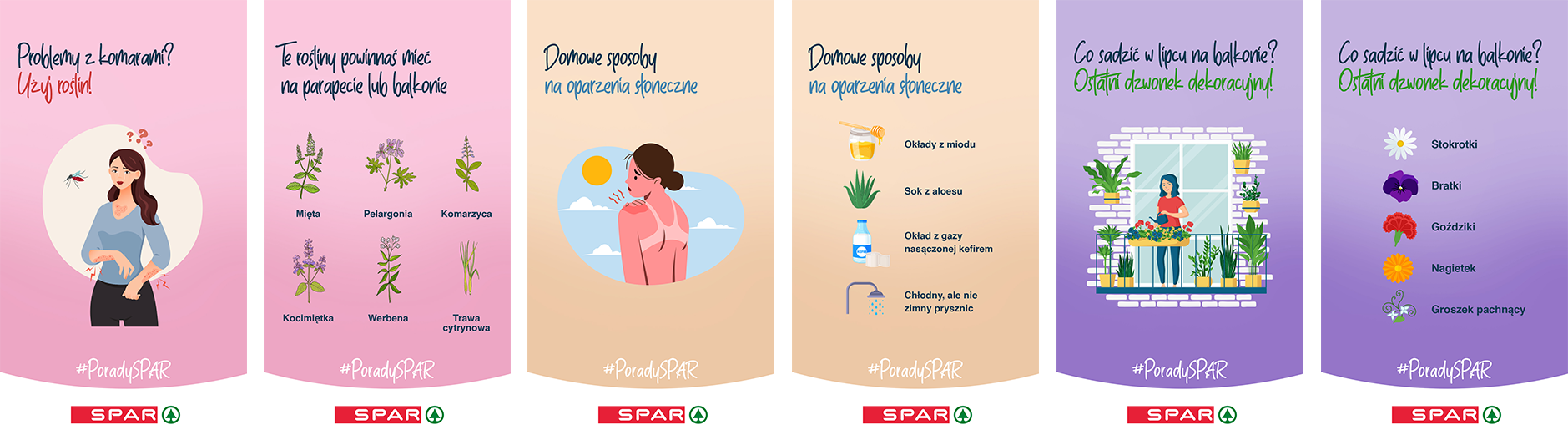
We also like contests where we are happy to give away prizes!

We are also responsible for user-targeted advertising on Facebook and Instagram. All this so that as many people as possible on the Internet see an offer not from this earth! And how are the results after a year of operation?
Over the past year, we have proven that we can create consistent and long-lasting marketing communications that will reach diverse target groups. And all this in an environment of creativity, humor and commitment.
Can it be done? It’s always possible in Lotna!
Copywriting and creative and strategic oversight: Piotr Mateńko
Graphic creation: Aleksandra Luboch, Urszula Małyszko, Michał Wyszyński
Visual identity of IRIS brand
Chr. Hansen is a global player in the bio-science market that produces natural solutions for the beverage, food, pharmaceutical and agricultural industries. Year after year, the company supplies probiotics, enzymes, natural dyes and bacterial cultures to manufacturers around the world.
One of the brand’s flagship projects is IRIS – a tool, or rather a whole package of services aimed at professional breeders. It helps to examine the bacterial flora of poultry intestines (the examination is done several times a year) and analyze it. It was for this advanced product that we created a comprehensive visual identity and Key Visual.
An important part of the design work was a thorough analysis of the new tool from Chr. Hansen. The portable research device was associated with dynamic advances in science, the development of technology and the creation of opportunities to discover the hidden – not only for specialized individuals, but also for those involved in breeding.
Having determined the values behind this project, we were able to proceed with the design work.


The sigil of the IRIS mark as well as the Key Visual of the tool refer to the eye and its iris. The movement captured in them symbolizes dynamism and rotation – for example, present when turning a microscope – a tool that is one of the symbols of the product.
The aforementioned dynamics provide a starting position for graphic communication, emphasizing the development, progression and motivation that accompany the daily operations of Chr. Hansen. The eye, on the other hand, is a symbol of insight, research and knowledge of the smallest details – thus the main tenets of the IRIS program.
The dominant colors of the project are navy blue and blue – associated with science, development and technology – you need the pillars on which Chr. Hansen and the IRIS project. The chosen set of colors also allowed us to capture dynamism – present in technological progress as well as in the speed of the IRIS set.

We designed the visual identity so that it could be easily implemented on all channels of brand communication. We created designs for packaging, printed materials (questionnaires, flyers, internal correspondence) and multi-format creations that can be published in the digital space.


Author of the idea and design: Michał Wyszyński
Creative and design supervision: Sylwia Dudzińska i Piotr Flis
