Visual Identity of the Museum of Metallurgy
Visual Identity
of the Museum of Metallurgy
The Museum of Metallurgy is a local government cultural institution established at the end of 2019, organized by the City of Chorzow. As part of the tender, we prepared a comprehensive visual identity system.
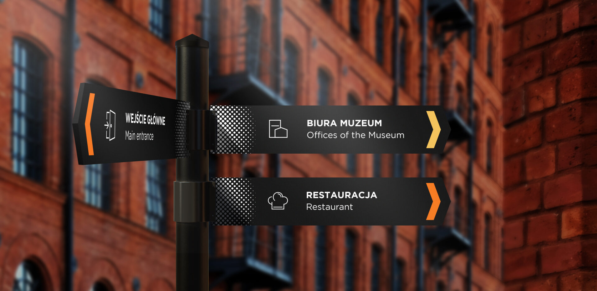
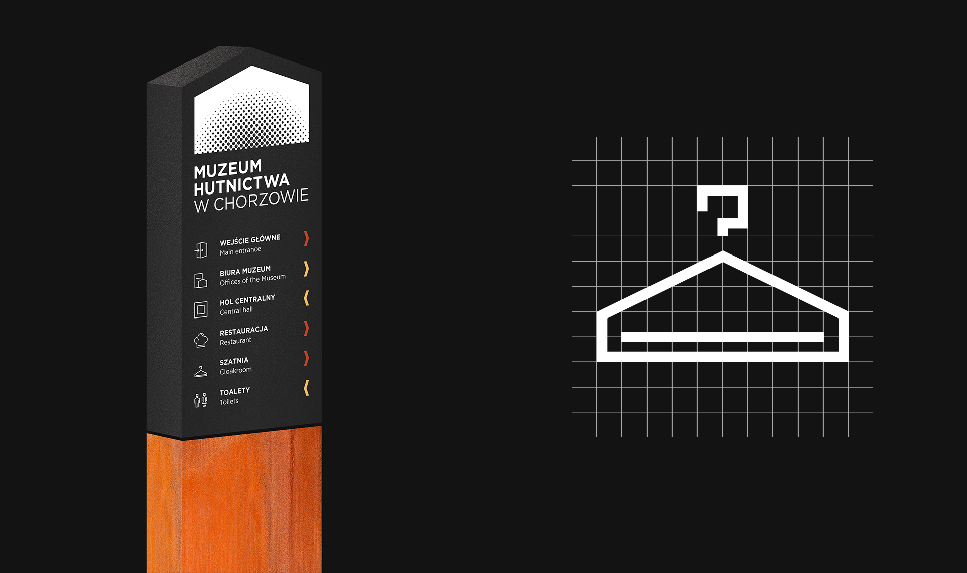
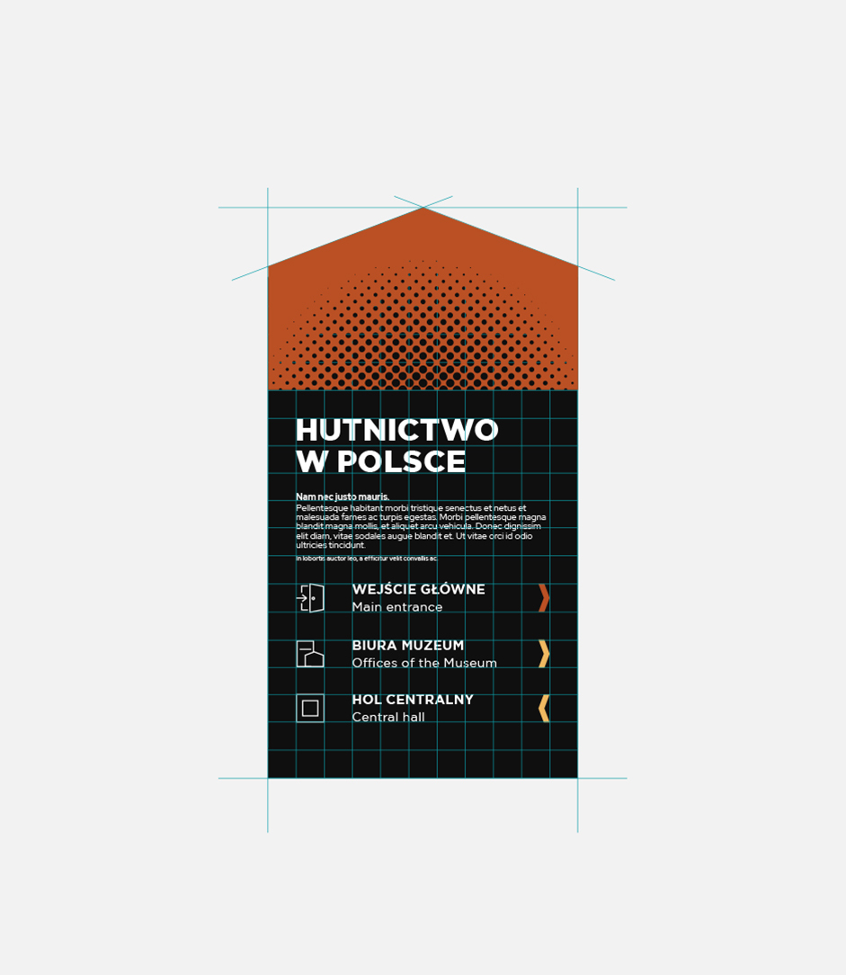
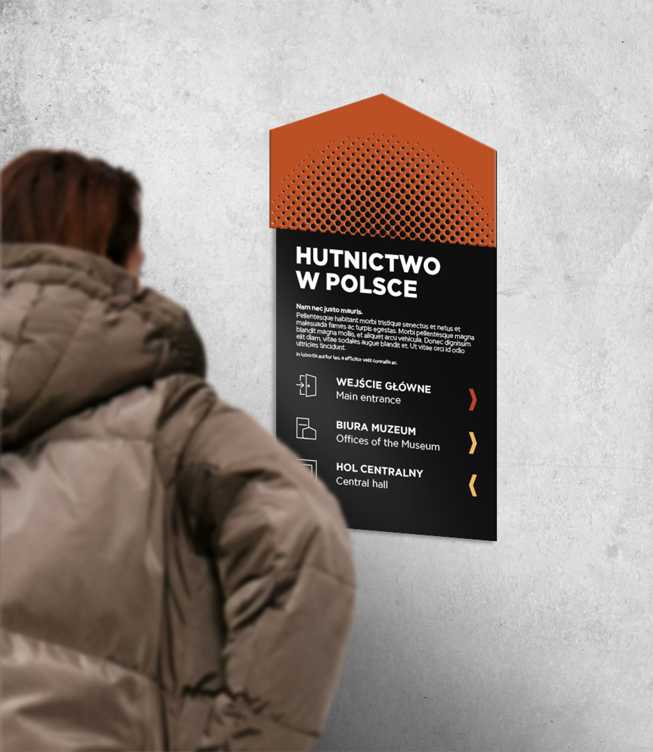
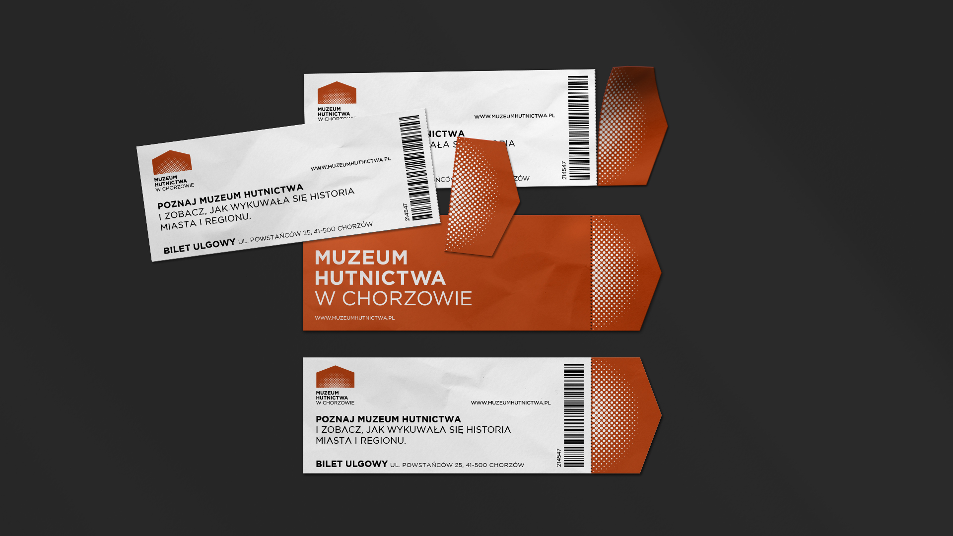
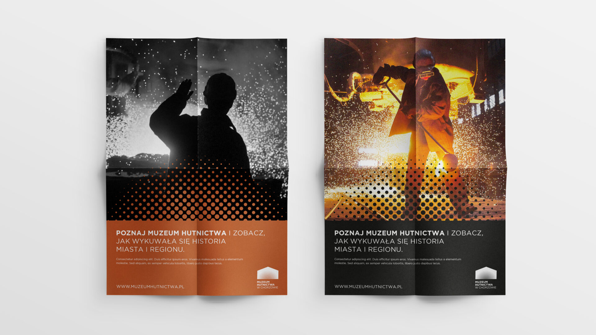
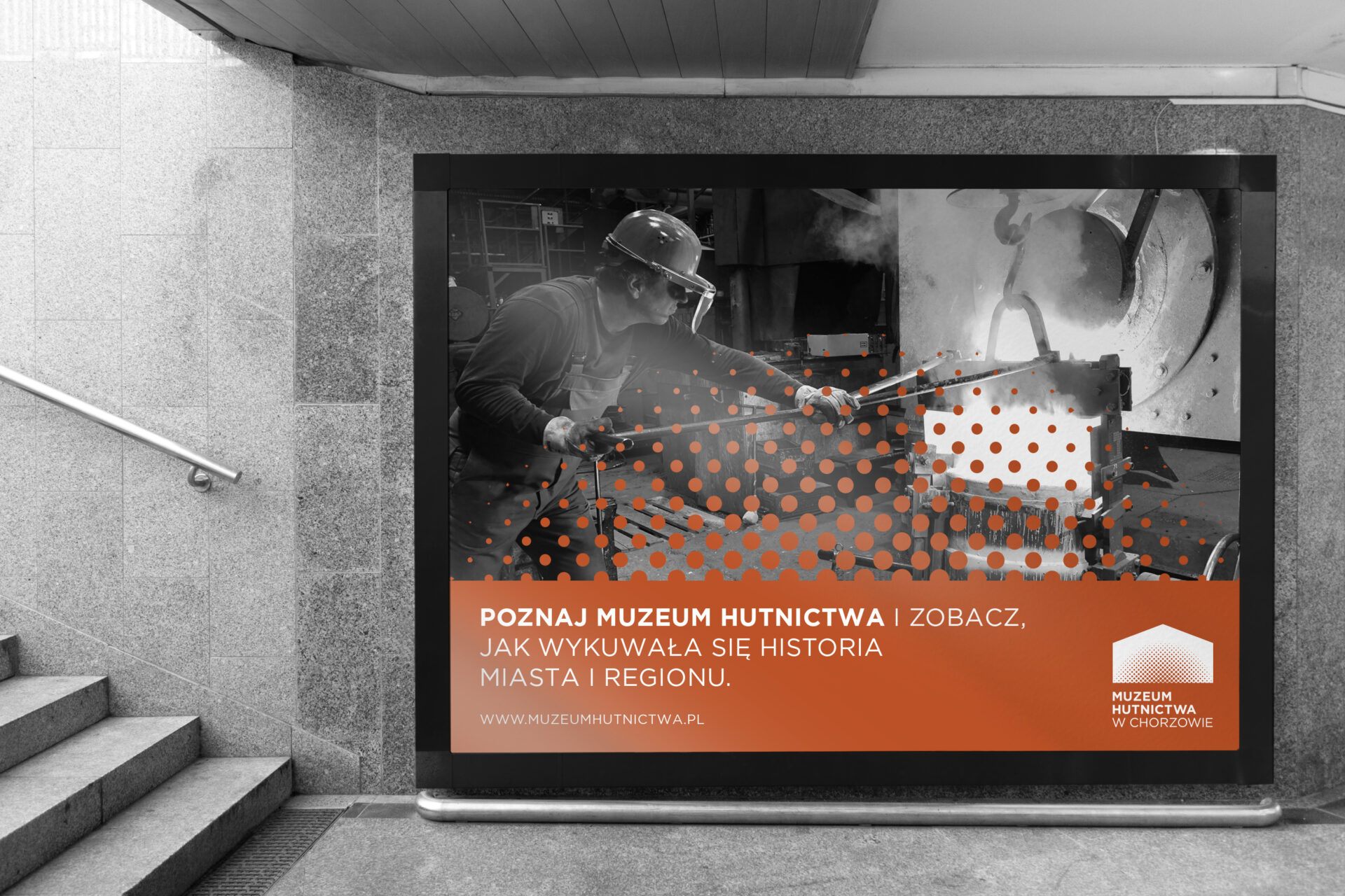
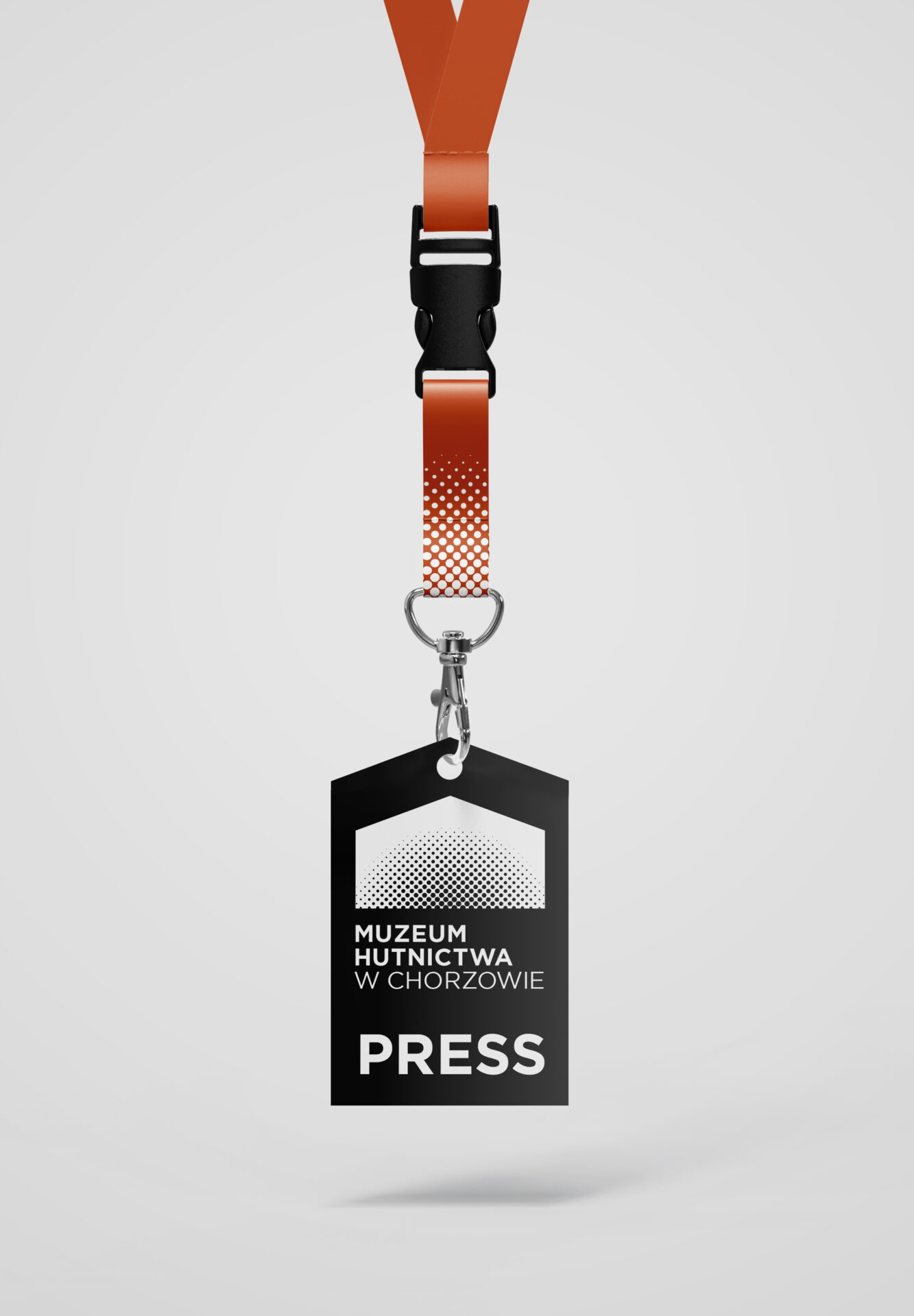
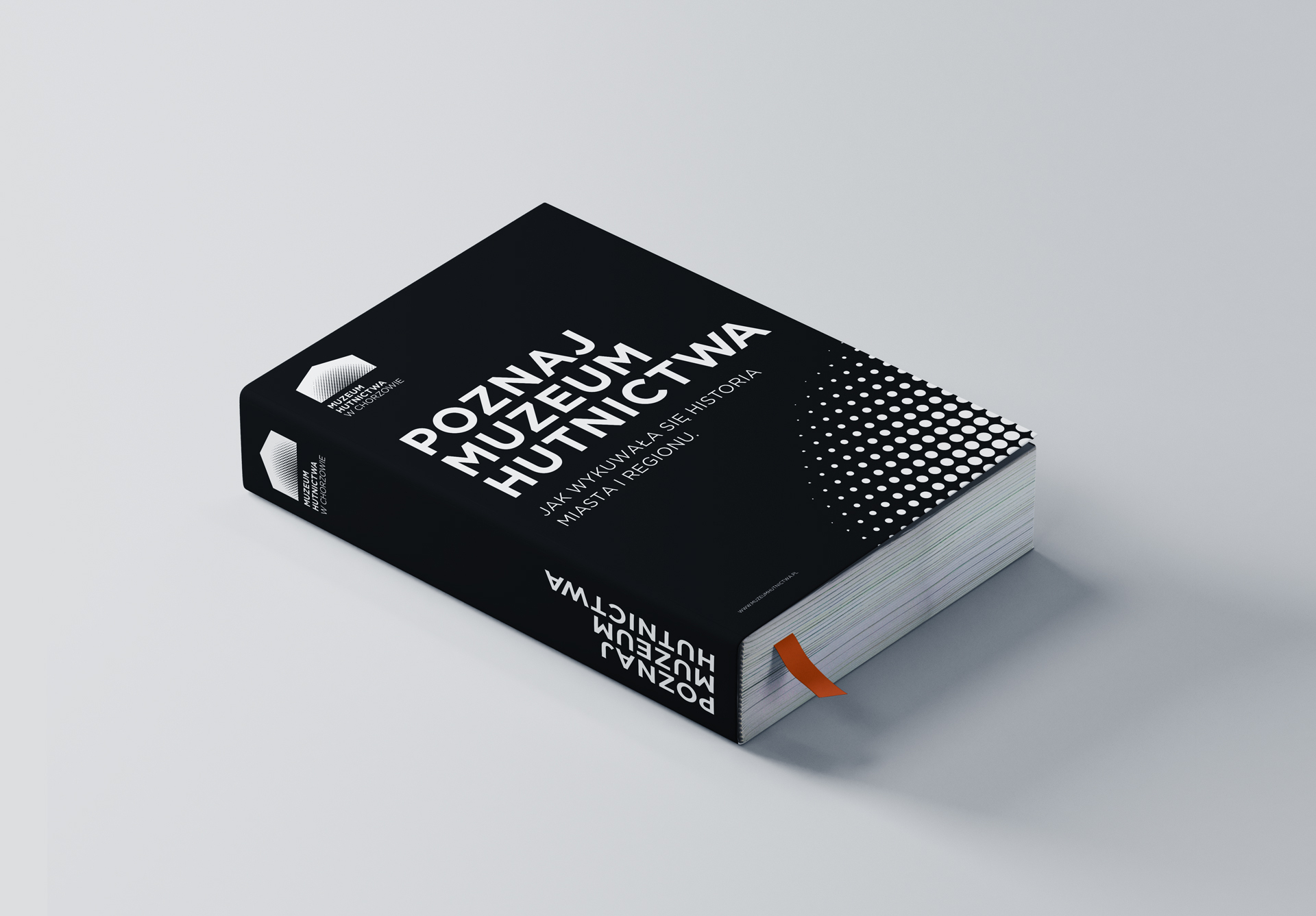
The idea of the system was based on two key foundations. The first is the shape of the Metallurgical Museum building under construction, and the second is one of the more distinctive elements at work in a steel mill – the ‘flying’ sparks during the smelting of steel and other metals. The sigil can also be associated with old steel furnaces, which further emphasizes the institution’s connection to history, the region and the guiding theme.
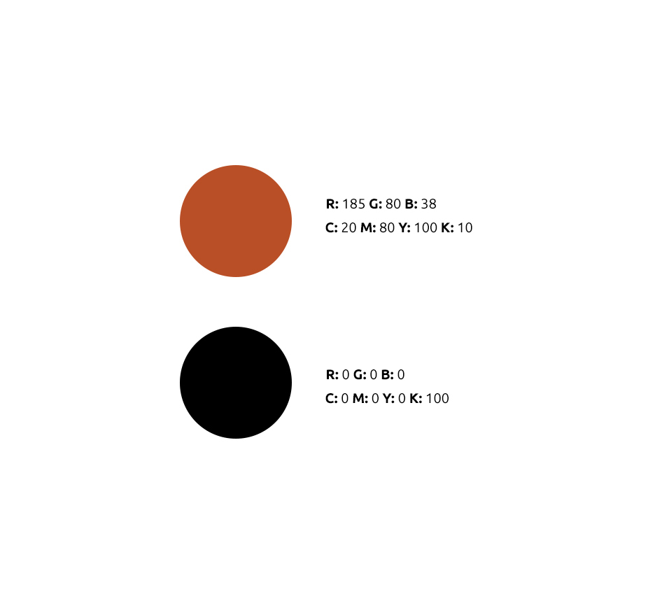
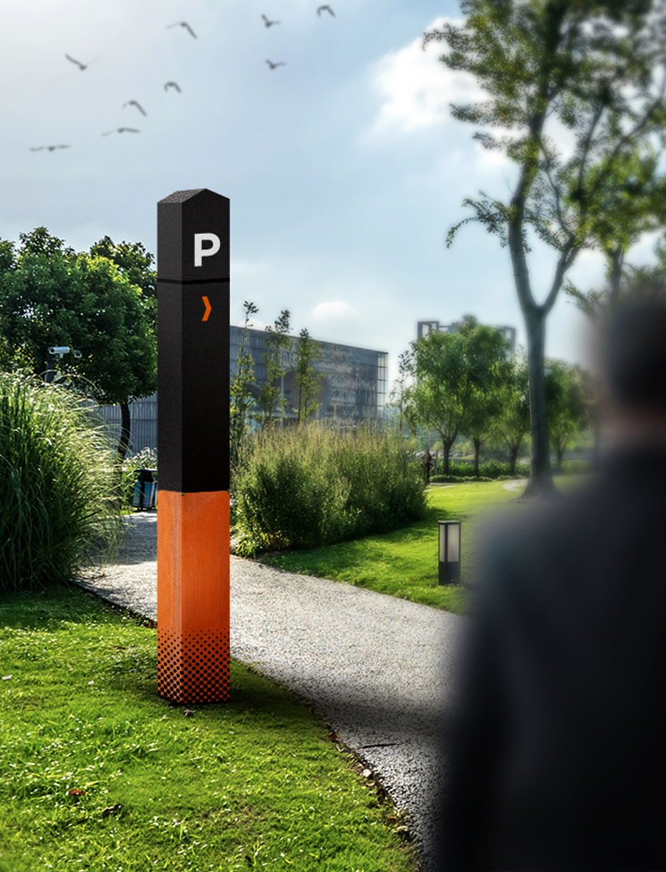
The color code is closely associated with both the reality of metallurgy and the materials used in the construction of the Museum’s headquarters. Oranges and browns, highlighted by contrasting black, are closely associated with fire, embers, sparks, the brick that was a structural element of the old part of the museum, the weathering steel used in the new segment, and the aging process of steel.
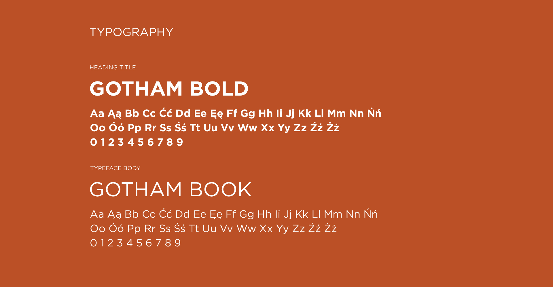
The typography used in the project is simple and minimalist, but very distinctive through its distinctiveness. It is easily readable by potential viewers and associated with a simple, industrial character, making it even more suitable for the place and institution where it will be used.
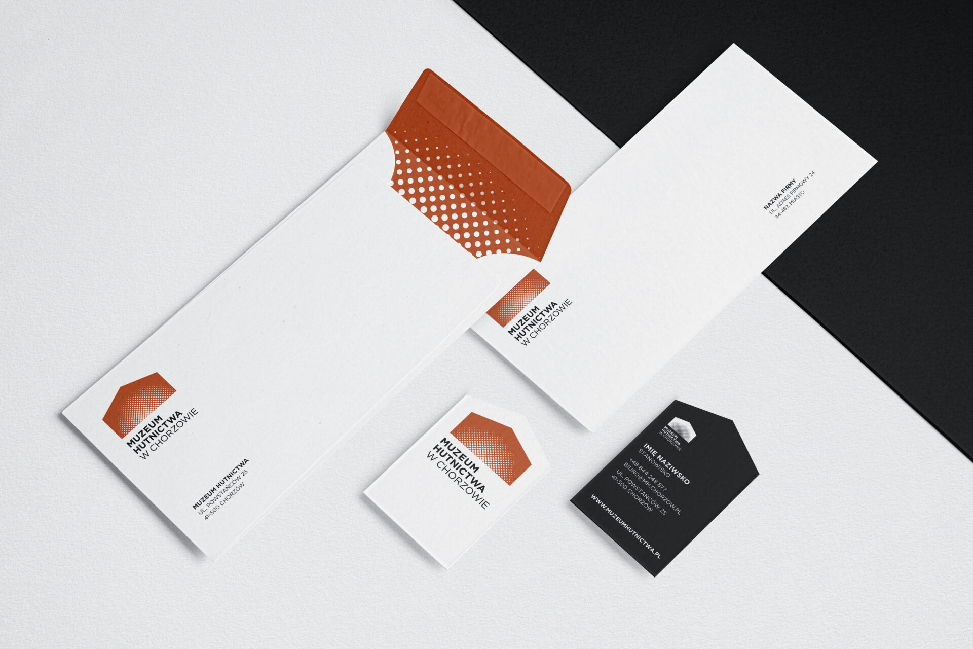
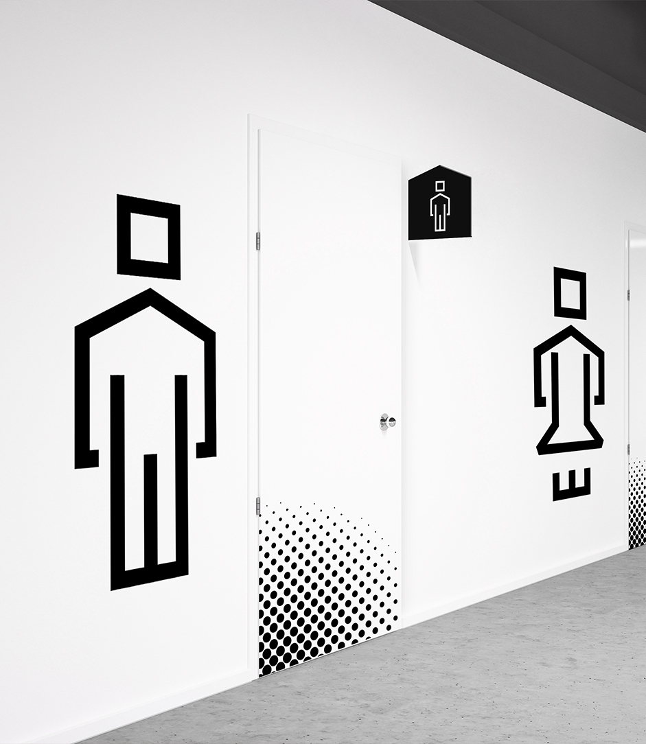
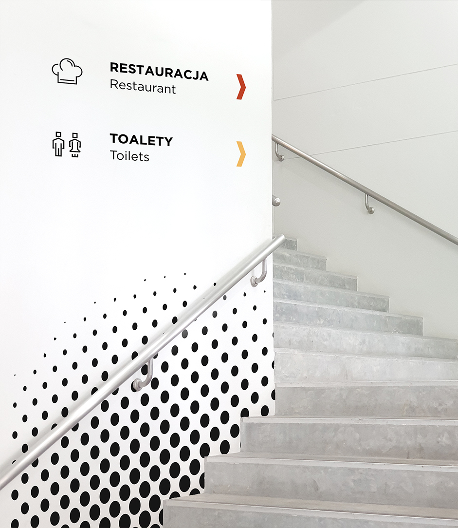
During the design work, we also created a system for the icons, which are based on sharp angles and thus, due to the lack of soft forms or curves, correspond to the styling of the signet.
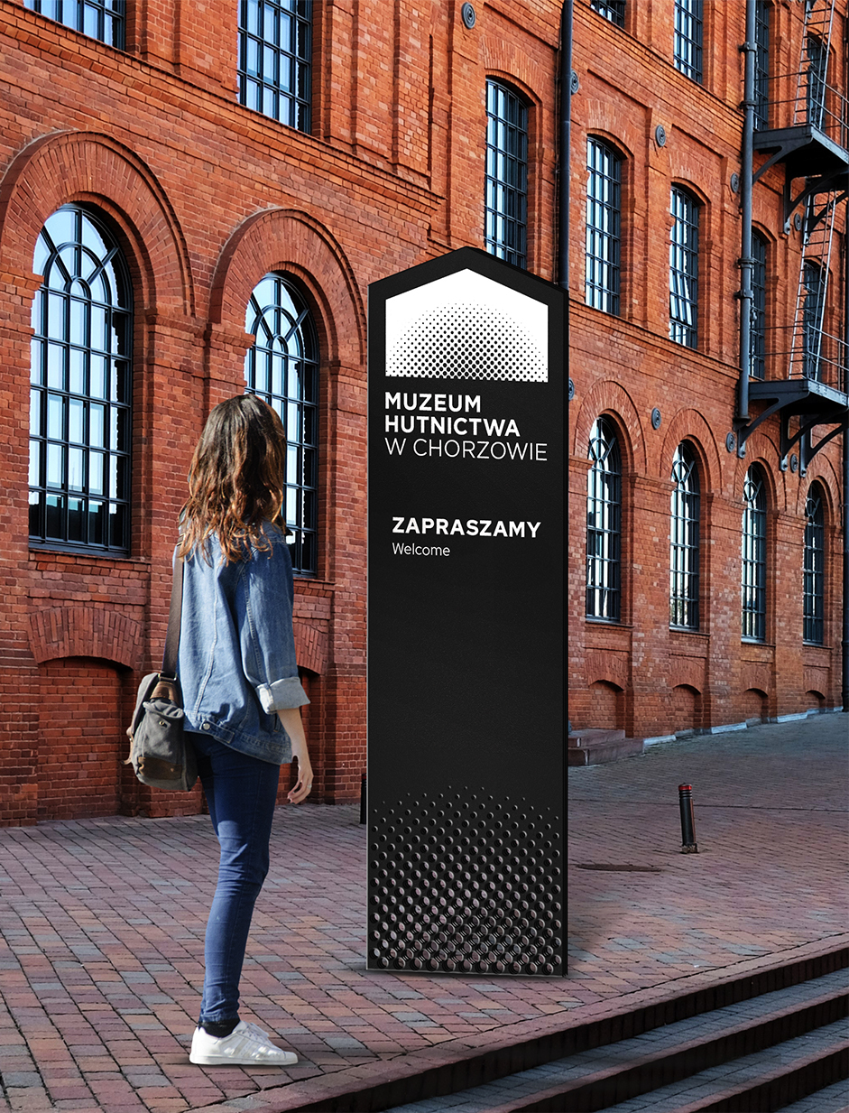
In creating the signage, we were guided by the principle of universality – so that it could be used in any area of the museum. An additional element in the form of a raster, referring to the sigil, is a leitmotif that appears in the development of the line and individual applications of the identification.
In developing the system, we were inspired by creations using perforated steel. It is now used in architecture not only as an element of facades, but also in the production of partition walls, pillars or balustrades. Perforations create a multidimensional effect and give the elements an industrial character.


Team:
Visual identity: Michał Wyszyński
Creative Supervision: Anita Kamila Sochacka
The project will not be implemented.
Packaging design for the Gift of Nature brand
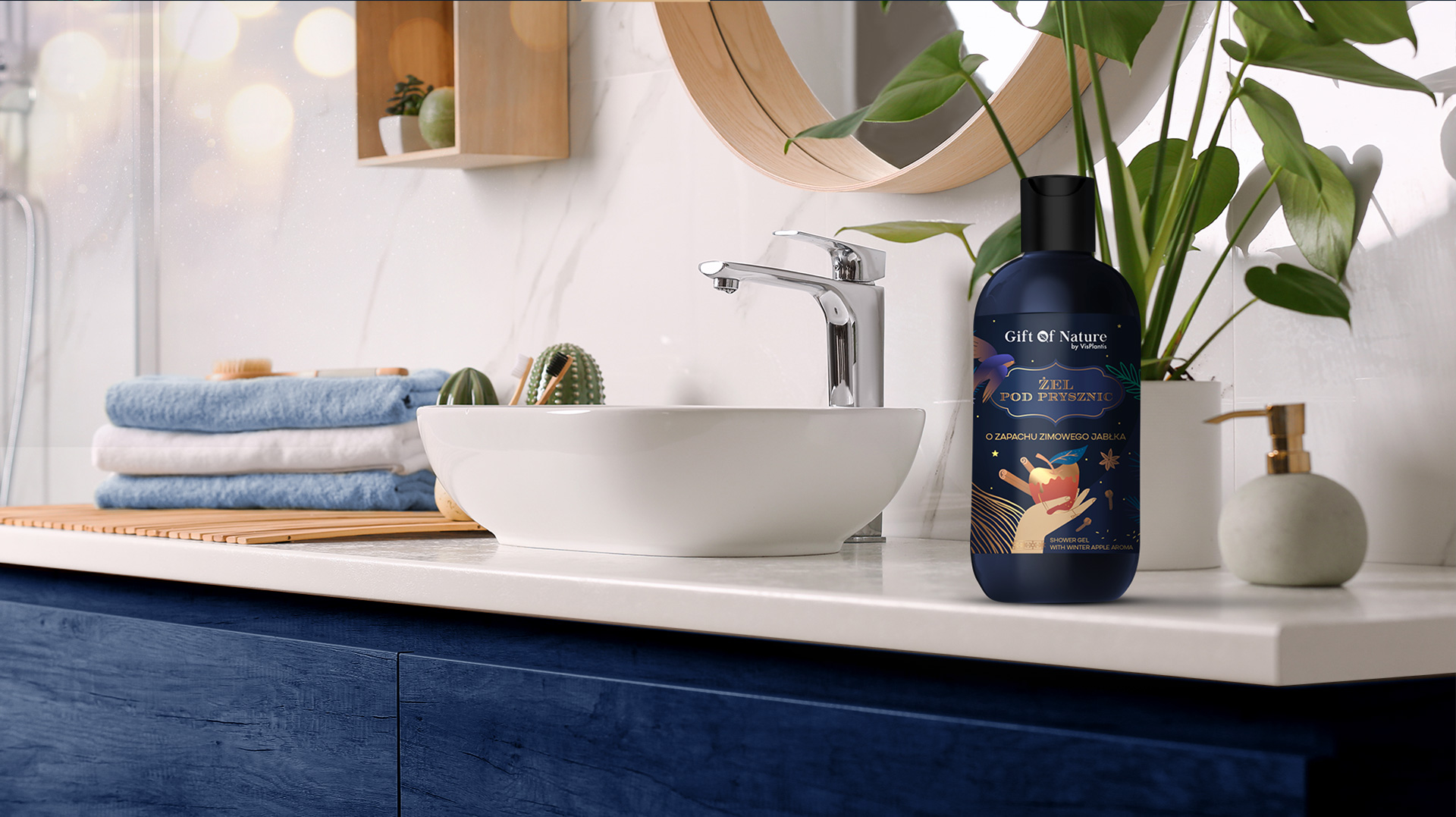
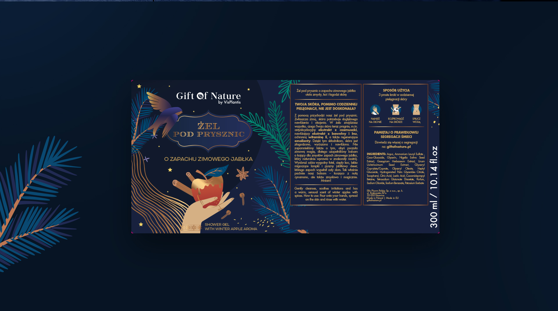
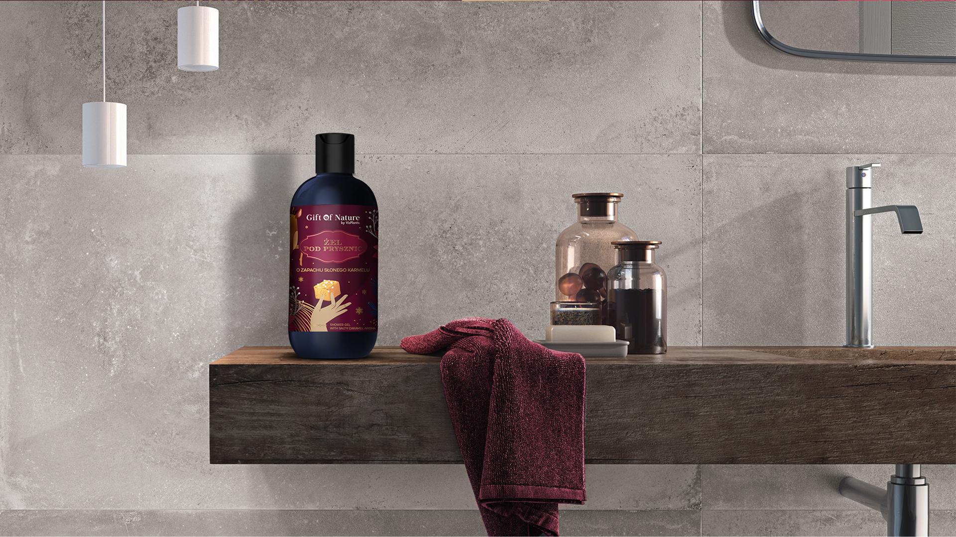
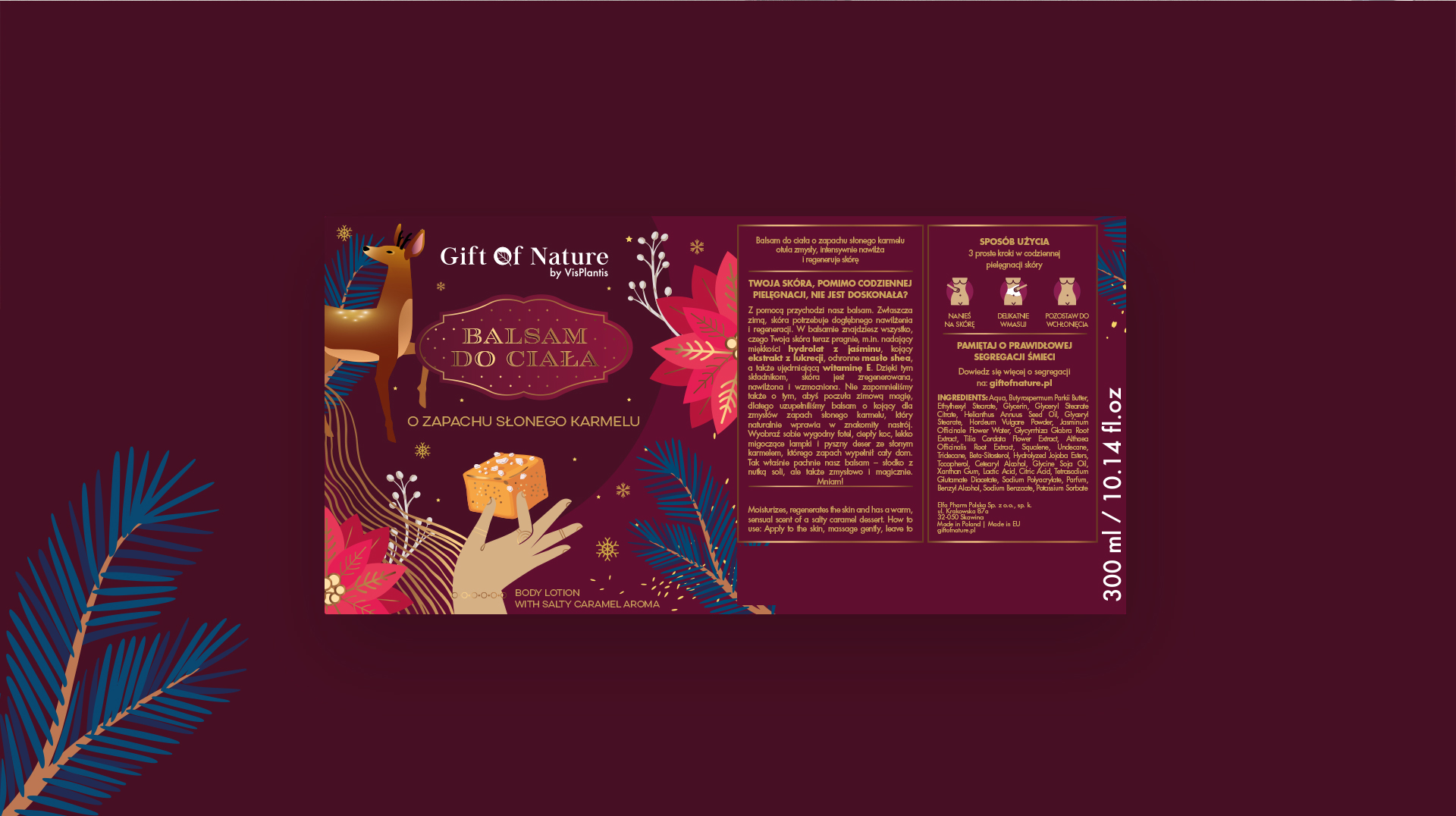
Gift of Nature by Vis Plantis is a series of natural, 100% vegan cosmetics that respond to the needs of modern women who want effective and proven products. Cosmetics from the GoN series are known for their original fragrances, natural composition and interesting label and packaging design.
It was for Gift of Nature cosmetics that we designed the special winter labels, which were placed on a special limited edition of packages, available for sale online. The project included labels for 4 products – two fragrance versions of shower gel and 2 fragrances of body lotions.
One of the most important considerations was to create a design that, at first glance, would fit the winter season in which the products are distributed. Special, occasional ornamentation, motifs associated with winter, as well as Christmas accents – which are an integral part of this season – make the products eye-catching for consumers.
The labels have what we call an “instagram look” – we based their design on current design trends, making it almost instinctive to want to reach for the product and take a picture of it just for social media.
The color scheme we chose is definitely associated with warm and joyful moments, it corresponds closely with the already known and accepted color of GoN bottles, and thanks to the subdued color harmony, all product information is perfectly legible.
Accompanying illustrations on the designs visually depict the qualities of the products, their character, fragrance, and also highlight the naturalness that characterizes the vegan cosmetics series.
Team:
Creative concept and design: Aleksandra Luboch
Creative Supervision: Anita Kamila Sochacka
Visual identity of the Air Force Military Academy
It is one of the most famous and recognizable universities in Poland, and unquestionably the best-known military university. The legendary “School of Eagles,” which has been training pilots, navigators and aviation personnel for both military and civilian needs for 95 years.
Due to changing conditions in the education market and the problem of the demographic decline, the authorities of this prestigious academy decided to put more emphasis on advertising and promotional activities, and for this a new structured visual identity was needed. An additional element that facilitated the decision to refresh the image was the change of the name from Wyższa Szkoła Oficerska Siły Powietrznych to the Air Force Military Academy.
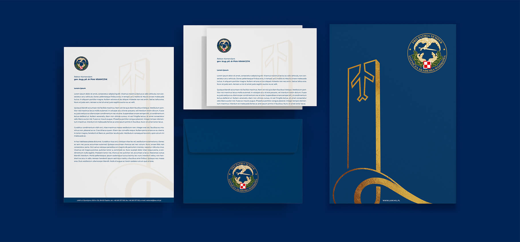
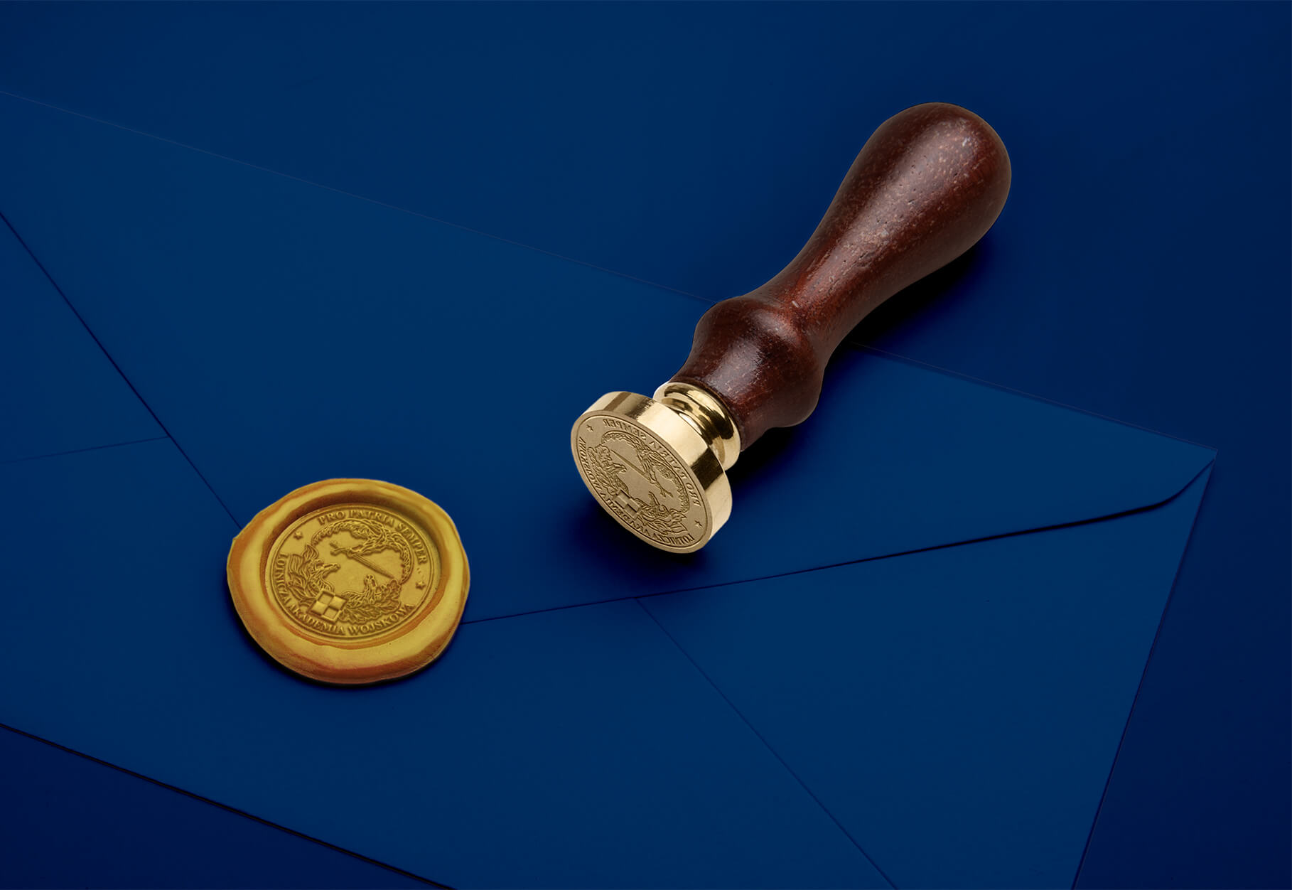
Until now, the function of the logo has been performed by the University’s emblem, which is technically complex and elaborate, making it difficult to use both off-line and on-line. However, it is a symbol that is well-known in the military community and has a great history, with which generations of graduates and employees of the University are associated.
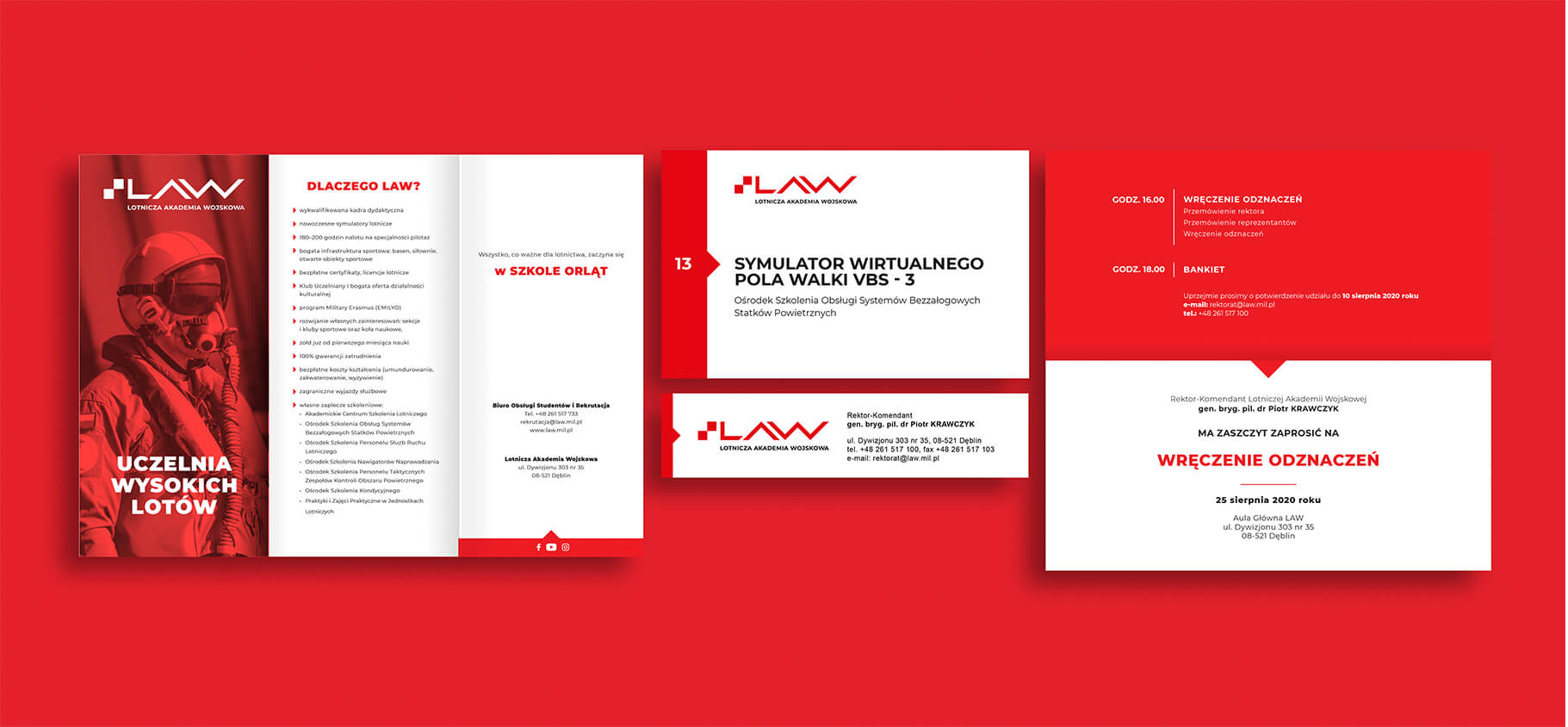
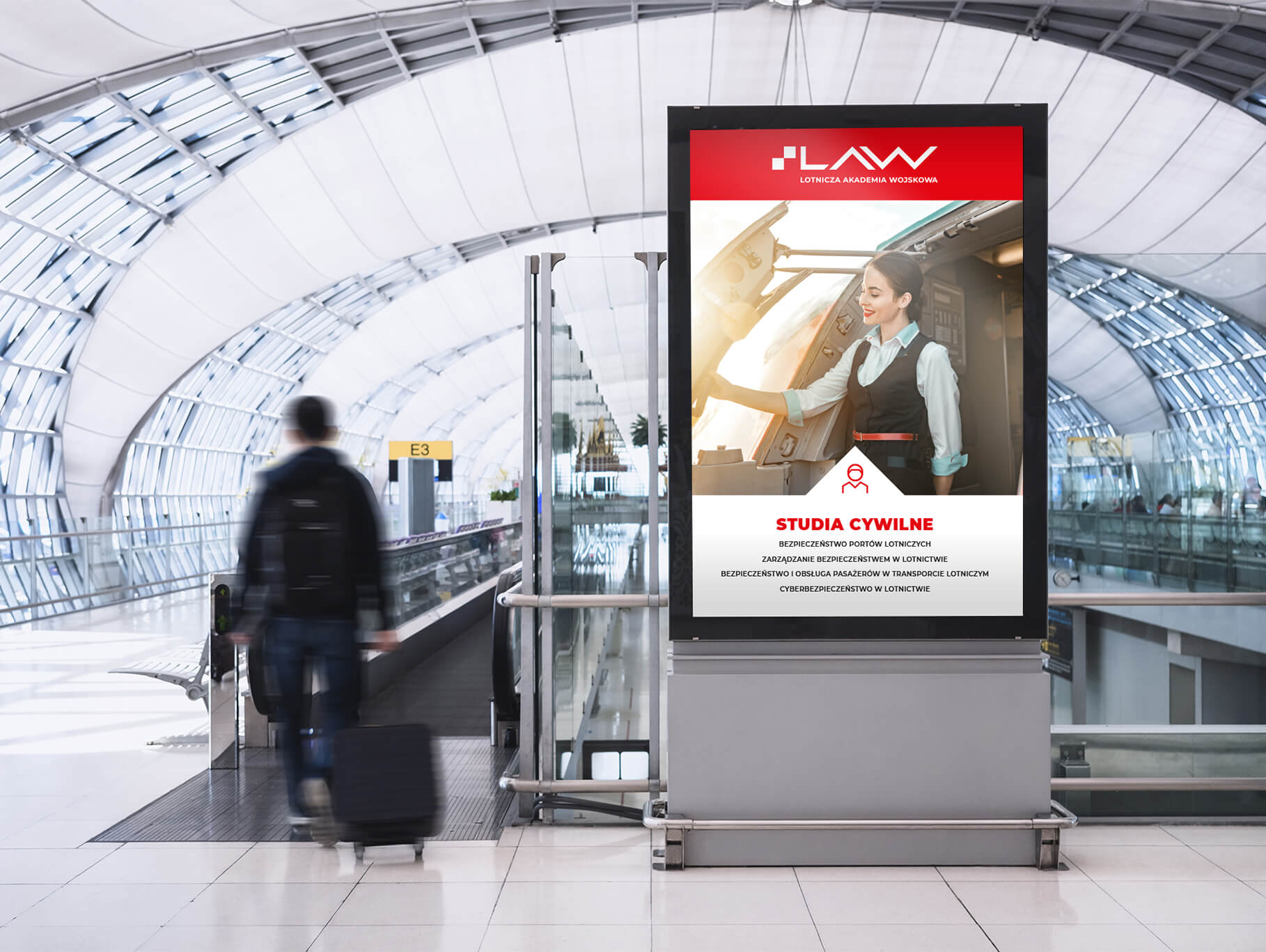
Therefore, together with the LAW Communications Department, we decided to develop two graphic lines. The Advertising Line – the main element of which will be the University’s new logo and the associated Kev Visual – and the Rector’s Line – a representative version, the main element of which will be a gently simplified Emblem and the Monument to the Heroic Airmen of the Dęblin School of Aeronautics, which is one of the most important objects of the University.
On the part of the University, a team under the leadership of the Rector-Commander was selected to work on the new Visual Identity, consisting of representatives of all Departments and Chairs of the University, the Student Government and the LAW Communications Department. On our side, the work involved the co-owners of the agency – Anita Kamila Sochacka, responsible for contacting the client, and Piotr Flis, responsible for copywriting and coordinating the work, while on the creative side, Michal Wyszynski, author of the logo and creator of the identity, and Katarzyna Loboda-Karki, responsible for technical supervision and development of the entire Brand Book.
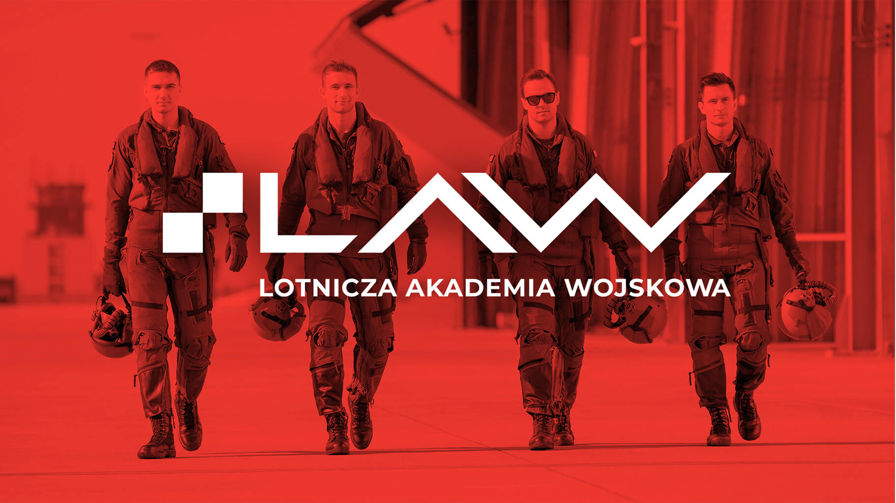
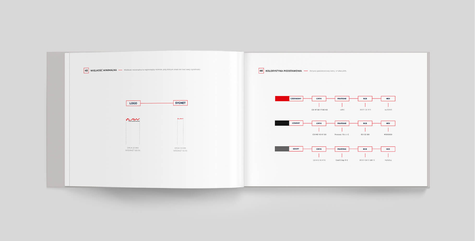
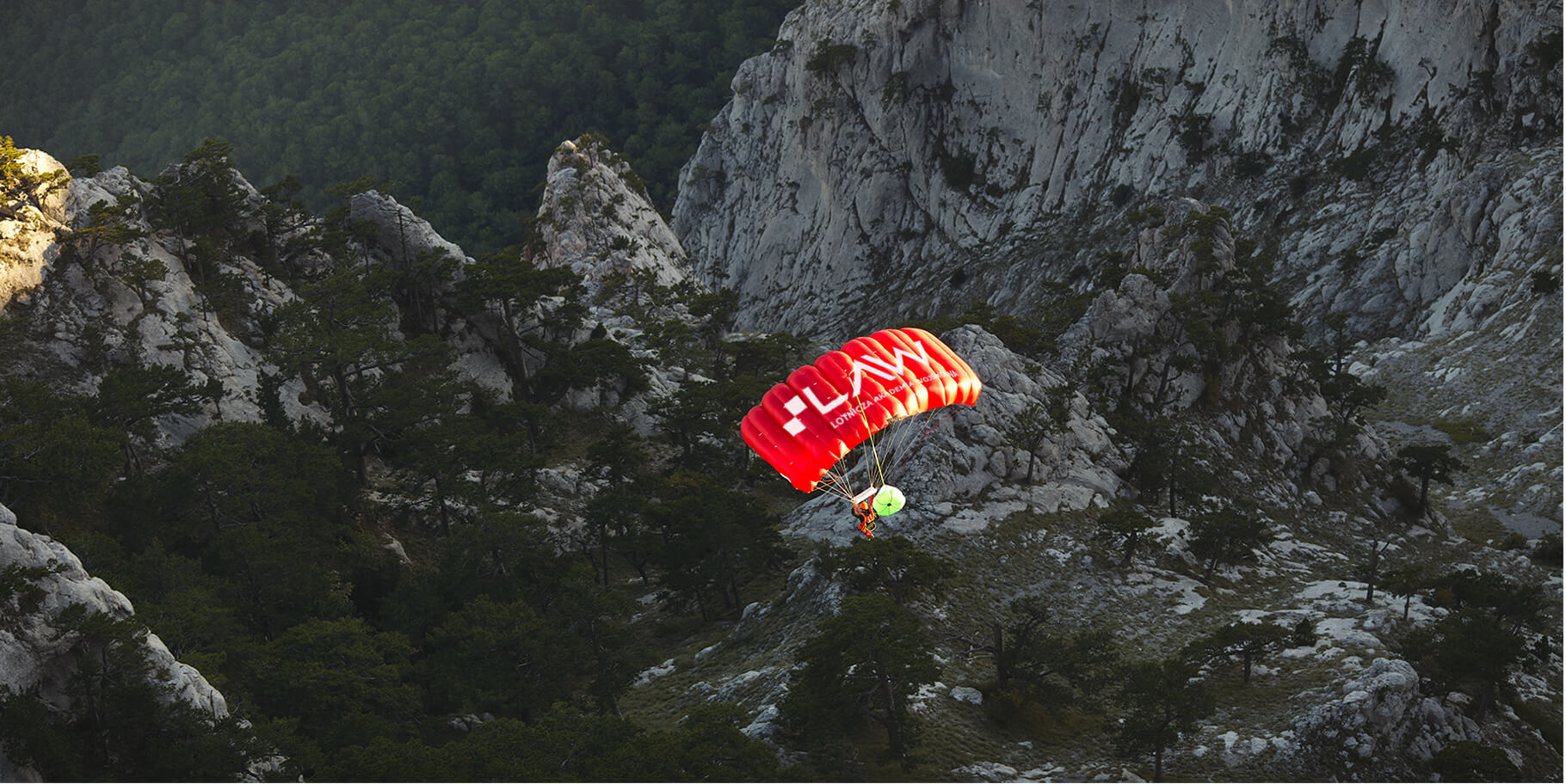
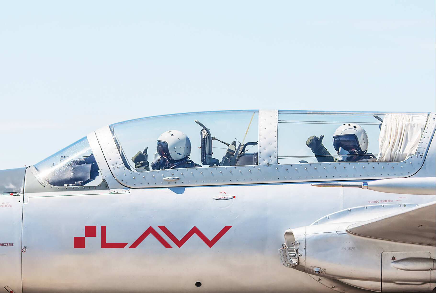
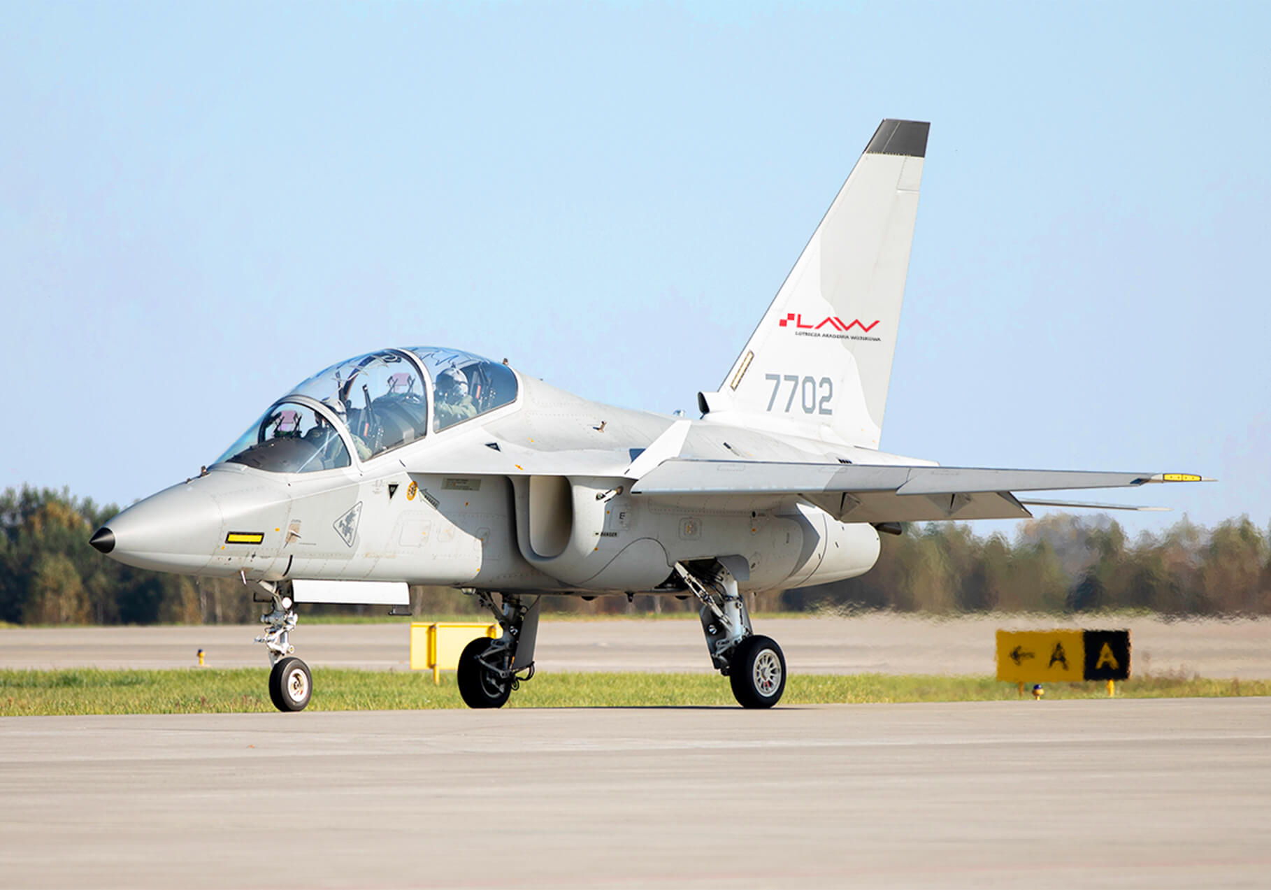
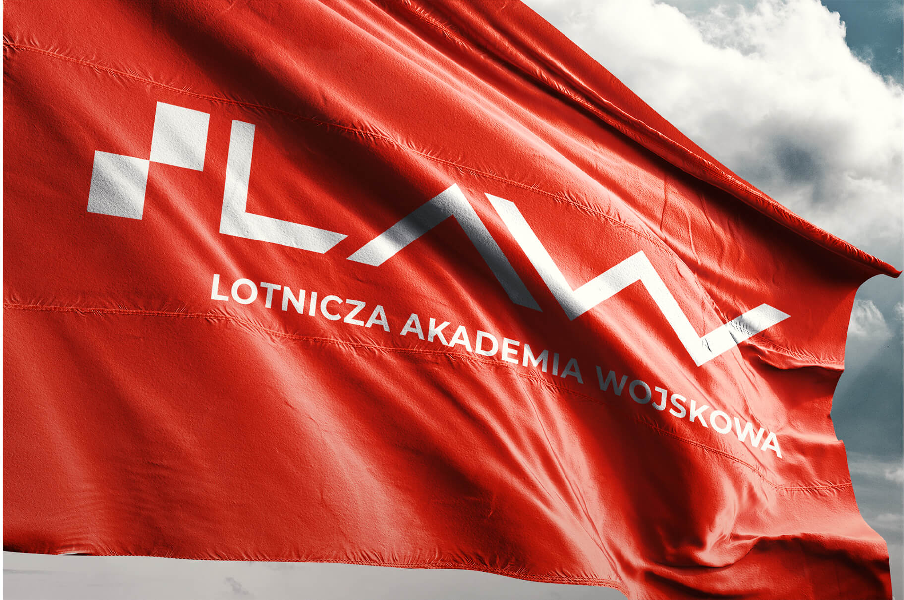
The logo and the entire visual identity of the University was built on the basis of the air chessboard – a universal, unique and distinctive sign of the Polish Air Force, unambiguously associated with Polish military aviation.
The checkerboard is a symbol of Polish military aviation with a history of more than 100 years. Referring to it, we wanted to highlight the Academy’s activities and honor its contributions to the Polish National Air Force.
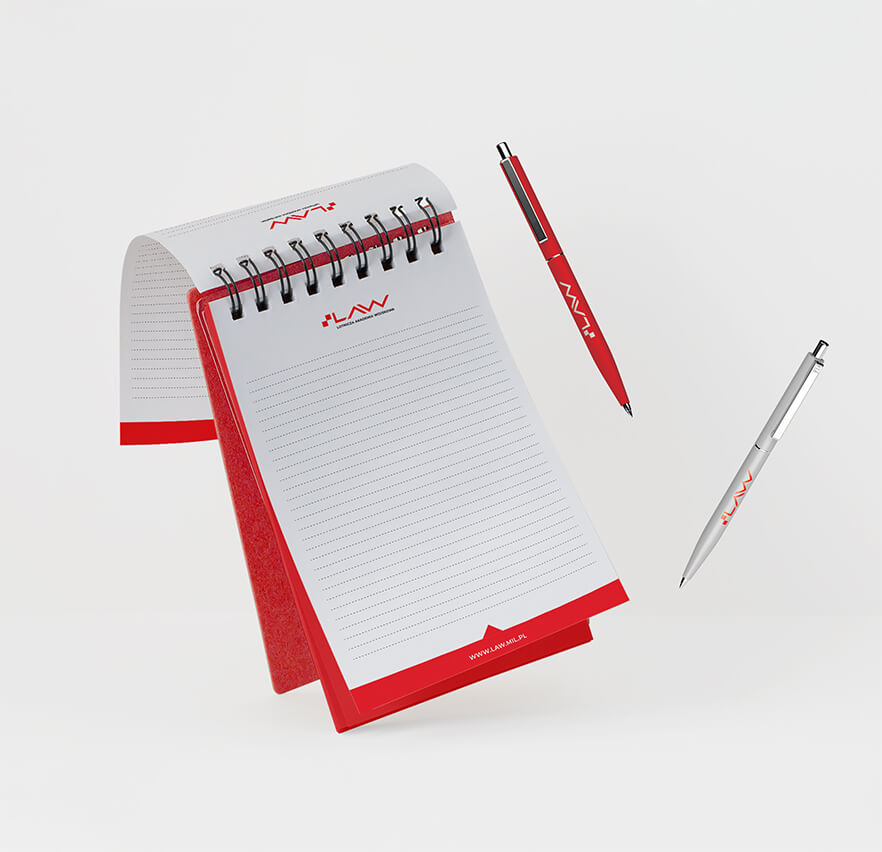
The signet of the mark of the Air Force Military Academy consists of red squares of a checkerboard and the abbreviation LAW built on its red borders. The whole forms a modern, dynamic and strong composition emphasizing the Academy’s activities.

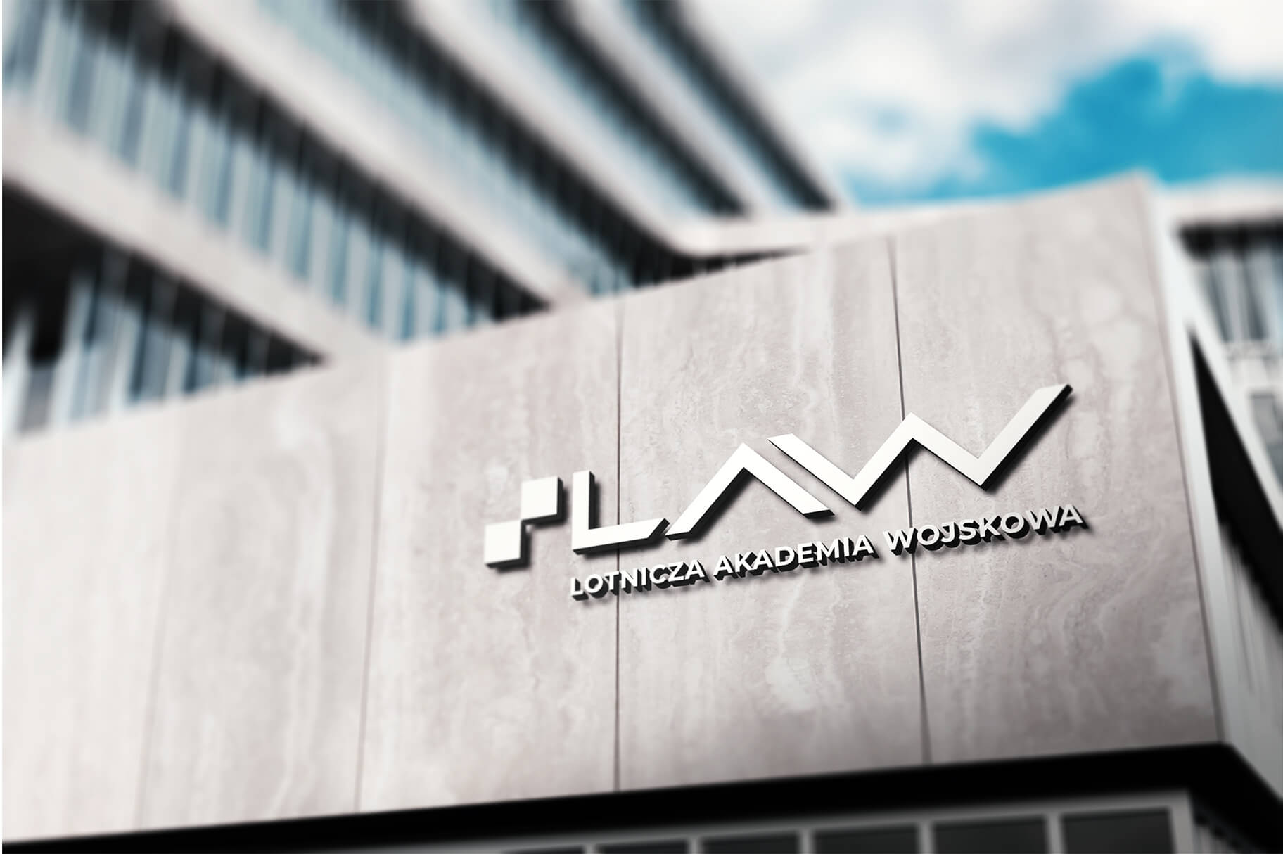
The visual identity links directly to the University’s logo. Its main element, organizing and giving direction, is the triangle called the distinguishing mark or bow. It derives directly from the sigil. It is a reference to the bow of an aircraft, that is, the forward-most part of the fuselage, forming an aerodynamically contoured streamline for air currents.
Z uwagi na różnorodność stosowanych treści oraz mnogość tematów, którymi zajmuje się Uczelnia, jej identyfikacja jest elastyczna i pozwala na dość swobodną modyfikację elementów składowych.
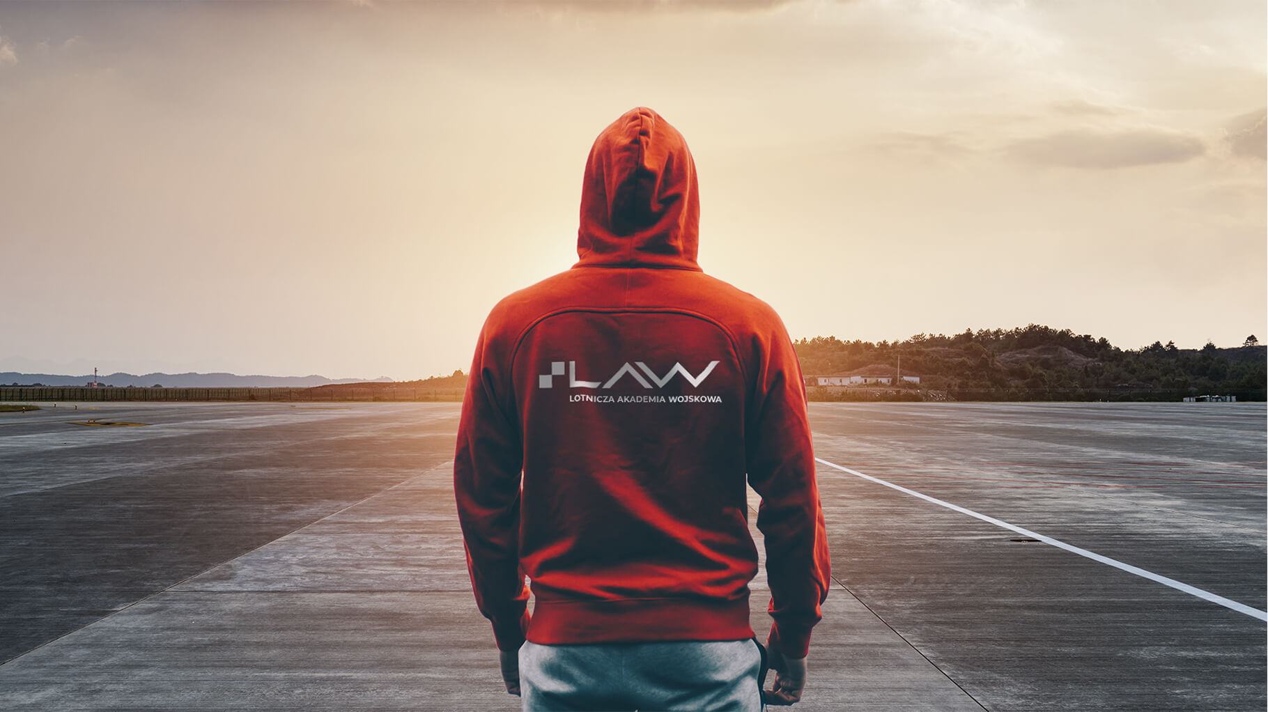


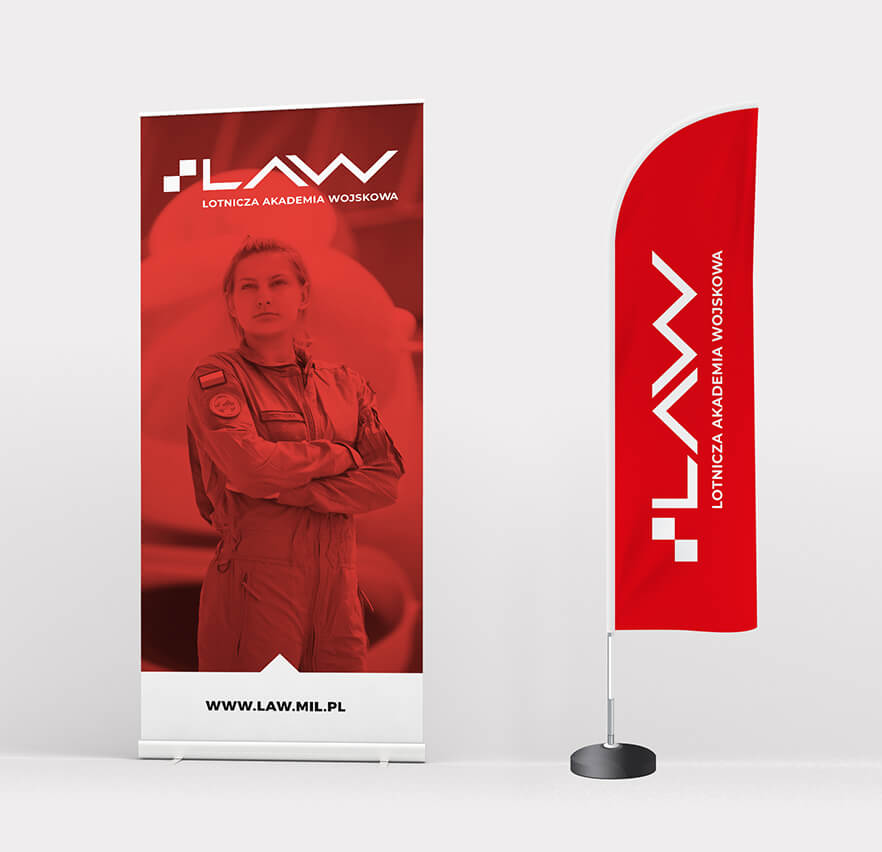


For the purpose of advertising activities, we also developed a slogan with a meaning that refers to both the University’s object of activity – Aviation – and the ambitious goals that LAW has before it and wants to achieve.
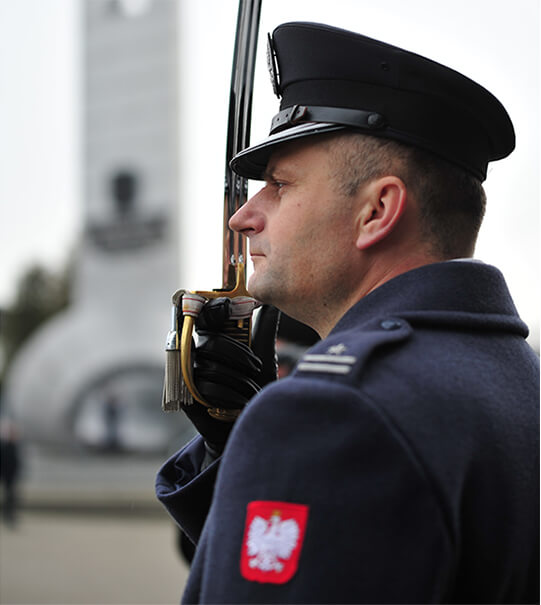
In addition to the advertising line, we also developed the Rector’s Line, using the traditional symbols of the “School of Eaglets” – the emblem and the “Heroic Airmen of the Dęblin School of Eaglets” monument. It was designed for the Rector-Commander of the Air Force Military Academy to represent his office. Materials from this line will be given to the highest representatives of state and international authorities during domestic and foreign official visits.


Team
Visual idenity: Michał Wyszyński
Verbal idenity and project management: Piotr Flis
Creative supervision: Anita Kamila Sochacka
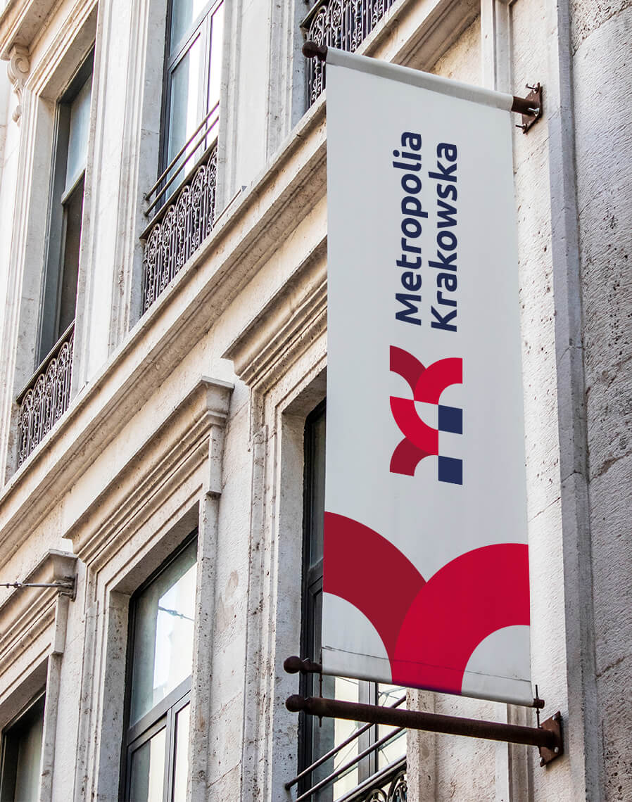
Visual identity
of the Kraków Metropolis
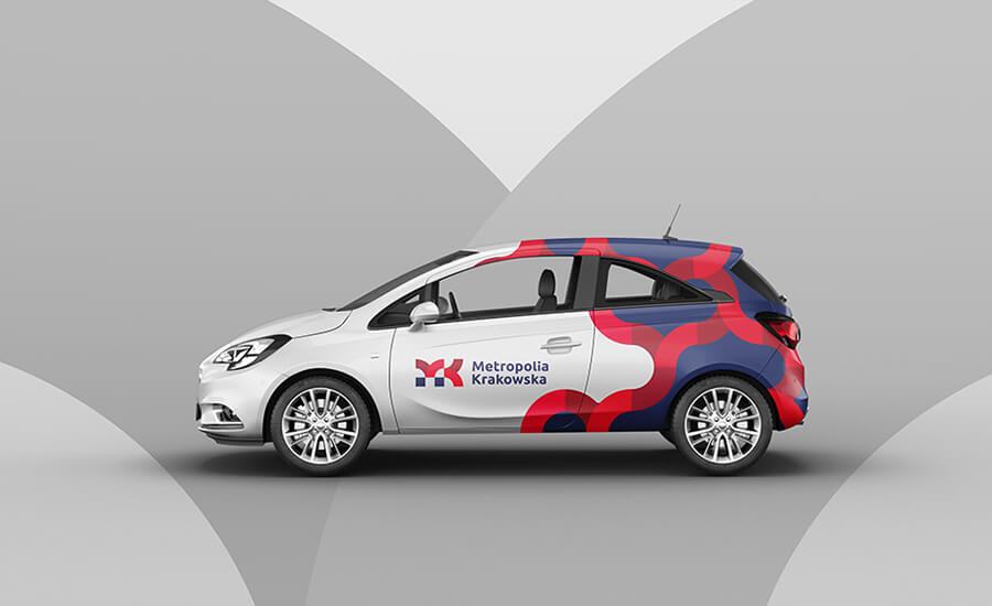
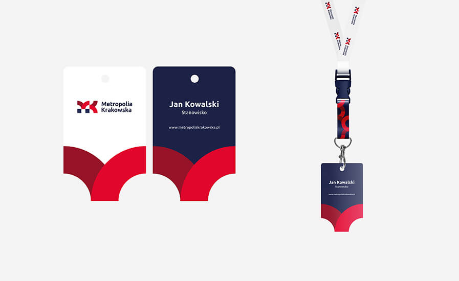
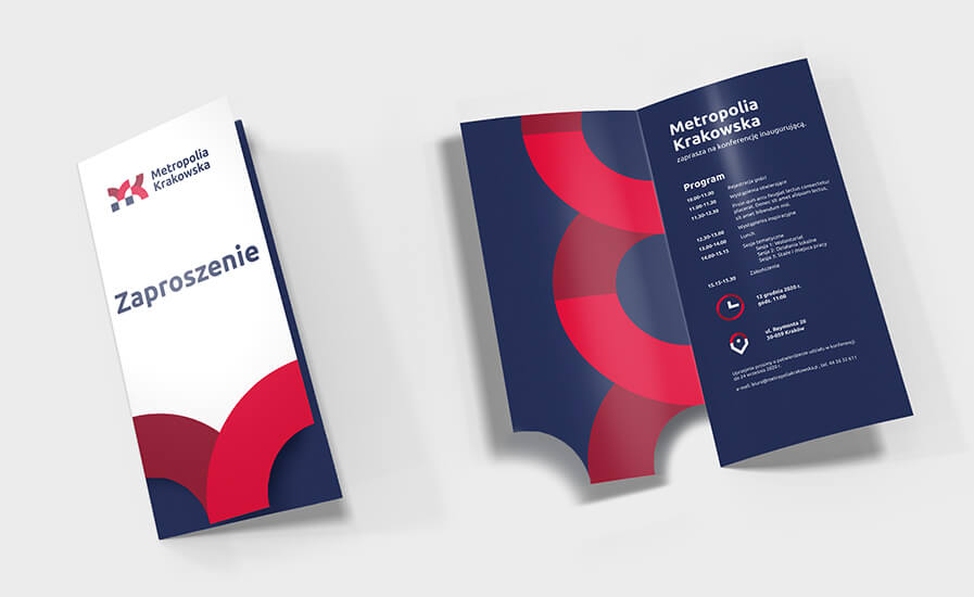
Krakow Metropolis is an association of Krakow and 14 surrounding municipalities. The main goal of the entity is close regional cooperation on many levels – including business, culture, tourism and technology. Members of the association also want to strongly promote the region internationally to increase the number of tourists visiting the Metropolis and to attract new investors.
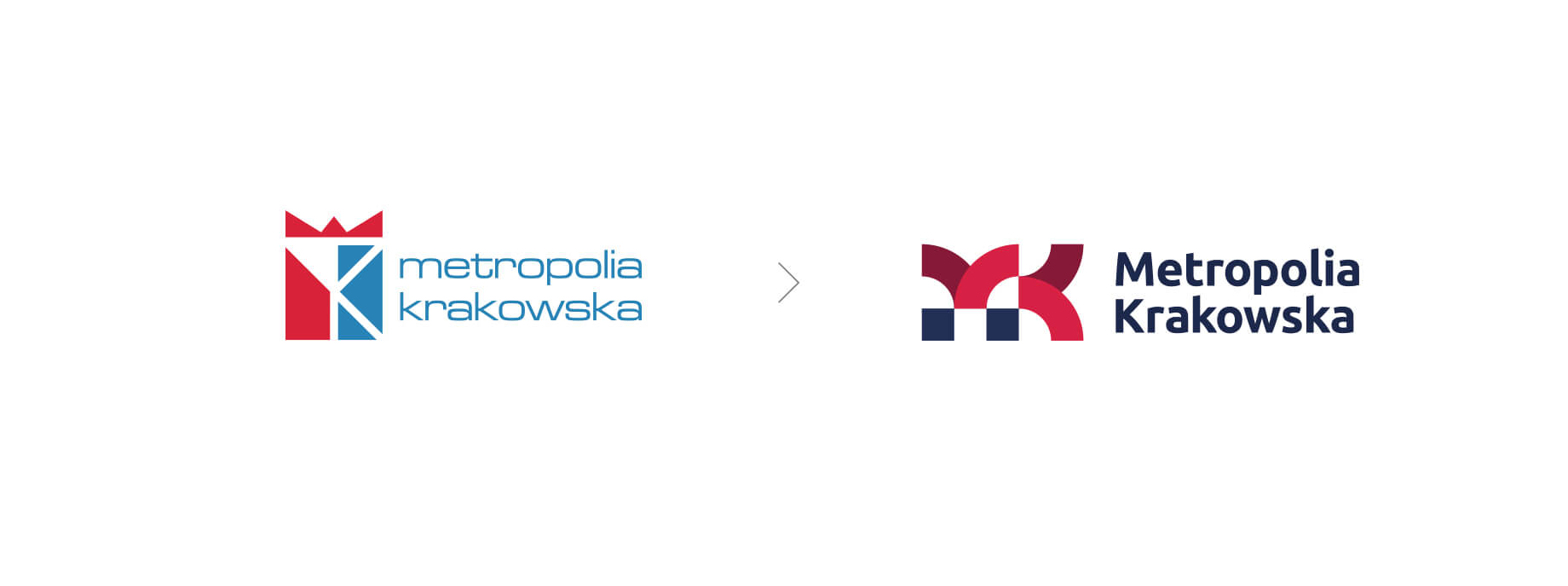
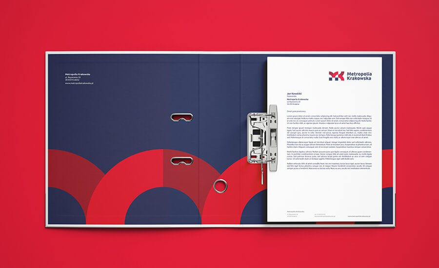
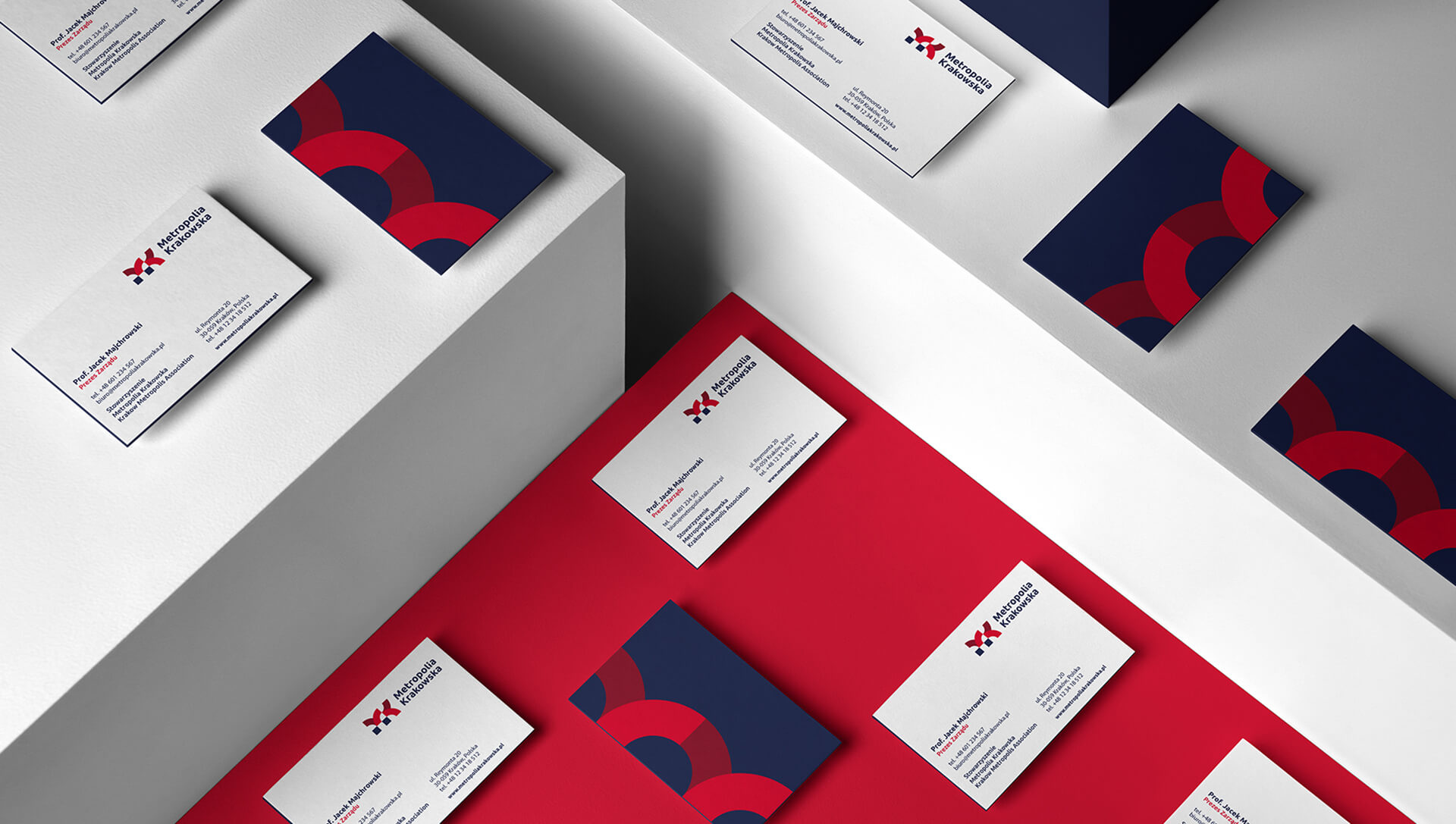
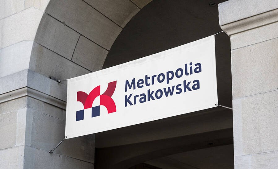
The first step to achieve these ambitious goals was the development of a consistent visual identity for the Krakow Metropolis Association brand, which consisted of refreshing the logo and developing a visual identity system.
When creating the new ToR, we took into account the diverse needs, goals and requirements of all 15 municipalities, as well as the diversity of areas that the Metropolis of Krakow deals with and wants to promote.
Before starting the work, we held a series of workshops and training sessions, during which we explained in detail the purposes that the identity serves, and gathered the expectations of local governments regarding the new identity.
As a result, the project was an accurate response to the jointly created brief and was unanimously accepted by all entities of the Metropolis.
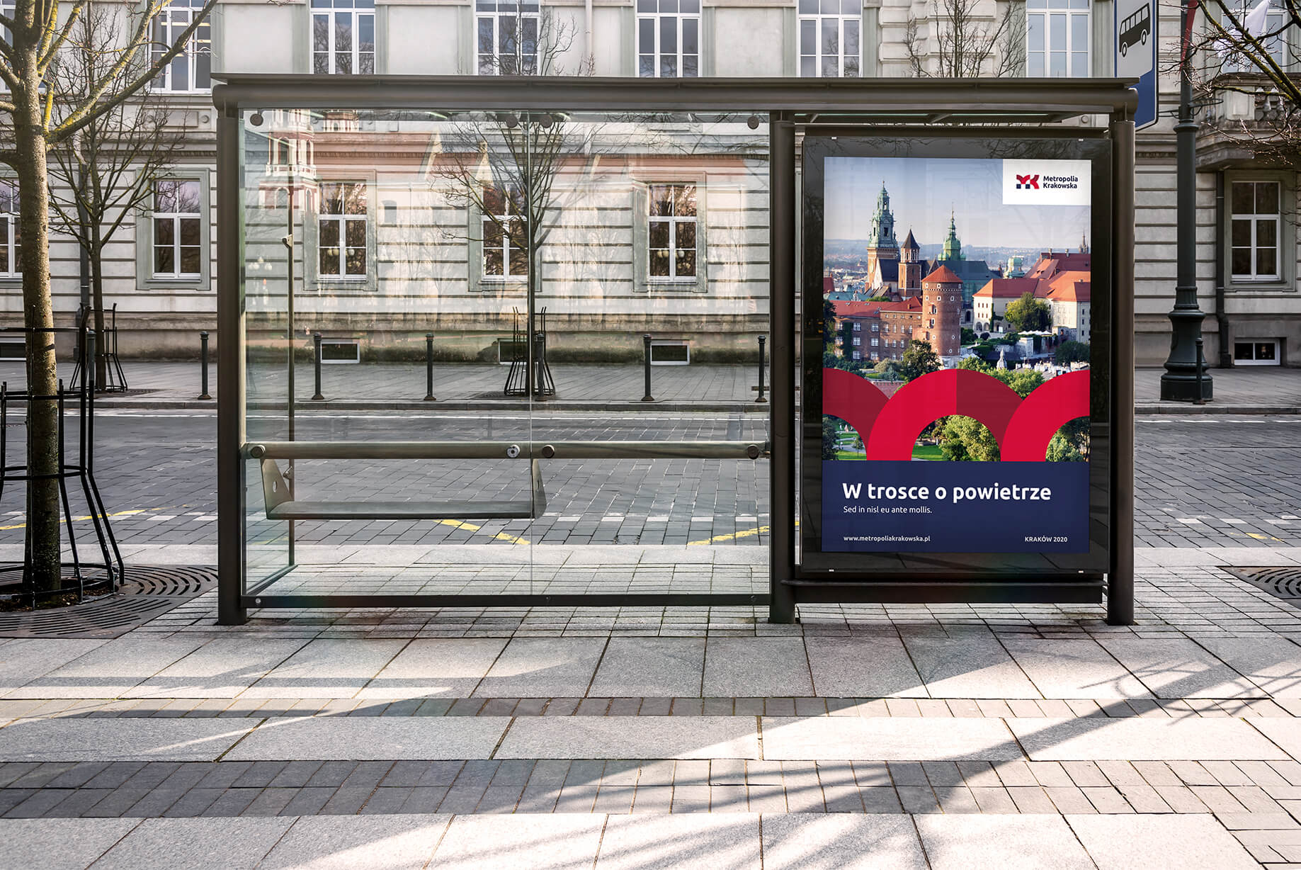
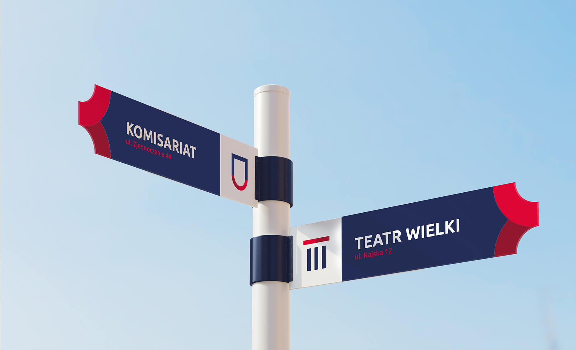
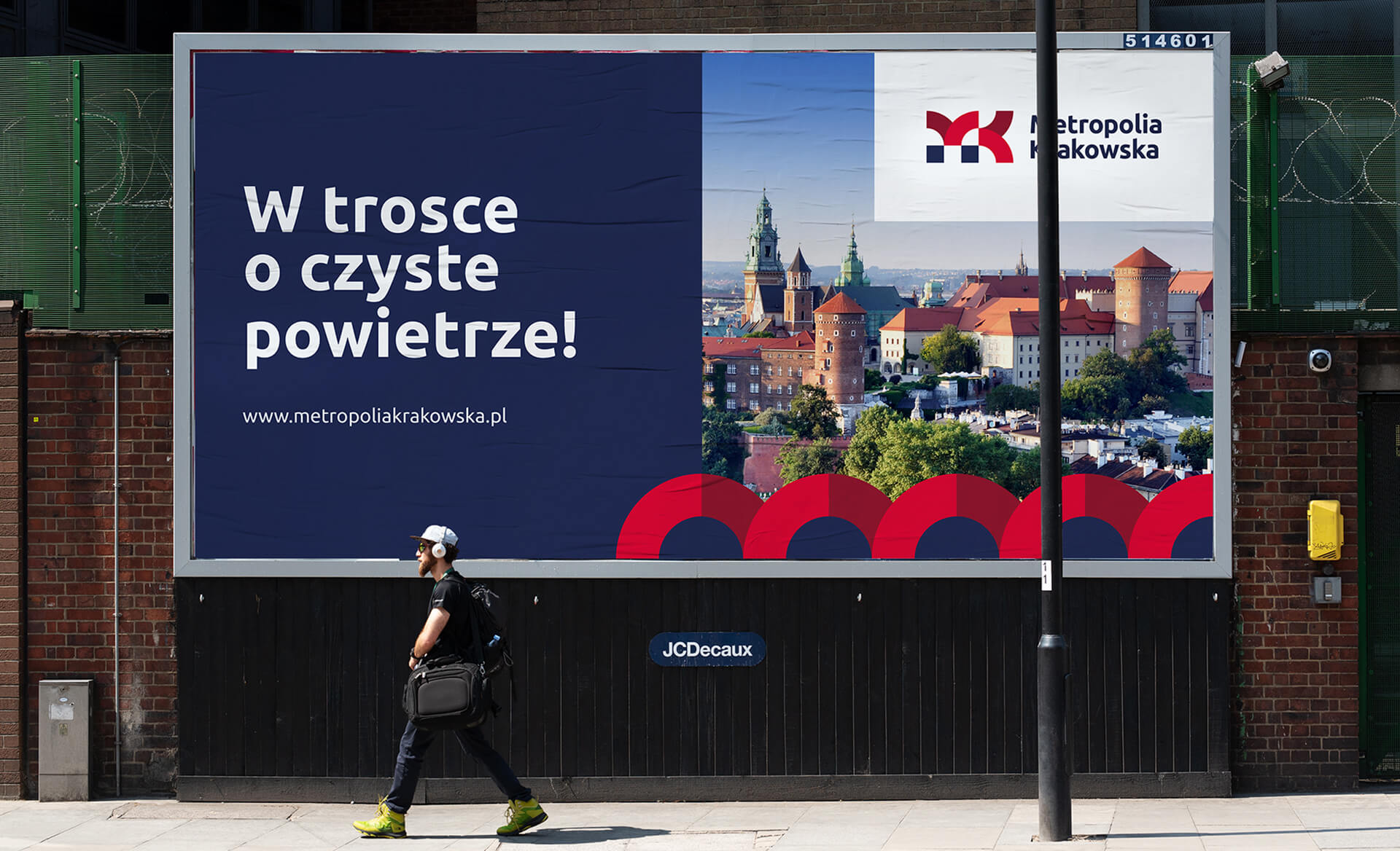
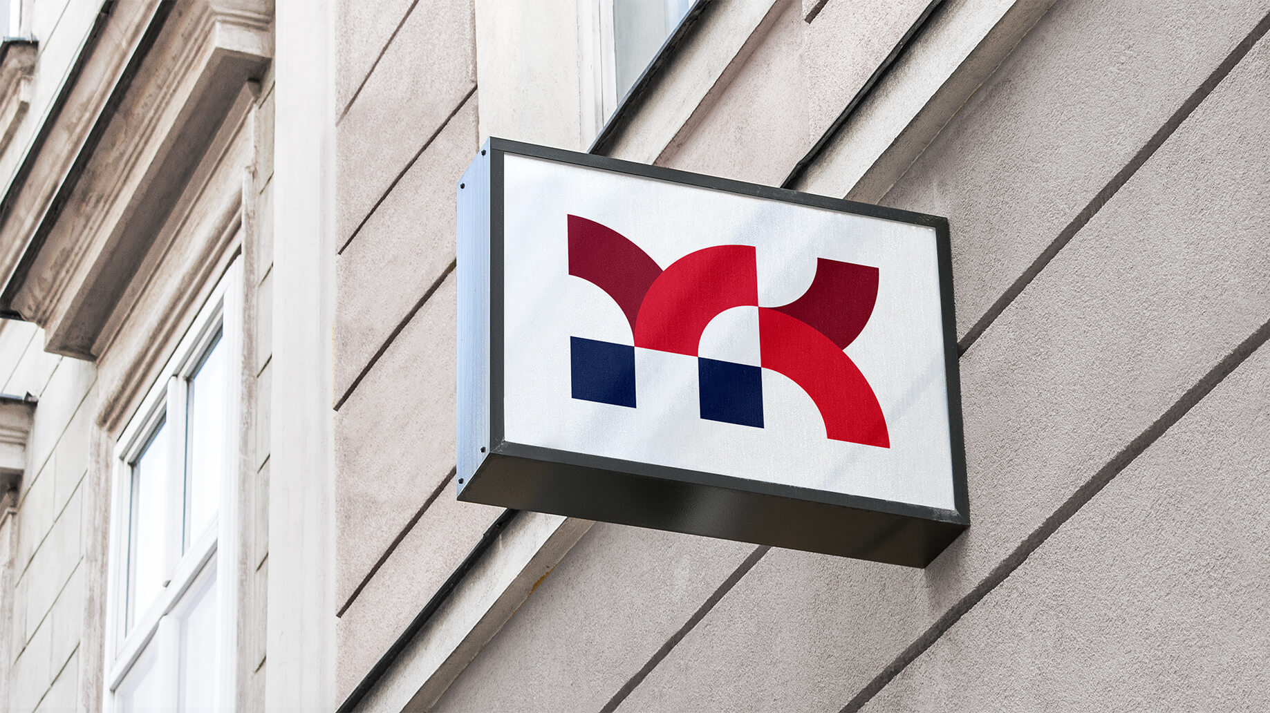
For the leitmotif of the sign and the entire visual identity, we chose arches – a symbol of the dynamism that characterizes the Metropolis, efficient cooperation between the associated municipalities, as well as the constant development of the association. The signet of the sign – is built of 4 arches and the base against which they are based and together form the letters MK – the abbreviation of Metropolia Krakowska.
In choosing such symbolism, we also took into account the regional aspect. The arches bring to mind the popular and well-known arcades of Krakow’s Cloth Hall, which, along with the Wawel Castle and St. Mary’s Church, are unambiguously associated with the region. Joined at the top, the arches form a gate – a symbol of openness, readiness to cooperate, hospitality.
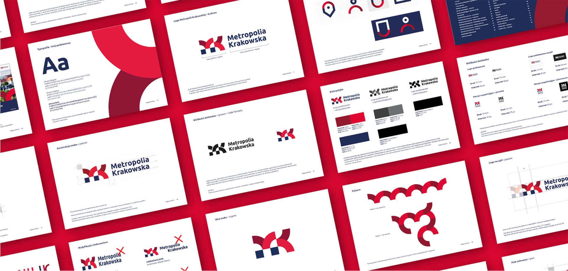
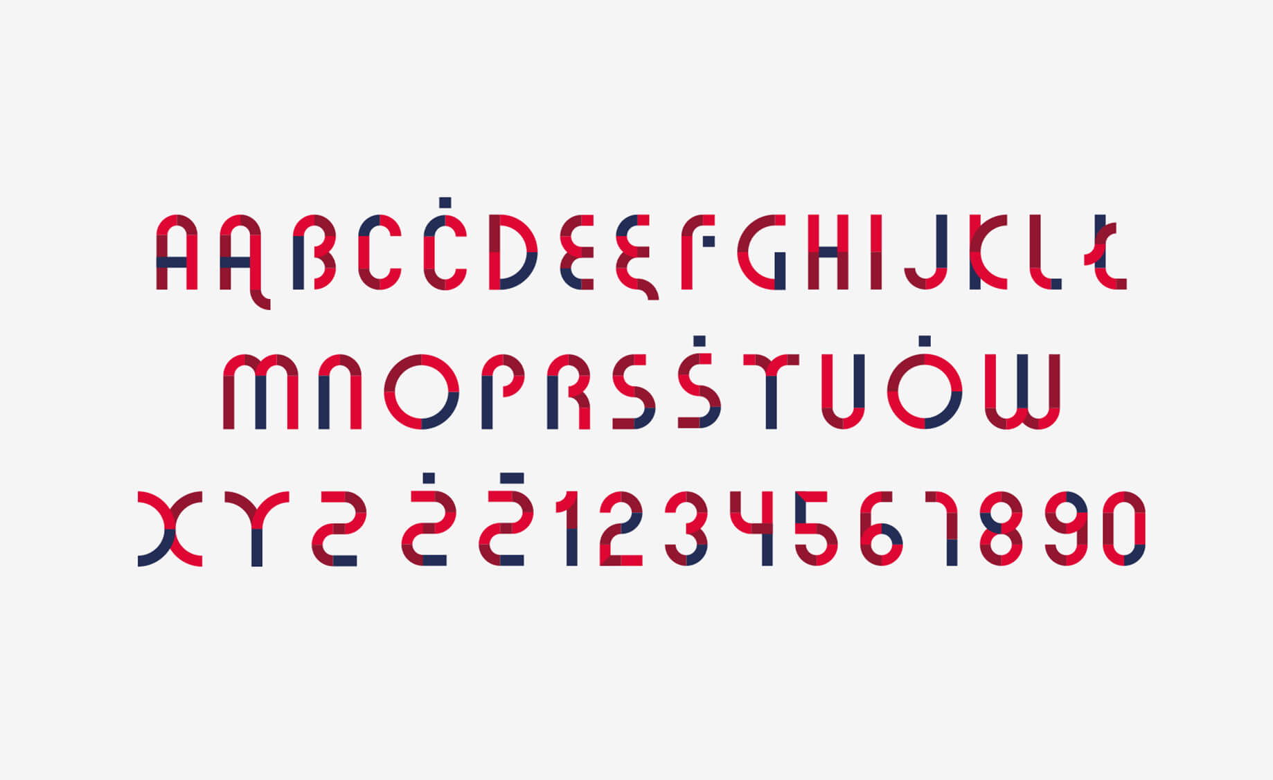
Based on the arcs from the sigil, we developed special typography, as well as icons and other graphic materials.
The color scheme used (navy blue and red) was taken from the old system, giving the whole process of change an evolutionary rather than revolutionary character.
The basic typeface – Ubuntu – is the same as the SIW of the City of Krakow, which will facilitate cooperation between the city and the association and help jointly achieve promotional goals.

Team:
Visual idenity Michał Wyszyński
Verbal idenity and project management: Piotr Flis
Creative supervision: Anita Kamila Sochacka
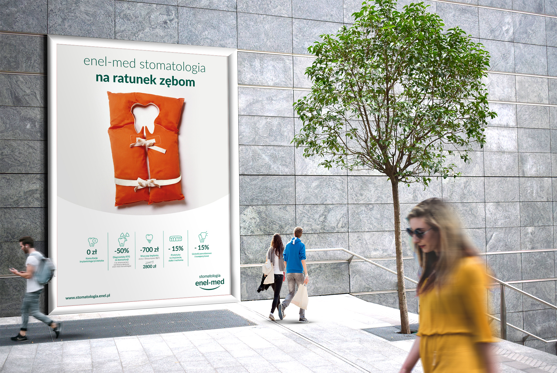
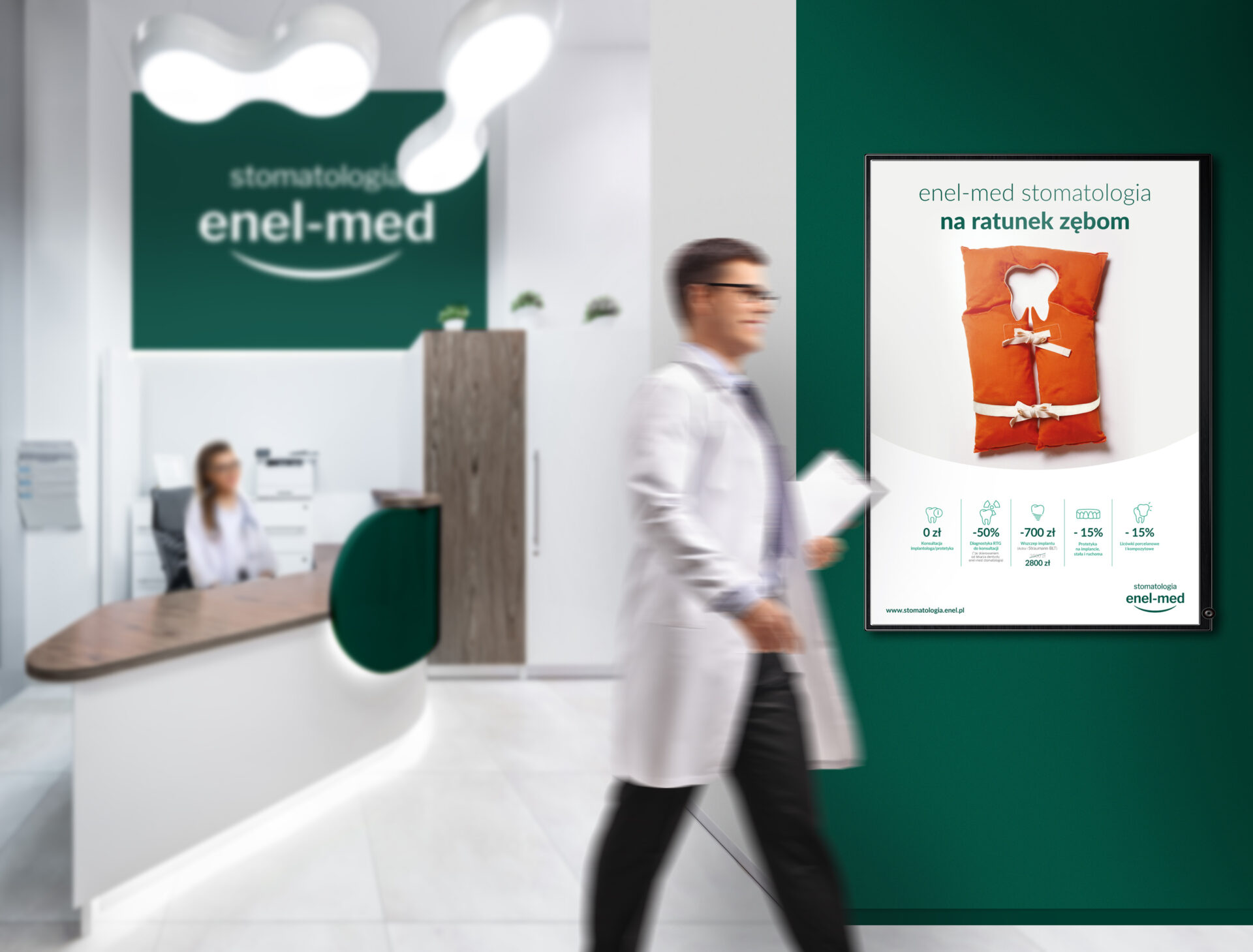
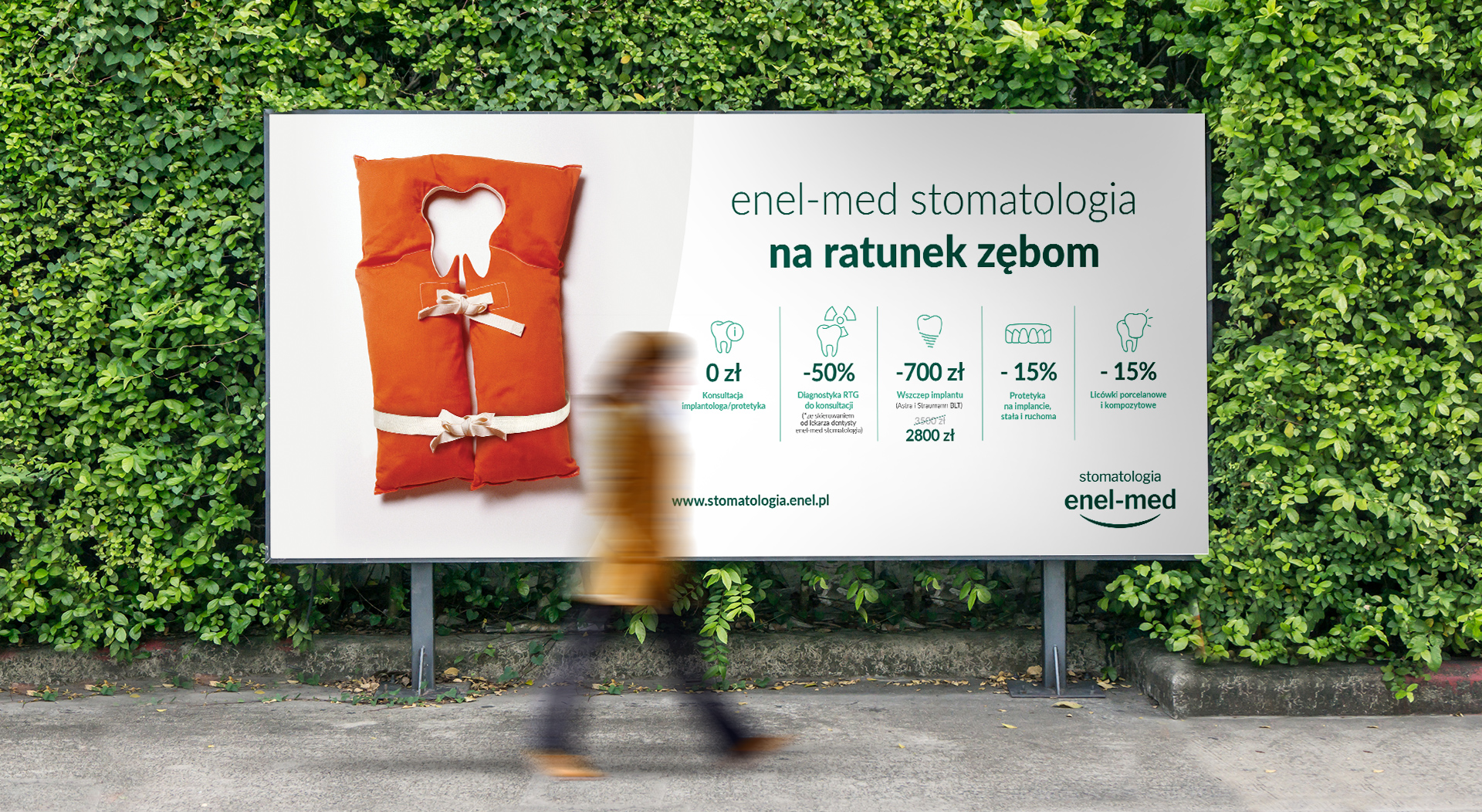
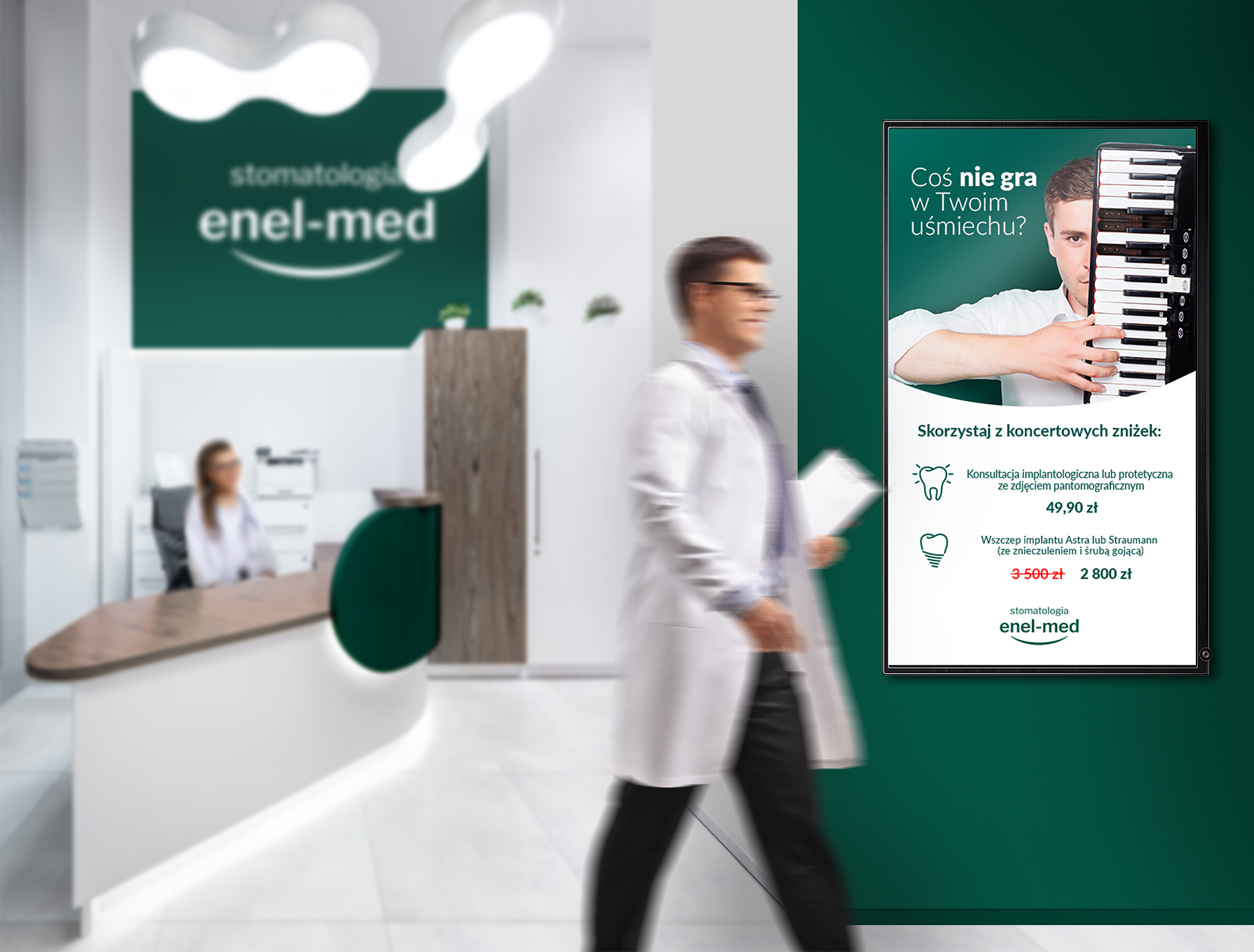
Enel-Med Stomatology advertising campaign
For almost 30 years enelmed-stomatologia has been providing dental services in Poland’s largest cities. Every year, tens of thousands of individual and subscription customers visit almost 100 dental offices of the brand.
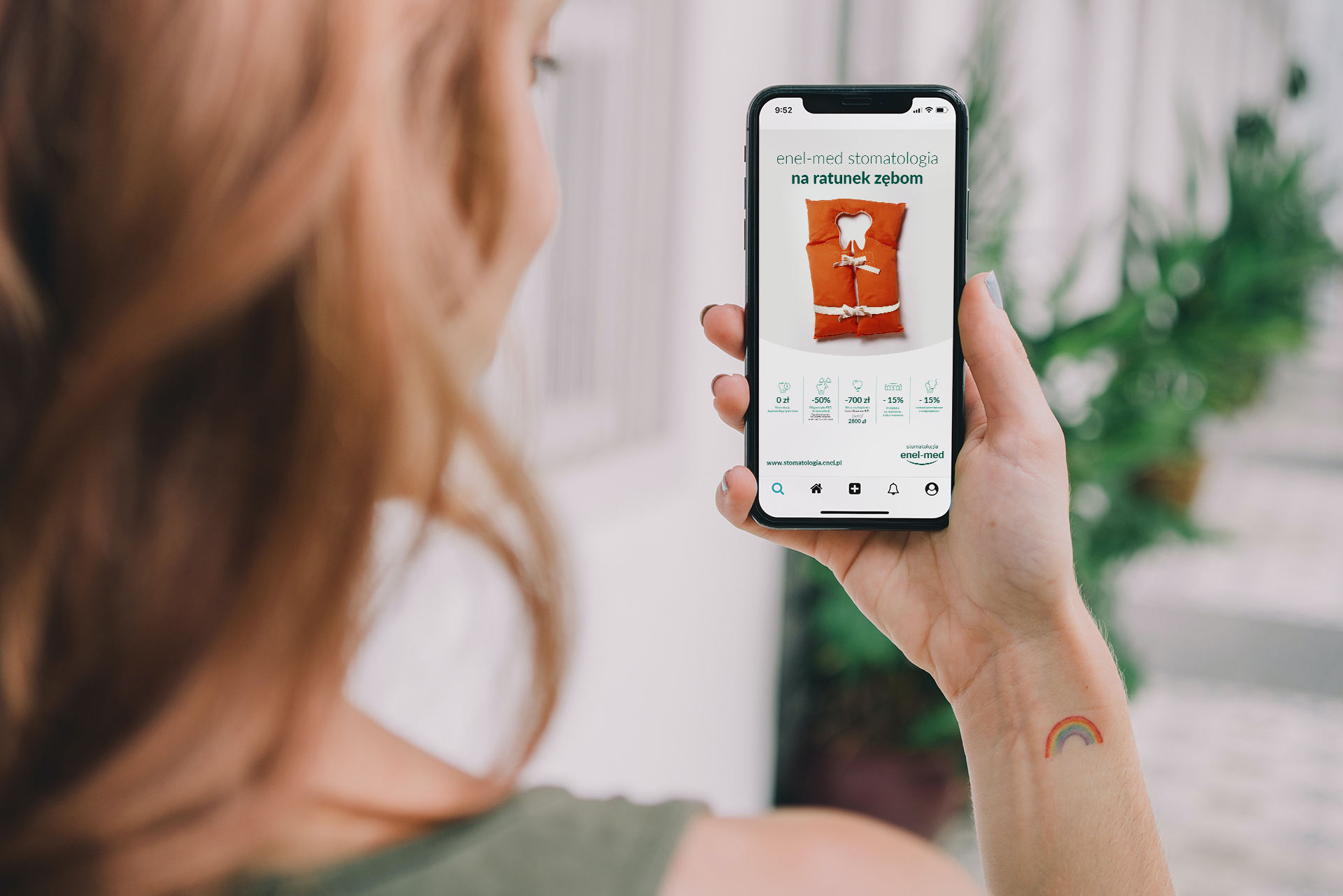
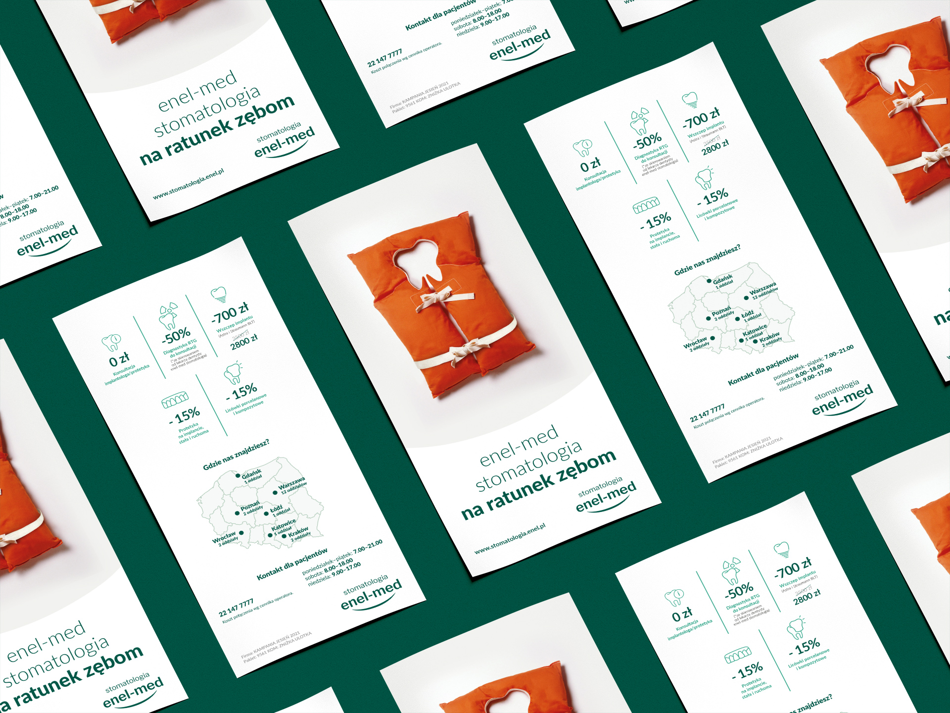
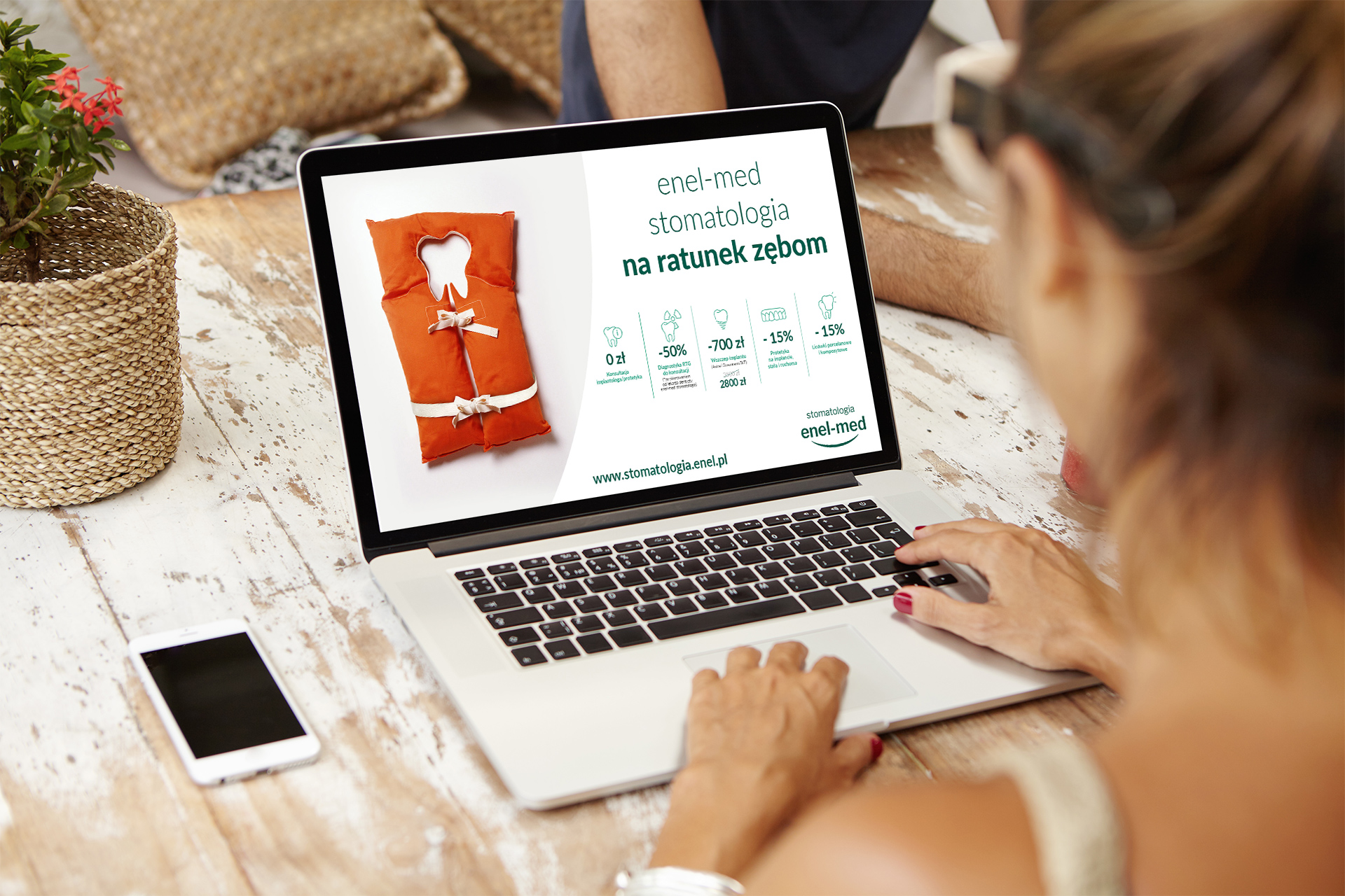
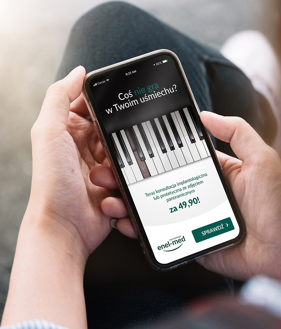
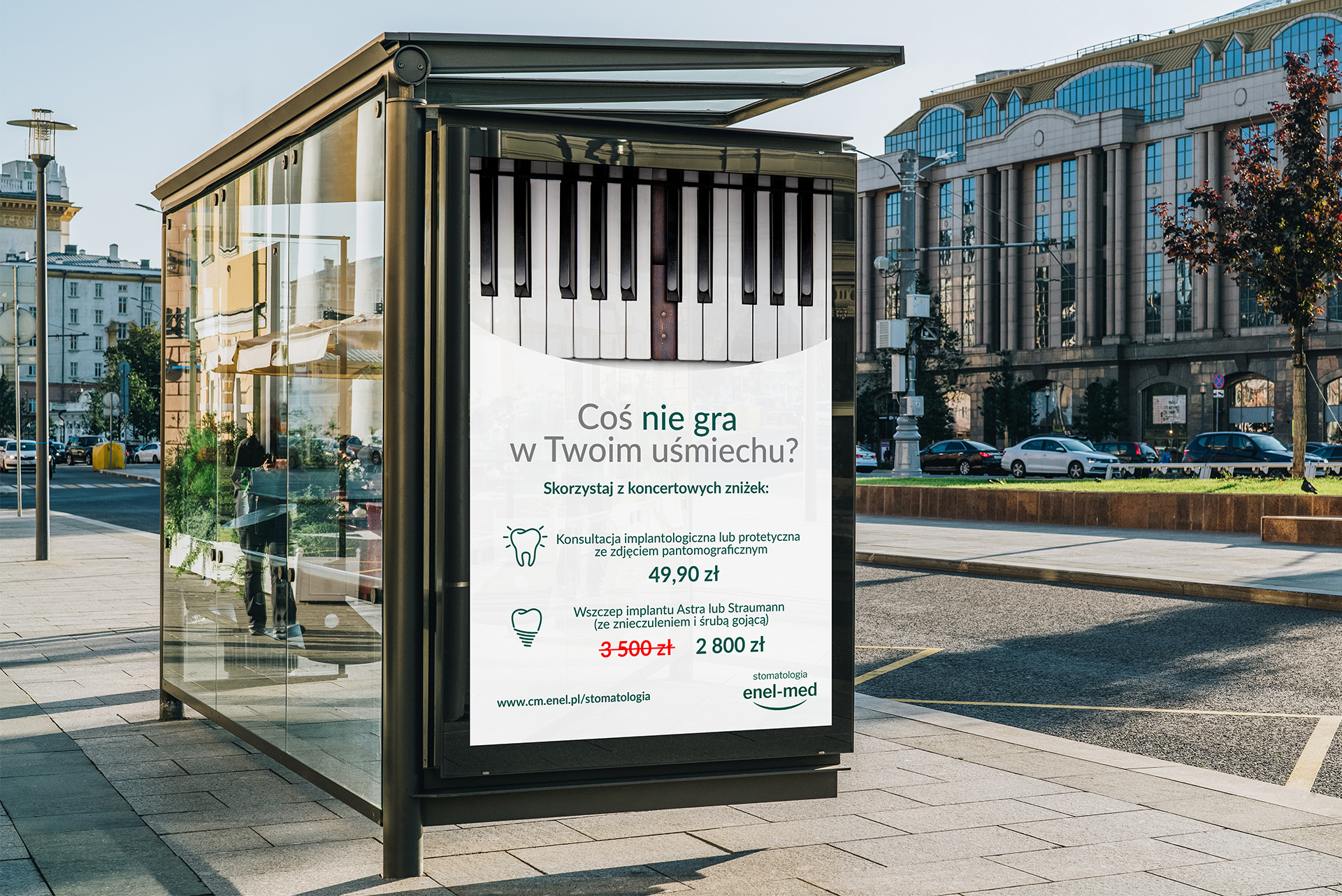
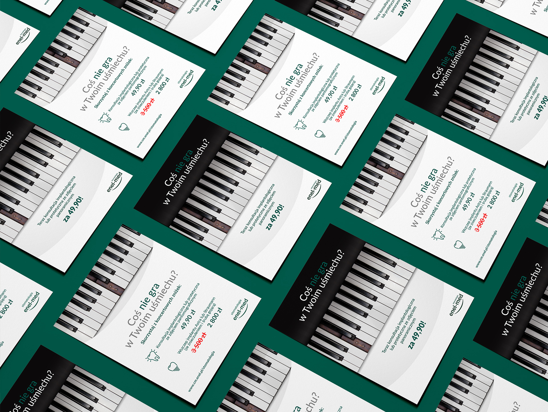
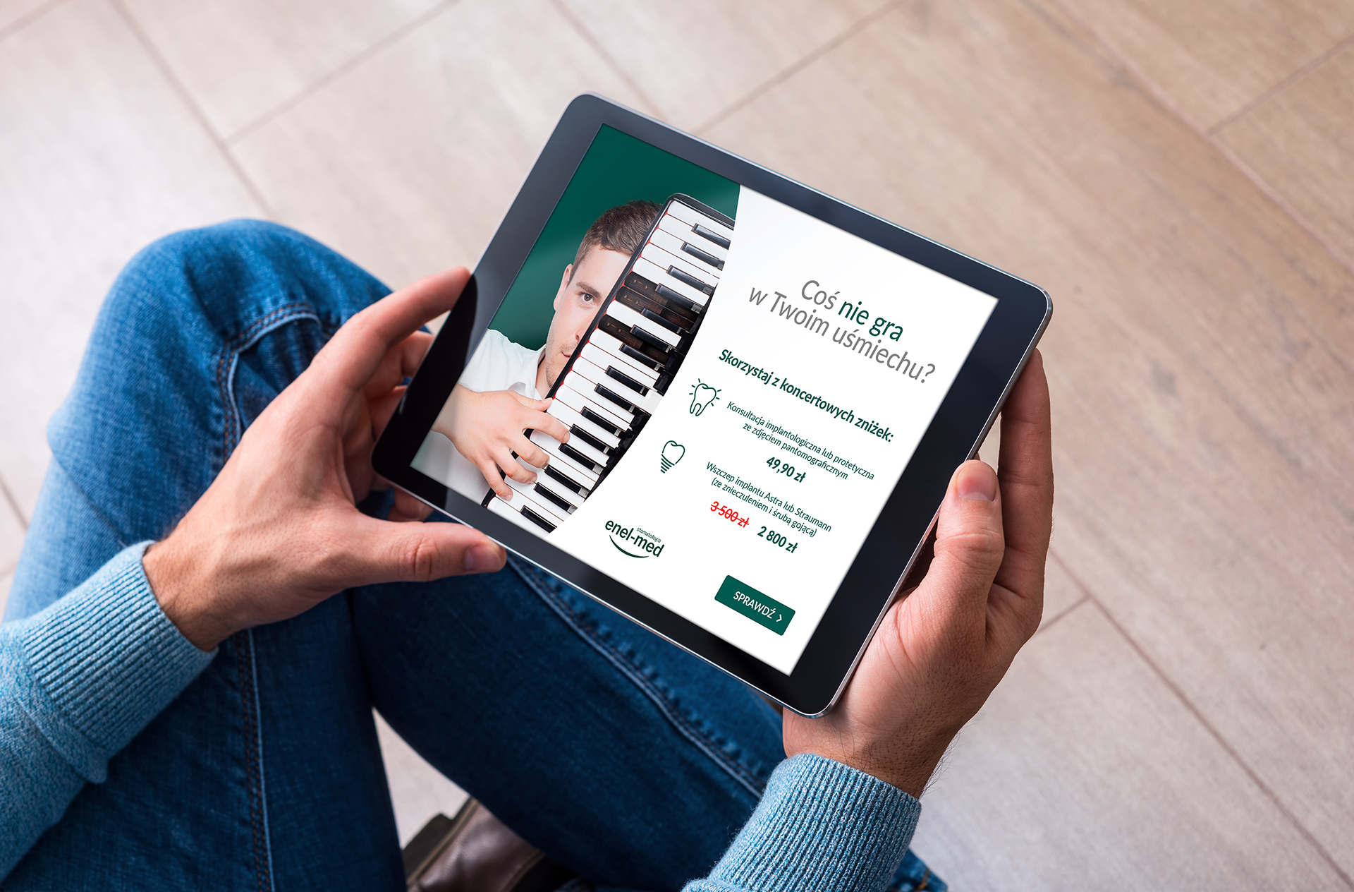
One of the services offered by the company is implant and prosthetic dentistry. In order to promote these specific services, we have designed an autumn nationwide sales and marketing campaign.
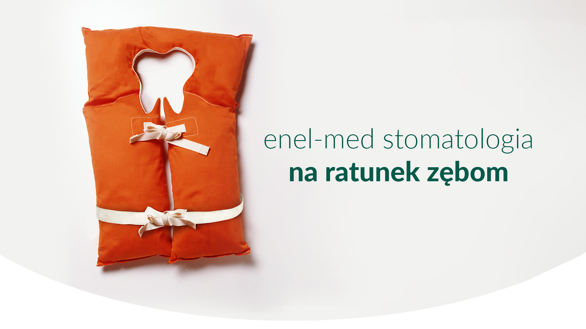
When creating the creations, we focused on playing with images and words, which directly as well as figuratively presents the possibilities offered by implantology and prosthetics. The result is the key visual of the campaign, based on non-standard associations – the main element of the creation is an eye-catching, orange life jacket, in which a cut-out shape of a tooth has been inscribed.
The creative and its reception have been enhanced by contextual copy that is not only hooking, but also on-point with the competence of the brand’s employees. The campaign is running in online channels (social media, display, mailings), as well as in all enel-med medical centers.
Team
Graphic creation: Katarzyna Łoboda-Karki
Copywriting: Piotr Flis
Creative Supervision: Anita Kamila Sochacka
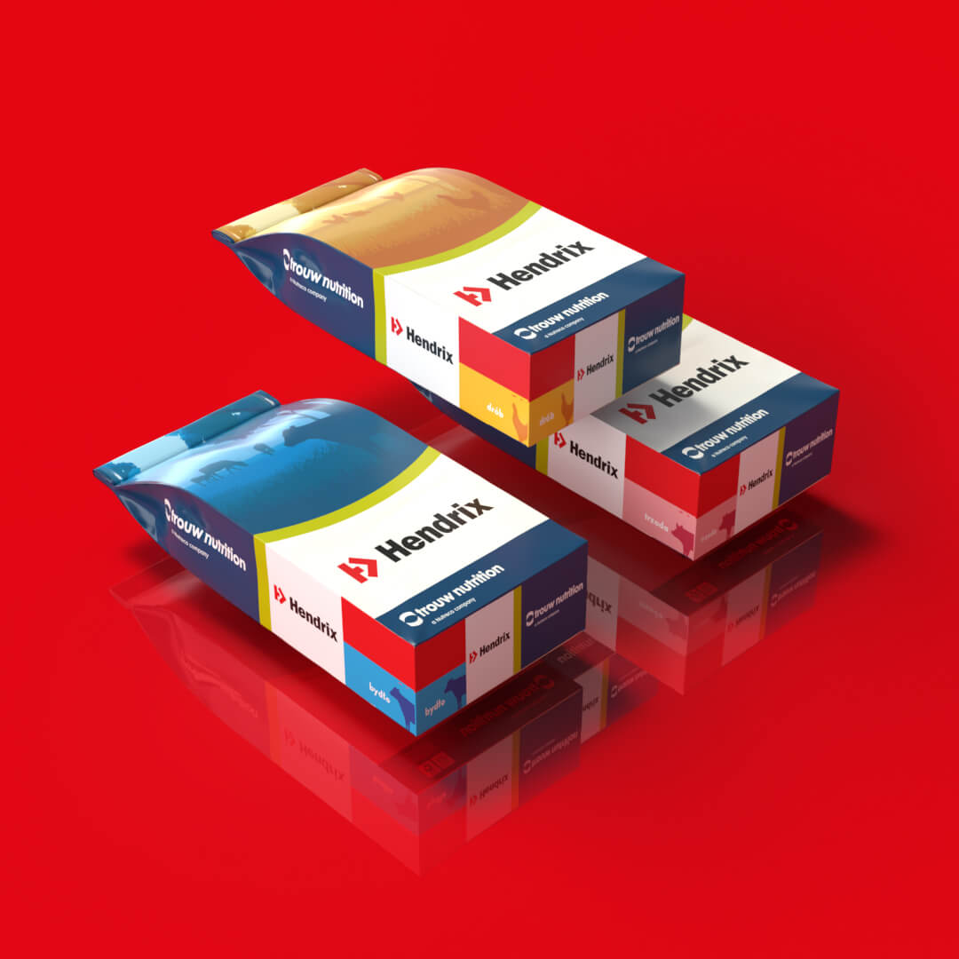
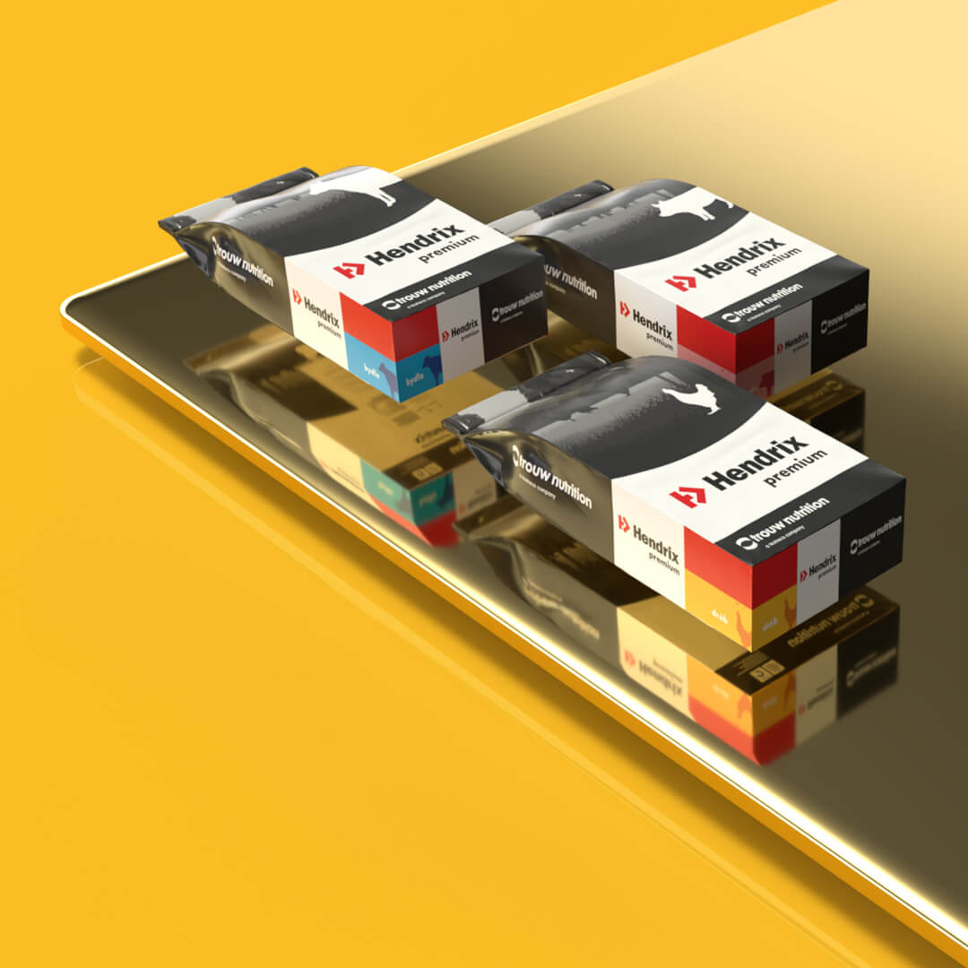
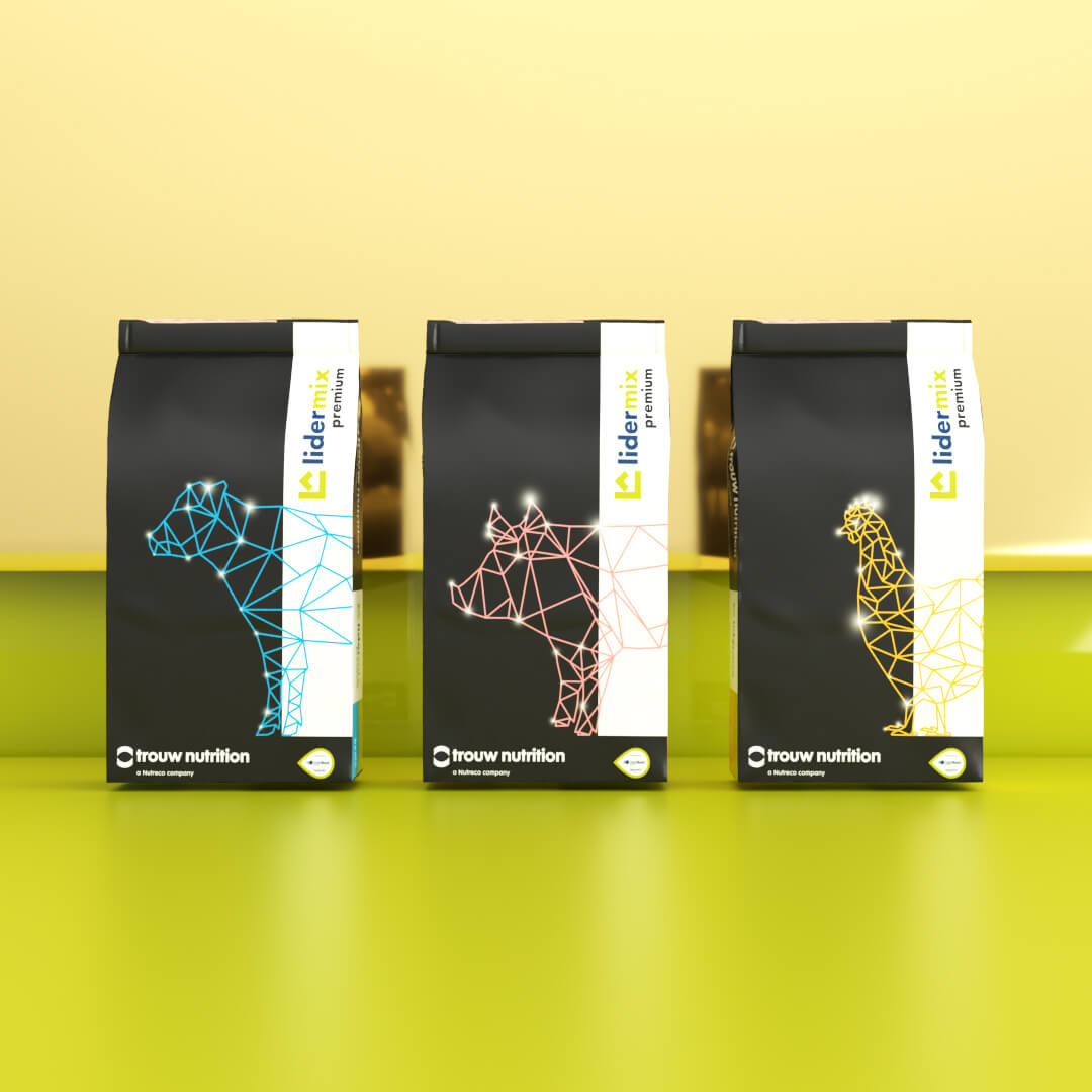
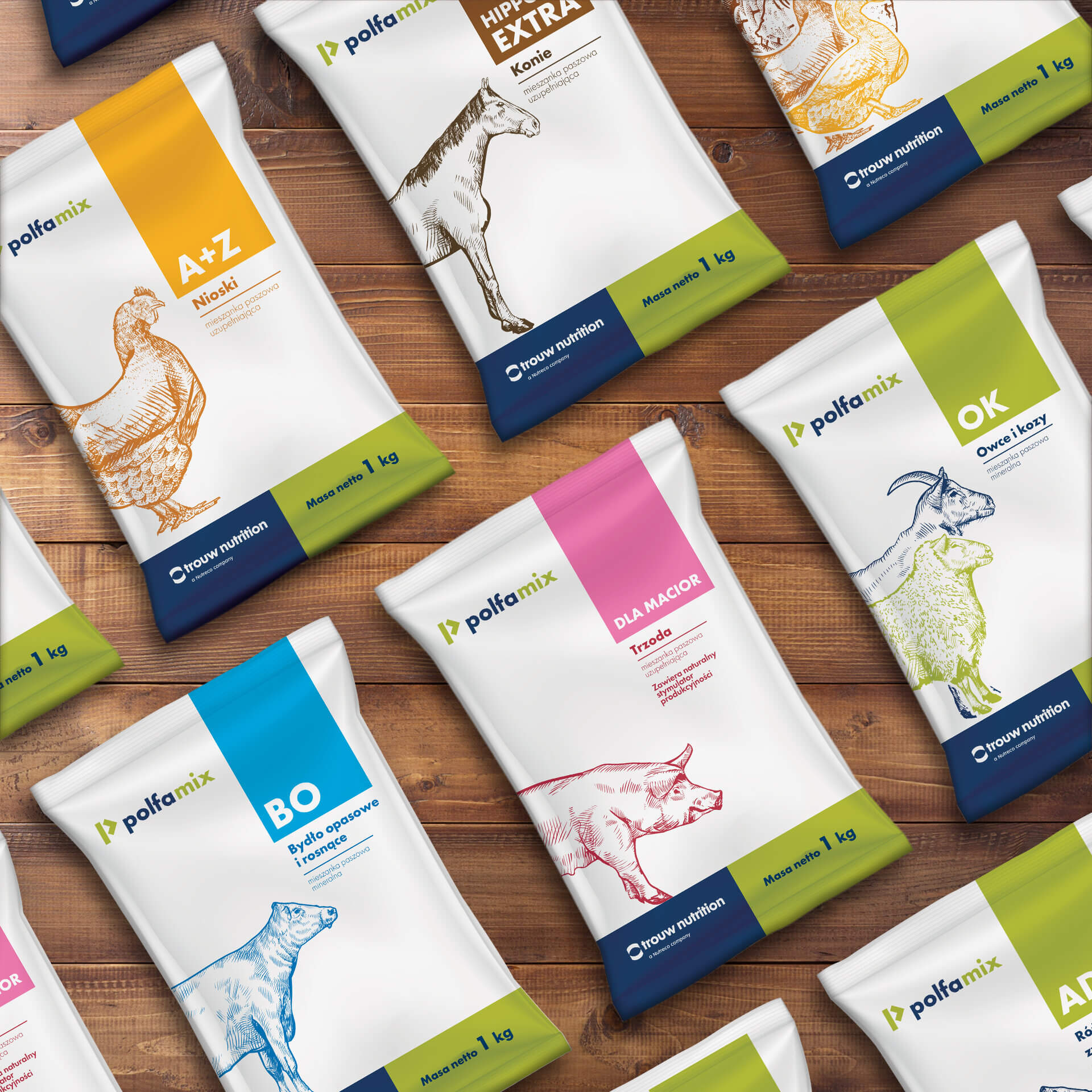
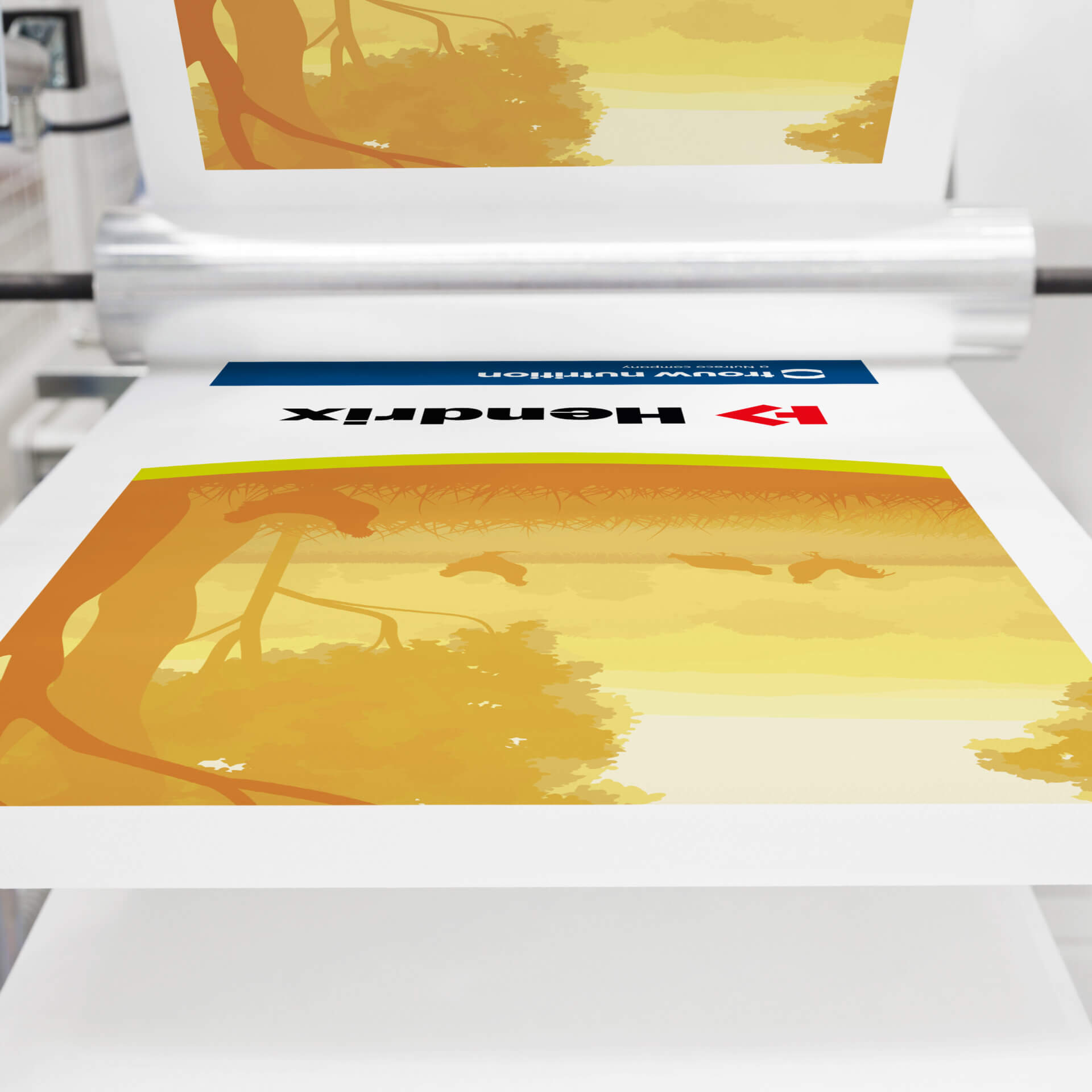
Premix packaging line for Trouw Nutrition brand
Trouw Nutrition is a world leader in animal food and nutrition consulting. It has been producing and supplying vitamin premixes and feed additives to thousands of farms on several continents for nearly 90 years. As part of the company’s ongoing development and to match its offerings to market needs, a decision was made to develop a new sales strategy and refresh the image of the three most recognizable products in the Trouw Nutrition portfolio – Lidermix, Hendrix and Polfamix. Our agency was selected to perform this task.
Each product can be differentiated on three levels:
– brand (Hendrix, Lidermix, Polfamix),
– category (regular or premium)
– destination (for poultry, cattle, pigs, etc.).
In addition to refreshing packaging graphics and brand marks, our task was to show all of the above elements so that the product is easily recognizable – regardless of its position and location.
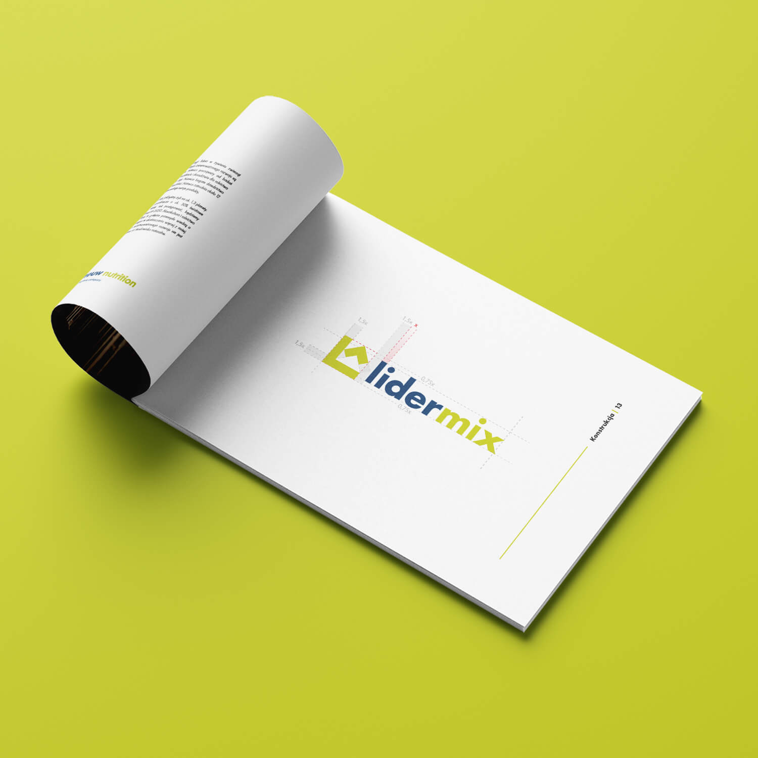
We began by redesigning the brands’ logos. Based on the mark of the existing Hendrix line in many international markets, the Polfamix and Lidermix marks were developed. All products were to form a single, consistent graphic line, in line with Trouw Nutrition’s new communication strategy.
The next step is the color scheme. To make product identification easier, three groups of color codes were created to be visible on each side of the package:
– Red or green, which, along with the logo, identify the product brand.
– Black or blue-green designate the category – standard or premium.
– Yellow, Pink, Blue, Green and Brown show the intended use of the product – for poultry, cattle, pigs or other animals.
In addition, Trouw Nutriton’s corporate colors – navy blue and green – familiar from the company’s logo and recognized by the product’s target audience, were incorporated into the designs.
We then developed a clear, intuitive packaging grid for easy product identification.
In total, we designed 6 packaging versions each for the Lidermix and Hendrix lines, and more than 20 for the Polfamix series.
Before work began, the agency identified the client’s needs in a workshop, learned about the production process at Trouw Nutrition’s facilities, and identified key production factors that had to be considered in the design process.


Team:
Visual identity: Katarzyna Łoboda-Karki
Coordination and client service: Anita Kamila Sochacka
Technical coordination: Piotr Flis
Visual concept and communication
of the LOTOS Pay&Go brand
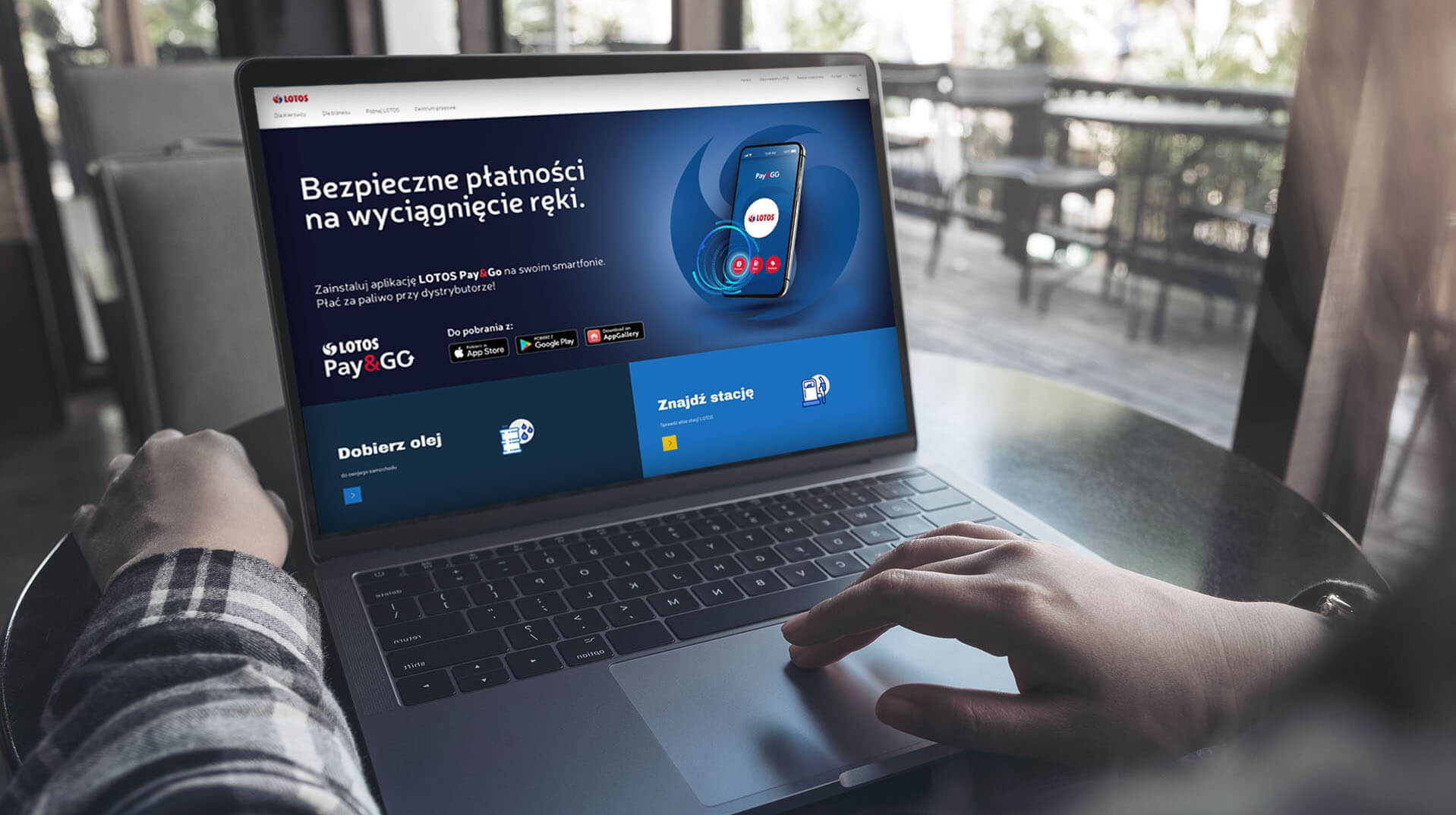
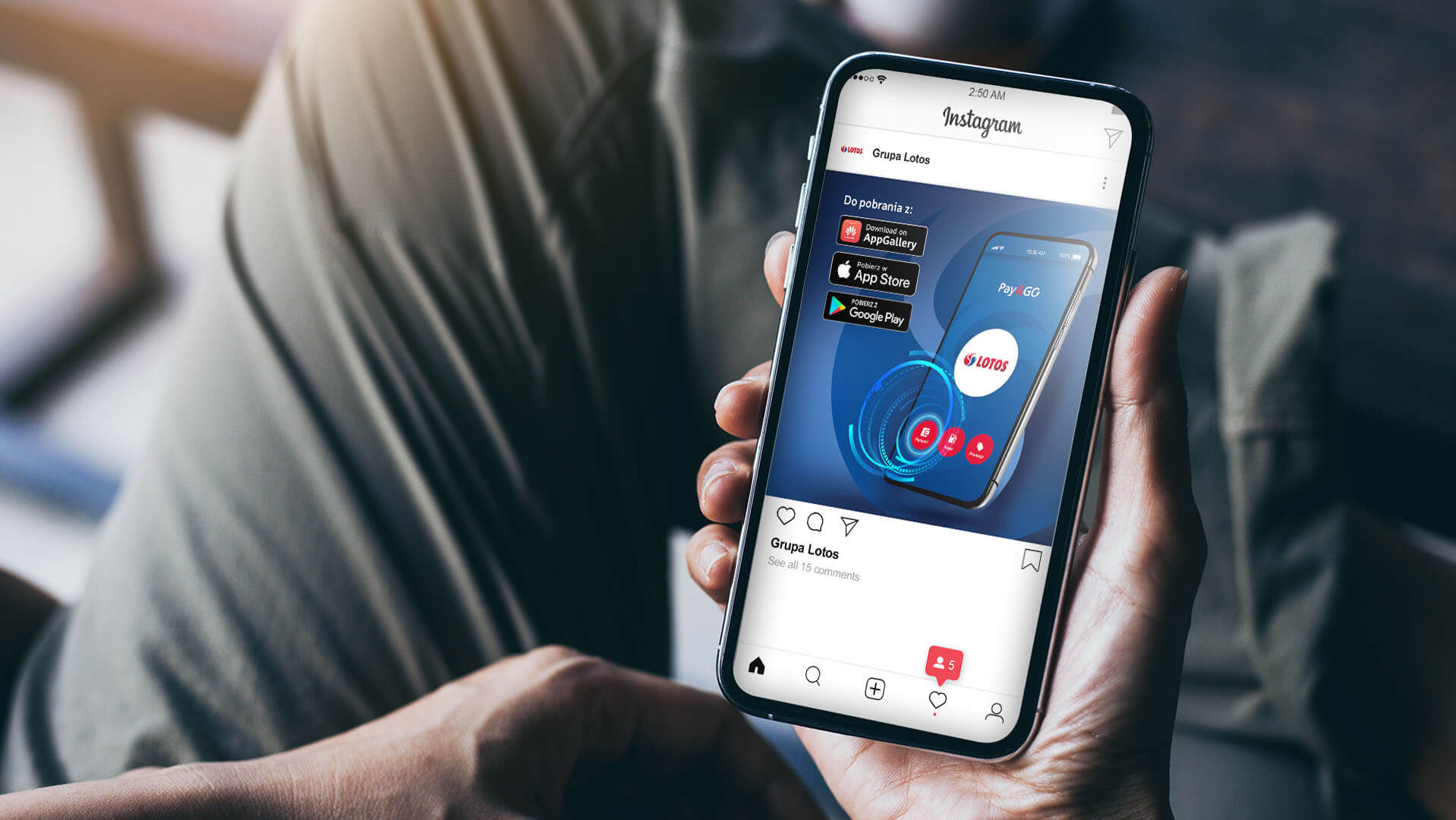
A pilot mobile payment service at LOTOS gas stations has been launched at the end of 2020. Network customers at selected 15 points can pay for fuel using the LOTOS Pay&Go application. Ultimately, the service is to be expanded to all of the corporation’s stations which is planned for the second half of 2021.
We had the pleasure of developing the visual concept, communications and advertising campaign for this service.
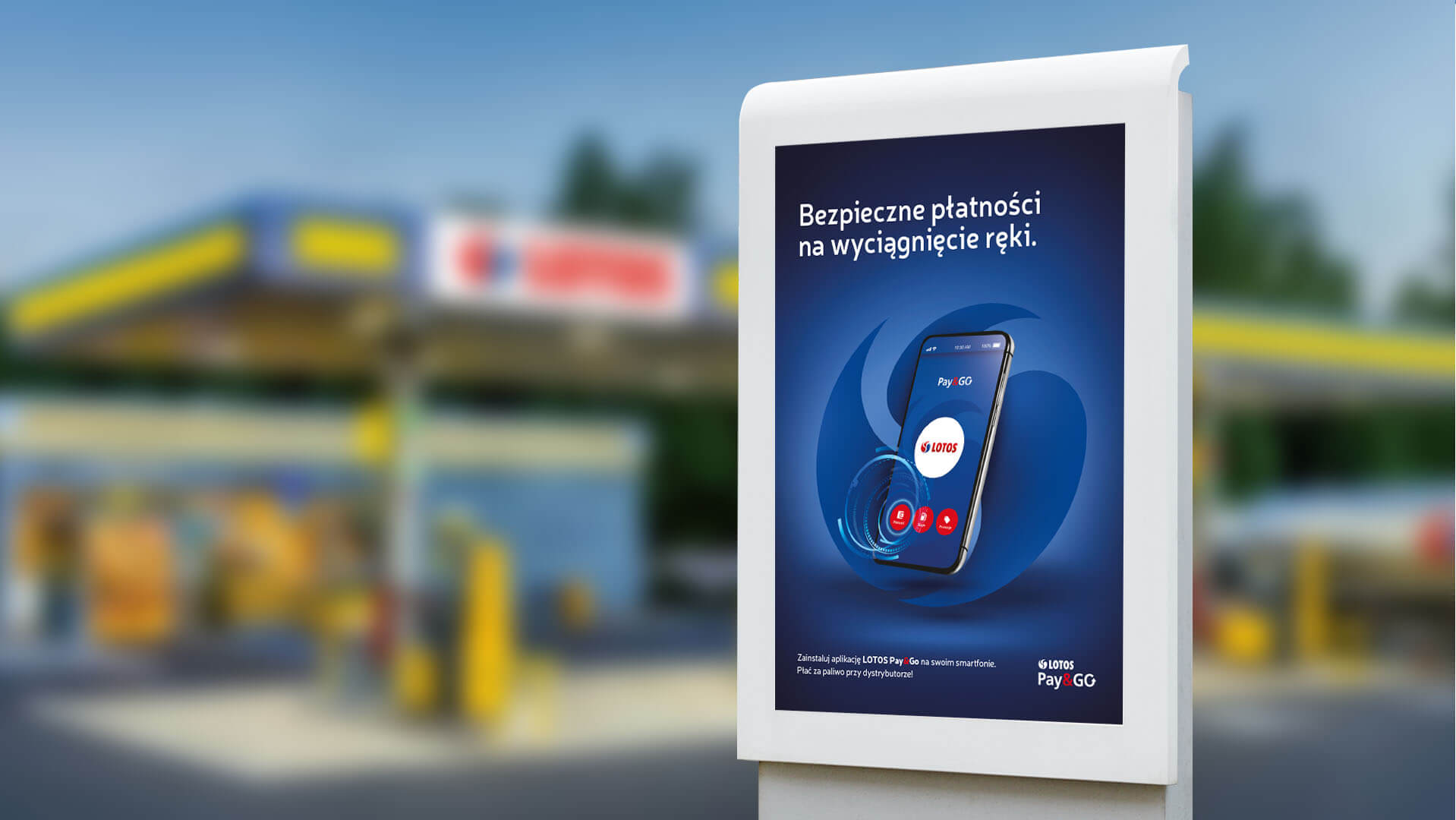
Mobile payments in Poland are a fast-growing market, and the pandemic has further accelerated this trend. The key to the success of any application is an efficiently designed system in terms of UX. Refueling at a gas station is a dynamic process – the customer pulls up to the dispenser, fills up the tank, wants to pay as quickly as possible and drive away from the station, making room for the next car. It was with the time-sensitive users in mind that we created the individual screens of the application. The designs had to be clear, intuitive and not misleading – so that the payment stage from the moment the app was turned on to the finalization of the transaction took as short a time as possible.
The main background motif was taken from the arcs present in the LOTOS Group logo. The color code, which uses white, red and blue in visual communication, is also based on it. The use of these three colors allowed us to create a design that is not only legible, but also does not tire the eyes.


Team:
Visual development and UX design: Ola Luboch
Verbal design and project management: Piotr Flis
Creative Supervision: Anita Kamila Sochacka
Advertising campaign
Enel-Med Stomatology
For almost 30 years enelmed-stomatologia has been providing dental services in Poland’s largest cities. Every year, tens of thousands of individual and subscription customers visit almost 100 dental offices of the brand.
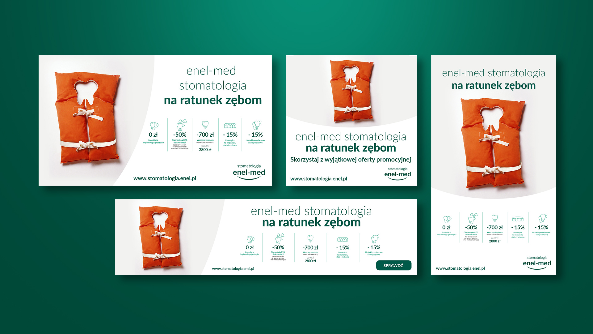
One of the services offered by the company is implant and prosthetic dentistry. To promote these specific services, we designed a nationwide advertising campaign.
In creating the creations, we relied on a one-element concept with a clean form and clear message, which at the same time relies on playing with images and words – both directly and figuratively. The element of hooking, as well as unusual associations were key aspects of the project, which was intended to draw the attention of the viewer.

The campaign was conducted in online channels (social media, display, mailings), as well as in all enel-med stomatology dental clinics.

Team:
Graphic creation: Katarzyna Łoboda-Karki
Copywriting: Piotr Flis
Creative Supervision: Anita Kamila Sochacka
Visual identity
of the e-care program
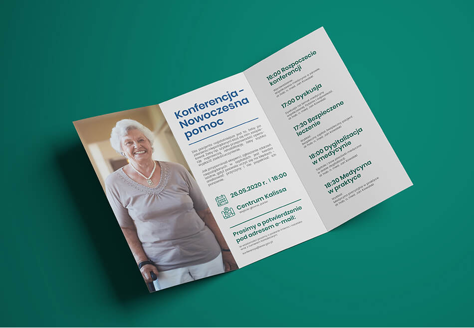
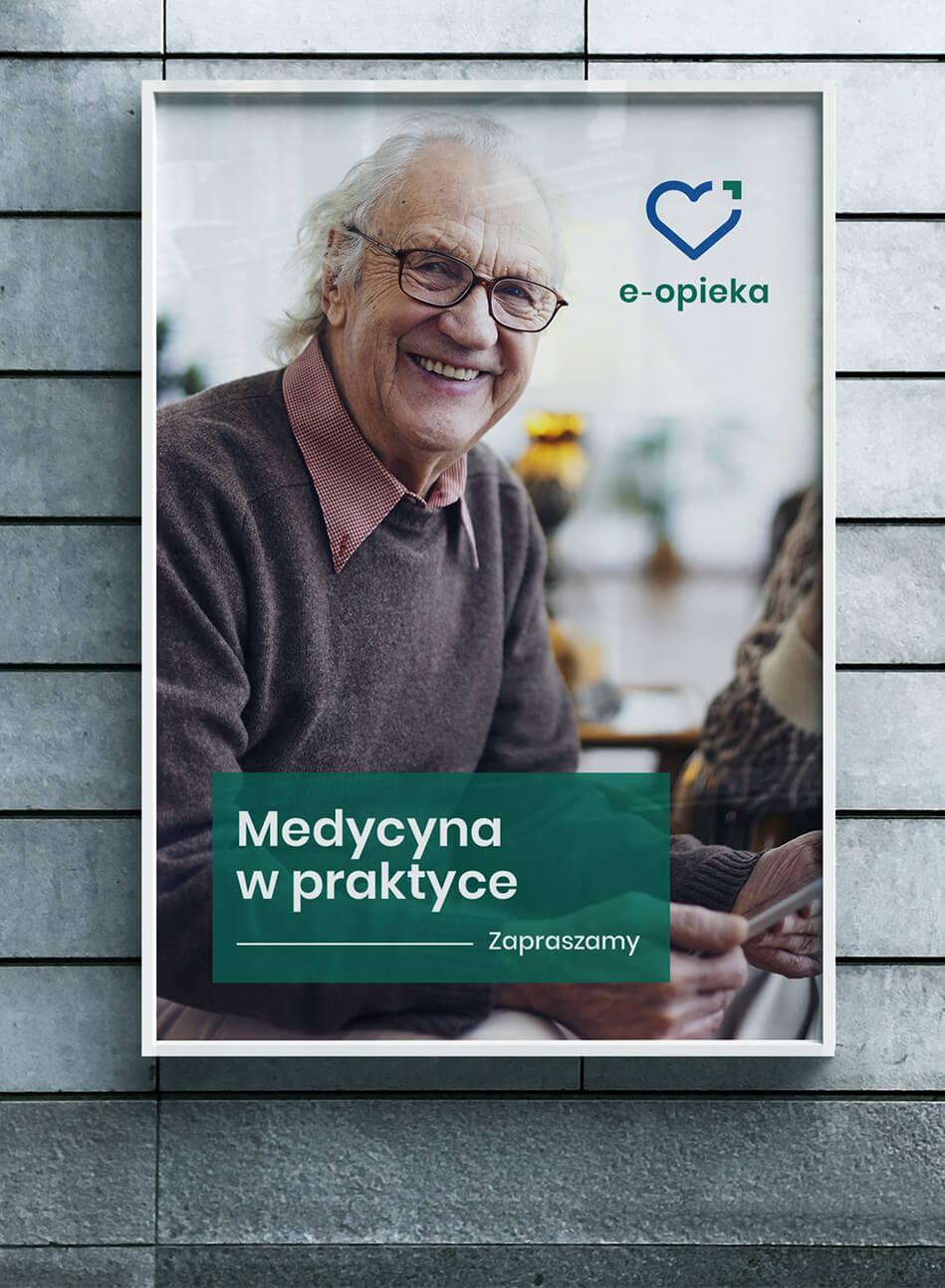
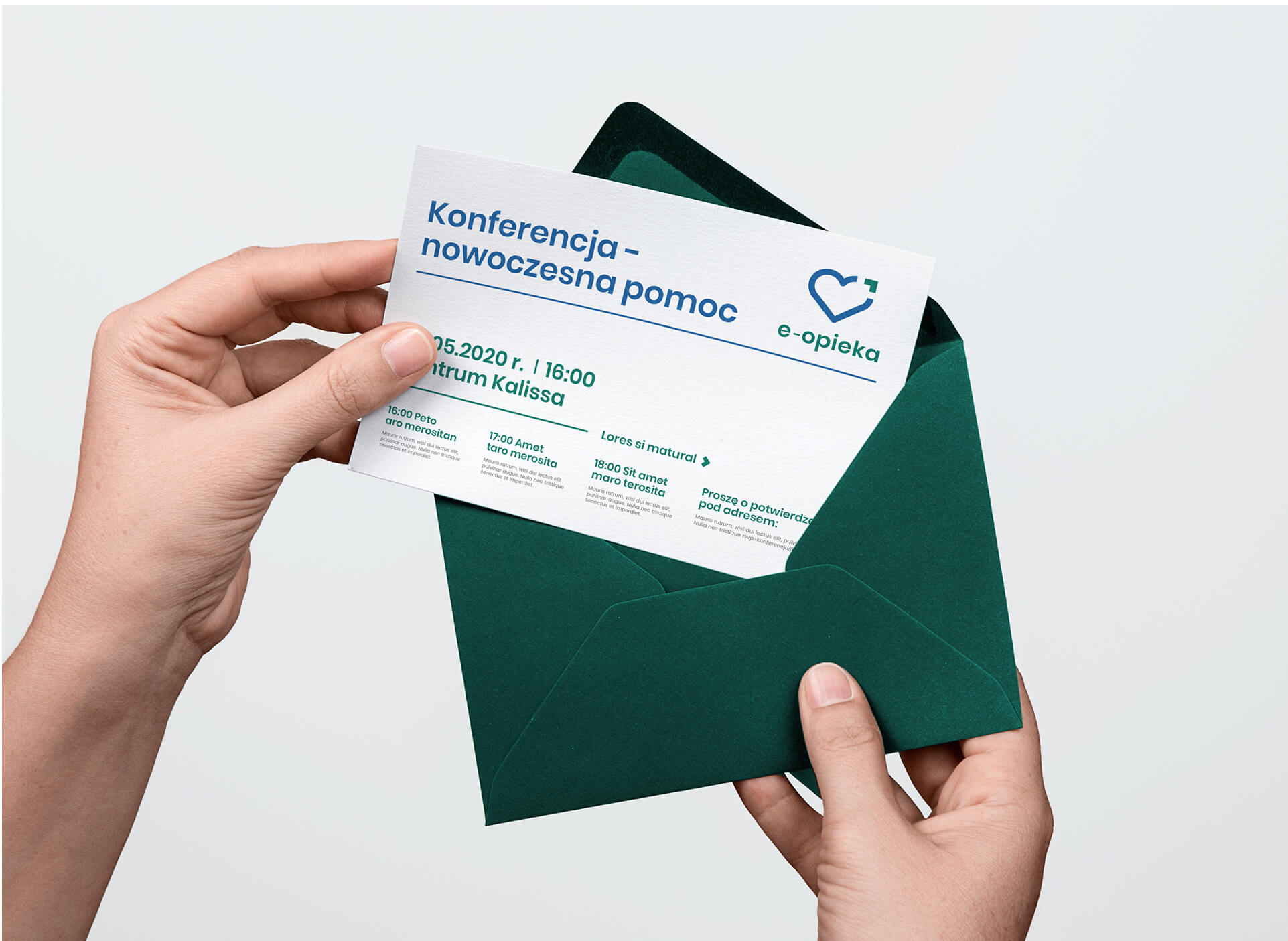
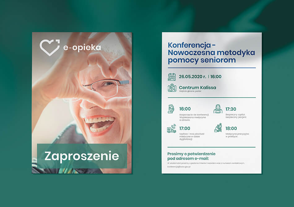
Warsaw has been developing projects in the field of social assistance for many years. One of them is the “e-care” system dedicated to seniors. The program aims to improve the quality of life of the oldest people who benefit from care services provided by the City of Warsaw and 19 adjacent municipalities.
Our task was to create a comprehensive visual identity for the project. In order for the work to proceed successfully, we first organized a series of workshops for representatives of Warsaw and municipalities, where we learned the exact goals and objectives of the program, and conducted training sessions, explaining what visual identity and brand identity are.
Thus, a graphic design was created that fully took into account the needs of local governments and accurately responded to the brief they created. Of particular importance was the choice of colors – we were looking for the right contrast to make using the site easy and intuitive for the visually impaired.
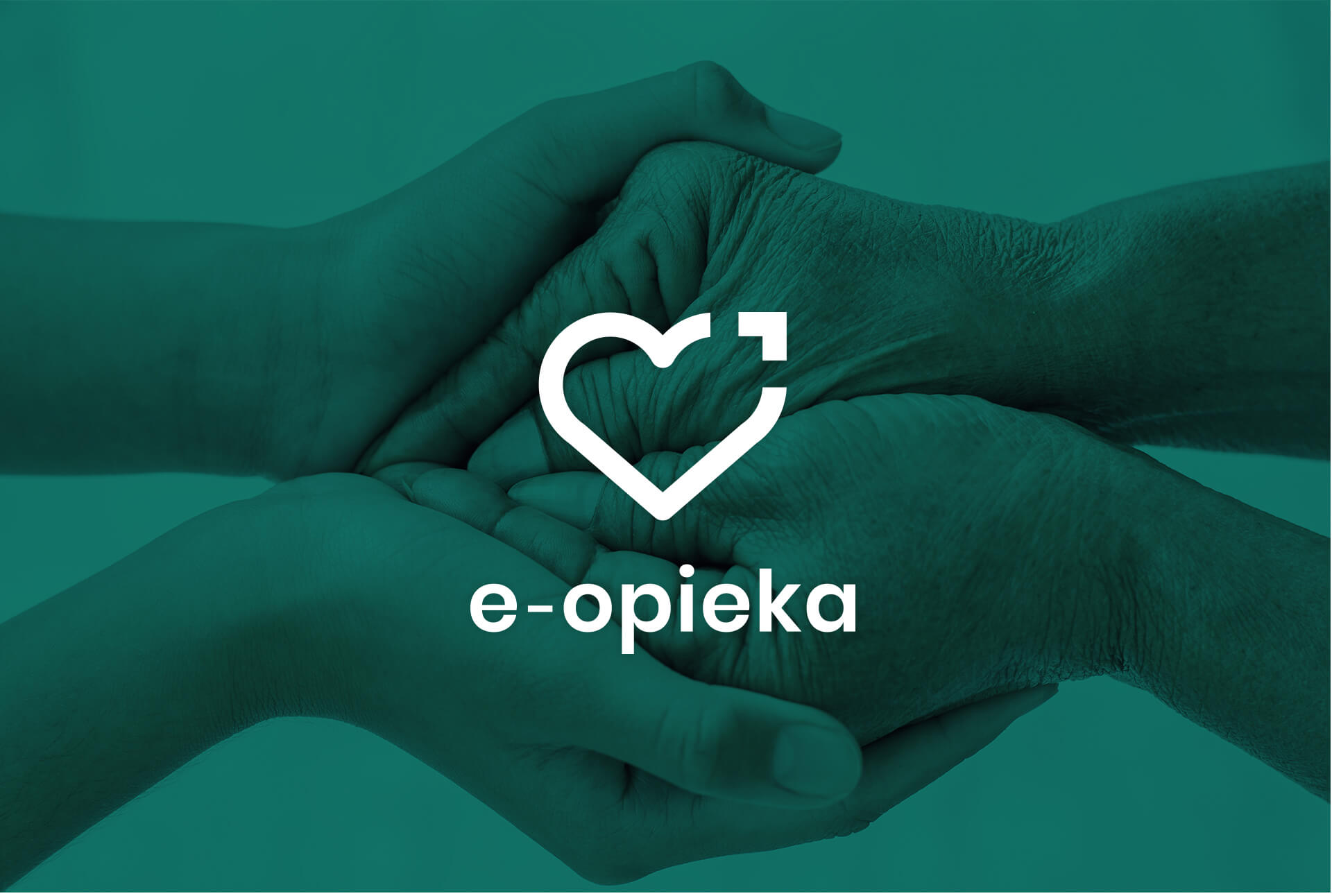
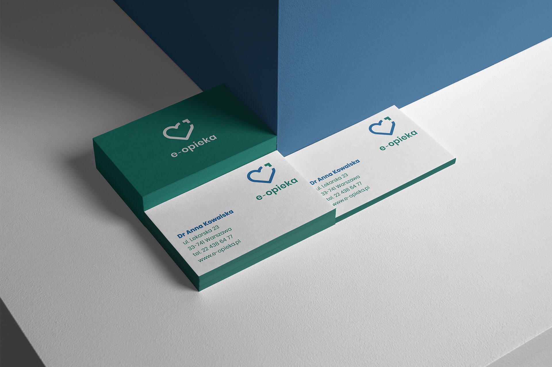
The logo consists of a heart-shaped sigil and a cursor symbol. It is complemented by the legible name of the program: “e-care”.
The heart symbolizes the health and care that the program’s wards receive. The closing element of the sigil was inspired by a cursor and pixels, a direct reference to electronics and ICT tools, which are an important element of the program. The aforementioned element also symbolizes mutual complementarity, unity and cooperation, as well as overcoming one’s own limits and development.
The color scheme refers to the health aspect of care. The primary colors were selected in accordance with WCAG 2.0 standards to maintain adequate visual contrast for people with disabilities.
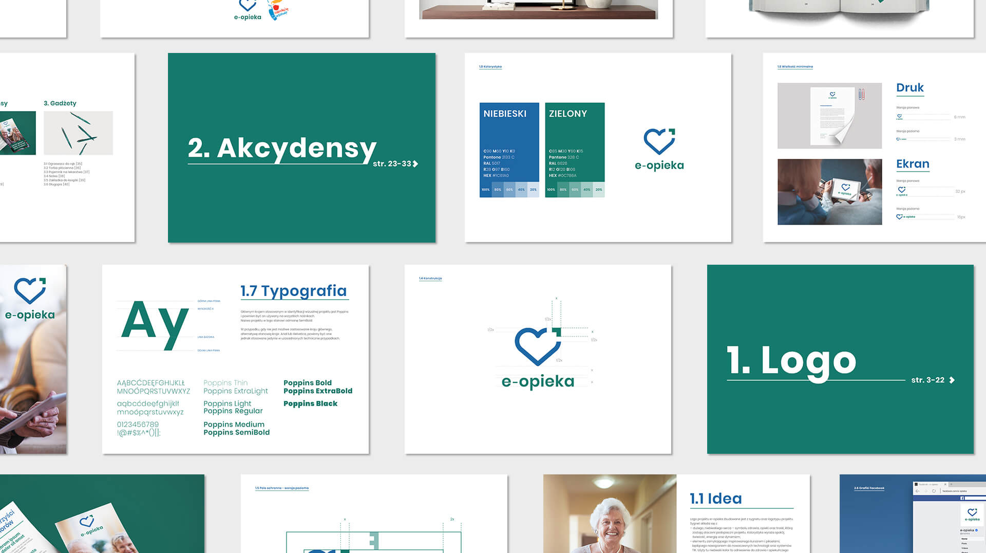
Identification is mainly based on
- warm pictures of people (realistic seniors)
- linearity (which is also in the logo; icons, separating and filling lines)
- primary colors (with logo)
- adaptation also for the elderly
- clear message (the main one on the appli), hierarchy of information


Team:
Visual identity: Katarzyna Łoboda-Karki
Verbal identification and project management: Piotr Flis
Creative Supervision: Anita Kamila Sochacka
Visual Identity
and Key Visual
of Cinema on Heels
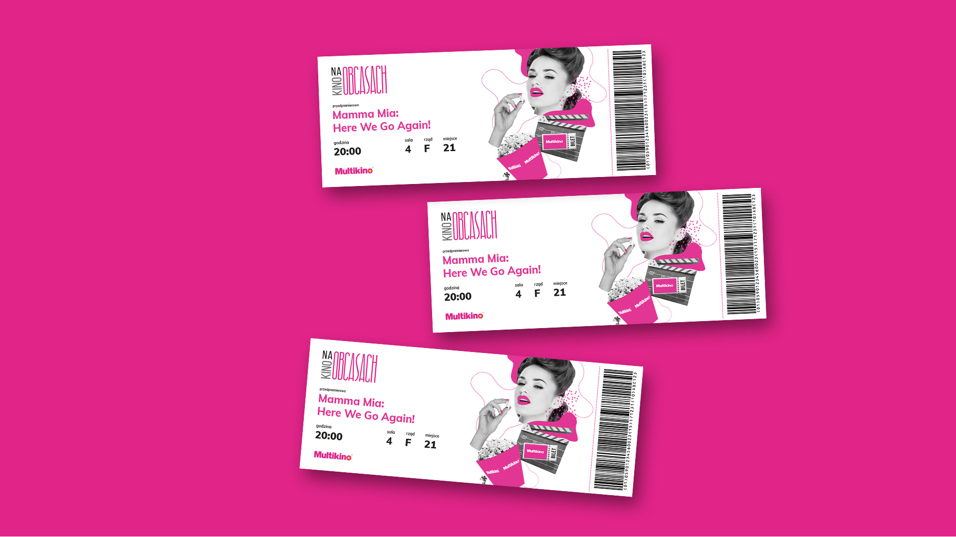
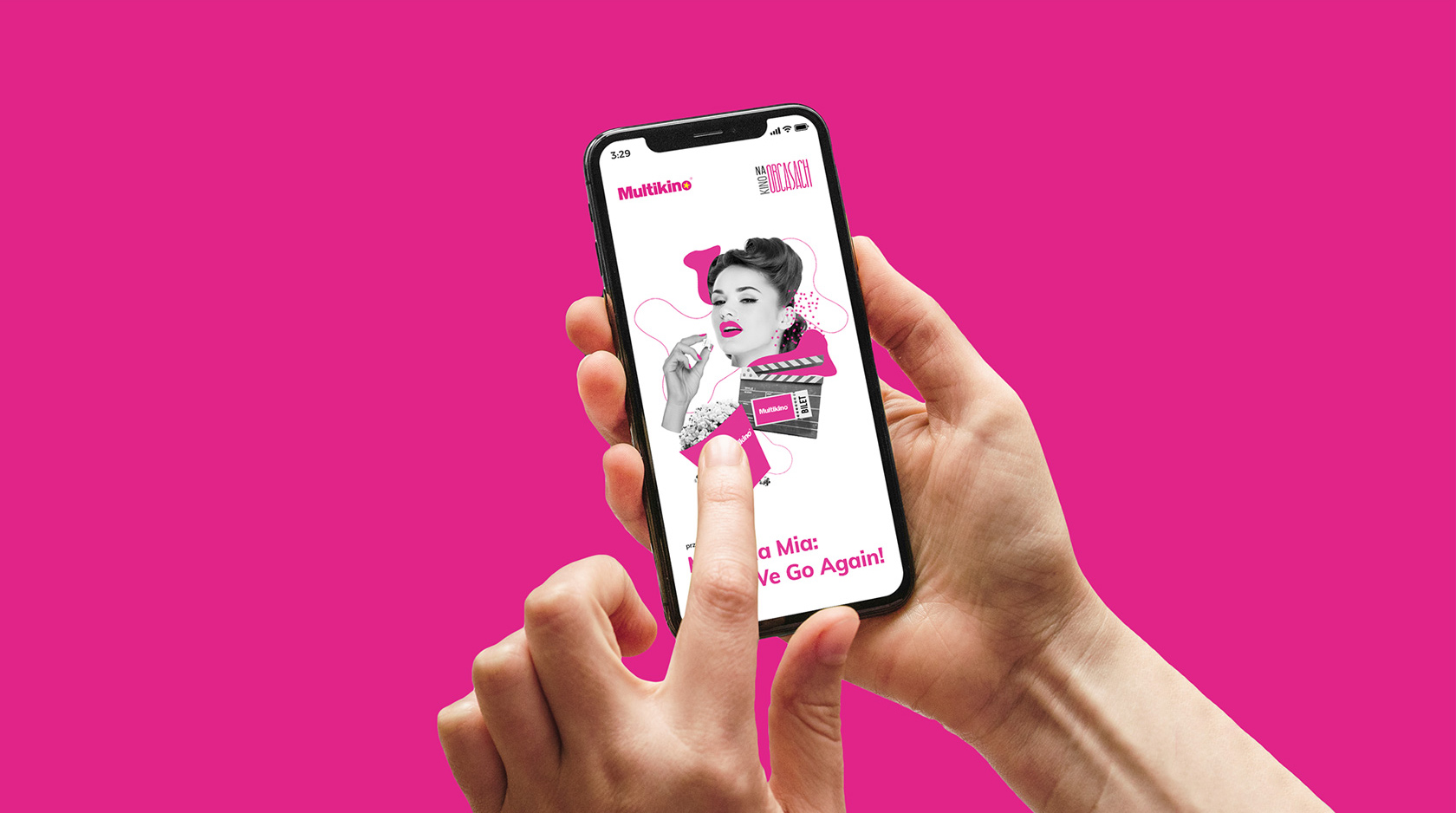
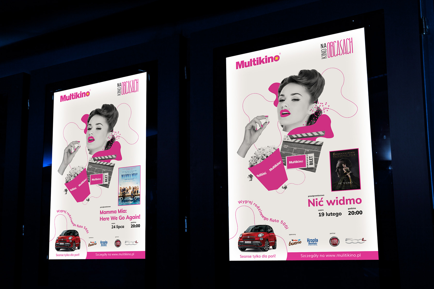
Multikino is one of the largest cinema chains in Poland with over 20 years of tradition. As part of its activities, the brand has many thematic events on offer – one of them is the Cinema on Heels project – which has been carried out for more than a dozen years in more than 20 of the chain’s cinemas. Its main idea is to integrate women, who meet in a common group for movie nights in Multikino halls – the events are often accompanied by various lectures and animations dedicated to women.
The agency was tasked with creating a new visual concept for Cinema on Heels. A new key visual was to be designed, which had to take into account several guidelines. Its space was to include:
- The title of the film, its poster or a frame with the original title
- Information about the date of the screening within the project
- The name of the project
- Logos of sponsors and partners of Cinema on Heels

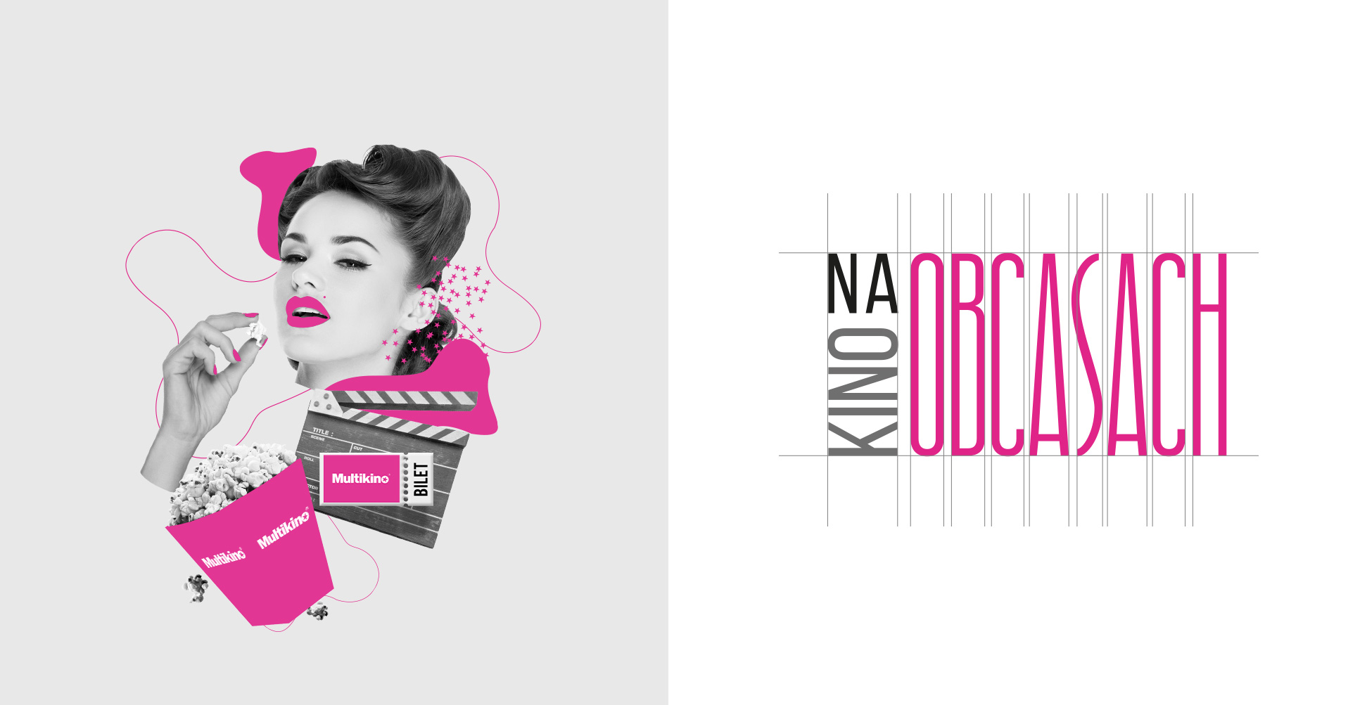
When designing the creation, we had to move away from the usual patterns and stereotypical associations that immediately came to mind – stilettos, heels, etc. We decided on a form that would clearly, yet indirectly, refer to the advertised event. This is how the collage created from graphic cutouts was created. The styling was kept in the so-called “duotone” trend, where two colors – gray and the brand’s characteristic dark pink – led the way.
The minimalist form – both on the level of colors and composition – was implemented on a number of materials distributed by Multikino – offline and digital.