Packaging design for LOTOS brand oils
Packaging design
for LOTOS brand oils
LOTOS Group S.A. is the second largest oil refinery in Poland and one of the largest in Europe. The company, through its companies, is active in exploration, extraction, as well as processing of crude oil and distribution of the resulting products.
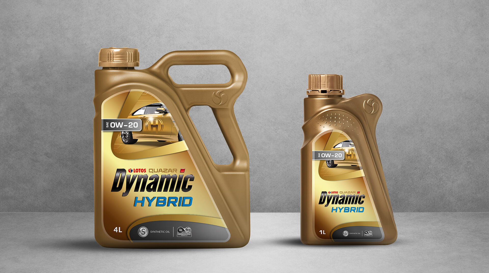
As part of our cooperation with one of them – LOTOS Oil – we carried out work to standardize the labels of oils from eleven lines and five applications – all for the purpose of easier identification of products available at gas stations across Poland.
For oils As part of our cooperation with one of them – LOTOS Oil – we carried out work to standardize the labels of oils from eleven lines and five applications – all for the purpose of easier identification of products available at gas stations across Poland. for passenger vehicles, trucks, transmissions, agricultural vehicles, and motorcycles and single-stroke, we used common elements – so as to maintain consistency among all packaging:
- same layout of elements (tag, KV, background, capacity, name and logo) and features (in all liters)
- uniform typography (a font associated with technical and motorization themes was used)
- the color system of the background is related to the particular oil application, and the tag – its line


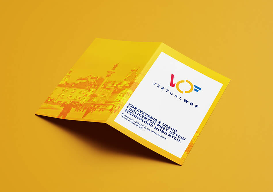
WOF visual identification
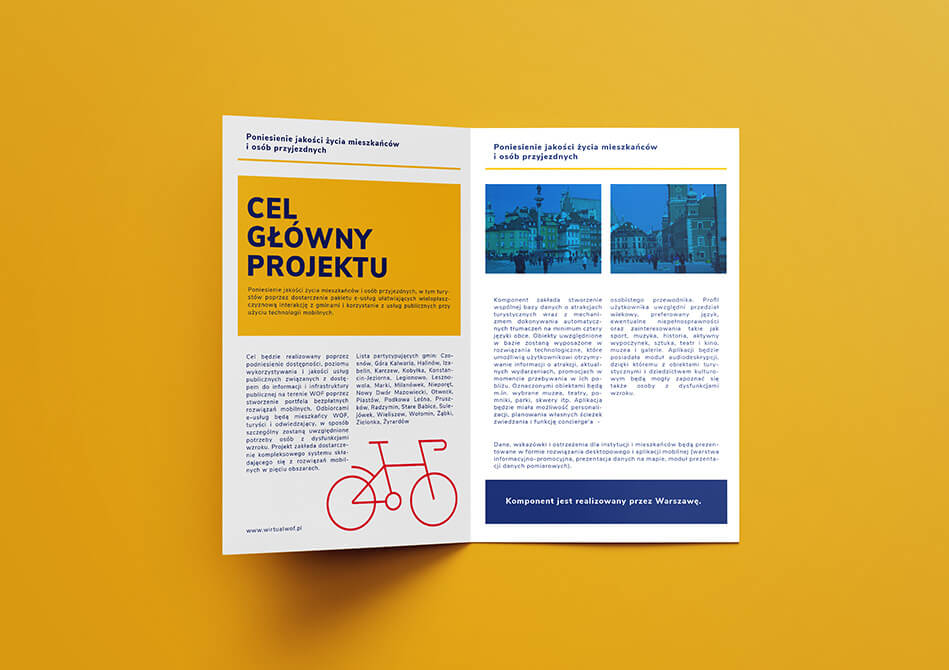
The Warsaw Functional Area (WOF) is a program carried out on a large and comprehensive scale, bringing together the City of Warsaw (leader) and as many as 25 partner municipalities. The aim of the project is to increase the accessibility of public space and services, make cultural and tourist offerings more attractive and broader, improve the quality of public transportation services, improve the parking system, and raise awareness of institutions and individuals about the environment. Within the framework of the conducted project, 5 basic thematic areas have been identified:
- E-accessibility: A micro-navigation and contextual information system to make navigating public spaces easier
- E-turystyka: A virtual, personalized mobile guide for tourists and residents with contextual information and elements of gamification and augmented reality
- E-transport: Metropolitan transportation travel planner based on real-time schedules
- E-parkowanie: An app that makes it easier to navigate the city and find free parking spaces in real time
- E-environment: A system and application that collects data on environmental parameters – air quality and noise intensity
To keep the program consistent with its thematic areas, we created a comprehensive Visual Identity System.
The mark consists of a sigil, which consists of the first letters of the program’s own name and a logotype, which is the name of the program. Two semicircles symbolize the area – the center of the city and services. They give the impression of turning, which brings to mind functionality, action, positive energy and modernity. The unclosed form indicates openness and unlimited possibilities and opportunities facing program participants. The semicircle, itself a universal form of expression, is easy to adapt to virtually any media medium. Its resultants convey the symbolism of the area, the zone, and match each of the program’s identifiable features. The sign’s design also has its roots in the image of the Warsaw Mermaid – a symbol of the Capital and the main element of its coat of arms.
Thus, a graphic design was created that fully took into account the needs of local governments and accurately responded to the brief they created.
SIW used a sans-serif font, which, thanks to its design, is complementary to the geometric form of the signet. In addition, the header font was specially selected – through its edginess it softens the composition and gives a friendlier character.
The color scheme used in the logo and identity elements refers to the city and traffic. The warm and contrasting colors are pleasant to look at. The palette was created based on the multitude of strong and saturated hues of a vibrant city. The vibrancy is balanced by the presence of a cool blue color. The juxtaposition of colors suggests cooperation, functionality and modernity. The whole design raises the dynamism of the designed sigil. An important role is also played by the appropriately selected contrast, which makes the use of the site easy also for the visually impaired.
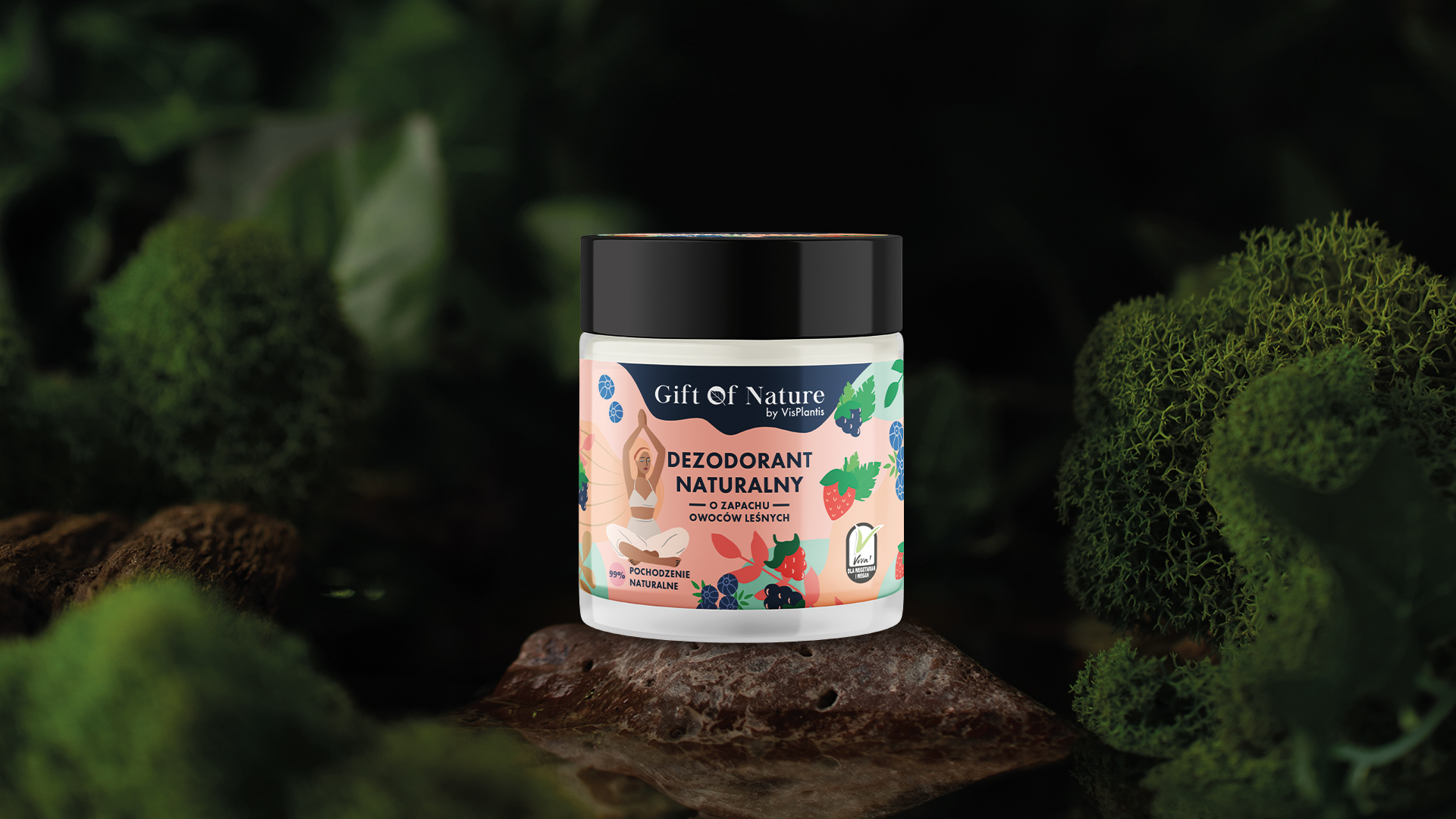
Gift of Nature by Vis Plantis packaging design
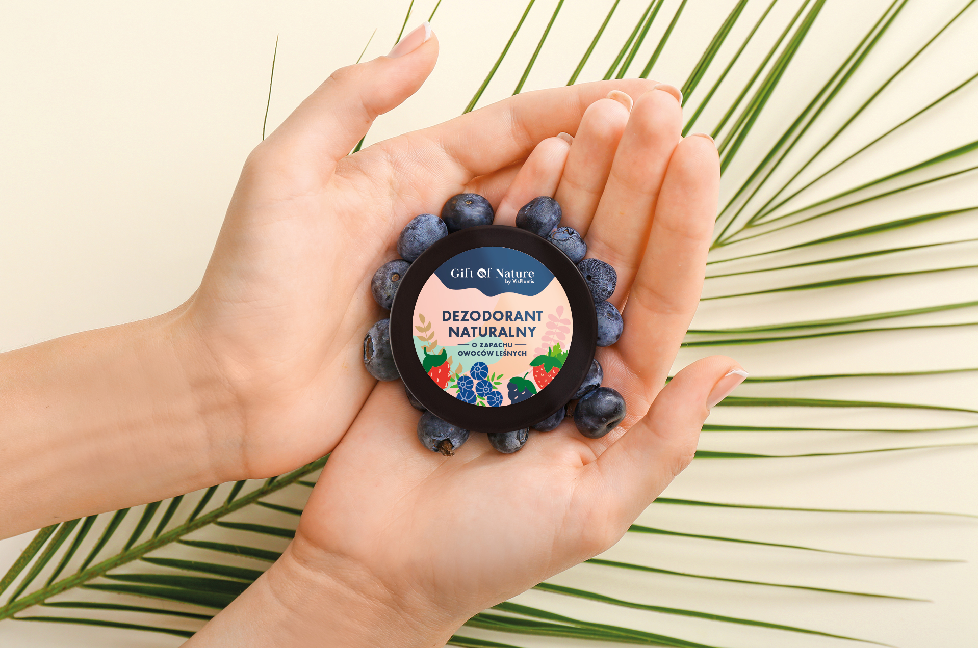
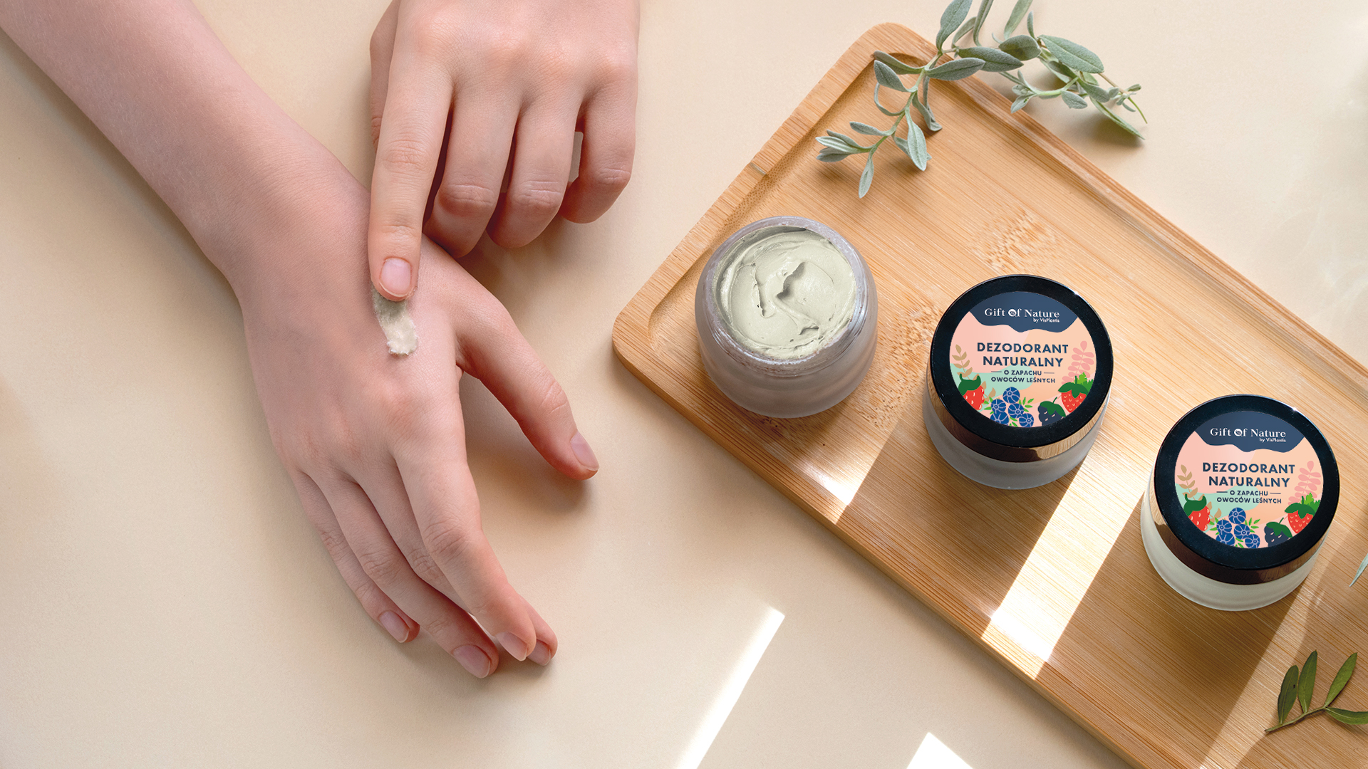
Gift of Nature by Vis Plantis is a series of natural, 100% vegan cosmetics that respond to the needs of modern women who want effective and proven products. Cosmetics from the GoN series are known for their focus on original fragrances, natural ingredients and interesting, eye-catching design.
As part of our collaboration with the brand, we created a branding for a new product – a vegan, natural deodorant cream. We followed two main guidelines in the project – to show the natural character of the product, as well as to match it visually with the main target group.
Thus, the branding is based on a color-saturated, highly visible and eye-catching creation. Its main element and foreground figure is a woman in a meditating posture – an emphasis on the nature of mindfulness closely associated with the target group and related aspects, such as harmony, harmony with the surrounding nature, as well as inner peace and subtlety. The figure has gently raised shoulders, so that the image contextualizes the application of the cosmetic, while still retaining the aesthetic and eye-friendly graphic aspects.
Fruits spread around the figure also play an important role, showing the fragrance line – forest fruits. The whole design is kept in a natural color scheme and style, further emphasizing the main qualities of the product, as well as showing it in an instagram look, which with its visual expression breaks the cold seasons as well as perfectly fits into the hot summer months.
Team
Design: Katarzyna Łoboda-Karki
Creative Supervision: Anita Kamila Sochacka
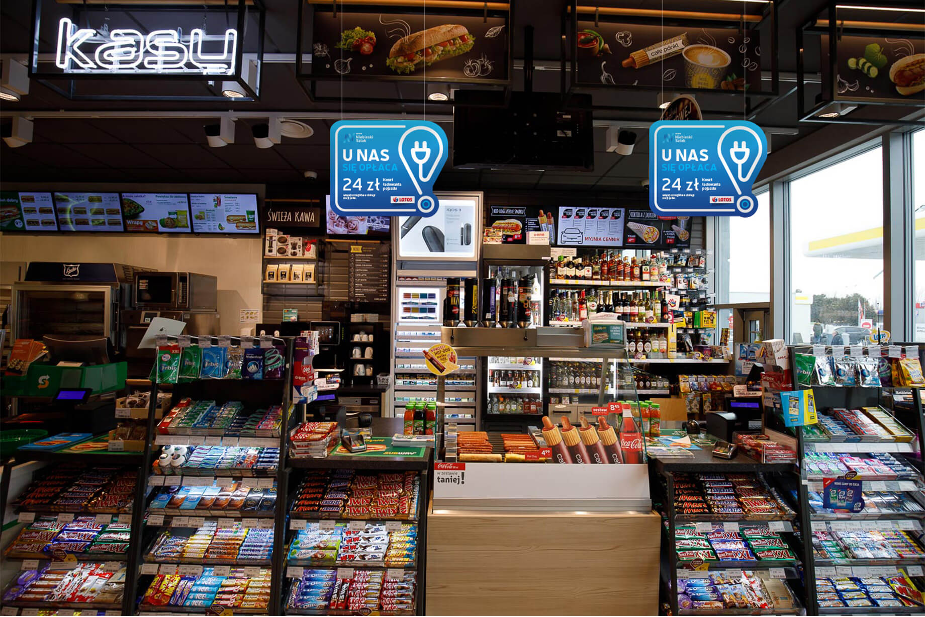
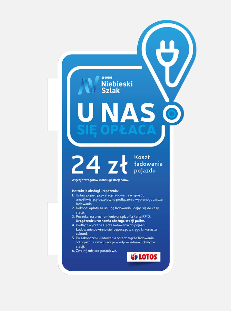
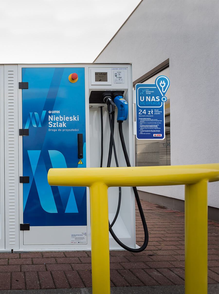
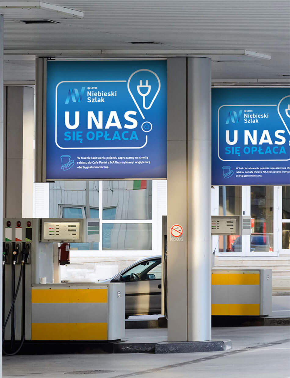
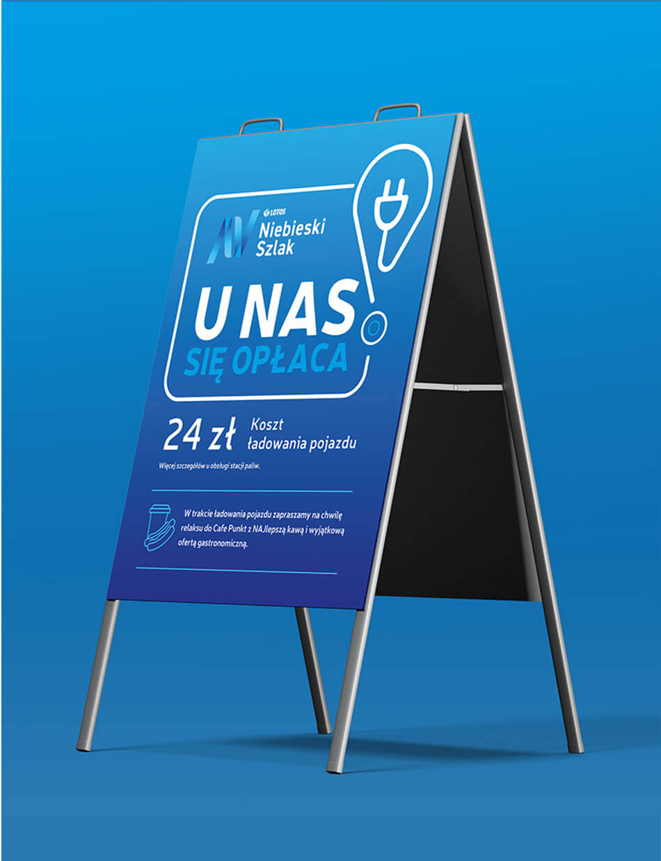
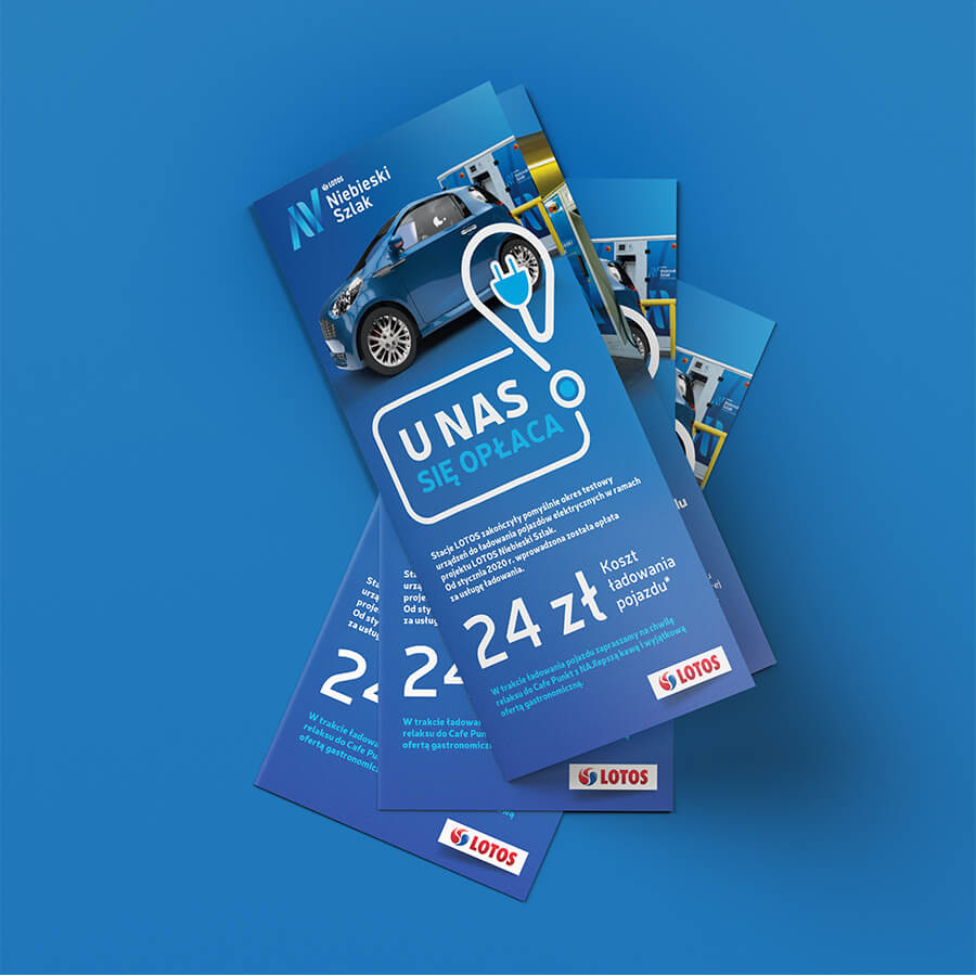
Blue trail brand – With us it pays off campaign
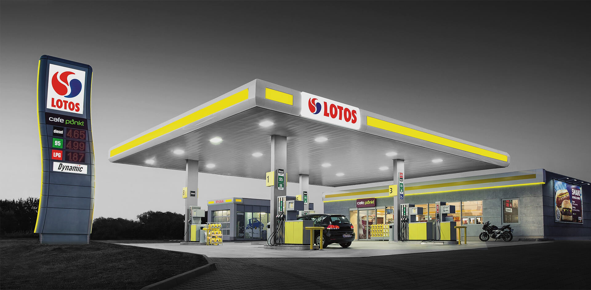
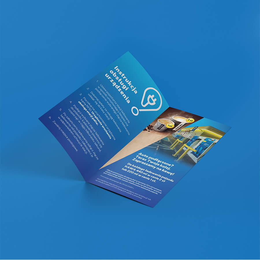
LOTOS Blue Route is a project by LOTOS Group, which established electric car charging points at 12 gas stations between Warsaw and the Tri-City. The initiative offered users free use of the charging service during a test period. After the first phase of operation, a one-time charging fee was introduced at the stations.
In connection with the event, we carried out a comprehensive online and offline communication campaign – from the creation of the creative idea to logistics – production and distribution of materials. The project included creations designed for digital and social media communication, as well as their adaptations on physical media that were installed at LOTOS fuel stations – leaflets, wobblers, hangers.
Agency co-owner Piotr Flis was responsible for the creative idea and copywriting matters. The preparation of graphic materials was handled by Paulina Troszczynska. The agency was also responsible for the production and distribution of advertising materials.
Visual identity
of the path Railway to Bicycle
“Railway to Bicycle” is an initiative of the Novosol district to promote regional tourism. Two bicycle routes, 18 and 30 kilometers in length, have been created on former railroad routes. Users have the opportunity to admire from their bicycles the picturesque landscapes of the post-glacial Barucko-Glogowska proglacial valley, where the routes are located.
As part of the tender organized by the district of Newosol, we created a proposal for a visual identification system for the “Railway to Bicycle” program being developed. The sources of identification can be sought in two aspects – the bicycle and the train. It is the individual elements of these means of transport that stand behind the idea, from which the logo and signet evolved. It is also a symbolic reference to the railroads on which the current bicycle routes were built.
The frame of the bicycle in the graphic proposal is taken from the bumper of the buffer – the most protruding element of old, distinctive railroad depots. This element adds dynamism and gives the impression of movement. The wheels allude to both the bicycle (the version with spokes) and the train, thus strengthening the connection of the creation with the program’s slogan.
The color of the saddle and part of the typography refers to the green aspect of transportation which is the bicycle. These are pro-environmental and environmental attitudes promoted by the program and representatives of the Novosol district. The gradient present in the creation further reinforces the symbolism of development and movement.


The project will not be implemented.
GalliPro’s international
advertising campaign
Chr. Hansen is a global player in the bio-science market that produces natural solutions for the beverage, food, pharmaceutical and agricultural industries. Year after year, the company supplies probiotics, enzymes, natural dyes and bacterial cultures to manufacturers around the world.
One of the brand’s flagship products is the GalliPro line, a probiotic in 3 varieties that helps animals absorb nutrients from feed. It is for this line that we prepared a series of key visuals, which were used in a global campaign in 2019 that had two iterations.
The first stage was to creatively show the shape of the animals – they were formed using shadows cast by appropriately placed hands. The second was based on the metaphorical portrayal of the three products as successful athletes who are the best in their disciplines. The creations were contextualized according to the regions in which the campaign was running – depending on the geographic location, the most popular sports in the area were chosen.


