Did you like this project?
Let's talk! You are welcome to join us for a short consultation. Click on the button below or write directly to: lotna@lotna.eu
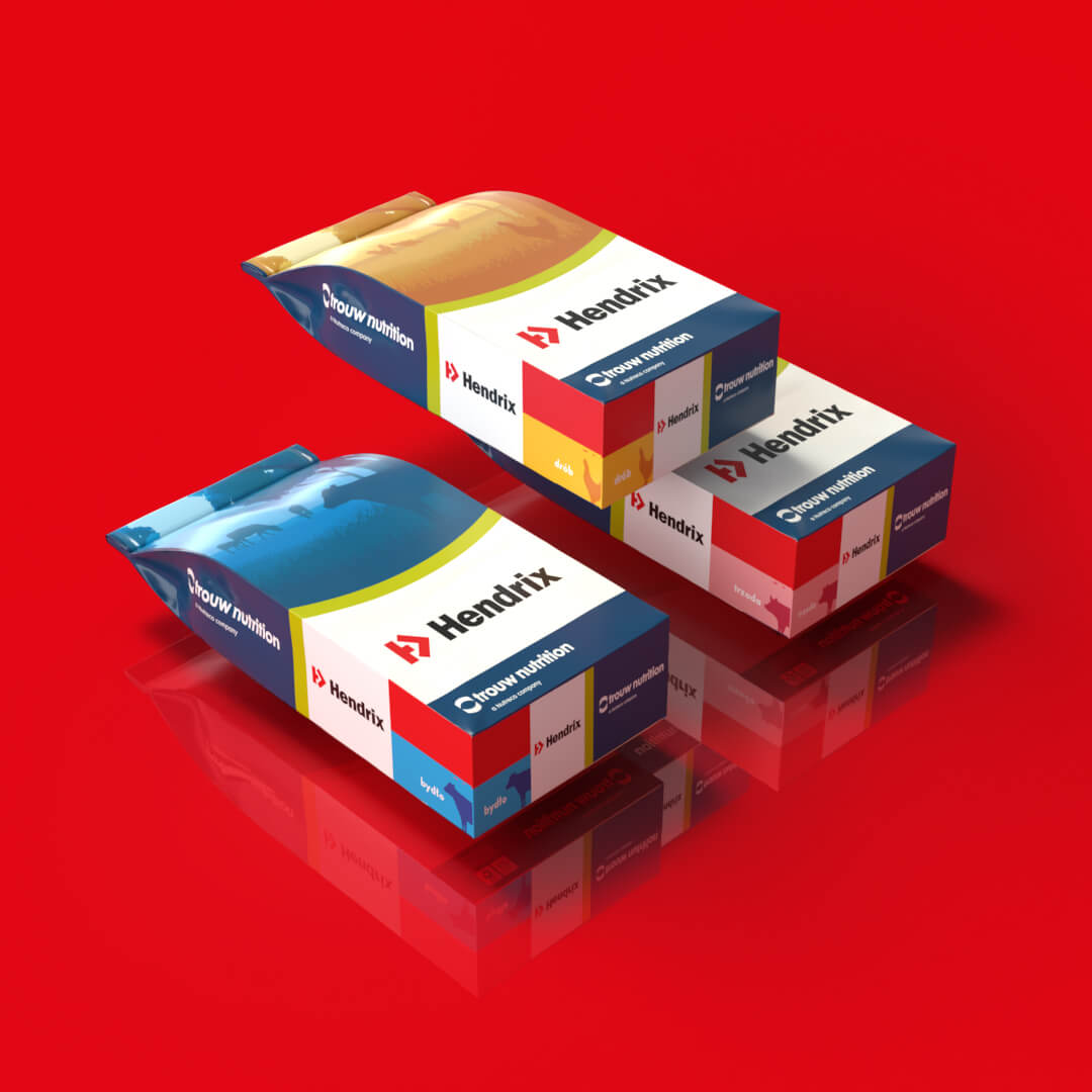
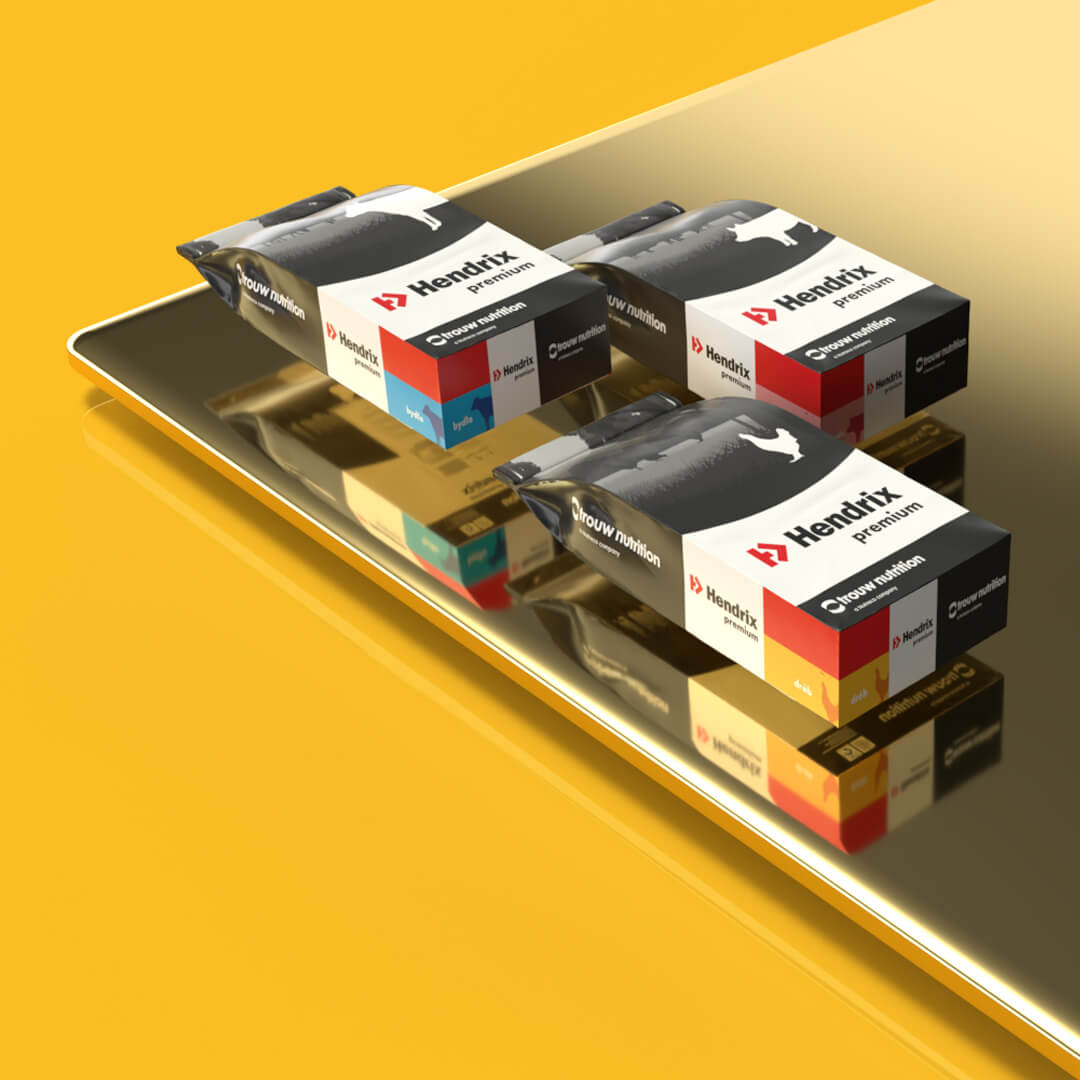
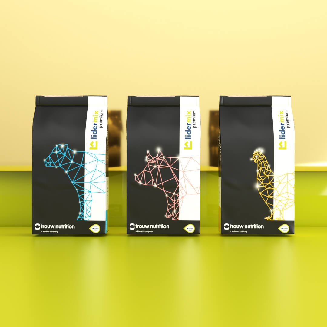
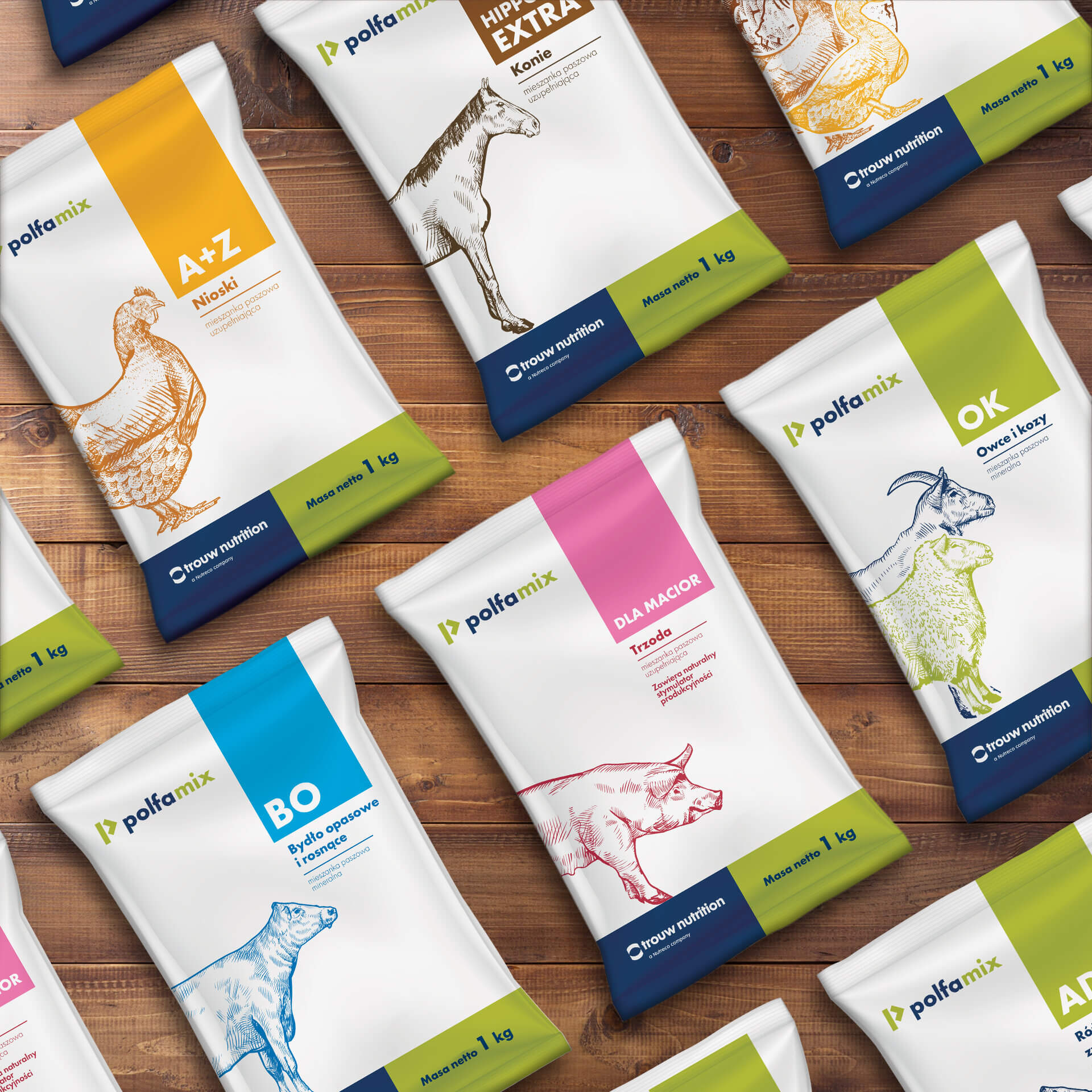
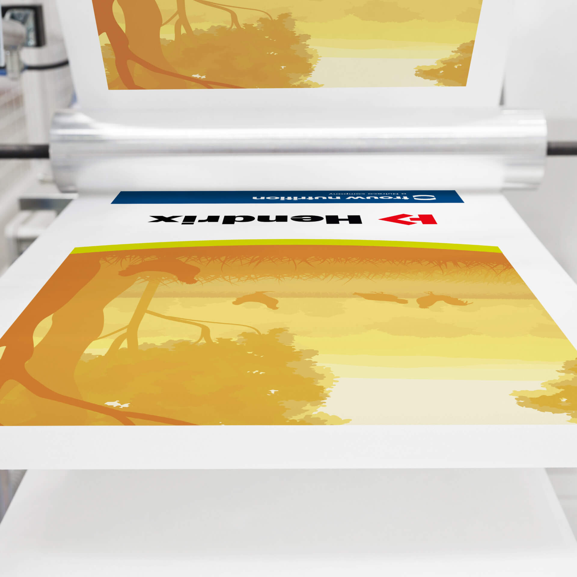
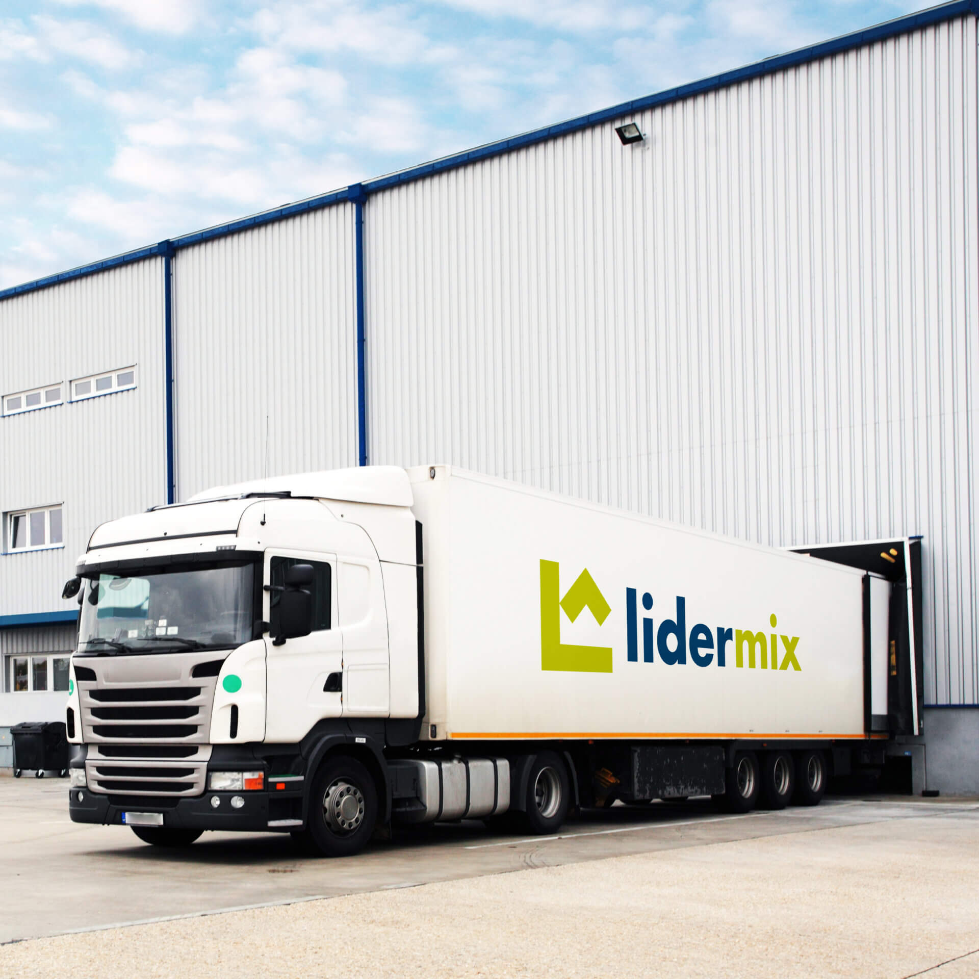
Trouw Nutrition is a world leader in animal food and nutrition consulting. It has been producing and supplying vitamin premixes and feed additives to thousands of farms on several continents for nearly 90 years. As part of the company’s ongoing development and to match its offerings to market needs, a decision was made to develop a new sales strategy and refresh the image of the three most recognizable products in the Trouw Nutrition portfolio – Lidermix, Hendrix and Polfamix. Our agency was selected to perform this task.
Each product can be differentiated on three levels:
– brand (Hendrix, Lidermix, Polfamix),
– category (regular or premium)
– destination (for poultry, cattle, pigs, etc.).
In addition to refreshing packaging graphics and brand marks, our task was to show all of the above elements so that the product is easily recognizable – regardless of its position and location.
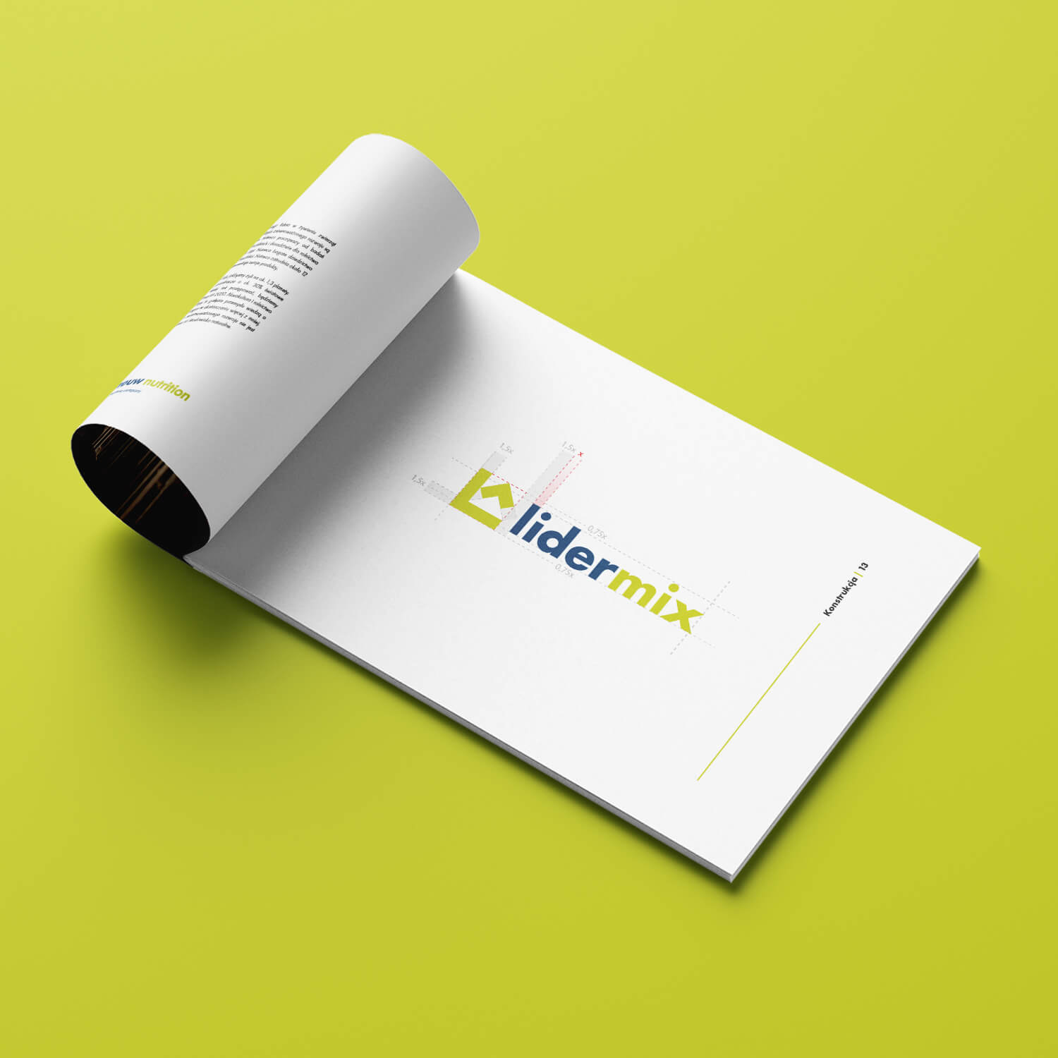
We began by redesigning the brands’ logos. Based on the mark of the existing Hendrix line in many international markets, the Polfamix and Lidermix marks were developed. All products were to form a single, consistent graphic line, in line with Trouw Nutrition’s new communication strategy.
The next step is the color scheme. To make product identification easier, three groups of color codes were created to be visible on each side of the package:
– Red or green, which, along with the logo, identify the product brand.
– Black or blue-green designate the category – standard or premium.
– Yellow, Pink, Blue, Green and Brown show the intended use of the product – for poultry, cattle, pigs or other animals.
In addition, Trouw Nutriton’s corporate colors – navy blue and green – familiar from the company’s logo and recognized by the product’s target audience, were incorporated into the designs.

Team:
Visual identity: Katarzyna Łoboda-Karki
Coordination and client service: Anita Kamila Sochacka
Technical coordination: Piotr Flis
Did you like this project?
Let's talk! You are welcome to join us for a short consultation. Click on the button below or write directly to: lotna@lotna.eu
Share:
