Did you like this project?
Let's talk! You are welcome to join us for a short consultation. Click on the button below or write directly to: lotna@lotna.eu
It is one of the most famous and recognizable universities in Poland, and unquestionably the best-known military university. The legendary “School of Eagles,” which has been training pilots, navigators and aviation personnel for both military and civilian needs for 95 years.
Due to changing conditions in the education market and the problem of the demographic decline, the authorities of this prestigious academy decided to put more emphasis on advertising and promotional activities, and for this a new structured visual identity was needed. An additional element that facilitated the decision to refresh the image was the change of the name from Wyższa Szkoła Oficerska Siły Powietrznych to the Air Force Military Academy.
Until now, the function of the logo has been performed by the University’s emblem, which is technically complex and elaborate, making it difficult to use both off-line and on-line. However, it is a symbol that is well-known in the military community and has a great history, with which generations of graduates and employees of the University are associated.
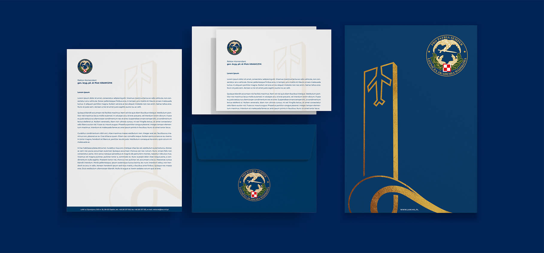
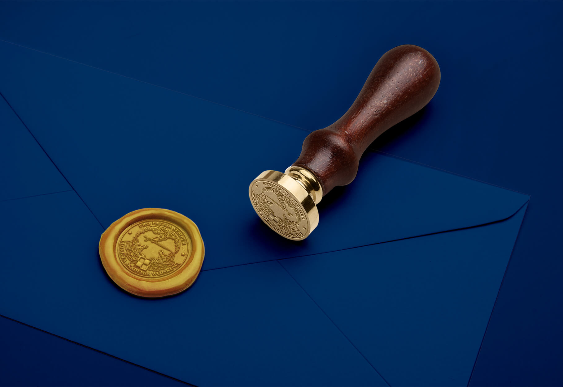
Therefore, together with the LAW Communications Department, we decided to develop two graphic lines. The Advertising Line – the main element of which will be the University’s new logo and the associated Kev Visual – and the Rector’s Line – a representative version, the main element of which will be a gently simplified Emblem and the Monument to the Heroic Airmen of the Dęblin School of Aeronautics, which is one of the most important objects of the University.
On the part of the University, a team under the leadership of the Rector-Commander was selected to work on the new Visual Identity, consisting of representatives of all Departments and Chairs of the University, the Student Government and the LAW Communications Department. On our side, the work involved the co-owners of the agency – Anita Kamila Sochacka, responsible for contacting the client, and Piotr Flis, responsible for copywriting and coordinating the work, while on the creative side, Michal Wyszynski, author of the logo and creator of the identity, and Katarzyna Loboda-Karki, responsible for technical supervision and development of the entire Brand Book.
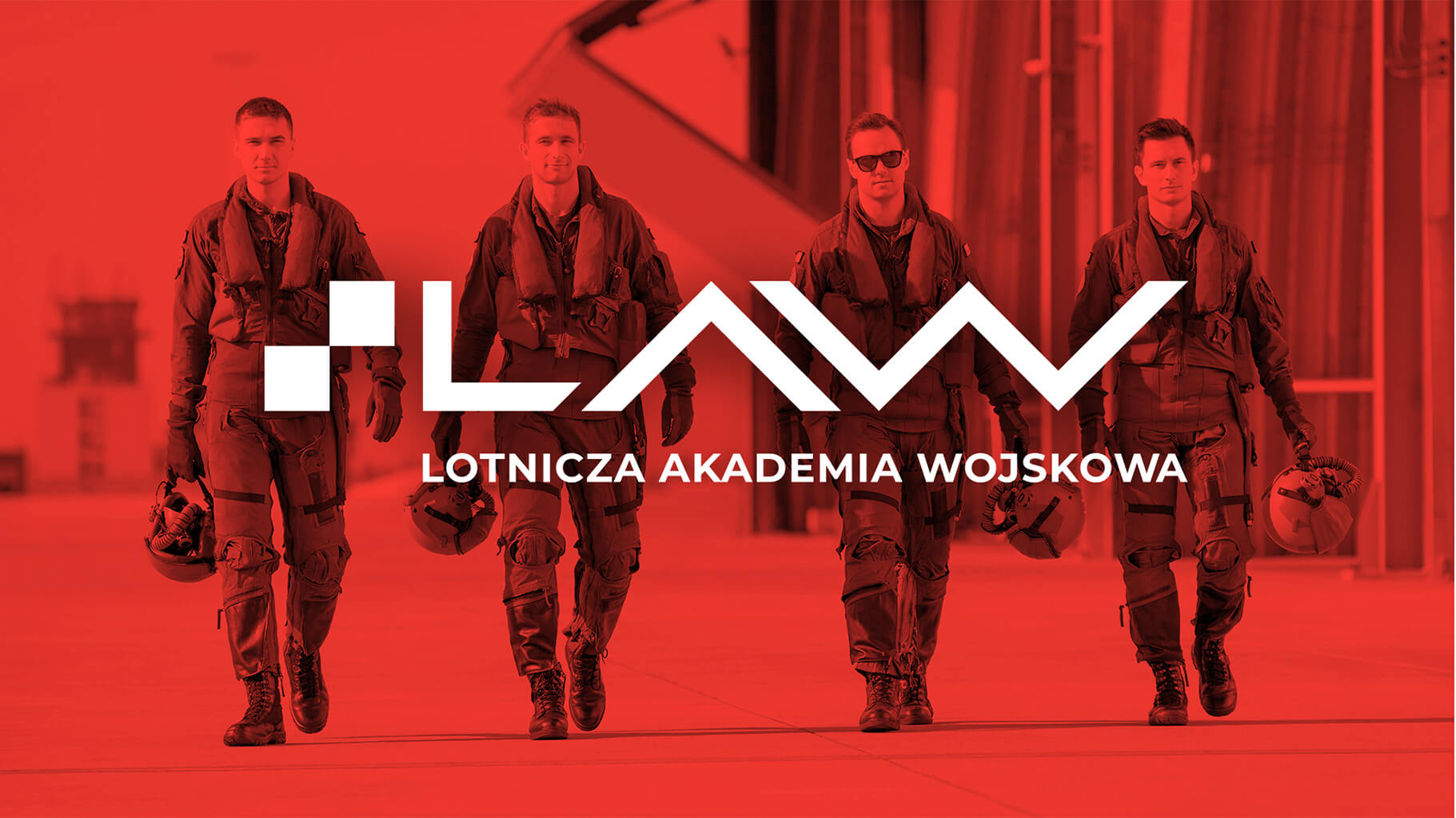
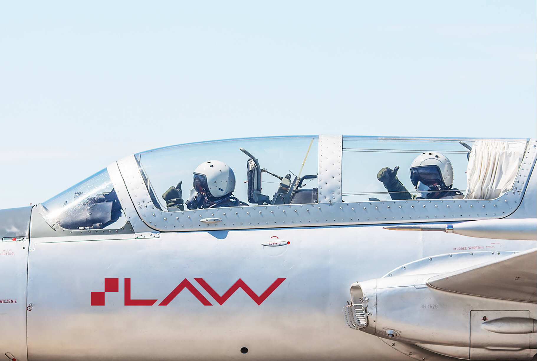
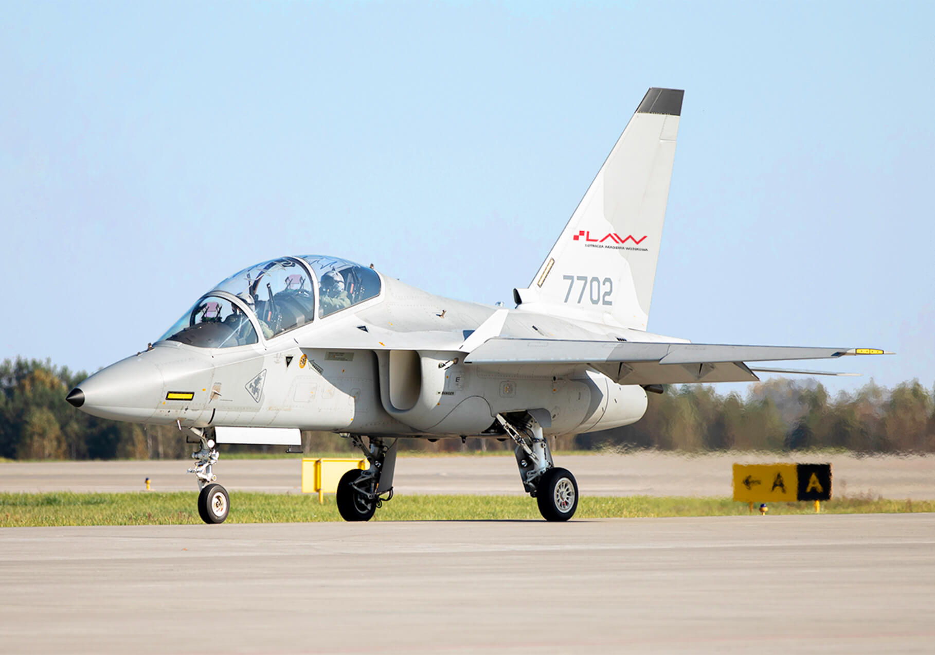
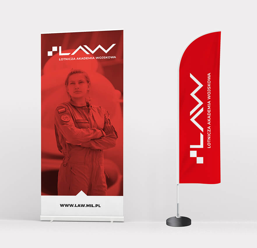
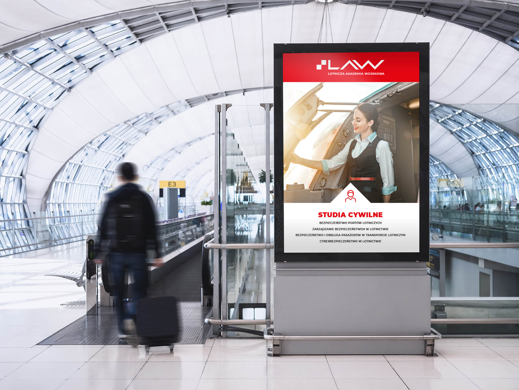
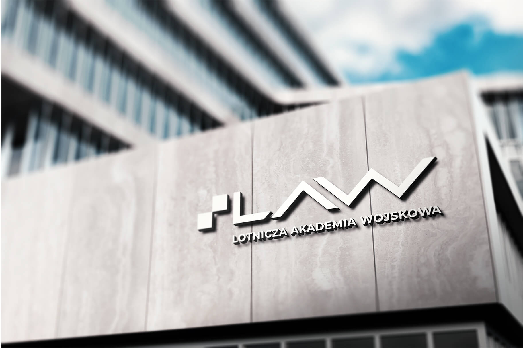
The logo and the entire visual identity of the University was built on the basis of the air chessboard – a universal, unique and distinctive sign of the Polish Air Force, unambiguously associated with Polish military aviation.
The checkerboard is a symbol of Polish military aviation with a history of more than 100 years. Referring to it, we wanted to highlight the Academy’s activities and honor its contributions to the Polish National Air Force.
The signet of the mark of the Air Force Military Academy consists of red squares of a checkerboard and the abbreviation LAW built on its red borders. The whole forms a modern, dynamic and strong composition emphasizing the Academy’s activities.

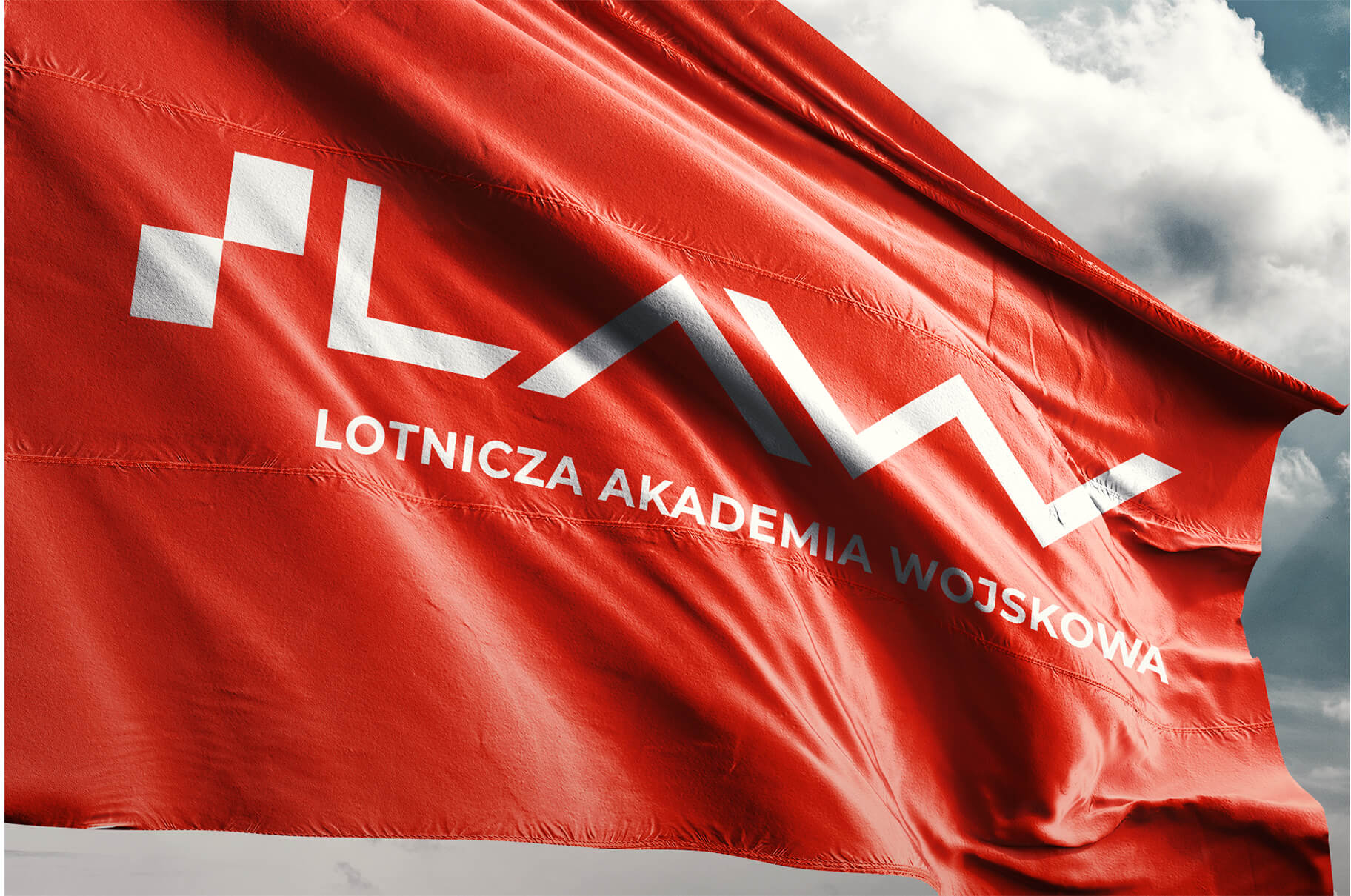
The visual identity links directly to the University’s logo. Its main element, organizing and giving direction, is the triangle called the distinguishing mark or bow. It derives directly from the sigil. It is a reference to the bow of an aircraft, that is, the forward-most part of the fuselage, forming an aerodynamically contoured streamline for air currents.
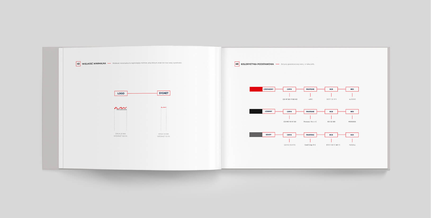
Z uwagi na różnorodność stosowanych treści oraz mnogość tematów, którymi zajmuje się Uczelnia, jej identyfikacja jest elastyczna i pozwala na dość swobodną modyfikację elementów składowych.
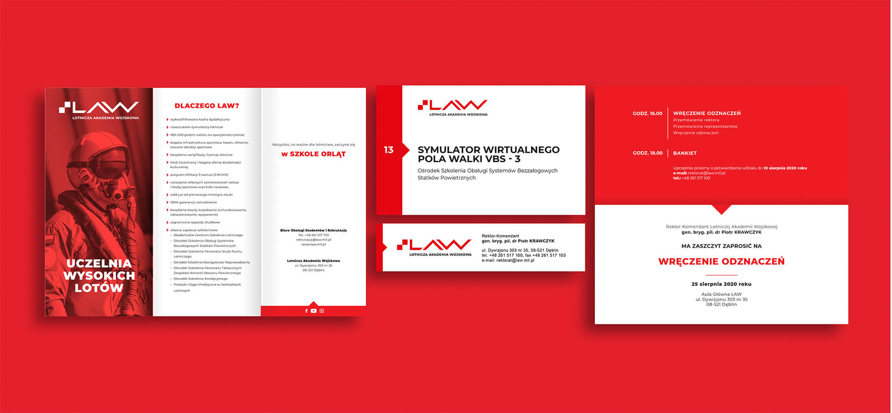


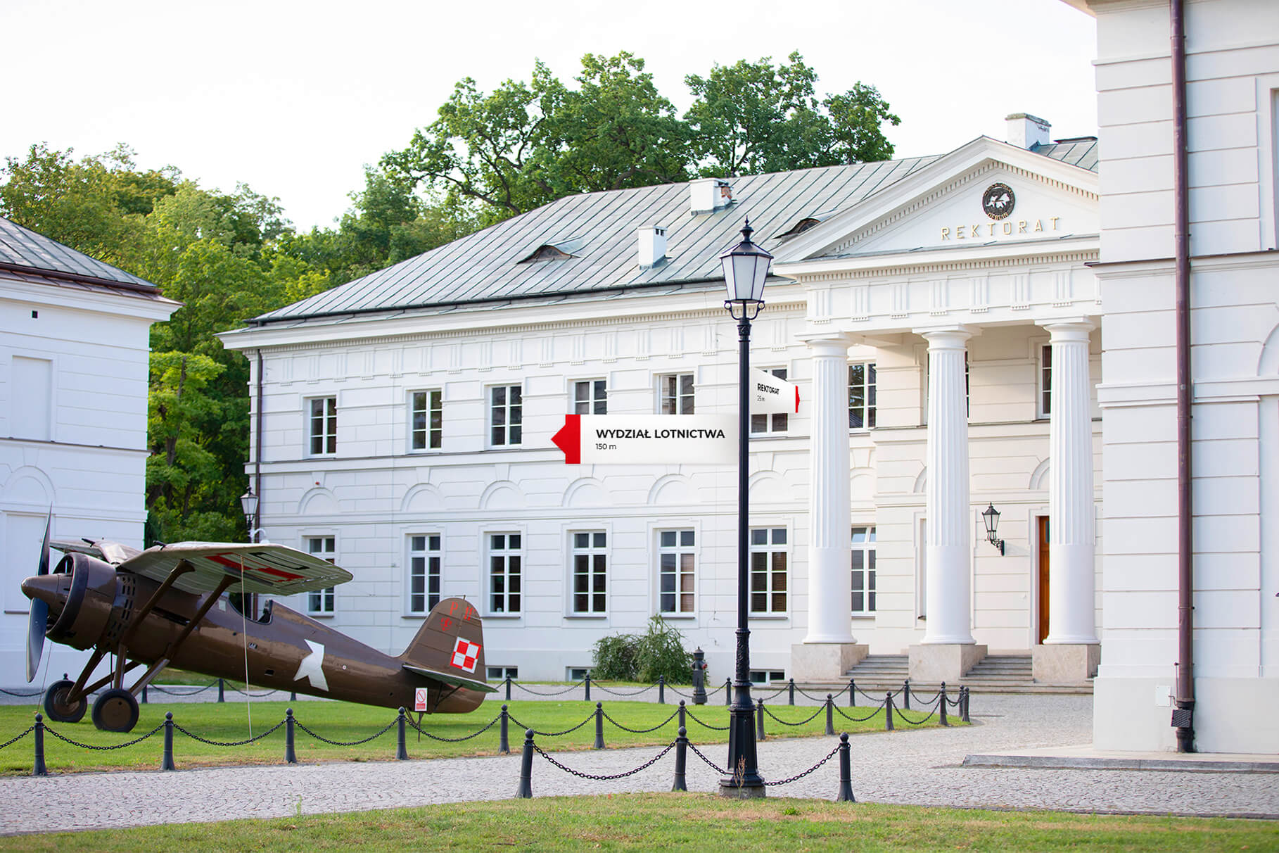


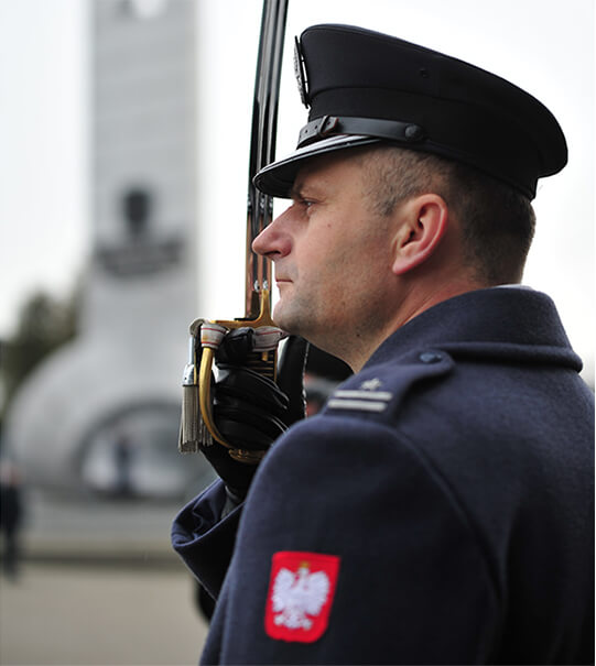
In addition to the advertising line, we also developed the Rector’s Line, using the traditional symbols of the “School of Eaglets” – the emblem and the “Heroic Airmen of the Dęblin School of Eaglets” monument. It was designed for the Rector-Commander of the Air Force Military Academy to represent his office. Materials from this line will be given to the highest representatives of state and international authorities during domestic and foreign official visits.


Team
Visual idenity: Michał Wyszyński
Verbal idenity and project management: Piotr Flis
Creative supervision: Anita Kamila Sochacka
Did you like this project?
Let's talk! You are welcome to join us for a short consultation. Click on the button below or write directly to: lotna@lotna.eu
Share:
