Did you like this project?
Let's talk! You are welcome to join us for a short consultation. Click on the button below or write directly to: lotna@lotna.eu
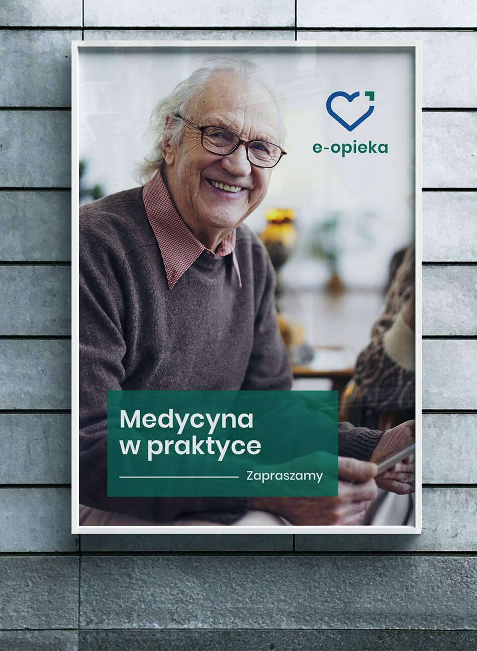
Warsaw has been developing projects in the field of social assistance for many years. One of them is the “e-care” system dedicated to seniors. The program aims to improve the quality of life of the oldest people who benefit from care services provided by the City of Warsaw and 19 adjacent municipalities.
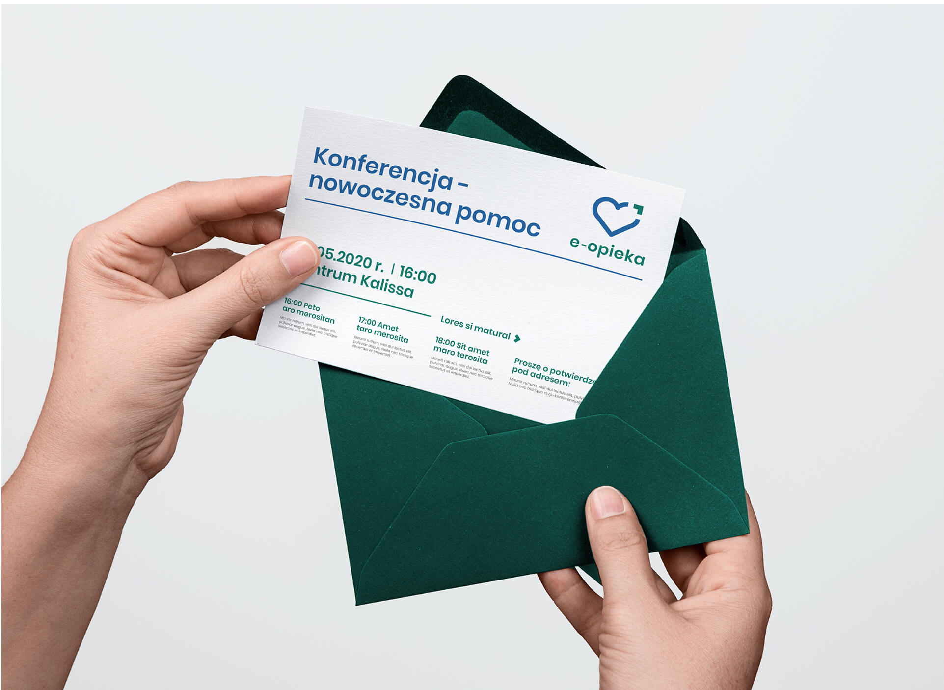
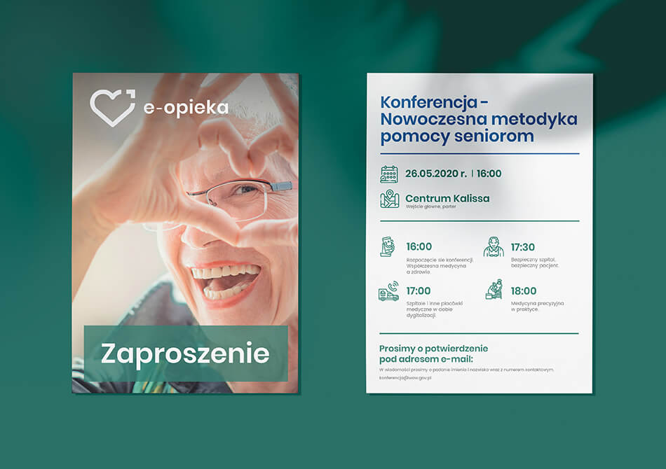
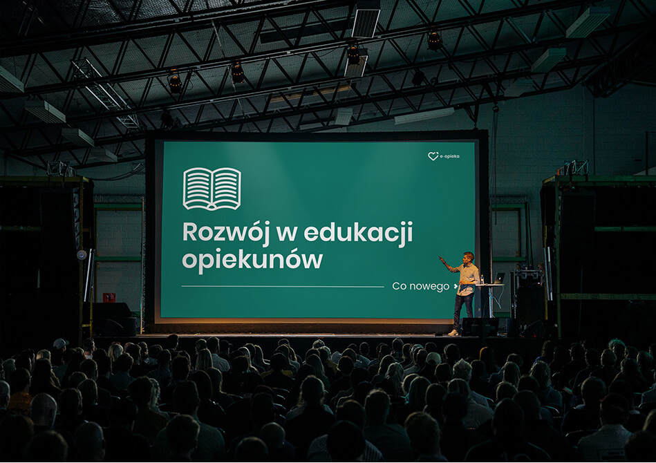
Our task was to create a comprehensive visual identity for the project. In order for the work to proceed successfully, we first organized a series of workshops for representatives of Warsaw and municipalities, where we learned the exact goals and objectives of the program, and conducted training sessions, explaining what visual identity and brand identity are.
Thus, a graphic design was created that fully took into account the needs of local governments and accurately responded to the brief they created. Of particular importance was the choice of colors – we were looking for the right contrast to make using the site easy and intuitive for the visually impaired.
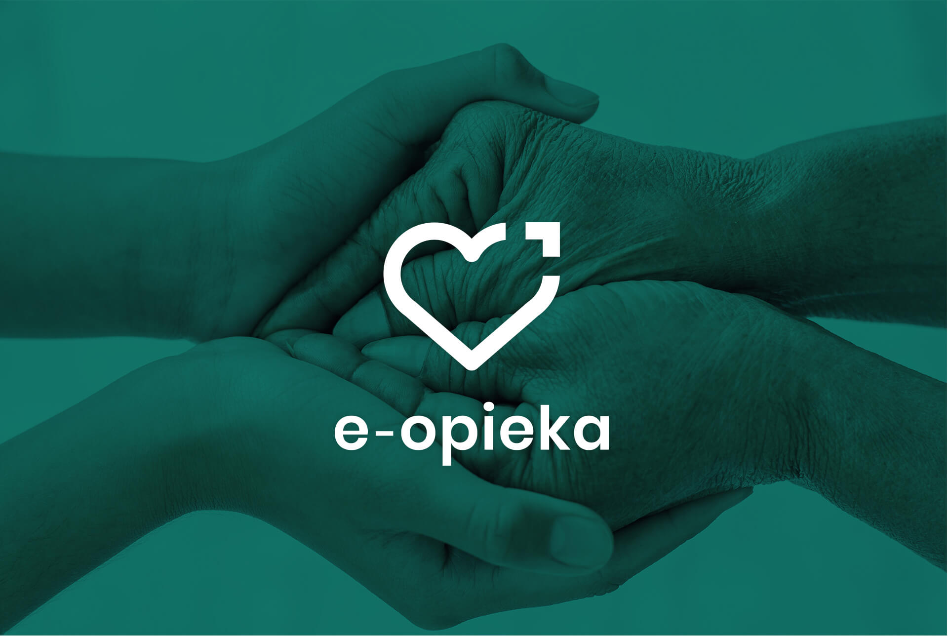
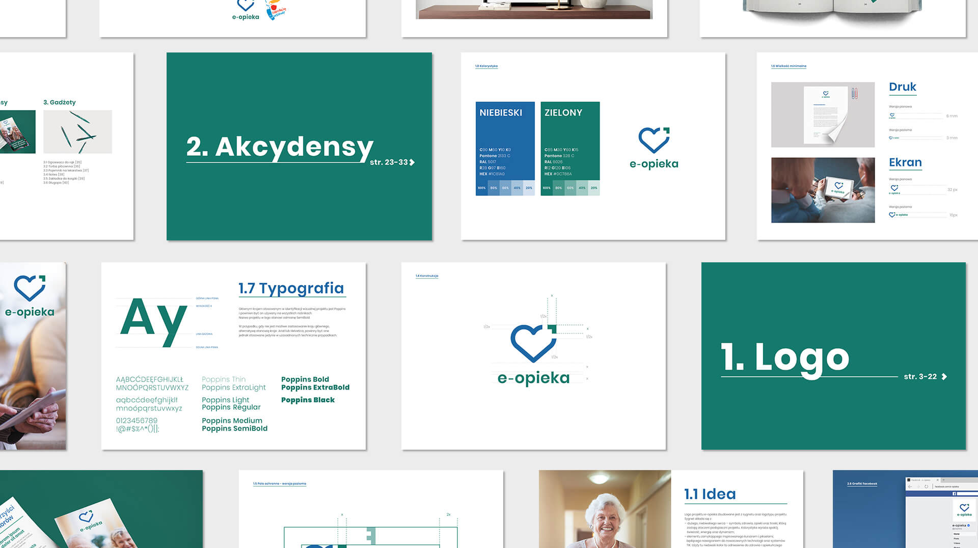
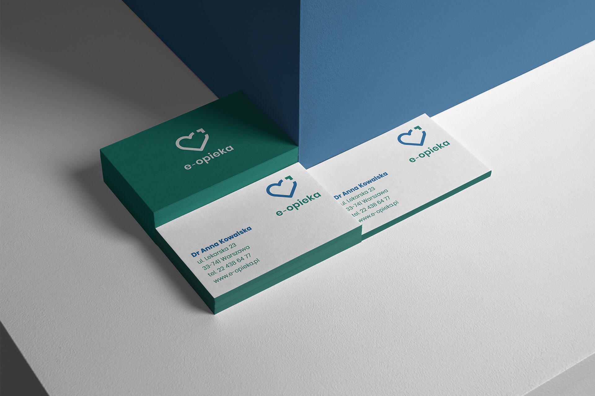
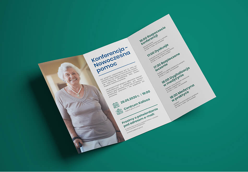
Identification is mainly based on


Team:
Visual identity: Katarzyna Łoboda-Karki
Verbal identification and project management: Piotr Flis
Creative Supervision: Anita Kamila Sochacka
Did you like this project?
Let's talk! You are welcome to join us for a short consultation. Click on the button below or write directly to: lotna@lotna.eu
Share:
