Did you like this project?
Let's talk! You are welcome to join us for a short consultation. Click on the button below or write directly to: lotna@lotna.eu
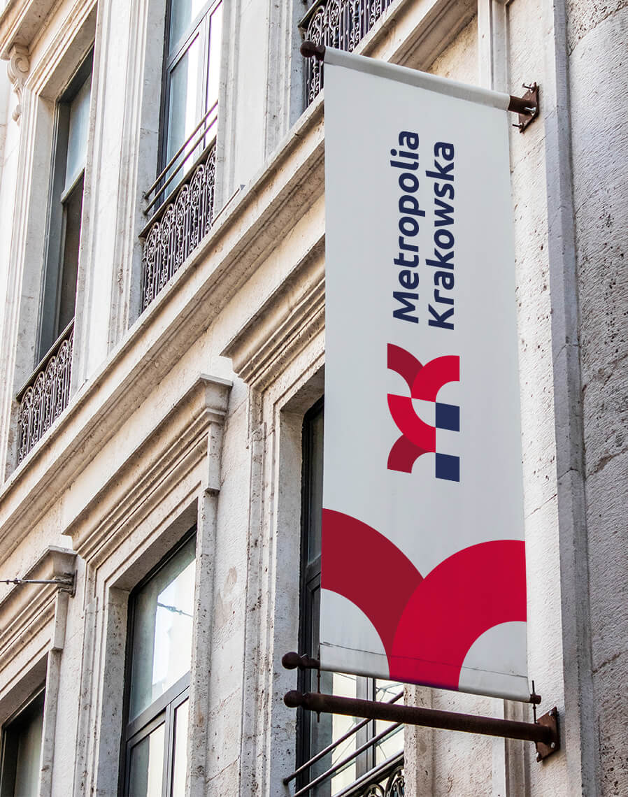
Krakow Metropolis is an association of Krakow and 14 surrounding municipalities. The main goal of the entity is close regional cooperation on many levels – including business, culture, tourism and technology. Members of the association also want to strongly promote the region internationally to increase the number of tourists visiting the Metropolis and to attract new investors.
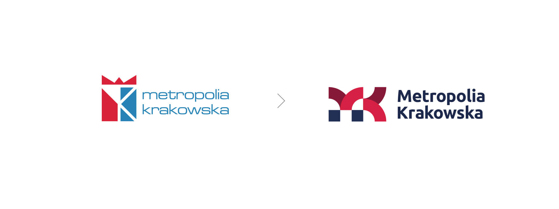
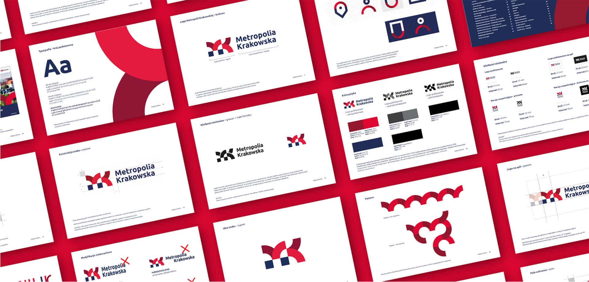
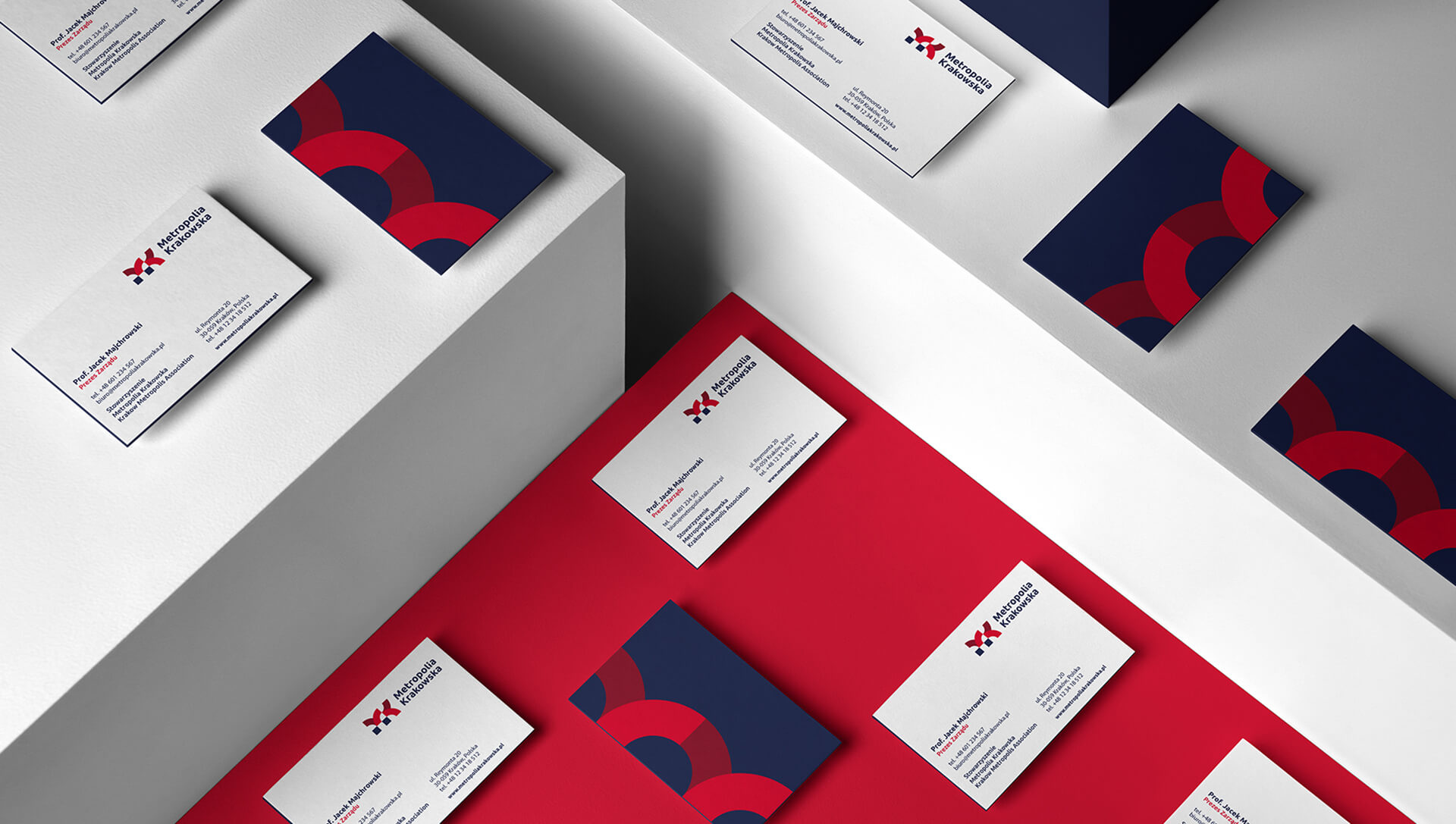
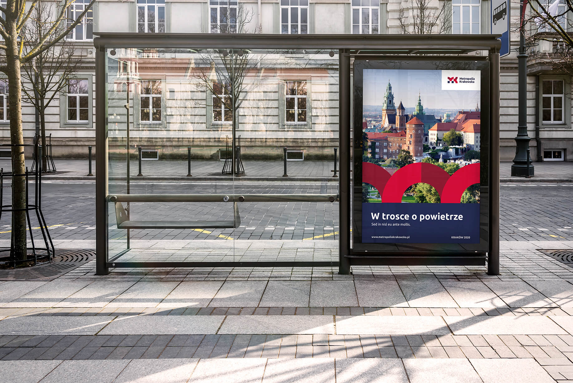
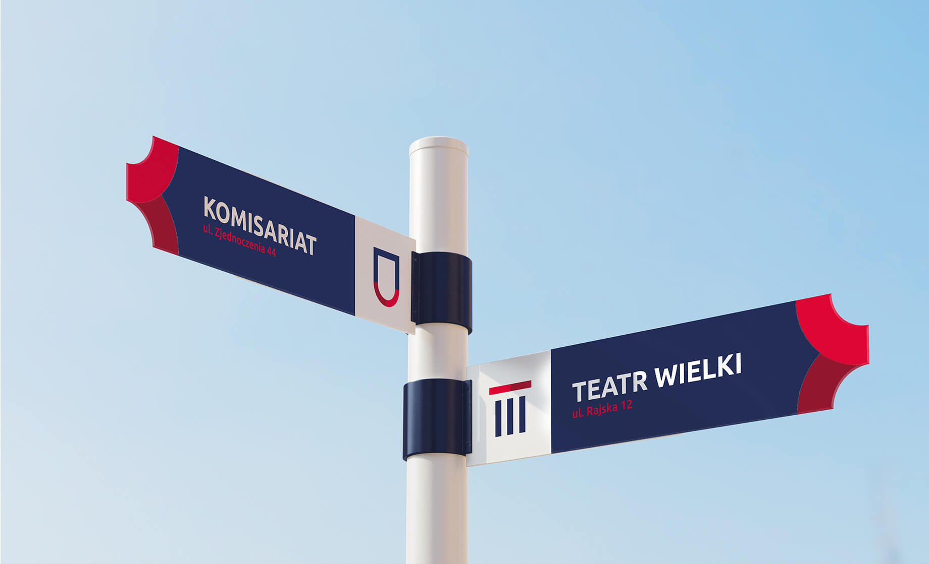
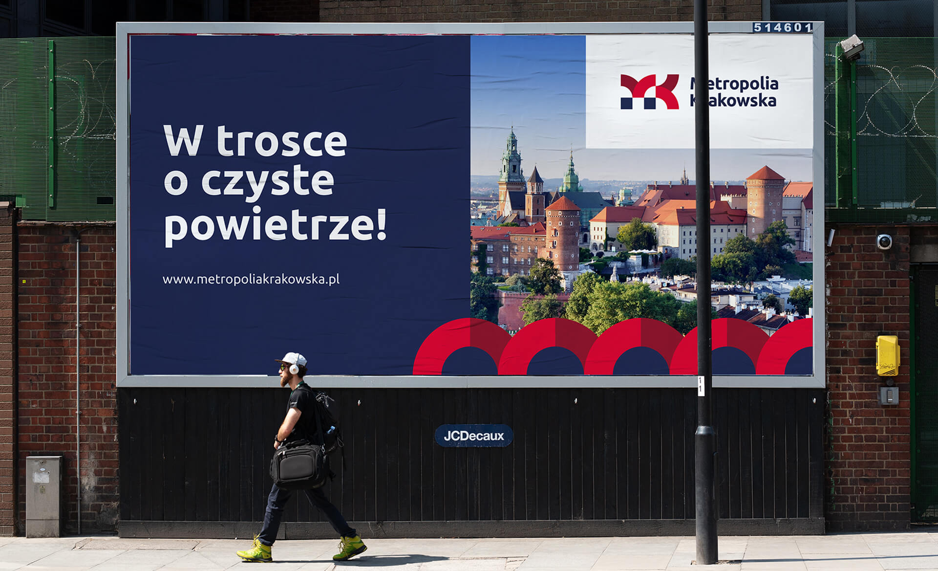
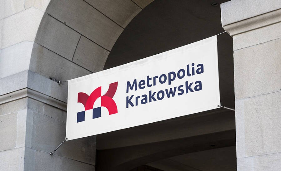
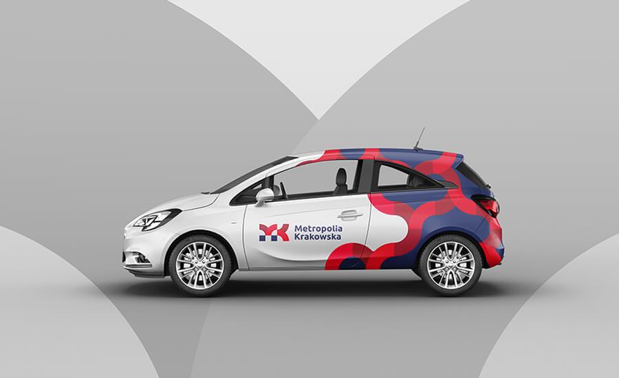
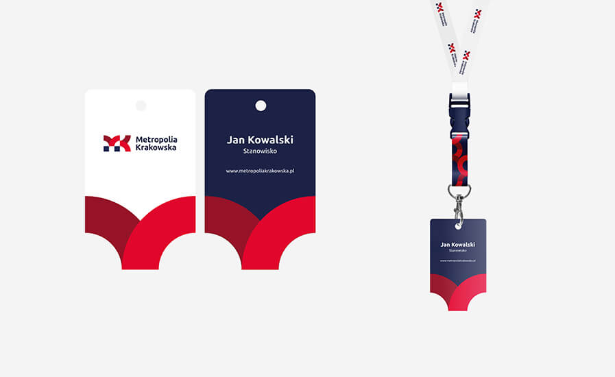
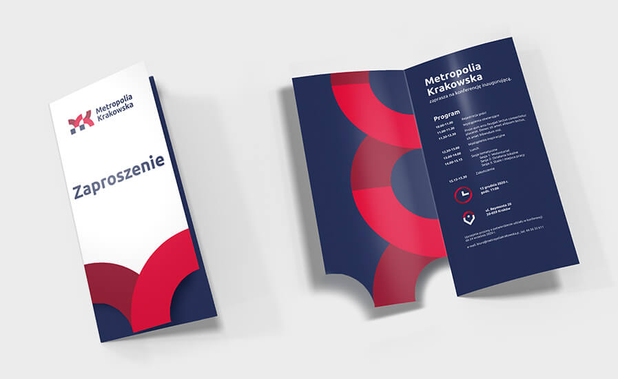
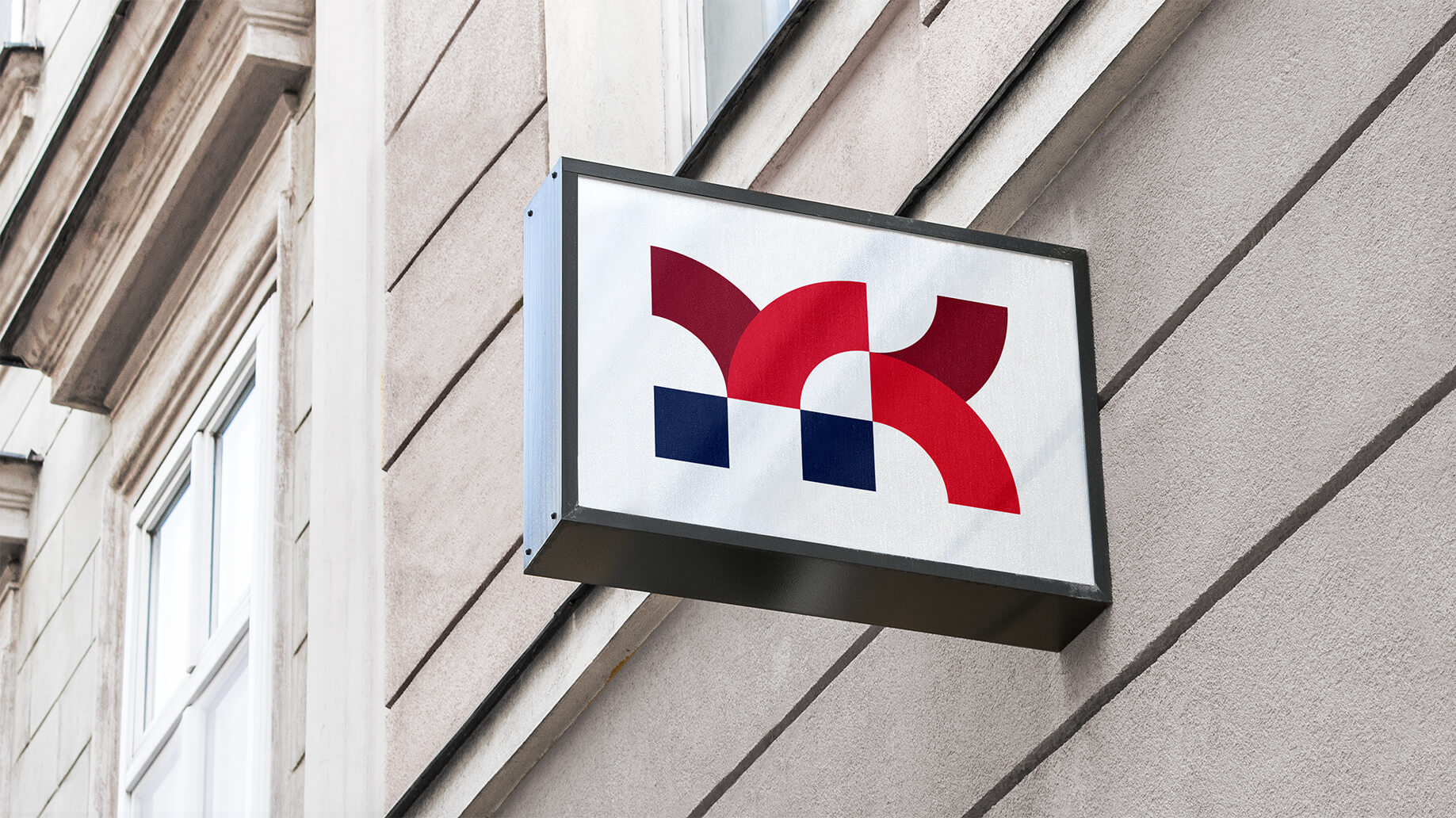
The first step to achieve these ambitious goals was the development of a consistent visual identity for the Krakow Metropolis Association brand, which consisted of refreshing the logo and developing a visual identity system.
When creating the new ToR, we took into account the diverse needs, goals and requirements of all 15 municipalities, as well as the diversity of areas that the Metropolis of Krakow deals with and wants to promote.
Before starting the work, we held a series of workshops and training sessions, during which we explained in detail the purposes that the identity serves, and gathered the expectations of local governments regarding the new identity.
As a result, the project was an accurate response to the jointly created brief and was unanimously accepted by all entities of the Metropolis.


Team:
Visual idenity Michał Wyszyński
Verbal idenity and project management: Piotr Flis
Creative supervision: Anita Kamila Sochacka
Did you like this project?
Let's talk! You are welcome to join us for a short consultation. Click on the button below or write directly to: lotna@lotna.eu
Share:
